This article has been contributed by Dawson Whitfield.
Maybe you’ve noticed it while flipping through a magazine or browsing your favorite sites online. Maybe you’ve opened one too many marketing emails only to be left with the same lingering feeling. Maybe you were looking at your own company’s branding only to have an odd feeling of deja vu. Whatever your moment of realization was, you were left wondering, “Is it just me, or do everyone’s logo fonts look the same now?”
To answer your question briefly, no it is not just you. Logo fonts are indeed beginning to converge into one homogeneous heap of sleek sans-serifs. This great streamlining of logo fonts has taken place across industries — from high tech to high fashion — and its seemingly unstoppable progress has left many wondering that very same question.
- Related: 38 of My Favourite Fonts for Design
- Related: My Top Logo Design Fonts (50% Off)
To understand the origins of this stylistic shift and where this trend is headed, we’re going to explore the emergence of sans-serifs as the logo font-du-jour. From larger trends in minimalist design, to the effect this homogeneity has on brands, to the future of logo fonts, there’s a lot to explore. So, if you’re ready to finally get an answer to that lingering question, let’s begin.
The Rise of the Sans-Serif Logo Font
Before we begin dissecting the details of this logo trend, let’s take a look at a few of its most notable examples. After all, if we’re going to understand where all the other have gone, we need to see where this evolution is emerging. Some industries have embraced the sans-serif logo font more than others, with tech being perhaps the most prominent proponent of typographical minimalism.
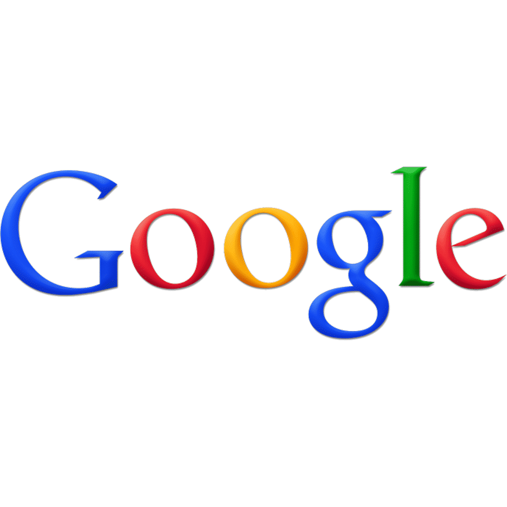
Sitting in a league of its own, tech behemoth Google is our first notable example of the sans-serif-izing of logo fonts. Google’s stripped-down brand identity kept the brand’s signature colors but got rid of its serif font. While the old Google logo included both serifs and shadows, the 2015 rebrand introduced a flat sans-serif font the company dubbed “Product Sans”.
![]()
Sans-Serifs in High Tech
But Google wasn’t the only tech behemoth to cut away at its logo fonts in the 2010s. In 2014, Airbnb dropped the multi-color bubble letters and opted for a monochrome lowercase sans-serif paired with the brand’s cryptic symbol.
![]()
2017 saw Pinterest ditch its script font in favor of a much blockier sans-serif.
![]()
Another lowercase sans-serif adoptee, Mailchimp traded in its swirling script font in 2018.
![]()
It’s important to note here that sans-serif fonts — especially modern fonts within the sans-serif family — have been a tech favorite for a while. Given tech’s emphasis on efficiency and streamlining, the prevalence of these minimalist logo fonts should be unsurprising.
In an industry where sleeker, simpler and easier is always better, it only makes sense that the go-to font should be something likewise sleek, simple and easy to read. When your industry is obsessed with creating the future, details like serifs and flourishes can feel like an unnecessary weight of the past.
While all of these tech companies seem like a natural fit for the minimalism of sans-serif, tech was far from the only industry that spent the bulk of the 2010s sanding away their font features.
Sans-Serifs in High Fashion
Perhaps more surprisingly, luxury fashion — an industry built on the detailed work of skilled craftspeople — also embraced the sans-serif look over the course of the 2010s. Diane von Furstenburg, the financially-troubled fashion label best known for popularizing the wrap dress, left its serifs behind in 2017.
Trench coat titan Burberry did the same in 2018, while Balmain both dropped the serifs and filled in its formerly hollow font that same year. Looking at the three logos side by side, the fonts are strikingly similar, as though the three companies had convened in secret to agree on a logo look before contacting their respective design agencies.
![]()
![]()
![]()
Sans-Serifs Everywhere
And the trend isn’t just in these two seemingly opposing industries. Across the middle ground behind high tech and high fashion, plenty of other brands have spent the past decade whittling away the details that once defined their logo fonts. The Huffington Post’s 2017 rebrand traded in its more traditional serif font for something sleeker. Now, the publication’s font reads more Buzzfeed contemporary than New York Times competitor.
![]()
In 2018, television channel Animal Planet traded in their over the top typography for a much tamer alternative. While the old font was also sans-serif, the bric-a-brac stacked lettering was noticeably toned down in the new logo’s plain text arrangement. With this logo, we can see an example of a company that already had a sans-serif logo font finding further ways to streamline the look of their logo.
![]()
Across industries, sans-serif fonts have been the rebrand tool of choice for many brands. Replacing everything from bubble fonts, to vintage fonts, to serif fonts, to script fonts, the sans-serif has spread to become a logo redesign staple.
The phenomenon of the ubiquitous sans-serif rebrand has even coined a term: reblanding.
However, all this design homogeneity comes at a cost.
The Cost of the Sans-Serif
There’s a reason designers often choose sans-serif logo fonts. They’re clean, easy to read, work for plenty of industries, and look good across a wide range of mediums. That said, those same traits that make these fonts a designer favorite also contribute to some of the issues that arise when everyone starts using them in their logos.
To understand the cost of sans-serif fonts becoming the de facto choice for logos, we need to look a little more into the anatomy of a character. Like all other typefaces, sans-serifs are made up of the usual font components. Things like arms, ascenders, bowls and bars make up the strokes that come together to create letters within this font family. However, unlike some other typefaces, sans-serifs are missing a few of the typical anatomical features. Serifs, spurs, swashes, and other flourishes are notably missing from sans-serif fonts, meaning this typeface lacks the level of detail and design differentiation that typefaces like serif or script can have. Especially when compared to the looping swirls and limitless flourishes script fonts can add, sans-serif fonts look downright utilitarian. And to a certain extent, they are.
While that utilitarianism makes these fonts readable and versatile, it has its drawbacks. Without the additional details and features of other typefaces, sans-serif fonts have far fewer options for differentiation. While you can vary things like the height, weight, slant and stress, sans-serif fonts simply have fewer features to work with than their more complex counterparts.
In the world of logos, this translates to logo fonts that look more similar to one another than their elaborate script or serif predecessors ever could. When you add in brands’ propensity to use the same monochrome, flat versions of sans-serif fonts in their logos, you’re left with a sense of sameness. Within the context of logos, sameness is a very bad thing. Considering the purpose of a logo is to create distinction and recognition for your brand, having your logo font look the same as everyone else can be a big problem.
Minimalism: A Minimal History
Now that we’ve covered the cost of constant sans-serif logo fonts, let’s break for a brief history lesson, shall we? It’s no secret that the sans-serif typeface is home to unapologetically minimalist fonts. But what’s important to keep in mind as we examine sans-serif saturation is understanding the context behind this trend. The rise of sans-serifs as the dominant logo font is part of a much larger movement towards minimalism in the past decade.
The Minimalist Cycle
Minimalism comes in waves. The excessive design of the 1980s was followed by the more stripped down and muted 1990s. In turn, the minimalism of the 1990s was followed by the bold, bright and often bedazzled 2000s. Following this pattern, the next decade took a much more austere route. But the 2010s were not just a product of a natural return to minimalism, the Great Recession also contributed to a reduced appetite for all things excessive. While this can easily be seen on the fashion and decor side, all aspects of design are inextricably linked — logo fonts included.
A Decade of Paring Down
When we look back on the 2010s now, we can see a decade defined by a less is more mentality. From the emergence of capsule wardrobes, to the rise of streamlined UX, to a movement towards minimal interior design, the past decade has been all about removing clutter in favor of efficiency. Getting rid of the inessential was so much in the cultural zeitgeist that there was a whole show about this concept in 2019 — Tidying Up with Marie Kondo, produced by online streaming giant Netflix and based on Kondo’s book on the same topic. All of this to say, when we look at the larger cultural context, sans-serif logo fonts are a natural extension of the 2010s minimalism movement.
When we ask whether they’re here to stay, the answer doesn’t rest on logo designers alone — but on the culture at large. If the appetite for minimalism remains strong, brands are likely to stick with the sans-serif logo font as a way to respond to customer preferences. But if tastes change, fonts are likely to as well.
A Return to Logo Font Diversity
But is the sans-serif really what customers still want? Or have the tides started to turn on this logo font standby? Back in 2018, Anne Quinto, a design and architecture reporter for Quartz proclaimed that the “The dark age of soulless sans-serif logos is coming to an end”. While there have been a few more rebrands featuring sans-serif logo fonts since this declaration, she makes an interesting argument for the trend coming to an end.
At the heart of her argument is a single term: “soulless”. Throughout this piece, we’ve talked about the sans-serifs and the utilitarian nature of their design. But perhaps their greatest sin is that they often lack personality. When more and more customers are looking for a more human relationship with brands, having the same logo font as everyone else just doesn’t cut it.
As customers look to brands for more than just products or services, but also for their stances on social issues and ethical practices throughout their supply chain, brands need to take a more human approach to design. Not just looking for the most readable, sleek, simple font possible, but seeking logo fonts that say something about who they are. We’re already starting to see the shift away from sans-serif logo fonts begin. In the later 2010s, brands like Chobani, Medium, and VRBO all moved to more elaborate serif fonts and away from their sans-serif roots.
![]()
![]()
![]()
Whether these more unique logo fonts are part of a larger shift away from sans-serif, or whether the minimalist font still has a few years in it, only time will tell. But until then, there’s still a sea of sameness to contend with.
How to Design in the Meantime
For designers looking at their own sans-serif logo fonts after reading this piece, there’s no need to rebrand in a panic. Sans-serif fonts, after all, do have a lot of merits when it comes to logos. Their streamlined, easy to read, no-nonsense design makes them incredibly user friendly. And user-friendly is always a good thing. But as we enter the 2020s, it may be time to stop treating them as the design default.
For designers looking to build brands that users connect with, personality is everything. That might mean choosing a more interesting font or it may mean taking a different approach to how you market with the font you have.
I’m going to leave you with one last example: No Name. A beloved generic food brand from Canada, No Name is known for its borderline dystopian branding that features a clean (and yes, generic) black Helvetica font atop a bright yellow background. At face value, their logo is as plain as it gets. But the brand finds other ways to be memorable. From its tongue in cheek Twitter account to its strikingly stark website, No Name approaches its plain packaging with a sense of humor. When you’re one of a million brands with nearly identical logo fonts, it can be hard to stand out. But with a little creativity, you can still become impossible to forget.
_
About the author: Dawson Whitfield is the founder and CEO of Looka, an AI-powered logo maker that provides entrepreneurs with a quick and affordable way to create a beautiful brand.


No comments:
Post a Comment