This article was contributed by Nathan McKinley.
The logo represents the most recognizable face of any business brand, and it can play a crucial role in creating a first impression that can stay in the minds of customers.
Naturally, designing a strong logo is very important for any business brand. If designed well, a logo can quickly become a great asset for any business brand.
But when it comes to logo design, creating a meaningful yet minimalist visual output that can be organically associated with a brand is not easy. It requires several design considerations. Many of these design considerations have been inspired by the logos of successful business brands across a range of industries, all over the globe.
1. Do Some Groundwork

Make a few preliminary sketches of different logo ideas. These initial experimental sketches should be done simply using pen and paper or by using a design tool like Adobe Illustrator.
The basic logic behind the importance of groundwork is that it helps you achieve the expected final output. If you rush to the final step without experimenting with different ideas, you end up compromising the final result.
Start with making a few dozen sketches of possible logos and create variations of every logo idea. This is in effect brainstorming, and can give you a lot of new possibilities that you can further explore. Remember, an experienced graphic designer spends a lot of time on this groundwork.
2. Don’t Get Too Trendy

Most human beings’ choices are shaped by current trends – what others are opting for at a specific time. Trends are infectious and often create a craze among people. But for logo designers, blindly following design trends can really be dangerous and counterproductive.
When you follow a trend, your logo could become outdated when the trend loses popularity. Since a logo is something of permanent value for a business brand, you must ensure that it has elements worth remembering for the entire life cycle of the brand. It needs to have staying power.
3. Does the Logo Genuinely Represent your Business?

A logo should represent the distinct identity of a business brand whilst alluding to the business’ industry and unique value proposition of the brand. When a logo represents all of these through a smart and minimalist graphic design, it quickly resonates with the audience and serves the branding purpose.
Consider what the logo communicates about your business and the unique value proposition of the brand. Also, think about whether the logo helps distinguish your brand from the competition. You need to choose a logo that effectively communicates the personality and mood of your brand.
For this, you should take an all-round look at your brand’s core personality and the way it is shaped. When you have know the key value propositions of your brand and its uniqueness, making the right design choices befitting this brand personality becomes a lot easier.
Do you want to get a comprehensive idea of the brand identity of your business? Consider the following questions.
- What is the primary objective of your business?
- What are the key values and beliefs that your company holds most dearly?
- What does the company do best?
- What creates the unique value proposition of the company from the user’s perspective?
- What three words easily describe the brand?
- How do you want your customers to describe the brand?
4. Steer Clear of Logo Design Clichés
Over the years, the art and science of logo design have given birth to several overused clichés that many brands all too readily incorporate into their business brand without success. There are several logo design ideas that have been used over and over by designers around the globe. These designs, instead of expressing the brand value of business, just make a cheap signature of the business brand.
While going with the current trend is one mistake that you should avoid at any cost, make sure you don’t fall prey to these design clichés either. They can make your design look dull and commonplace, which is the exact opposite of the objective of logo design. The moment you shape your logo using an overused concept, it becomes outdated and undermines the value proposition of your brand.
5. Pick a Suitable Design Style

When you have a clear idea about the business’ unique brand personality and value proposition, it is time to translate this into befitting design. To make your design come alive, you need to put a lot of design elements together. From font, colors, shapes and graphics to layout, every element is important. Instead of shaping all these design elements at once, it is important to approach the element one at a time and create the design step by step.
Before you pick the design elements for your logo, consider determining the design style that would be ideal for your logo. There is no single design aesthetic that can be right for all brands, so you need to choose a style that best suits your business brand.
Ideally a business’s design identity remains constant over time, especially the logo. A classic style will help your logo stay valid for years and eventually can be part of the lifetime value of a brand. Just make sure that the classic design isn’t a cliché.
Retro or vintage style is popular as it can evoke memories and create an aura of nostalgia that users hold dear to their hearts. For certain products, such styles help to connect the brand with a feeling of nostalgia to help in marketing to the right audience. Often, hand illustrations done in warm hues fits this design style.
Some business brands prefer a simple, minimalist and clean logo to easily communicate a fresh idea to the intended users. Such logo designs often utilize a lot of negative space around the logo and help convey a cool, professional and purposeful approach.
Funny and quirky logo designs are also popular among many businesses due to their unique capability to engage the audience quickly. Funny logos may be suitable for business brands with a predominantly young audience. They are also popular for certain business niches associated with sports, energy and celebration. Businesses like sports, movies, entertainment, music and games often use such a logo style.
Finally, there is a constant demand for handcrafted logos simply because they are very distinctive and personality-driven. Often handcrafted logos bring a little mix of other popular styles, such as vintage, funny or minimalist. Handcrafted logos can quickly describe the unique personality of a brand and its niche audience.
Now, let us be clear that none of these styles will work for all brands. If your business brand and audience call for a classic logo, creating a funny or quirky logo will be an utter waste of creative energy and time. So, pick your style wisely based on your unique brand.
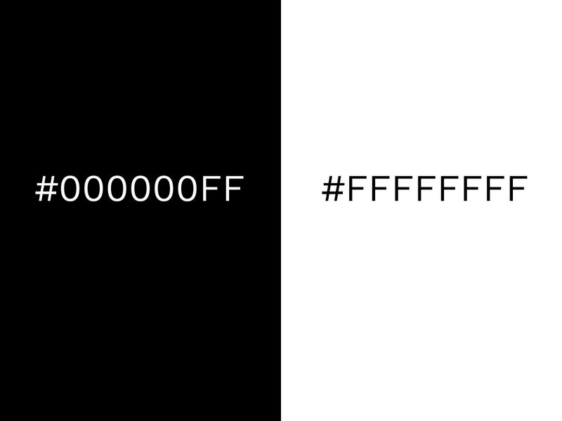
6. Create a Black & White Logo First

Image source: designwizard
You may choose an expressive color palette for your logo design, but colors can often put the core design considerations in the back seat. This is why it is extremely important to create a stripped-off black and white logo design before considering the color options.
When you create the black and white logo first, you can concentrate on the core design elements and shape the ideas into a legible design. After fixing these, you can move on to color options.
7. Smarter Use of Color Palette

For designers, using the color palette is, of course, an important thing. Besides putting color psychology in the context of logo design, it is important to consider various aspects like balance, contrast, brand-specific color choices and synchrony.
You need to use colors that sit close to one another in the color wheel. For instance, if you want to use a warm palette, use red, orange and yellow shades in a balanced manner to maintain synchrony. Always ensure that no color is too bright to create pain for the eyes.
Colors are the most important aspect of delivering the brand message, because every color has a unique aura and represents a mood that others are missing. While using red in the design, you can make your brand look highly energetic, passionate and aggressive. By using blue, you can represent the brand as cool, professional and passive. So, choose colors for your logo that make sense to the brand personality and the things that you do.
Do you want to catch the attention of your audience with the logo? You can do this with bright and bold colors. But remember, the colors themselves must fit the brand message and brand personality.
8. Passive or Active Elements

Image source: webflow
Do you want to create a sense of motion with your logo design? Or do you want to create a sense of restfulness with the design elements? Well, these two contrasting aspects determine the passive and active logo elements.
For instance, the Apple logo is a standstill object, whilst Twitter’s logo instills motion in our mind at the very first sight. You need to choose the design element as active or passive based on your core design concept and how it connects to your core brand message.
Brands that use mascots in logos particularly need to incorporate motion into the design elements. A bird in motion, a hand lifting upward, flapping wings and many similar concepts of motion in logos are already popular. There is no hard and fast rule for choosing motion in logo design or avoiding it. It largely depends on your core design concept and the way it is utilized for branding.
9. Ensure Balance

In the context of logo design, ensuring balance is of extreme significance. The balance in logo design is ensured by keeping the graphics, color, and logo size equally on every side. Every element in the design should complement each other.
Even when you occasionally break the rules of design balance, make sure it perfectly fits into the overall design context of where it is used. Since you cannot expect exceptional visual taste from the masses, maintaining balance is the right and safe approach.
10. Size and Scalability are Important

For logo design, size matters a lot. A logo should look brilliant and fit perfectly across all screens, places and use scenarios. Size and scalability matter because the logo must look perfect in all sizes, surfaces and screens. From billboards to TV ads to web and mobile apps, the logo should look flawless in all different use contexts.
11. Use the Right Typography

Many logos need to deal with text or just letters. For such logo design needs, choosing the right typeface, font size and font style are extremely important. Using sans-serif and serif fonts are safer options in most cases, though you can always opt for custom fonts.
Make sure your chosen font doesn’t make your logo amateurish. Also, don’t use more than one font to make the design simpler and more effective. You can take inspiration from many brands that successfully use custom fonts in logos such as Pepsi and Coca Cola.
Conclusion
A brilliant logo that instantly makes customers remember a business brand is an invaluable asset for a brand. Use the above principles and your in-depth knowledge of your or your client’s brand to design a successful logo that will last for years to come.
_
About the author: Nathan McKinley is Business Development Manager at Cerdonis Technologies LLC, mobile app development company in Chicago with 5+ years of experience as a leading tech solution partners for numerous enterprises and tech startups.
Thanks for sharing your blog related to . Logo Design .
ReplyDelete