Sunday 30 September 2018

How To Brand A Startup On A Small Budget

This article was contribute by Kayleigh Alexandra.

So the plans are underway, and you’re getting ready to launch your brand new startup. Exciting times!

But you’re starting to think about branding and now you’re panicking about going over budget and how much it’s all going to cost… (Not so exciting, especially if you’re working with a small budget).

Strong and effective branding can really help your company stand out in a competitive market, and as a newbie, you need to put some time and effort into creating a strong brand value proposition.

Branding a startup can often cost an arm and a leg, but it really doesn’t have to. There are a whole host of ways you can create a brand for your new business while saving valuable money that could be spent elsewhere. After all, things like product development and customer service should be at the top of your priority list right now.

Below we’ve shared some expert top tips on how to brand your startup on a shoestring budget

Develop a brand strategy

First things first, come up with a plan. You need to create a brand strategy and stick to it. This will ensure that you don’t waste time or resources that you don’t have on superficial things that won’t benefit your startup in the long run.

You should use your overall business strategy as context for your branding strategy —  the two should go hand-in-hand, informing each other.

Do your market research

When you’re planning a branding strategy for your startup, you need to do plenty of research.

  • Start by identifying your target customers or clients, and research them. The most successful businesses out there have picked a very specific target group to aim their brand towards, and then designed their branding to appeal to this group. Trying to appeal to anyone and everyone with your product won’t work, and neither will a ‘one size fits all’ approach to your branding.
  • You need to research competitors and see what they’re doing: what are they doing to brand themselves successfully? Tools like Ahrefs and SEOquake will help you to understand useful SEO patterns you can then use to benchmark your own branding ideas against the competition. Look at things like relevant keyword ideas, traffic estimations, and competitor results to help ‘fill in’ the commercial gaps of your startup branding strategy.
  • If you’re the new kid on the block and feeling bold, why not brandjack the big boys? Launch your company as an alternative to key game-players by highlighting your similarities and differences. Are you selling a similar product but cheaper and lesser known? Create a comparison table to showcase why your customer base should pick you instead. They may be a huge multinational, but everyone loves an underdog story.

Put effort into branding basics early on

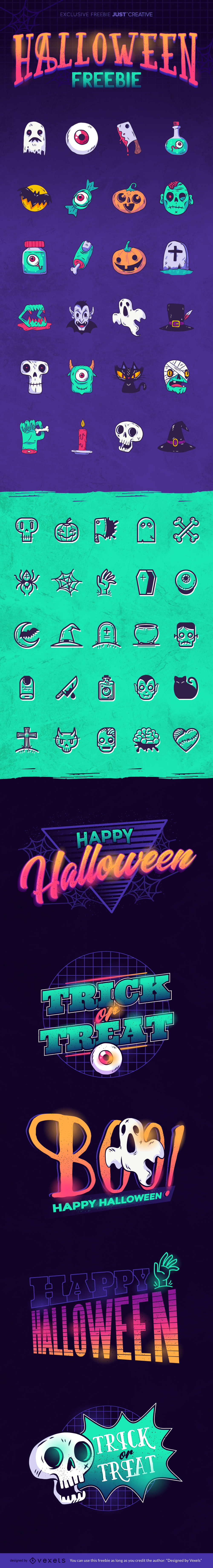
When it comes to branding your startup, prioritise creating an attractive, instantly recognisable logo and strong tagline.

These are an important part of your identity as a business, and set the tone early on — both logo and tagline should memorable and relevant to your brand as a whole.

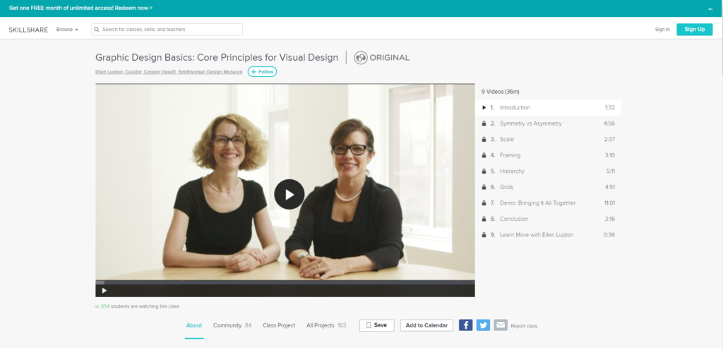
If you’re a complete novice when it comes to branding and designing a logo, check out this useful post to understand more. And if this really isn’t something you’re comfortable with, or it’s just not where your skillset lies, hire a talented freelancer.  Freelancer fees aren’t as high as you might think they are — and a well-designed logo will pay dividends when it comes to brand reputation.

“If you think good design is expensive, you should look at the cost of bad design.” – Ralf Speth

Save money by using design tools to create social media graphics and infographics, but skimping on your logo design & brand identity could end up really costing you later down the line.

Ensure that you are consistent with your branding: once you’ve developed your brand signifiers, these must be are visible on all media platforms. Brand collateral is very important: everything from your website to letterheads must have continuity and provide your audience with a tangible grasp of your brand’s core values and concepts.

Aim for uniformity across all mediums: be aware of logo placement, stick to a colour scheme, and avoid using too many varying fonts (see here for great font combinations). This will help to ensure your startup’s branding is professional. Attention to detail doesn’t cost anything, and there are loads of free-to-use open-source fonts you can download for free. There’s no excuses for sloppy branding, even as a startup.

Take advantage of free and cheap resources

Make the most of open-source software, crowd-sourced imagery, and a whole network of global experts to help you create brand assets at a fraction of the cost of a traditional branding agency.

As a young startup, leveraging the digital marketplace is one of the savviest ways to cut branding costs.

  1. If you’re branding your startup on a small budget, don’t forget that there are plenty of free website platforms like WordPress that you can use to set up your business website. WordPress sites are easy to customise and maintain, and  — big positive — they free up some of your budget to be used elsewhere. Use a low-cost theme (there are loads aimed at startups), and just swap out the content and imagery. There is no need to over-engineer your first website. Pick up brandable images for your website at no extra cost on handy free stock image websites like startup-friendly Burst and Picography — reserve original photography for the team pages and big hero images only.
  2. Sometimes there will be things that you may not be able to do yourself: sites like Fiverr, Upwork, and PeoplePerHour can help get you in touch with freelancers who you can employ at an hourly rate to help with things like writing or web development.
  3. If you’re really on a budget, you can always outsource to people in other English-speaking countries for a fraction of the price of getting someone down the road. Sometimes it pays off, however it may not always be the best option. Outsourcing cheaply means that the end result might not have longevity.

Spend time on your content as part of your brand

Creating your own content identity and tone of voice are important (and free) elements of branding your startup.

Always strive for consistency with your branding: your voice and content is an extension of your product, so create a tone of voice that represents this accurately, and stick to it. Who are you? Who are your customers? What message are you sending out?

Your clients or customers need to have a clear idea in their head of what your business is offering them: your tone of voice needs to reflect this. Correctly-toned content is one of the easiest ways to brand your startup, and one of the cheapest methods of asserting a consistent brand online. Ensure that every little detail — from packaging to website footers, has an undeniable brand voice.

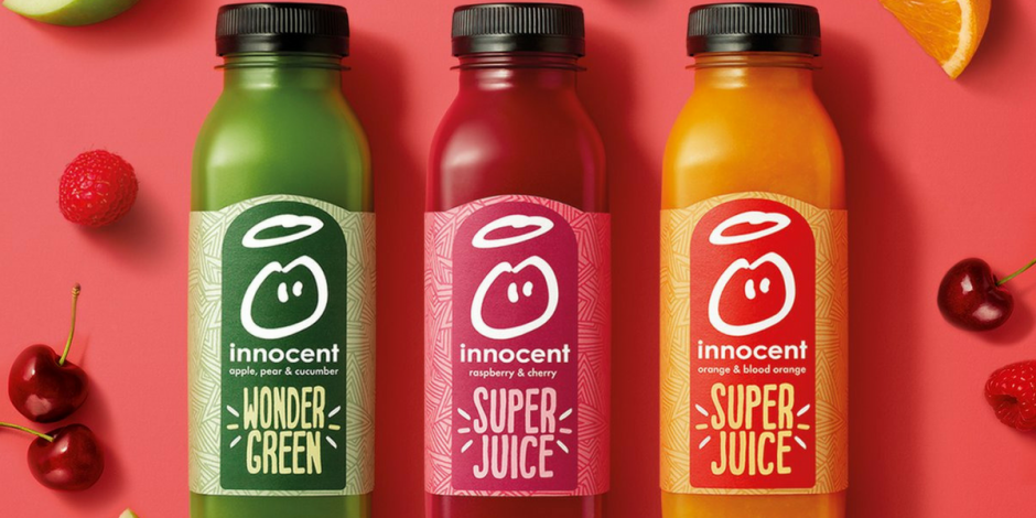
Check out innocent for a great example of unique, fun content that really adds value to the brand through humorous storytelling:

Innocent Drinks

Be platform-specific and committed with social media marketing

Social media platforms are a cheap, easy way to market your new startup, and should be a cornerstone of your branding strategy. They are some of the best places to go to when it comes to grassroots and small-scale brand promotion, and are an ideal launchpad for your own brand community. On social media, all you need is a unique message, some witty repartee, and some nice imagery in order to evoke brand coherence.

Learn about the most effective ways to target your potential customers on each platform. For example, used image-based platforms like Instagram or Pinterest if you have products that would benefit from very visual promotion.

Whereas platforms like Facebook or Twitter allow you to verbally connect with customers, and nurture relationships through discussion and sharing information.

Most people tend to spend the majority of their time on one particular social media platform, so research your audience and find out where they spend time. Do you have a product that would benefit from very visual showcasing that you’re aiming towards women? 80% of Pinterest users are women, so make sure you tap into this. There are plenty of easy-to-find stats out there, so get researching.

Check out  Gary Vee’s video below about the different social media platforms.

However, as we mentioned in our last point, remember to be consistent with your branding.

It’s very easy to farm out your social media posts to your unpaid intern, or to rush over your posts because you need to get onto something more important. But you should really be paying attention to these platforms too!

Everything you post should be on-brand.

Lack of branding, poorly written copy, incorrect spelling and a tone of voice that is completely different to the one on your website… All of these send out mixed messages to potential new customers or put off existing ones. Take the time to be brand-aware on social media — it’s free and useful.

Social listening tools can also help you monitor and jump in on brand conversations as they develop. It’s important to create lots of positive social proof for your brand in the early days. See your social media pages and profiles as an extension of your testimonials page.

If you follow this advice, branding your startup on a small budget will be much easier.

Just remember to come up with a strategy: this means developing your brand positioning, your messaging strategy (i.e how you’re going to reach your target audience), developing your name, logo and tagline, and developing your website.

If you’re still worried about blowing your budget, don’t be. You don’t have to do everything at once—  start with a central spoke and built out from that.

Prioritise: start with your logo, brand and tagline, and go from there. Soon, everything will fall into place.

And just remember: be consistent. It’s FREE!

Kayleigh Alexandra is a content writer for Micro Startups — a site dedicated to giving through growth hacking. Visit the blog for your latest dose of startup, entrepreneur, charity, and content marketing insights from top experts around the globe. Follow us on Twitter @getmicrostarted.

[Freebie] 40+ Halloween Icons, Badges & Banners

Halloween is just around the corner and preparations for the spookiest night have already begun.

This year, the folks over at Vexels created this exclusive freebie to give your designs a wicked touch. With these bats, ghosts and skeletons, your Halloween graphics will surely have a fun and unique look.

This freebie includes +40 icons in two different styles, as well as badges and banners in neon colors.

Everything comes in AI, PDF and isolated transparent PNGs.

» Download Free Halloween Freebie Pack (61mb)

While you’re here, ensure you check out my favourite go-to icon pack, Streamline 3.0.

Halloween Vector Free Download

» Download Free Halloween Freebie Pack (61mb)

Monday 24 September 2018

Get your FREE Hotjar account & see how your visitors are really using your website

With HotJar, you can see how your visitors are really using your website.

It’s a fast & visual way to understand your users.

Hotjar All-in-one Analytics and Feedback is the new and easy way to:

  • Get ‘in-the-moment’ visual feedback
  • See how people are really using your site
  • Uncover insights to make the right changes

» Get your FREE Hotjar account now

Hotjar Header

“Some of the most impactful tests I’ve ever run have come directly from ideas that I wouldn’t have been able to come up with without Hotjar.”

Mike Fiorillo, Growth Product Manager
– InVision

» Get your FREE Hotjar account now

Streamline – The World’s Largest Icon Library (31,000+ Icons)

When you discover a resource as epic as this, you JUST have to share it.

Meet Streamline 3.0, the world’s largest icon library, clocking in at 31,000+ icons.

All of these icons have been individually designed by Vincent Le Moign over the course of a few years, and it is my #1 go-to icon pack.

Why is Streamline 3.0 my go to icon pack?

  • The sheer choice
  • The ease of finding icons (they’re divided into 53 categories & 720 subcategories)
  • There are 3 unique weights: light, regular and solid
  • They’re beautifully designed & the minimal style works with nearly every project
  • Amazing value (see below for a 20% off code)

Streamline Icons Animated

Get Streamline 3.0 Icons

Get 100 icons for FREE or choose which icon packs you want on a tiered basis.

EXCLUSIVE 20% Discount!
Get 20% off any pack for 7 days only. Use coupon code ‘jacob’. Sale ends October 1.

I personally have the Ultimate Pack which includes all 31,000+ icons, and it rocks!

» Get Streamline 3.0

Streamline Weight Overview

Below, you can see a small sample of icons in the three weights.

Streamline Icons All 3 Weights

» Get Streamline 3.0

Sunday 23 September 2018

10 Best FREE Graphic Design Courses Online

Have you ever thought about starting a career in graphic design or has it been a while since you last worked in the field and you want to refresh your skills?

One of the amazing things that the internet can offer is online courses. Whether you want to learn about graphic design, learn a new language, or even learn how to grow watermelons, chances are there is a resource out there for you to learn how.

I know what you’re thinking though. That you don’t have the time. You have a full-time job and a house and kids to take care of and on top of that, you don’t have the extra money laying around to spend on books or materials or to pay for classes, and you definitely do not want to take another student loan to pay for it.

Believe me, I get all of that and let me say that those excuses are just that. Excuses. Yes, we’re all busy and have other responsibilities. However, here is the wonderful news you have been waiting for:

These graphic design classes are 100% free.

Yes, free. I know it’s not a word we use much anymore in our culture but they are. If you are interested in taking a course in graphic design, whether you’re a beginner or have 25 years in the field, free is good.

With that in mind, we wanted to highlight some of the best free graphic design courses that you can find online in 2018, 2019 and beyond. That way, you can table the excuses and start learning and either add a new skill or sharpen an old one.

Let’s get started!

How to teach yourself graphic design

Becoming a graphic designer does not have to be done at school, in fact, if you follow the below steps, you will be well on your way to becoming a professional designer.

  1. Understand the core principles of graphic design (see courses below)
  2. Ground yourself with the the history of graphic design (this book is essential)
  3. Familiarize yourself with the graphic design process & solving problems creatively
  4. Consider advanced study & development (either online or at school)
  5. Learn from professional graphic designers
  6. Develop your proficiency, intuition, and flow
  7. Put together a portfolio and blog
  8. Participate in professional graphic design communities
  9. Diversify your skillset (enroll in another course)
  10. Find work as a freelance graphic designer

Best Free Graphic Design Classes Overview

Below we’ve shared 5 reputable online course providers, and their recommended courses to start teaching yourself graphic design.

Free Skillshare Design Courses

Skillshare offers prospective students lots of short & in-depth courses centered around graphic design. Many of these are available for free, or with a paid subscription, you can access them all. To help those who may be just beginning, we wanted to highlight a few free courses that would be a great benefit.

Graphic Design Basics: Core Principles for Visual Design

Free Graphic Design Basics Course

Whether you’re new to graphic design or an old pro, everyone has to start somewhere. Generally, that means starting with the basics which is the focus of the Graphic Design Basics: Core Principles for Visual Design course that within its 35-minute class will walk you through 5 basic principles of graphic design.

Another class taught by Ellen Lupton, along with Jennifer Cole Phillips will show you how those basic principles can be perfect to use in all projects that range from creative design, marketing, to even photography. Through the course, you’ll learn:

  • How to identify and define the 5 basic principles of design
  • How to critique your own work looking for balance and effectiveness
  • Learn how you can apply each concept to your future projects

Creating Brand Systems: An Overview of Combining Logos and Type

Free Branding Design Course

Taught by Mike Ski and Jesse Jay, designers from True Hand, the Creating Brand Systems course asks students to think about how a great logo or brand system comes to be. Through the six video course, Ski and Jay go over and describe the collaborative process that they used in order to create the logo for Kensington Quarters, an eatery in Philadelphia.

A shorter class than most, the Creating Brand Systems course is designed with designers, illustrators, enthusiasts, and creative in mind. Those who are looking for a high-quality walkthrough of what it takes to create a dynamic logo that can be used across many different channels and applications will want to check this course out.

Typography That Works: Typographic Composition and Fonts

Free Typography Course

When you’re starting out as a graphic designer, you may spend a lot of time perfecting the logo that portrays your brand to prospective clients, but what about the typography on your website or business card? What is that telling your clients about not only your business but about you as well?

Also taught by Ellen Lupton, curator of contemporary design at Cooper Hewitt Smithsonian Design Museum, will help to teach you the difference between good typography, which can be very beneficial for you or your client and bad typography, which can have adverse effects. In this course you’ll learn:

  • Sans + Structure – Learn what gives the sans serif typeface its special character
  • Serif + Details – Exploit the details of the full-bodied serif type family
  • Slab + Customization – Learn what to do with slab faces, described as heavy furniture by the syllabus

Free Udemy Graphic Design Courses

Founded in 2009, Udemy is an online learning platform that was created to help people learn new skills. Many of the courses on Udemy can be perfect for someone looking for to learn graphic design. We decided to highlight a few of these that we think you may find useful, plus our list of the Top 10 Udemy courses to take in 2018.

1. Introduction to Graphic Design

Udemy Free Graphic Design Course - Introduction to Graphic Design

Created by Sean Berg, the Introduction to Graphic Design course hasn’t been updated since 2014. But the overall syllabus of the course content is as relevant now as it was when the course was first created. You don’t need any special software or hardware to take the course, the only thing required as stated by the overview is “an open mind and thirst for knowledge”.

Designed to be more of a lecture series than practical application course, the Introduction to Graphic Design helps provide beginners with information about the graphic design field as a whole, what is and isn’t considered a design and the process that goes into designs. If you’ve ever had an interest in graphic design, but aren’t sure if you’re ready to take a practical class, this is a good first step.

2. Learn Adobe Photoshop from Scratch

Udemy Free Graphic Design Course - Learn Adobe Photoshop from Scratch

Created by Eduonix Learning Solutions, this free program provides students with eight hours of on-demand video and doesn’t have any specific requirements to take the class other than already having Photoshop installed on your computer. A comprehensive course that introduces beginners and experienced users alike to professional Photoshop principles.

The course is structured to provide you with a hands-on training of the software while sharing tips and tricks that pros use. Learning the outcomes is the focus of the course, it does this by using task-based lectures as well as discussions about the tools that can be used in Photoshop. Techniques and effects are taught through detailed process lectures. The Learn Adobe Photoshop from Scratch is a great class for anyone looking to get the most out of Adobe Photoshop.

3. Professional Logo Design in Adobe Illustrator

Udemy - Free Graphic Design Course Logo Design in Adobe Illustrator

In Professional Logo Design in Adobe Illustrator, created by Rawson Uddin, students are given access to over seven hours of on-demand video courses, as well as full lifetime access and receive a certificate of completion at the end of the course. The only recommended requirement is to have a basic knowledge of Adobe Illustrator as the course is an advanced lesson.

Throughout the course, you will learn about a plethora of topics that can help you design your own logo or maybe even start a logo design business on the side. These topics include:

  • How to choose the right typeface
  • Using simple shapes in a design
  • Designing with negative space
  • Choosing colors for the logo
  • Adding other effects to your logo design

Along with the course, you can download a working file to practice with as you go through the course. All in all, the Professional Logo Design in Adobe Illustrator provides a robust class for those looking to start designing logos.

Alison Free Online Courses

Free Graphic Design Course - Alison

Any list we create would be incomplete without Alison Online on it. Taking the Visual and Graphic Design course on the site will earn you a test-based certificate upon completion, which can be great for anyone already studying graphic design.

Now for some who may have been working in graphic design for some time may not see the value in the completion certificate. However, if you are a graphic designer just starting out, having a certificate in a subject can help establish credibility when trying to secure a new job or freelance project.

Founded by Mike Feerick, while Alison online offers completely free classes, they are uncredited. This means that no matter if you receive a certificate of completion or diploma, your current or prospective employers may not recognize it. Self-described as a “new world of free certified learning” Alison Online offers not only classes in graphic design but in so many different subjects, that it’s worth checking out regardless.

Coursera Free Design Courses

While not every course on their site is free, Coursera offers online courses from some of the top universities such as Stanford and Yale. While at first glance, the site pushes you towards paying for the classes they offer, there is the option to “audit” the class.

This means that while you can take the class, none of your work will be marked and you won’t be able to earn a certificate at the end of the course. To take the classes for free, follow this guide here and get started right away. Here are some free courses you may want to consider:

1. Graphic Design by David Underwood

Free Graphic Design Course

Taught by David Underwood, the Graphic Design course is structured to provide you wither the tools in order to generate professional looking reports, resume, presentations, and Powerpoints using techniques and practices that have been refined through years of practical use.

Through this course, you’ll learn how to make your work look inspired and fresh, how applying simple design “tricks” can give your project an air of professionalism and confidence. Finally, learn how to respond to criticism and use it to make your project go from good to great.

2. Fundamentals of Graphic Design

Free Graphic Design Course - Fundamentals

Led by Michael Worthington, a member of the faculty at the California Institute of Arts, the course will teach you how to implement visual, rhythm, and pattern in design, techniques of image making and how to create your own series of images as well as how to use scale, direction, texture, weight, and space in your project.

The Fundamentals of Graphic Design course does this by breaking down the topics into four one-week segments that cover a different topic each week:

Week 1 – Fundamentals of Imagemaking – In the first class, the lesson shows how an image functions in terms of conveying connotative and denotative messages.

Week 2 – Fundamentals of Typography – This week’s class looks at typographical terminology as well as the basic rules for typography creation.

Week 3 – Fundamentals of Shape and Color – Graphic designers use shapes and colors as the fundamental building blocks of their work. In this week’s class, you will take a closer look at how they do this.

Week 4 – Fundamentals of Composition – How graphic designers use visual contrasts, cropping, direction and hierarchy with complex compositions and single images is the focus of this week’s lesson.

3. Introduction to Typography

Free Graphic Design Course - Introduction to Typography

Anther Kiley, an LA-based graphic designer teaches the course to anyone who already has a basic working knowledge of and access to Adobe InDesign how to get the most out of the program’s features and tools.

The Introduction to Typography course goes in depth into the different areas of typography and is broken down into 4 simple-to-take weekly lesson plans:

Week 1 – Talking type – In this weeks lesson, the course looks at types of typefaces, as physical artifacts as well as works of design.

Week 2 – Typefaces and their Stories – Exploring the way a typeface can express connotative meaning, otherwise known as how they can tell stories is the focus of the lesson this week.

Week 3 – Putting Type to Work – Learning to engage visual principles, as well as the conventions of typesetting is the focus of this week’s class. A look at how the spaces between letters, lines, and blocks of type can be manipulated to refine their appearance is included as well.

Week 4 – Making Meaningful Type – In the course’s final week, the class will look at the ways that typographic form can shape the meaning of written language dramatically.

— 

Canva Design School – Basics of Graphic Design

Canva Design School Free Course

Originally started by Melanie Perkins and Cliff Obrecht to help students who were struggling with the basics of Graphic Design. In the six years since they started, Canva has grown to include a design school as a way for those who may not have that much experience with graphic design to learn the basics and some helpful hints.

The Design School area of their website provides students with several resources that can be beneficial to beginners, those with a little bit of experience, or anyone working in graphic design for quite some time. A great starter course for anyone looking to learn the basics of design should check out their Introduction to Graphic Design class.

The Design School from Canva is broken down into four modules:

  1. Module 1 – Introduction to Canva – Students take a tour of Canva and learn more about the site.
  2. Module 2 – Fonts, Colors, and Images – Students learn about type terminology, how to create a font palette as well as typographic techniques. You will also learn how to use grids, photo filters, and transparency
  3. Module 3 – Backgrounds, Layouts, and Shapes – In this module, learn how to create beautiful backgrounds; using images as backgrounds, the use of white space; using transparency, as well as presentation design and also how to design infographics or add visual interest using shapes.
  4. Module 4 – Wrap Up – Put all the information you’ve learned together.

More Online Free & Paid Graphic Design Courses Online 

While we doing our research, we came across so many different sites out there that can help you learn more about graphic design that we didn’t have the room to list them all. So, in order to give you the best information to start your journey, we wanted to list them here so you can check them out yourself

How to choose the best Graphic Design Course for you

Choosing to take an online course to learn a new skill, try a new path or even just as a refresher for the skills you already have is a very honorable thing to do. Like you, we understand that time, money and many other factors can keep you from picking one course to take over another.

We hope that the courses we showcased here can give you some idea of some of the best free graphic design courses available online today.

Monday 10 September 2018

The Best Mouse for Graphic Designers in 2018/19 & How To Choose What’s Right For You

When you start your career as a graphic designer, you tend to concentrate on making a big first impression to any potential clients and delivering more than you promise. However, if the tech you’re using to create those works of art is out of date, it will affect the quality of your work. You’ll know it and your client might know it too.

While it’s always a good idea to upgrade the monitor that comes with the computer you just bought, don’t forget about the little guy most people just ignore. The mouse.

Related posts:

Much like the headphones that come with your new smartphone, they work just fine, but you know there is a better option out there. The mouse is more often than not, the one thing you use more than anything else related to your computer. So why would you use the generic piece of wire and plastic that comes with your computer when there are so many options out there?

Maybe you don’t know where to start or you’re worried you might pick the wrong one. It’s fine, we understand, you’re busy, which is a good thing. That’s why we’re here to show you what are the 5 Best Mice for Graphic Designers on the market today.

You should know what to look for when choosing the best mouse for your job. Let’s start there, shall we?

How to Choose the Right Mouse for Graphic Design

Before you decide to hand over your money for a new mouse for your needs as a graphic designer, there are a few details about the mouse you need to consider:

  • Wired or Wireless
  • Laser or Optical
  • Ergonomics
  • Full-size or Travel-size
  • Programmable Buttons

Wired or Wireless

Whether you choose a mouse that is connected to your computer with a wire or through the computer’s USB port generally comes down to personal preference. After years of struggling and hating all the cords on their desk, some people opt to use a wireless mouse, which avoids the problem of tangled cords but you do run out at the wrong time. While there are some wireless mice out there that come with docks to charge it so you’re not hoarding AAA batteries, you’ll still need to remember to dock the mouse so it can charge. Some mice come with an on/off switch that will help extend the life of the battery you’re using, but again, that’s only useful if you remember to switch it off at the end of the day.

Wireless mice come with a receiver that lets your computer and the mouse “talk” to each other. Some mice come with what’s known as a nano receiver that can sit flush with your computer’s USB port. Some come with a larger wireless receiver that sticks out from the USB port a couple of inches. Those with nano receivers tend to be more expensive than their counterpart, but might be worth checking out, especially if you travel a lot for work. While a wired mouse doesn’t have to worry about batteries or charging because they are plugged into your USB or PS2 port, the downside is that you a tied to your computer. You have a limited length of cord to work with which can be troublesome as well as having to deal with tangled cords that may damage the wire.

Laser or Optical

When you use your mouse, it operates by tracking in dpi, otherwise known as dots per inch. Optical mice typically track between 400 and 800 dpi which is perfectly fine for your regular everyday-use mouse. However, a laser mouse will generally be about to track 2,000 or more dpi. While this number is pretty high and not really necessary for consumers using a mouse for basic functions, such precise tracking can be overkill, even becoming annoying. For those who work in graphic design or those who may be pretty big into gaming, the preciseness and sensitivity that comes with such a high dpi can be a welcome feature.

Ergonomics

As using computers and mice have become the norm in our society, so have the issues with hand and wrist pain that come from the odd angles we keep our hands in while we work. This is why the ergonomics of the mouse you choose is the most important thing to consider before you buy not only a mouse but any peripheral. For mice, in particular, correct ergonomics is important because it can help prevent repetitive stress injuries like carpal tunnel syndrome. Unfortunately, the ergonomics of a mouse isn’t something that is one-size-fits-all, no matter what the manufacturer’s marketing department might tell you.

The only way to really know if you’re going to feel comfortable using a mouse for hours on end, is the same way you know if your shoes fit at the store, is to try them on. Now with computer peripherals, a lot of times products will be boxed up so you cannot “try before you buy” or anything like that so your best option is making sure that you do your research first, like reading this article. Good Job!

When you buy the mouse, be sure that you can return it and how long you have, so you aren’t stuck with a mouse you can’t use. When you get home try it for that amount of time to see if it’s comfortable and doesn’t cause any pain in your arm or wrist. Many people will choose a mouse based on its look which is fine. For graphic designers, however, you will want to focus more on comfort than aesthetics in this case.

Full-size or Travel-size

Most manufacturers make mice in both full-size and travel-size options. Which size you choose can come down to one singular piece of criteria: comfort. Many people who may never take their mouse off their desk will feel more comfortable using a travel-sized mouse because of the comfort that it provides for them, especially if they happen to have smaller hands. Likewise, many people who primarily travel for work will choose a full-size mouse because of the comfort it provides their hand, while a travel mouse may cause them discomfort.

Programmable Buttons

Your standard mouse comes with two buttons and a scroll wheel in the middle. However, there are many mice on the market, tailored for those who may work in specialized fields like graphic design, come with additional buttons on the side of the mouse. These buttons are there so that you can program them, otherwise known as “mapping” them for certain functions. One such example is to set one of the buttons to be a back button when you’re on the internet. These additional buttons can be very handy, especially if you use the same programs over and over. Mapping these buttons to a specific function isn’t very difficult and you should be able to learn how either with the mouse’s manual or on the manufacturer’s website.

The Top 5 Best Mice for Graphic Designers in 2018

Like each person’s hands, when it comes to choosing the best mouse for their needs, everyone has different requirements. However, these are what we consider to be the top mice for graphic designers in 2018 and most likely, 2019.

  1. Logitech MX Master 2s
  2. Apple Magic Mouse 2
  3. Anker Vertical Ergonomic Optical Mouse
  4. Logitech MX Ergo Wireless
  5. Microsoft Bluetooth Mobile Mouse 3600

1. Logitech MX Master 2s

Best mouse for graphic designer - Logitech MX Master 2s

Computer peripherals and Logitech are pretty much synonymous in today’s market. They tend to produce some of the best products in terms of quality and responsiveness. This can be a great thing when you need a mouse that can handle the precision required of the type of work you do. A cordless mouse, the MX Master 2s is designed to fit comfortably in your hand without causing strain over long periods of use.

With a 4,000 dpi Darkfield sensor, the 2s works on all surfaces, including clear glass. When you come back to your desk to work, the mouse wakes up instantly, providing you with an indicator of the battery’s charge with the three green LEDs on the left side of the mouse. The battery life of the mouse can last up to 70 days from a full charge though in a pinch, you can use the micro-USB on the front of the mouse to charge it while you’re working.

There are buttons located on the side of the mouse that let you change between windows without using your keyboard and is also easily programmable. A scroll wheel on the side of the mouse lets you scroll through web pages or documents quickly and easy, depending on how fast you flick the wheel.

Although it comes with a hefty price tag, the Logitech MX Master 2s is a high-end mouse that has the features and the ergonomic design that makes it a perfect option for a graphic designer.

Learn More

($99)

2. Apple Magic Mouse 2

Best mouse for graphic designer - Apple Magic Mouse 2

People who prefer working with Apple products know that they are buying high-quality and have a very aesthetically pleasing design. With its super-light design, the Magic Mouse 2 from Apple comes with the capability of laser-tracking which can make it easy to switch between pages as well as make changes to your project on just about any surface.

The Magic Mouse is designed to make multi-touch commands easily executed including swiping left and right between pages you are working on and you can bring up Mission Control by double-tapping the mouse with two fingers. While regular scrolling, as well as right-click can be performed on the touch-sensitive surface of the mouse, these can be turned on or off if you’d like.

A big change that comes with the Magic Mouse 2 is how the mouse charges. Gone is the battery-access door, replaced with a Lightning port. While it only takes a couple of minutes to charge the battery long enough to get through a day at work, while keeping the mouse plugged in all night can last a whole month. The only downside about plugged the mouse in to charge it is that the port is on the bottom, meaning you can’t use it while it’s charging.

While many will choose the Magic Mouse 2 because of the brand name, the physical design can take some getting used to. The slim design isn’t very ergonomically friendly putting your hand in an odd position that doesn’t occur with other mice. Overall, while the Magic Mouse 2 from Apple is an impressive mouse and one of the best on the market, it’s not a peripheral that makes it worth buying a computer for.

Learn More

($79)

3. Anker Vertical Ergonomic Optical Mouse

Best mouse for graphic designer - Anker Vertical Ergonomic Optical Mouse

The first thing that stands out when you look at the Anker Vertical Ergonomic Optical Mouse is the design. Obviously, it looks awkward, but the vertical design is engineered to promote healthy, neutral positioning of your wrist and arm, avoiding repetitive stress injuries otherwise known as RSI.

If you are someone who spends a great deal of time doing graphics designs by primarily using a mouse, having an ergonomic and comfortable mouse or tablet is very important in avoiding RSI. Think of it this way, if you hurt your arm or wrist that means you can’t work. If you can’t work, you can’t get paid so taking the proper precautions to protect yourself helps your bottom line.

While it does have an odd design, the Anker Vertical Ergonomic Optical Mouse provides three different levels of sensitivity 800, 1200, and 1600 dpi to improve the tracking the mouse is capable of. A total of five buttons give you accessibility to scroll, left and right click as well as next and previous buttons which can be helping when going from website to website doing research. Overall, the Anker Vertical Ergonomic Optical Mouse may have a weird design, but for an affordable price, you can protect yourself from possible injury.

Learn More

($19)

4. Logitech MX Ergo Wireless

Best mouse for graphic designer - Logitech MX Ergo Wireless

At first glance, you might think you’re looking at a mouse that we’ve kept in storage since the 1990s but you’re wrong. The Logitech MX Ergo Wireless may look like a retro-style mouse but that’s only because of the trackball. Very few mice-makers make peripherals with trackballs, choosing to create mice with an optical laser instead.

Logitech continues to support the trackball and many graphic designers are happy that they do. For some, using a trackball while working on creative projects can make the work feel more comfortable, intuitive and precise. To provide you with a more natural hand position, an adjustable hinge lets you change the angle of the trackball from zero to twenty degrees.

The Logitech MX Ergo Wireless has fully customizable buttons and with the Logitech Flow system, you can control two different screens with the same mouse. A full charge of the battery lasts for four months while charging for just one minute can give you a full day’s charge. If you’re used to using a trackball to work on projects, with all the features and option that the MX Ergo has to offer, it makes absolute sense to chose this mouse

Learn More

($79)

5. Microsoft Bluetooth Mobile Mouse 3600

Best mouse for graphic designer - Apple Magic Mouse 2

For many years, Microsoft was primarily known as a software company, putting out programs like Office and Windows. But more and more, the tech giant has gotten into the hardware side of things. With products like the Surface and even the Bluetooth Mobile Mouse 3600, people have started seeing Microsoft as much more than a software company.

A very reliable mouse, it doesn’t kid around by trying to be something that it isn’t. While its small enough for people with smaller hands to use comfortably on a daily basis or if you happen to work primarily on the road and don’t want to carry a full-sized mouse with you. While it may not be the most expensive mouse on the market, the quality of how it is built should keep your attention.

Now, at this point, we figure that you’re asking why this little mouse would make our top 5 list and that’s because even though it is small in stature, its ambidextrous design makes it great in either hand and usable on just about any surface.

But most importantly, to us, it is the perfect back up mouse. Just about all of the mice on our list either have batteries or need to be charged, but like most of us, we tend to forget things and in a pinch, if you mouse’s batteries die or it loses it charge, the Microsoft Bluetooth Mobile Mouse 3600 is a very suitable option.

Learn More

($29)

Choosing the best mouse for your designing needs

When it comes time to buy the best mouse for your needs as a graphic designer, there can be a lot more choices out there than you might have thought. At first glance though, it may be easy to label each mouse out there as basically the same. Because of this, before you buy anything, you need to make sure you do your research so that you are getting one that gives you the features, the design, and extras you are looking for.

Related posts:

Wednesday 5 September 2018

Single Page Web Design: Trends, Tips & UX Advice

This article was contributed by Meaghan Yorke.

So you’ve decided to go for a single page web design. While this approach has its limitations, it can be very useful for certain purposes. Usually, these websites are used as a sort of a presentation for a company, a product or an independent artist or entrepreneur. So it’s not uncommon to see product sites, specified business offerings, portfolio pages or even some business websites laid out as a single page. Before turning to tips on how to improve your single page design, let’s briefly check out some of its advantages and drawbacks.

Pros and cons of single page design

Pros

One of the most obvious benefits of single page web design springs to mind immediately: it’s simple to design, update and maintain. Moreover, making a mobile version of the website is quite easy, as it can remain basically the same yet perfectly apt for mobile devices.

Depending on the purpose of the website, it can be very simple and convenient to use as well. If there’s a sort of uniformity of purpose or message behind the site, then this might be the best way to go. When presenting a single idea or a product, a single page design offers a chance to organize the info in a way that can be very handy for users or even for yourself. Namely, you can arrange the information in such a way that the visitors discover them in the exact order you wish them to.

Furthermore, if you just want to make a brief presentation of your company or your project to the audience, single page design is a great choice. Check how Pixel Lab did it in a simple, charming way, answering the most common questions and displaying their most important work.

FAQ

A more concrete business benefit is that, if used properly, it can increase conversions. The entire conversion funnel is placed on the same page, making the conversion process quick and simple.

Cons

As much as it’s suitable for single-product presentation, single page design doesn’t go that well if you want to display multiple products or services. Having all these on the same page can end up looking messy and confusing. On the same token, scalability is an issue as well. If you’d like to significantly expand your business or your offers, it may be impossible to do it in a reasonable way without adding more pages, in which case… well, in which case it obviously stops being a single page website.

Sometimes people try to cram too much information into one page and end up being forced to leave a bunch of external links on the website. This is not the best way to go since it complicates the idea and violates the whole concept. Especially if people don’t know they’re going to end up at another website. This is exactly what Clean Air Commute Challenge did and it’s definitely not the best of strategies. Simplicity should be one of the main characteristics of single page sites and you should have that in mind at all times.

Clean Air Challenge

Furthermore, the fact that you have all the content under the same URL can create more issues. Namely, it’s not just harder for visitors to share a specific part of the content they like, but it’s also harder to analyze which exact content performs best.

Finally, there are SEO troubles. If you decide to upload too much content your website will take ages to load and this can ruin your rankings. It’s also harder to optimize the website for a large number of keywords, as there’s a limitation on this number.

All in all, going for this type of design is an excellent idea, but only if there’s a firm logical connection unifying products or ideas presented. Here are a few tips on how to make it more appealing and user-friendly.

Useful tips

Divide the page into sections

Naturally, finding your way around a single page website can be very difficult if there’s just one big homogenous pile of content. Thus breaking up the page into clearly distinguished segments is an absolute must. Otherwise, the visitors could feel overwhelmed as soon as they start roaming around your website.

There are all kinds of techniques you can use in order to make these divisions. Using different styles, background colours, fonts or separating them with headings or blank space are all reasonable ideas. Nevertheless, a blank space is not enough sometimes, especially without proper navigation. Your website can look confusing and there’s no way to quickly and effortlessly distinguish between different sections. Take Varsity’s website, for example.

Varsity

On the other hand, being creative and playing with these division-creating options can result in some top-notch web design. Check how Porsche did it.

Porsche

The order of sections should be logical and continuous, and so should be the content itself. If it’s a business page, you could even include all the sections that traditional multi-page business websites have (content, bio, products and so on), but integrated into a single, well-divided and neatly organized page.

Easy navigation

Obviously, making a clear separation between different segments is important for solving navigation issues as well. Again, wandering around a single page website can be a nightmare, especially ones with a large amount of content.

In any event, when it comes to navigation, you have to have an alternative to mere scrolling, otherwise, you’ll definitely have a hard time keeping people on your website. Most people simply won’t have the patience. That’s why you’ll need a sticky navigation bar on the top or at the side. It’s crucial that your visitors know which section they’re reading at any point, as well as where it’s positioned compared to other sections.

A great example of how to do it right is Muffin Group’s solution to this problem – a clear, legible and interactive navigation bar on the left side is all you need to avoid getting lost.

Muffin Group

It’s very important that the bar is clear, unobtrusive and always on screen as it could seriously disrupt UX otherwise, just like in the case of this artist’s personal website.

Josh Sender

For those who choose to scroll anyway, you can include some scroll-on animations in order to make the experience more dynamic and amusing. Just make sure they don’t affect the performance of your website, in which case it may be more sensible to avoid them.

Importance of hierarchy

Determining the hierarchy on your website is important not only for UX, but it also serves another purpose. Namely, this way you can direct the users to focus primarily on the elements you find the most significant. The fact that you (hopefully) have a very limited amount of content on the site doesn’t mean it’s all equally important. Bitrise did a great job here with neatly organized content that’s very informative, easy to scan, and has the perfect flow.

Bitrise

Of course, visual hierarchy is necessary for any website, but what’s specific about single-page ones is that you can’t make a hierarchy between different pages, but only between different sections. Finally, highlighting the most important info in every single section is essential in order to catch the eye of all those who tend to quickly scan through the page and move on.

It seems like Make Your Money Matter didn’t do so well in this respect.

Make your money matter

This website features some great story-telling, but it’s impossible to pick a few slides that would make the visitor familiar with the basics of this story. Lack of hierarchy makes the users read through the whole thing if they want to understand what it’s about, and most of them aren’t going to be patient enough for that.

Keep it light

The fact that your entire website comes down to just a single page might lead you to think that it’s smart to compensate for it by experimenting with complex and flamboyant design elements. This is probably not the smartest option as these elements can easily make the website heavy and slow. And slowing down a single page, in this case, means slowing down your entire website. With a three-second rule of page loading in effect, this may cause a lot of people to leave immediately.

Surely, this doesn’t mean you shouldn’t learn from the latest web designs and employ some of the newest trends. Just try choosing those that won’t make your site unbearably inefficient. For instance, using a clean and simple design can look very professional and appealing, yet the lack of unnecessary elements will make the website light enough, just like in the case of Trippeo.

Trippeo

On the other hand, even the most prominent brands like KitKat will sometimes go for the heavy solution. Although the website itself is well-designed, an additional few seconds that you have to wait for it to load is definitely a significant drawback.

Kit Kat

Pay attention to CTA buttons

Most probably, the point of setting up your website is to induce some sort of user action. Even non-profit organizations have a goal to make people join, subscribe or simply support their cause. And both them and companies who actually sell something have a good opportunity to convert, as the entire conversion process takes place at a single page.

Optimizing CTA buttons is thus of vital importance. They should be visible and it’s perfectly fine to place them above the fold. There are examples of CTAs or contact info that are way below the fold and thus too far away from the visitor’s eyes – take Agigen’s website, for instance. There are no call-to-action buttons and in order to find out how to get in touch with them, you have to scroll all the way to the bottom of the page.

CTA Buttons

You need to make it easy for your potential clients and customers to reach you, buy from you or sign up. In this respect, Midnight Sketch did a great job. CTA is above the fold and clearly visible due to the contrast with the rest of the page.

Midnight Sketch

However, you shouldn’t make the CTAs too obtrusive and you need to make sure they’re not in your users’ way to check other content on your website. How exactly CTA buttons will look like depends on your overall design, but in any event, conducting A/B tests to see what works best for you may be helpful.

Takeaways

All in all, you should be very careful with single page design. It can be a great way to develop your website if it’s supposed to serve a simple, single, and uniform purpose. Otherwise, it can be very inconvenient and cause a lot of troubles, in terms of content, looks and functionality. Therefore, think twice before going for single page web design and make sure you follow the described tips and tricks in order to make the most of it.