Monday 31 August 2020

The Dos and Don’ts of Logo Design

This article has been contributed by Umer Bilal.

When first starting up your business, you absolutely have to nail the branding. You need to create a strong identity for yourself from the very beginning in order to make a lasting impression on the customers you want to attract.

A business’s brand identity needs to be consistent across all media – from print to web, and all platforms – from its website to social media ads. For brands that operate mainly online, a website design agency can help you with your brand identity or you could hire a graphic designer.

A key part of a business’s brand identity is its logo – but do you know the basic dos and don’ts of creating a logo?

What is a Logo?

In simple terms, logos are symbols that are made up of images or text that help customers identify brands. A great logo will be the cornerstone of your brand and will help customers (and potential customers) understand what you and your business do, who you are and what you stand for.

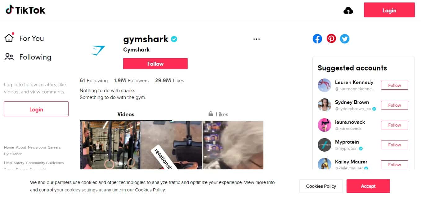
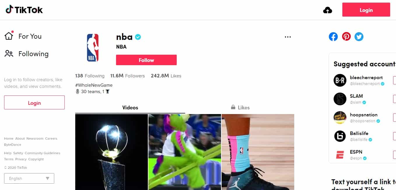
The most important function of your brand logo is to give your company or organization a unique mark that will set you apart from other businesses (AKA your competitors). A good logo will also provide your customer base with important information about your company – it can communicate what product or service you are providing, what industry you exist in, your brand values and sometimes even your brand values.

Logos are an important aspect of branding, especially when you first start your business. Creating a logo is so much more than just throwing shapes, colors and fonts together to look nice. You need a logo that represents your brand’s true identity.

Porsche's logo reflects the brand's identity

We’ve put together helpful dos and don’ts that will make sure you stand out from the competition and make a name for yourself in your industry.

When Designing a Logo, Do:

1. Research and Define Your Audience

One of the purposes of your logo and your brand is to attract your main target audience. Your logo needs to look appealing to them. While you may think specific fonts or colors look good, your customers or potential customers may not feel the same way. If your logo doesn’t catch the attention of your customers or clients, you’ve gone in the wrong direction.

Define your audience as your first step in the logo-making process. Research their interests and online habits so that you can create the perfect logo that is guaranteed to catch their eye.

A good way to do so is by investigating your competitors’ follower base. Study each user’s social media profile to learn what type of content they engage with the most. Go in-depth to find who they follow and what type of feeds those profiles have. If your targeted users are following a majority of clean, minimal feeds, that may be the direction you should go.

2. Make Sure It’s Legible

Logos are supposed to be easy to read. If you’ve created a logo but people can’t read it, it’s time to rethink your chosen font. Your customers may look at your logo and see a different name to what you intended, and this will cause confusion. Keep your typography simple and easy to read, staying away from complicated or overly intricate fonts.

Paying close attention to your fonts will play a strong role in ensuring your logo is legible to all. No matter what type of font you choose, whether it’s strong and bold or whimsical, the font is what will create that first impression on your audience.

When logos are hard to read, customers are often deterred from interacting with the brand. You can be creative, but make sure that the masses are able to read your logo. After all, you wouldn’t want to buy products from a brand whose name you don’t even know!

3. Plan For Different Sizes

While you may only need your logo to appear on business cards, social media pages, or your website, this would only be in the initial stages of setting up your business. You need your logo to be future proof so that if you need to increase the sizing of your logo, say for billboards or posters, the quality of the logo isn’t affected. Your logo needs to look perfect even when scaled!

Test out your logos in different sizes to make sure that quality is not lost when the time comes to enlarge (or shrink) your logo.

4. Design Multiple Variations

When working on your logo designs, create different color variations and orientations. Your logo needs to be able to be placed on anything without any struggle so you should be creating vertical, horizontal and square versions of your logo as well. Having various color options is a necessity as well, to ensure your logo can be placed on different backgrounds. This will also prevent any printing limitations in the future.

Logo in branding guidelines

This step is often overlooked in the logo-making process. People are quick to overlook the necessity for different sizes because of the assumption that everything is digital. While digital marketing is trending upward, you must not overlook the fact that traditional marketing is still in play. Large billboards and posters are still very eye-catching, even in 2020.

Using print media also allows you to reach a newer audience – this could be those older age groups who don’t spend too much time online or on social media. If you do decide to advertise using posters or billboards, plan in advance! Make sure your logo looks great no matter what format you choose to advertise your products with.

5. Be Mindful of Taglines

When creating your brand identity, a tagline is an important aspect of showcasing your personality. If you intend on including this tagline in your logo, ensure that the tagline is shorter than the business name to avoid a crowded or busy-looking logo. When choosing fonts, use a thinner font for your tagline so that attention goes to your brand name first.

Taglines are a great way to express your creativity and showcase your brand’s true identity. You want your tagline to create a story without being too complex and tedious to read. Your brand tagline should be catchy and easy to remember.

Brands such as Nike, McDonald’s and L’Oreal are great examples when looking at successful taglines or slogans. Today, they’re easily recognizable just by those famous short words.

6. Pay Attention to Color Theory

Similar to the way that fonts create an impression, colors tend to evoke different emotions and feelings when viewed. Study the psychology of color to learn what emotion is evoked from each color.

For instance, fast-food restaurants tend to use yellow and red tones as those are known to evoke hunger. Blue brings out a feeling of peace, calmness and a sense of trust – many social media platforms have blue in their branding or logos for this reason.

What emotion do you want your customers to feel when they look at your logo? Once you establish this, you can choose the right colors for your target audience.

While yellow is known to evoke hunger, it also evokes happiness and optimism. Green can evoke a sense of nature and personal growth; pink evokes compassion and love, while purple is typically associated with royalty and spirituality.

Snapchat's yellow logo evokes optimism

Color theory in branding is just as important as choosing your fonts. You need to be sure of what emotions you want your customers to feel and use the appropriate colors to do.

So, we’ve established 6 steps to ensure you do take when designing a logo – but what about things to avoid doing at all costs? Here they are….

When Designing a Logo, Don’t:

1. Make it Too Detailed

As we mentioned before, logos aren’t meant to be complicated or intricate. Simplicity is key!

Avoid using too many colors or making it look like an expensive work of art. Having too many words in your logo or combining multiple fonts will be too distracting and will result in people focusing on the wrong aspects of your logo. Adding too many elements will also affect the scalability of your logo.

Details are often great when it comes to marketing in general – but you need to know when to hold back. Logos aren’t supposed to be intricate designs. They don’t require hours of detailed sketching. Save the details for your website design instead! Focus on simplicity for your logo.

2. Copy Other Brands

Copying other brands or companies is clear plagiarism and will get you a lot of negative publicity. The purpose of branding is to set yourself apart from the competition. If you want to stand out in the crowd, you won’t be able to do so by copying other brands.

While it may be an obvious statement, it is important to remind newer companies to stray away from copying existing successful brands. Taking inspiration and imitating are completely different things. It’s also a bad way to start getting your name out into the industry.

If your first step into the market is met with backlash and negative publicity, it sure won’t do you any favors. It also has the potential to get you into a lot of legal trouble.

3. Switch Things Up

Logos do not need to be updated regularly like your marketing strategy needs to be! Consistency is so important when it comes to logos. If you’re constantly changing or revamping your logo, it can actually deter customers and could cause some to not even recognize your logo if you happen to make drastic changes.

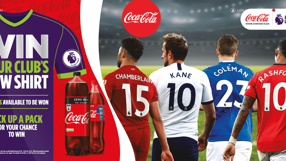
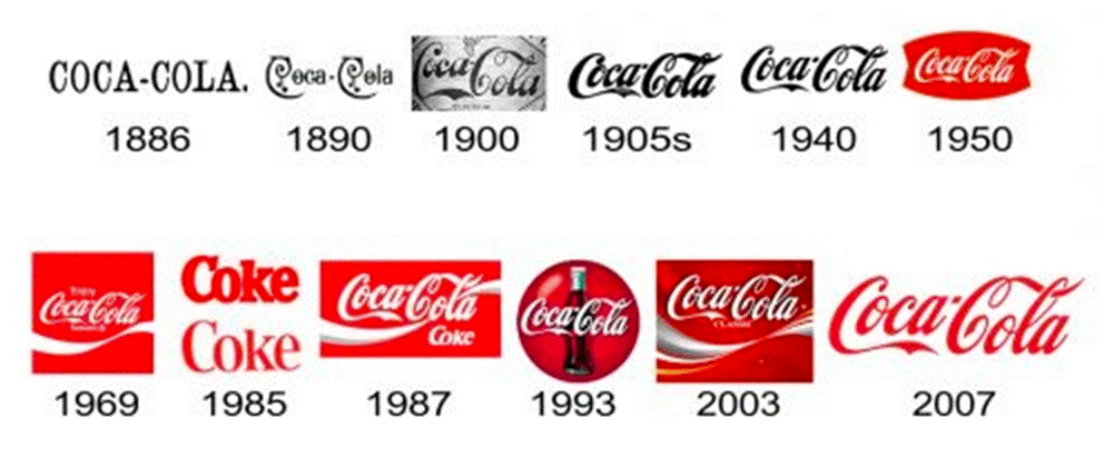
Look at the McDonald’s logo. The two yellow arches have been a consistent symbol for the brand since 1961 and has become iconic.

McDonald's golden arches

While Coca Cola has undergone some logo changes since its inception in 1886, for the most part, the branding has remained consistent since they found their voice. You can see below that they strayed from their prior brand identity in 1985, renaming from “Coca Cola” to “Coke” and changing the logo font quite significantly. However, the brand quickly reverted back to the previous name and font and haven’t changed these aspects of their logo since.

Coca Cola's logo history

4. Forget To Ask For Opinions

It’s important that you ask for opinions from other people. Your logo may have a double meaning which you may not be aware of. You would have had one specific vision in mind when creating it – but this may not translate well to your audience. Before launching, make sure your brand vision translates well to your market.

If it’s a suitable option, invite a group of people (this should include your target customers) and show them multiple logo designs. Show them your first concept, any in-between, and the one that you believe is right for your brand. Ask for suggestions on how you can improve your logo.

Opinions from your customer base can really help you find your true voice, even if you think you’ve already nailed it. Remember, just because something works, that doesn’t mean it can’t be improved!

5. Follow Trends

Trends are constantly changing and if you follow a trend when designing your logo, your branding may appear outdated within a year or so. With social media especially, our internet habits are constantly evolving. While we may be interacting with certain memes today, we/ll probably forget about them tomorrow.

Trends are great to keep an eye on for marketing purposes but serve no use when it comes to your branding and creating a logo. For instance, if this was 2013 and you decided to use the popular ‘Doge’ meme for your logo, your logo wouldn’t appeal to a large audience in a matter of years.

6. Be Too Literal

Logos are fun and colorful! Being too literal with your design may result in something that appears too complex or even too boring. If you run a restaurant, there’s no need to incorporate an actual restaurant setting into your logo. Try to be as original and creative as possible.

Being too literal and detailed with logos will result in a very crowded and distracting logo. Your visual identity needs to be simple, eye-catching and colorful enough to deliver your message upon first glance. If you were to look at a logo and be overwhelmed by information, you would automatically focus your attention elsewhere.

Keeping your logo clean and simple is such an important factor in getting people to notice your brand – they won’t be able to do that if you force too much information into a tiny space.

_

About the author: Umer Bilal is an SEO Executive at Grafdom.

5 Ways That Brands Can Utilize TikTok in Their Video Marketing

This article has been contributed by Laura Zamfir.

TikTok is not only on the rise, it’s here to stay. Every month, millions of people around the world are scrambling to download the app from their app store.

It’s a new social media giant that’s wholly dedicated to video content. And the app has come at the most opportune time. Soon 82% of all web traffic will gravitate towards videos.

Although TikTok isn’t the numero uno social media platform at present, it’s the most downloaded app of 2020.

It has a large user base which is predominantly young. Plus, statistics show that each user spends at least 46 minutes on the app every day. This gives a new and exciting opportunity for brands to target young people, who are the chief spenders, consumers and influencers of tomorrow.

Aside from its natural appeal to brands and marketers, TikTok provides a self-service ad platform, creator marketplace, and other facilities to promote one’s brand.

Have we convinced you to take TikTok seriously? If you’re planning to include the platform in your video marketing strategy, read on to find 5 ways to maximize your brand’s impact.

1. Try Your Hand at TikTok Original Content

Most brands want to make videos that can be used across multiple social media platforms. Alas! TikTok is a unique platform that’s based on viral content.

But rest assured, TikTok original videos could become your best video marketing strategy, if you manage to make them fun and lighthearted.

Videos can be up to 15 seconds long, which is an ideal duration for crisp content with a succinct message. (The platform does extend video length to 60 seconds if certain conditions are met.)

Brands that are not sure where to start can leverage the trend culture. Find topics that everyone is interested in and making videos on at the moment.

How To Make Trending TikTok Videos in 8 Steps

  1. Visit the Discovery page to find the latest trends and hashtags.
  2. Pick one or more that could help you market your product or service.
  3. Make your video version of the topic/hashtag/trend.
  4. Add a subtle marketing message by including elements of your product or service.
  5. Make the video silly, quirky or funny.
  6. Add filters if you think that will help your video go viral.
  7. Add relevant hashtags to the post.
  8. Upload the video and watch it go viral.

Brands can include industry secrets, tips, tricks and how-to videos to gain exposure on the platform.

Wipe It Down Challenge

During the anti-germ COVID times, the #WipeItDown challenge has become a popular one. TikTok challenges video creators to wipe their mirror to the ‘Wipe It Down’ song. They show a different version of themselves on the third wipe and revert to the original for the fourth and fifth.

Fashion brands could leverage this challenge by partnering with an appropriate influencer who wears their clothing during the third wipe. A cosmetics brand could present a polished looking version of a celebrity during the third wipe versus the user without makeup on the other wipes.

Once you have finalized your idea, always make the video authentic and professional. Unedited videos recorded using a smart device works for normal users. But brands must add quality and professionalism to their videos.

There are plenty of firms out there who are ready to help brands convert their ideas into engaging TikTok videos from the initial idea through to the finished product.

Alternatively, brands can record videos themselves with their employees as the stars and use video editing services to edit and polish the content to make them professional.

2. Use Fun and Entertaining Content to Win Hearts

Brands have other opportunities to focus exclusively on the design, features and functions of the products. The same goes for services as well.

TikTok has a reputation for being the platform of the young. Young adults (42%) and teens (27%) make up over two-thirds of its user base. Additionally, it has managed to carve a niche for itself as a major player in providing fun and entertaining content.

A casual scan of the videos on the social media platform shows that TikTokers prefer lighthearted content. Brands won’t make much of an impact on the audience by giving them boring product demos and testimonial videos.

So, brands planning to give greater exposure to their products and services must adhere to the unwritten rules of the platform. Showcase products and services in a fun and entertaining way to attract and engage more people.

Gymshark: Promoting Products Indirectly

TikTok Content Promotion: Gymshark

Gymshark has taken a creative approach to showcase its gym and workout clothes. Instead of posting videos of their workout wear, Gymshark focuses heavily on educational and emotional content.

Everyone wants to stay healthy. Most people fail because they don’t know what to do and/or how to stay the course. Gymshark publishes a lot of videos that address these pain points.

Its target audience is fitness enthusiasts. Hence, workout videos, boxing training and flexibility tests attract plenty of views.

From fat to fab is an unattainable journey to many. They lose interest midway. A brand that addresses this issue can make relationships for life. Gymshark emotionally engages its audience by posting motivational, inspirational and fitness journey videos.

NBA: Diversify the Content

TikTok Campaign: NBA

NBA has a mass following in the United States. In fact, there are umpteen television channels dedicated to the sole coverage of everything related to basketball.

Even so, the basketball league has more than 6.5 million followers on TikTok. It has managed to garner a large following. It has kept them engaged by a wide range of content.

NBA’s TikTok videos not only celebrate the brand; they also celebrate the sport and the triumph of the human spirit.

In addition to slam dunk and trick shot clips with peppy music in the background, the audience gets to see the lighter side of the sport and league with sports bloopers and half-time antics.

NBA also shows the emotional side of the sport and sportspersons to develop a deeper connection with the viewers. RJ Barrett’s reaction after being drafted helps showcase his emotional journey.

3. Piggyback on User Generated Content to Improve Engagement

TikTok’s phenomenal growth can be attributed to its ability to induce viewers to become content creators. The Hashtag Challenge feature has played a big role in this endeavor.

Over 35% of users have tried hashtag challenges and more than 16% of all TikTok videos are associated with hashtag challenges.

For those not familiar with TikTok, many of the hashtag challenge tasks will appear odd and silly. But, these tasks generate hundreds and thousands of responses and millions of views.

The TikTok Hashtag Challenge is one of the most popular features of the platform. Many brands have been effectively using it since its introduction.

Apart from promoting a product or service, the hashtag challenge also gives customers a voice, an opportunity to express their views and emotions. Perhaps the biggest benefit is the connection that develops between the brand and its customer.

Moreover, each video uploaded with the challenge hashtag has a chain reaction that can lead to more responses.

GUESS: In My Denim Challenge

TikTok Challenge: GUESS In My Denim

The fashion giant GUESS partnered with influencers to launch its first hashtag challenge on TikTok. The challenge #InMyDenim showed popular TikTokers flaunting their new denim outfits. The brand also encouraged other TikTok users to hop on the challenge.

Teaming up with influencers is an excellent strategy. At least 40 TikTok influencers have more than 10 million followers.

Through these influencers, brands can reach millions of users. Moreover, watching influencers partake in a task makes their followers only too happy to record and share their own experience.

Chipotle: Lid Flip Challenge

TikTok Challenge: Chipotle Lid Flip

Another brand that’s crushing the hashtag game is Chipotle. The brand’s #ChipotleLidFlip challenge has so far accumulated more than a billion views and hundreds and thousands of mentions.

The hashtag task is simple. Users have to demonstrate their ability to flip the lid and make it rest on the Chipotle bowl. The campaign was initially launched to promote the Chipotle Cinco de Mayo free delivery deal.

Hashtag challenges involve many subtle marketing strategies. This campaign encouraged millions of users to buy Chipotle products to partake in the challenge. Plus, the brand was betting on the multiplier effect to reach a wider audience.

Users now associate the Chipotle brand with qualities such as fun and entertaining. This paves the way for deeper engagement between the brand and customers in the future.

A great many things can be achieved by brands if they manage to combine fun, engagement and their product.

The hashtag challenge feature does exactly that. It gets customers excited about a product or service.

4. Team Up With Suitable Influencers and Celebrities

Looking at the GUESS and Chipotle campaigns, it’s fairly clear that partnering with influencers works. On TikTok, influencers with considerable fan followings can amplify a brand’s reach and impact on customers.

But on social media platforms you can find an influencer at every other turn. Brands wanting to make a mark and extend their reach on the platform must team up with relevant influencers. The person you choose must be right for the company, its goals, budget and campaign.

TikTok makes it easy for brands to connect with relevant influencers, via the Creator Marketplace. This feature allows brands to search and connect with over 1,000 influencers on the platform.

The portal has filters for brands to find TikTok stars based on location, audience demographics, topics, followers and more.

Calvin Klein: My Calvins Challenge

TikTok Challenge: Calvin Klein My Calvins

Luxury fashion brand, Calvin Klein, partnered with top fashion influencers and celebrities to showcase their favorite clothes in the #MyCalvins challenge.

The brand aimed to leverage the popularity of celebrities to give its products a wider exposure.

During the campaign, TikTok users got to see Shawn Mendes expressing what it feels like hearing the crowd sing back. He shared his thoughts wearing Calvin Klein.

Celebrities who would appeal and connect with a younger demographic were chosen for the challenge, including Kendall Jenner and ASAP Rocky.

Crocs: Thousand Dollar Crocs Challenge

TikTok Challenge: Crocs Thousand Dollar Crocs

The footwear brand Crocs has posted a wide range of videos. But none have had an impact as great as the #ThousandDollarCrocs videos.

The hashtag challenge was an instant hit, thanks to the involvement of Post Malone. The hashtag challenge became a huge success.

The challenge itself was simple yet creative. The brand asked users to share their looks wearing Crocs as if they paid $1000 for them.

The brand saw an 18% increase in its followers due to the #ThousandDollarCrocs challenge.

5. Promoting Business Using TikTok Ads

Creating viral content is easier said than done. Even the best of influencers can’t guarantee the success of your videos.

Moreover, organic marketing strategies take time to yield results. Sometimes the idea behind a video might go out of vogue before it even reaches most of your target audience.

However, TikTok has introduced its advertising platform to cut delays and increase reach for brands.

Big brands like Disney and Nike have money to splurge for advertisements on all social media platforms. Small businesses have to think twice before opting for paid marketing.

The cost of advertising on TikTok can vary based on the campaign, goals and various other factors. That said, keep in mind there is a minimum investment of $500 to start an ad campaign on the platform.

If you can allot a special budget for TikTok Advertising, then go ahead and create an ads account.

How To Set Up A TikTok Ad Campaign in 6 Steps

  1. Once you have created an ad account, go to the dashboard and start a new ad campaign.
  2. Next, select the primary goal from the options provided (app install, traffic or conversions).
  3. Now choose your budget. You can select either a daily or total budget for the campaign (both fields do not accept a value less than $500).
  4. Decide where to place the ads, enter your website URL and up to 20 keywords.
  5. Fill in the target audience section. Here you define your market using parameters such as gender, age, location, interests, language, etc.
  6. Once the campaign details are entered you can start designing the ad.

Video Creation Kit and TikTok Ad Types

TikTok has made it easy to design ads. It also allows ads of various types and layouts, including image-based ads and vertical, horizontal and square ads.

Brands that are not yet ready to outsource video creation can use the TikTok Video Creation Kit. This portal provides image and video templates that can be customized to make ads. Brands also get to choose from 300+ free background music files.

At present, TikTok has the following ad types:

  • Hashtag Challenges: Brands join hands with the TikTok team to roll out sponsored hashtag challenges. Challenges encourages users to share video content relevant to the defined hashtag. This type of ad generally runs for six days.
  • In-Feed Ads: These advertisements appear as part of your video feed or at the bottom of an organic video. The in-feed ads can be effectively used in link-building efforts. Brands can insert links in ads that will lead the viewer to the profile page, landing page or website.
  • Brand Takeovers: Users see brand takeover ads on opening the TikTok app. The ad takes the user to another video, profile page or an external page. Brand takeovers cost more than in-feed ads. TikTok allows only one brand takeover advertiser per day.

Final Thoughts

As you can see, TikTok can fit very well into the video marketing strategies of brands targeting younger audiences. The platform provides plenty of opportunities for brands to market their products or services, both directly and indirectly.

This social media platform is all about customer engagement. The more brands connect with the customer, the better their conversion rates.

We have already seen how brands are making use of TikTok in fun, creative and entertaining ways. TikTok Advertising also provides brands with a speedy route to reach their target audience.

Given TikTok is still a growing social media platform and is poised to become the leader of the pack shortly, brands will position themselves well by starting to use the platform sooner rather than later.

Creative Ways to Approach Human-Centered Design in Business

This article has been contributed by Roli Edema.

One of the most widely acknowledged principles in business is the importance of understanding your customer and designing for them.

A deep understanding of your target customer often translates into perceptive design decisions that help you build strong brand awareness.

In recent years, the concept of human-centered design has emerged as an approach to involving the human perspective in all stages of the problem-solving process.

There are various creative approaches that companies of all sizes can use to gain insights into customer pain points and core needs. Let’s look at ways that entrepreneurs and small business owners can place a greater emphasis on human-centered design to create better products.

Why Put People at the Center of the Design Process?

A failure to connect with the target audience and create real value is one of the foremost reasons why new businesses fail. Keeping people at the center of the design process helps you avoid making false assumptions that could potentially be disastrous to your business.

It’s easy to get into the trap of thinking of creating what you think is a great product. After all, it’s exciting when you think you’ve found a great solution. But without research to back it up, you may not be addressing the problem that your customer actually wants to solve. Human-centered design helps you navigate the early stages of product creation by focusing on the problem rather than the solution.

In business, it’s quite ideal if you are in your target audience. But what if you aren’t? How can you design an excellent product or service if you don’t have experience in that area? That’s another reason to involve users in the design process. Keeping people at the center of the design process enables you to create products that provide optimum user experiences and effortless interaction. It also enables you to innovate with more success and less risk, improving your overall design strategy.

Common Methods of Approaching Human-Centered Design

Surveys for human centered design

Three common ways of involving humans in the design process are through surveys and questionnaires, focus groups, and by using prototypes.

  • Surveys and Questionnaires help you gather customer perspectives through a series of targeted questions. They’re useful because they allow you to quickly collect answers from a large number of people. Product surveys can help you narrow down your target audience and gauge interest in a new product or service.
  • Focus Groups are another popular tool for measuring customer reactions. Focus groups can help determine user viewpoints on elements such as a product’s design, packaging, message or price. Non-verbal responses, i.e. facial expressions and body language can supply further insights and provide information that’s easier to understand than statistical data.
  • Prototypes are an effective way to make ideas more tangible. Prototypes enable you to test and explore ideas before too many resources get used. The goal of prototyping is to create something that’s quick, inexpensive and easy for users to connect with. Prototypes allow human-centered designers to learn through making, and then quickly get feedback from the people they’re designing for. Trying out multiple prototypes and testing them with users can help uncover challenges and subtleties in design.

More Creative Ways to Approach Human-Centered Design in Business

The above methods are useful ways to involve users in the design process, but they’re not the only options. There are other, more creative ways for business owners to approach human-centered design and collect fascinating insights about consumer perceptions.

Ideo is a global design company that’s famous for its creative approach to human-centered design. They created Method Cards as a tool to help designers understand people, their experiences, behaviours, perceptions and needs. The cards are divided into four categories representing ways to empathize with people:

  1. Learn
  2. Try
  3. Ask
  4. Look

Let’s identify practical ways to apply some human-centered methods in these four categories to your business and product design process.

1. Learn from Your Data

Designing for humans involves gathering requirements and learning from your data. Here are some activities that can help you identify patterns and insights:

a. Character Profiles

Character profiles or buyer personas are a useful way to bring a typical customer to life. Based on observations of real people, you can develop profiles to represent archetypes and the details of your target customer’s behaviour or lifestyle. Personas help you understand your customers better, making it easier for you to tailor your content, messaging and product development to meet the specific needs of members of your target audience.

b. Flow Analysis

Flow analysis is a useful way to identify bottlenecks in product or system design. It involves representing the flow of information or activity through all phases of a system or process. It’s extremely useful when you are trying to build a tool for businesses where information flows between multiple people or programs, i.e. a registration or membership system.

Flow analysis for human centered design

Flow analysis can be used for a variety of projects. It can help you design a seamless experience for users navigating a website, and it can also help with the design of physical products. For example, if you are in the card design business, a flow analysis can help you better understand the journey of a card (where it travels around the house) once it’s received.

c. Long-Range Forecasts

Understanding trends is essential for human-centered design. The idea with long-range forecasts is to write up scenarios that describe how social or technological trends might influence people’s behavior and the use of a product, service or environment. This activity can help you get a better understanding of the long-range implications of design decisions.

2. Try Being the Customer

Putting yourself in your customer’s shoes and reflecting on the experience is a good way to understand what type of product your customer needs. Here are a few creative ways to empathize with your customer:

a. Role-Playing

It’s good practice to constantly be looking for ways to challenge yourself and step out of your comfort zone as a business owner, both personally and professionally. Role-playing is a great way to do this, and it’s an activity that can help you better connect with your customer. Role-playing involves identifying the stakeholders involved in the design problem and assigning those roles to members of your team.

Role-playing can help you answer the following questions about your typical customer and the activity that a product would be used for:

  • What problems exist during the activity?
  • How do they do their work/activities?
  • What is the social situation around the activity?
  • What cognitive or emotional constraints do they deal with?
  • What inspires or motivates them in their activities?

By enacting activities within a real or imagined context, the team can trigger empathy for actual users and raise other relevant issues.

b. Predict Next Year’s Headlines

Predicting next year's headlines as an approach to human centered design

This activity challenges you to project your company into the future, identifying how you want to develop and sustain customer relationships. Your predictions can help you define which design issues to pursue in product development. Defining and clarifying upcoming targets also helps ensure that your design methods align with your overall business goals.

c. Scenarios

Scenarios can highlight the ways in which particular design ideas serve different user needs. For example, you could create a storyboard that describes the context of use for a product or service. This can help to communicate the essence of a design idea within the context that it will likely be used, and it is especially useful for the evaluation of service concepts.

Scenario testing is a related activity where you show users a series of cards depicting possible future scenarios and invite them to share their reactions. This is a useful way to evaluate early design concepts.

3. Ask for Feedback

Opportunities to get direct feedback from your ideal customer are priceless. Here are ways to enlist people’s participation and elicit information that’s relevant to your project.

a. Narration

Narration can be a useful way to assess people’s motivations, concerns, perceptions and reasoning. Invite your customer to perform a specific task and ask them to describe aloud what they are thinking. This gives you insight into the way a customer’s mind works as they complete a routine activity or use a product. It’s a great way to pick up subtleties in people’s thought patterns that you may never have known of otherwise!

b. Unfocus Group

You’ve heard of focus groups, but are you familiar with unfocus groups? Focus groups are a traditional method where the conversation is centered around a particular topic. However, unfocus groups are more flexible and encourage members of the group to contribute to the conversation without an agenda, discussion guide or main topic. These kinds of discussions are user-centric and allow you to stumble on valuable insights because you aren’t confined by structure or biases.

Unfocus groups for human-centered design

How do you implement an unfocus group in your business?

Assemble a diverse group of individuals in a workshop to use a stimulating range of materials and create things that are relevant to your project. The interactions in an unfocus group are rich and creative, and open up new ways of thinking about design.

c. Draw the Experience

This fun activity can help you identify what consumers think a product should look like, even before you start creating anything. Ask participants to visualize an experience by drawing it and using diagrams. This can be a good way to debunk assumptions and reveal how people truly envision a process.

For example, if you are designing an eCommerce website, getting people to draw their experience can help you picture the order in which people complete certain actions, and where on the screen they expect certain buttons to be.

4. Look at What People Really Do

Good observation skills can help you design products and services that people truly love. Observing people allows you to discover what people actually do rather than what they say they do. Here are methods that can help you watch and learn from potential customers:

a. Fly on the Wall

The fly on the wall technique is where you gather participants to observe and record their behavior within its context, without interference. This is useful in product design because it enables you to see what people do within real-life contexts and time frames, rather than accept what they say they did after the fact. People are often forgetful, so this method helps you pick up on details they might have missed.

Shadowing is a related activity where you tag along with people to observe and understand their day-to-day routines, interactions and contexts. Shadowing can reveal design opportunities and how a product might affect or complement users’ behaviour.

b. Personal Inventory

Observing the way people talk about things that are important to them can help you understand how a product or service fulfills a particular need. Ask your participants to document and describe personal objects they handle and encounter every day. This activity is a method of cataloguing evidence of people’s lifestyles, preferences and values. It can also help you identify patterns in behaviours and perceptions.

c. Social Network Mapping

Identify the different kinds of social relationships within a customer group and map the network of their interactions. People are influenced by other people, and this method helps in figuring out which individuals hold what levels of influence over other individuals or groups.

Social network mapping can also provide you with insights into interpersonal and professional network structures. Understanding the social networks of your target customers can help you discover new ways to reach them. It can also inform you on the types of messaging that resonate best within their social circles, enabling you to craft stronger emotional appeals in your marketing.

Conclusion

Keeping humans at the center of the design process will consistently result in the delivery of better products and services.

As a business owner, the concept of human-centered design does not have to be intimidating or overly technical. It just requires being proactive and taking advantage of opportunities to get customers involved in the conversation.

As you make it a priority to get feedback from current and potential customers, you’ll continue to equip yourself with insights needed to build a well-respected brand. When you learn, look, ask and try, you’ll let your customers tell you exactly what they want, and you’ll discover how best to provide it to them.

_

About the author: Roli Edema is a personal development author and digital marketer. She runs the blog roliedema.com where she shares useful insights to help individuals reach their personal, career and business goals.

How to Use the Psychology of Color When Creating a Website

This article has been contributed by Dave Schneider.

Colors are one of the most impactful ways that we perceive the world. Because of that, it’s not surprising that colors are an essential consideration when it comes to marketing as well.

In fact, over 90% of people cite color as one of the primary influencing factors in their buying decisions. That’s a number that no company can ignore, especially at a time when even the slightest advantage can be the difference between success and failure.

With the help of color psychology, you can form strong connections in your prospect’s mind from the moment they first interact with your brand. Colors are perceived on a very deep, even subconscious level, which means that knowing the reactions that they evoke is crucial if you don’t want to put off people without even understanding what happened.

But what is the psychology of color, and how can you use it to your advantage?

Let’s dive deep into the subject and explore numerous examples of how you could employ different colors when creating a website.

What is the Psychology of Color?

Psychology of color is a scientific field that looks into how colors affect human behavior. But while the history of color psychology dates back to as early as the 16th century, it is still surrounded by controversy.

Some even doubt that something as subjective as color perception, and its relation to human behavior, can be measured at all.

However, since marketers have noticed the powerful effects that colors can have on the success of advertising campaigns, there has been an abundance of data showing just how much of a difference the right color can make.

Therefore, while some may consider colors of their websites an afterthought, savvy marketers know that choosing the color theme for a site can become a crucial factor that ultimately decides how the users respond.

Color Wheel: The Basics

Color wheel for website design

The color wheel is one of the simplest and most straightforward ways to look at how colors relate to one another. Today, there are powerful color wheel picker tools that allow blending of various colors, experimenting with combinations, and finding the perfect balance of colors for your website.

The reason why the color wheel is such a useful tool is that it’s very helpful in aligning your website with the color psychology principles.

You can mix and match various colors, analyzing their behavioral response, and make sure that there are no color clashes that could cause confusion or irritation among your site’s visitors.

You can combine various primary, secondary and tertiary colors, as well as use multiple techniques for discovering new ideas for which colors you could combine. For instance, you can use the complementary color technique to find which colors are naturally aligned to fit together or use triadic colors by mixing three colors at once.

The color wheel can help people with little to no experience in color psychology gain much more control over how their site turns out. But to take full advantage of what it can offer, you must also have a solid understanding of what each of the colors represents.

Color Psychology: Examples

Now that we understand what color psychology is and how you can use a color wheel to come up with various combinations, we must analyze some of the most common colors and their associations in the human mind.

While most people understand color associations on an intuitive level, having a more in-depth understanding is crucial when you’re creating a website and want to remove as much guesswork as possible.

Below, we’ll go through each color, discussing its traits and how you can use it in your design.

White

White has become one of the most popular colors to use in web design because of its clean and sleek traits that are naturally appealing to the human eye.

There’s a wide range of possible uses for white, and it could (and probably should) be used at least in part on most web designs, no matter the industry.

However, white is especially useful for fields like medicine and dentistry, as well as sites selling luxurious or high-end items. Recently, more and more tech companies have started using white more prominently as well, which has coincided with the trend of many designs becoming more minimalistic and uncluttered.

Some of the best pairing options for white are various shades of gray and silver since these neutral tones can create a beautiful color ensemble. But, since white is so universal, you could probably successfully combine it with almost any color.

Website design using white for colour psychology

Image source: shortlist.io

Black

If you want to make a statement, choosing black as your primary color is certainly a bold way of doing it. While there are risks around accessibility by potentially making your site more difficult to read, daring designers have had massive success with going heavy on black, as it’s a color that will never fail to capture an audience’s attention.

When you want your brand to seem elegant, sleek and timeless, black elements will help you put those associations at the very forefront of your design.

However, be very careful not to overwhelm your audience, as a pitch-black website might have the opposite effect to what you’re looking to achieve.

In some cases, black can even have negative subconscious associations, as it can also be a symbol of darkness, evil or uncertainty. Make sure that the advantages that black offers outweighs the potential risks, and carefully analyze your audience to figure out whether the sleekness factor is the look that you should be going for.

If you’re in a field where making a statement is mandatory, such as fashion or high-end consulting, you might find that black is just the right choice to resonate with the very best prospective customers you could possibly attract.

Website design using black for colour psychology

Image source: jackdaniels.com

Red

Red might actually be the most powerful color on this entire list. Its vivid association with blood can get the heart to pump just a little faster, but not necessarily out of fear.

In the human mind, red is also the color of lust, passion, urgency and sexual energy. And that is the perfect combination for when you want to instantly jolt the visitor out of their current state of mind and get them fully focused on what you have to say.

There’s a reason why red is the color of choice to emphasize promotional messages. When you have a great deal that’s only available for a limited time, red is perfect for making the reader feel the urgency on a visceral level.

Red is also a popular choice for sports websites because it generates excitement around the fast-paced world of competition. Naturally, advertising and marketing websites can also benefit from combinations of red, but it’s essential to maintain a healthy balance not to make the site seem too pushy.

In the end, red is a color that can have both a positive and a negative effect on your website’s effectiveness, so you should make sure not to overuse it and think of how to combine it with other colors.

Website design using red for colour psychology

Image source: cocacola.co.uk

Blue

If you’re looking for a color that immediately instills confidence and gets people to trust your brand, you can’t go wrong with blue. Its soothing effects can quickly put your site’s visitor in the right mood and make them much more likely to trust the claims that you make.

Many surveys even place blue as the world’s most popular color, especially among men, which is why so many brands use it as a primary color on their websites.

Unlike red, which causes excitement and sometimes even agitation, the soothing qualities of blue are ideal for organizations that want to seem dependable, like banks, health institutions and government agencies.

However, when using blue, be careful not to make your website seem cold or distant, as using too much might not work in some industries. For instance, blue has been shown to reduce appetite, so if you operate in the food industry, that could cause an unwanted reaction from your audience.

Website design using blue for colour psychology

Image source: evolvewealth.co.uk

Green

The health industry is full of websites using green as their primary color, and for good reason. It’s one of the most soothing colors in the spectrum, and it has strong associations with nature, which makes it ideal for products that are related to alternative health, beauty and even tourism.

But that’s not all that green is associated with. Many have found success using green to symbolize wealth, peacefulness, or even masculinity – the color’s universal qualities make it a relatively safe bet to work in a wide range of situations.

However, at the same time, there are situations when green might not work well. For instance, luxury items are usually better suited with black, blue, or gray shades of color, since green doesn’t have the sleekness that those colors can offer.

Website design using green for colour psychology

Image source: evernote.com

Orange

Orange is a high-energy color that’s suitable in a wide range of situations, especially when you feel that red might be too intense but still want a color that’s associated with happiness, enthusiasm and overall positive vibes.

Many marketers use orange for their sales materials as well, since it’s a color that draws attention and stands out in almost any color scheme. Being not as direct as red, it can be the perfect color for the automotive industry, various eCommerce stores or even for food-related websites.

However, an important thing to remember when working with orange is that you shouldn’t overdo it, since it’s a dominant color and can become overwhelming when used without restraint in your web design.

Image source: wix.com

Gray

When you need a neutral color to complement your design, gray is an ideal choice. While pure white can be a bit overwhelming in itself, various shades of gray don’t produce any response on their own, making it perfect for augmenting other colors and making them stand out.

It’s a perfect choice for tech industries that want to remain sleek while not seeming too pushy, especially when combined with white and black.

One thing to remember, though, is that too much gray can make your website seem grim. So, unless you’re aiming for that, avoid using too many different shades of gray, and consider adding some sharper colors to bring your site to life.

Website design using gray for colour psychology

Image source: myownbike.de

Yellow

If you want your website to be bright and cheerful, yellow might be the perfect choice as a primary color. Designers that manage to incorporate a yellow-centric color scheme have achieved excellent results in websites that want to present themselves as positive and youthful.

When you want to showcase your positivity and energize your visitors, yellow works really well. However, yellow can sometimes have a negative effect as well, especially if you want to position yourself as a high-end company.

Ideally, you should avoid using too much yellow in your design, and instead add it in touches that can help bring your design to life without overwhelming it.

Website design using yellow for colour psychology

Image source: thinkmoto.de

Final Words

The science behind color psychology is still evolving, but we already have plenty of insights that can help savvy web designers match the right colors with the goals of the website and the brand.

Analyzing the qualities of different colors can help you get a better idea of what colors might best suit your brand. And if you use the color wheel to look for combinations, you will never run out of different options to consider and will come up with the colors that your audience will absolutely love.

_

About the author: David Schneider is the cofounder of NinjaOutreach, an all in one Prospecting and Outreach tool, which was created to streamline the process of connecting with influencers. He can also be found via his business blog, SelfMadeBusinessman.

How to Drive Organic Traffic with a Robust SEO Strategy

This article has been contributed by Ryan Jackson.

If you are a business owner, you do your best to impress your customers. Your main aim is to reach more people and connect with them before your competitors do.

Depending on your business, you probably reach a lot – or even all – of your customers online. This may be via social media, digital advertising or your website which people find by searching Google.

If so, it’s likely that you know how search engine optimization strategies are continually changing, and generating more organic traffic through SEO forecasting is getting tougher.

Why? Well…Google is evolving in terms of power and sophistication all the time. It analyzes websites incredibly thoroughly to determine webpages’ positions on search engine results pages (SERPs).

In this article, we will discuss ways to drive more organic traffic with effective SEO. But here’s a hard fact that no one wants to hear – SEO takes time. The results won’t happen overnight, but rest assured that they will be worth the effort.

Let’s jump right in.

1. First, Track Your Website’s Rankings

Before we discuss the steps you’ll need to take to increase organic traffic to your website, let’s see where your site currently stands. There are multiple tools available to analyze your website’s search engine rankings, or positions on SERPs, for different keywords.

It may be obvious, but let’s make it clear – the higher your rankings, the more organic traffic your site will get, and the higher your ROI will be. Ranking at the top of search results is a dream come true.

Google search engine results page

If you find that your website is performing poorly based on keyword research, don’t worry! Follow the rest of this guide, and your website will rule the SERPs.

2. User Experience Is The Key!

Let’s begin with search engine basics. Google, Bing and other search engines strive to find and provide the best answers to the query asked by the user (i.e. their search). Doing so helps them to maintain the user (and earn more money via ads, of course).

Google, a search engine giant, is splendid at answering queries right on target. It knows how to determine the quality and trustworthiness of websites. As a result, you must be up to date with Google’s algorithm and what aspects of your site it assesses to gauge these qualities.

If your site fails to deliver genuinely engaging content, Google will assess it as a poor site. And a poor site means poor rankings.

Imagine yourself in the shoes of a user for a while. If you click through to a site that looks fishy, out of date and unprofessional, what would you do? You will quickly hit “Back” to the search results and try a different page. Google will recognize that this content is not what the user wanted when they searched, and move the page down in ranking.

It’s as simple as that!

Google assesses a page as great if users spend a lot of time on it, and/or clicks through to more content on your website. In return, it rewards such pages or sites with higher SERP rankings.

Google Search Console metrics

a. Is Bouncing Bad For SEO?

A bounce is when a user visits your webpage, stays there for any period of time – short or long, then clicks “Back” without a single interaction.

Bouncing is not always bad as far as SEO is concerned. For example, a user may spend a bit of time on your webpage, find the answer to their question, then leave that page satisfied with what they found.

For this reason, perhaps, Google hasn’t officially declared that bouncing is terrible.

b. Improve Content Readability

Readability of web content is often overlooked. Optimizing just the technical aspects of content, purely for SEO, is not enough to boost your rankings. The user needs to actually enjoy reading the content and/or find it useful, in order for rankings to be high.

Quality content is the most basic requirement for successful SEO. So, be very attentive about the topics you publish content about, the originality of your content, the sources you link to as reference material, sentence structure and grammar when creating copy for your website.

In addition, make sure to:

  • use bullet points lists when relevant
  • incorporate relevant images and infographics naturally into the text
  • write powerful headers and sub-headers
  • use short, sharp sentences
  • make good use of bold and italic text.

c. Content Flow Is Important!

No content can spark interest in readers without a smooth flow. A lack of flow causes distraction, and ultimately, loses the reader.

Alright, you might be thinking, how do I do that? The answer is quite simple. Interact with your readers as if you are literally talking with them. Ask questions, surprise them, summarize your theory, and so forth.

Have you heard of the term “bucket brigade”? Well…in the content marketing world, they play a significant role in boosting your performance. In a nutshell, they add interest, intrigue and eventually a flow to your content.

For example, instead of starting a paragraph directly with “Content marketing is blah blah…”, how about starting it with “Let me tell you something interesting about content marketing”? The second one sounds more interactive, right?

d. Optimize Your Site’s User Experience

User experience (UX) plays a huge role in your site’s rankings. Poor UX will result in high bounce rates, low time-spent-on-page rates and eventually low rankings. Conversely, great UX will ensure users spend long periods of time on your site, possibly clicking between pages, and will often result in visitors returning. Google will recognize this and reward your site with decent rankings for relevant keywords.

Woman enjoying user experience on website using laptop

There are powerful tools – some of which are free – that will help you analyze how users are jumping around your site.

3. Ensure Your Webpage Loads Quickly

According to a study, 70% of users say that website load speeds affects their online purchasing behavior.

People’s lives are getting faster, and so are your competitors’ websites. If your site takes ages to load, users will quickly move to another website. One study says if a page’s load time increases from 1s to 5s, the probability of bounces increases by 90%.

Google takes the speed factor very seriously, which makes loading speed a critical ranking factor that site owners should monitor and optimize.

If you do not know your site’s exact website speed, do not panic! There are several ways you can analyze and enhance the speed of your site. Do your research and know what you have to do.

4. Keep Blogging!

To be honest, blogging is one of the most powerful ways to generate organic traffic. It allows you to dig deeper into your niche and establish yourself as an authority in the area.

But hey! AVOID posting spammy, plagiarized or low-grade content. It’s good for nothing.

5. Do Not Take Voice Search Lightly!

Smart speakers are the next big thing. You know how common they are nowadays, and the number of users isn’t going to drop any time soon.

Google Home Mini voice search

As a result, voice search optimization is a crucial to increasing your organic traffic. Remember, it’s not the same as content optimization. The reason is that we tend to perform text search and voice search differently.

For example, while typing, you may write a “weight gain diet.” However, when you speak, you probably say, “What food should I eat to gain more weight?”

Do you see the difference? Often, a voice search result is a simple answer rather than a long paragraph. Google answers such questions mostly through snippets.

To cope with this, there’s a trick you can use. Add a “Q&A” section on your website. Not only will this allow you to create content geared to appear in snippets, but you’re also indirectly optimizing for voice search.

In addition to this, you can consider the following things for voice search optimization.

6. Work On The Mobile View Of Your Site

There are no two ways about the fact that the majority of web surfing is done on mobile phones. Nowadays, users prefer mobile phones to do their product and service research on the go, and what else could be more useful than smartphones to do this?

This gives rise to the need for a great user experience of your website on mobile. You’re probably used to working on your website using your desktop or laptop, but always check how new pages and edits look on mobile as well. Most browsers allow you to do this, or you can install an extension.

Web design on desktop, mobile and tablet devices

7. Topic Clusters Weigh More Than Keywords

If you think that your website will rank at the top of the Google search results only because you have used proper keywords, you are wrong.

Focusing only on keywords is not enough. You also need to consider user intent while creating content. Google is adapting every day to satisfy user needs with the utmost accuracy.

To contribute to Google’s efforts, you must understand what the user wants and work in that direction. How do you know what the user wants? If we were to summarize the answer to this question in one line, it would be “Understand who your target audience is“.

In short, when you know your readers’ web habits, location, age, interests, gender, etc, you can create high-quality, tailored content. The more information you have about your target audience, the more powerful content your content can be.

Once you know what your audience wants, develop topic clusters – sometimes known as content hubs or silos. Each topic cluster will consist of a few linked pages, each about closely related sub-topics.

Monitor how your users move between and within the pages to find out more about the type of content they’re after.

a. Keywords Are Still Important!

Whilst topic clusters are an ace, this does not mean that you can avoid keywords. Well-structured content is not that useful without proper keywords.

Keywords are the supporting heroes of content, and function as lighthouses to Google. They convey the nature of your content, and Google uses those hints to answer users’ queries.

Thorough keyword research is recommended before you begin writing your blog. Check what users are looking for in your content. See how they enter their query in the Google search bar. Cover all the information that answers their questions and other relevant queries.

Google keyword search using laptop

This not only improves your site ranking but also builds a trusted connection with the readers.

8. Generally, Longer Content Works in Your Favor

Longer content means more information for users, and often a higher number of backlinks from other sites. As a result, your page will see better traffic generation.

However, do not take this as a given! This does not apply everywhere. Sometimes, users just want a simple answer to their question. It can be a one-liner. Writing a 1500+ word blog post to satisfy this user intent would be a horrible idea.

Let us understand this concept with an example. If you want to know more about custom truck services in New Jersey, you expect a helpful blog about various truck services in the region. On the contrary, if you just want to know the price for installing a new pair of wheels on your pickup, a small para with costing info would be sufficient.

The challenge here is, there is no standard tool or guide to determine ideal content length. In this case, use your intuition and common sense and then decide how the user query can be answered in the best way.

9. Heard About PPC, Facebook Ads and Other Organic Boosters? Use Them!

Understand that keyword-optimized content and a highly effective SEO strategy are enough to win half of the battle. The rest of the battle can be won with the help of website promotion.

For this, you may need to spend some hard-earned money. If you are ready to trade in some cash, online advertising platforms such as pay per click (PPC) ads (like Google Ads) and Facebook ads can help you reach more people.

Set your target audience, and kickstart your digital advertising with a bang! Follow the instructions provided about character length, titles and content quality. If you want to test your ads first, you can do that too (with minimal charges).

10. Keep Updating Your Site

After all the hard work to grab a place in top ranking positions on Google, consider maintaining that spot over time.

In many cases, your site rankings can decrease because of new or existing competitors. There are multiple reasons behind this such as:

  • competitors rebuilding their content with more improvements
  • technical issues on your website
  • search engine algorithm changes.

Unfortunately, there is no fixed way to pinpoint the exact reason for rankings losses. This is why it is vital to update the content on your site regularly and build even stronger partnerships. This helps you to stay competitive in this cut-throat race.

Conclusion

Overall, there are hundreds of different things to consider when it comes to SEO. This does not mean that you have to become an SEO ninja overnight. Understand that every content strategy is 100% unique, and it takes a while to learn the basics of SEO.

Know your needs, target audience, business goals and user intent before you jump into action. Once you have taken our 10 steps, keep a close eye on your site’s performance and adapt your strategies accordingly.

_

About the author: Ryan Jackson is the owner of Jackson Digital. With years of experience in SEO and growth marketing, Ryan relies on researched and controlled growth through analytics.