Thursday 30 July 2020

Brand Naming – How to Win The Pitch Every Time

This article has been contributed by Rob Meyerson, who we interviewed on the JUST Branding Podcast.

Those with little experience naming new brands may imagine it takes little more than a late-night brainstorm over pizza and beer. But the scarcity of available names, the necessity of legal and linguistic viability, and the difficulty of aligning on a single name require a considerably more rigorous approach.

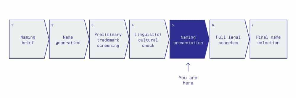
The entire naming process includes writing a clear naming brief, generating a massive list of ideas, and putting a shortlist through preliminary trademark screens and linguistic checks. Once this work is completed, you’ll have a list of on-brief, vetted name ideas. But ultimately, you don’t need a list of names – you need one.

Getting a client (or your own team, for that matter) to agree on a single brand name is one percent creativity, ninety-nine percent psychology. Maybe that’s an overstatement, but for all the effort that goes into creating names, much of the work of naming is in getting a group of people – often with diverse roles, backgrounds and levels of comfort with creative exercises – to select a final name.

That’s where the naming presentation comes in. And it’s why a good naming presentation is not just about showcasing the best ideas, but also driving consensus and buy-in. Managing disparate reactions and opinions is a messy business, but a well-crafted presentation can mitigate many predictable challenges of consensus-building.

Man delivering brand name presentation

How to Structure a Naming Presentation

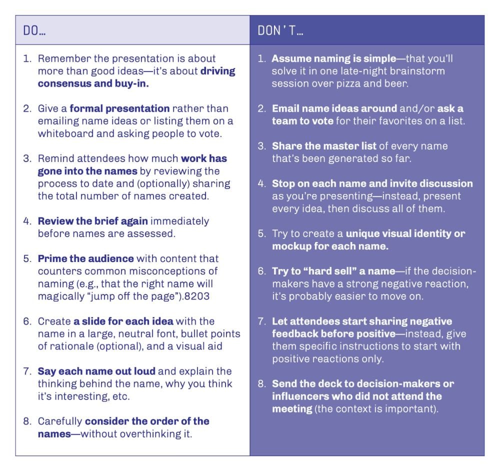
One reason to insist on a formal presentation of names is that it lends some gravitas to the naming process and helps ensure the audience is paying attention. Rather than emailing name ideas or listing them on a whiteboard and asking people to vote, build a presentation in slide software like PowerPoint, Keynote or Google Slides. In addition to standard content – title slide, agenda, next steps – the naming presentation should contain the following five sections:

  1. Overview
  2. Review of the naming brief
  3. Priming the audience
  4. Name ideas
  5. Summary of name ideas

Let’s examine each section in more detail.

1. Overview

Start by reminding the decision-making team that the purpose of the meeting is to select a handful of preferred name candidates – not to decide on a final name. (This reminder sets the right expectations and takes some pressure off the meeting.) They can’t narrow it down to one at this point in the process, because name ideas will have only undergone preliminary trademark searches. A more in-depth legal search should inform the final decision. Because that deeper search can nix several names, plan on sending five or six to the attorneys.

Sharing a process overview at this point can also serve as a subtle reminder of how much work has gone into the names you’re about to share – that these are not just a selection of your favorite, off-the-cuff ideas, but name candidates derived through a rigorous process.

Steps of a typical brand naming process

2. Review of the Naming Brief

As mentioned, the beginning of the naming process should include the creation and approval of a detailed naming brief, featuring information such as what’s being named, what ideas the name should convey, what types of names are in bounds and out, and the desired tonality of the name.

Even if the audience is intimately familiar with the naming brief, it’s best to review it again, immediately before assessing names. Remind everyone what served as a “jumping off point” for naming, what was explored and avoided, and any other relevant details from the brief.

3. Priming the Audience

The next section of the presentation aims to put meeting attendees in the right frame of mind for reviewing names (i.e. here comes some psychology). Each slide counters a common misconception of naming that could derail the presentation. Slides in this section often include the following reminders:

  • The strongest brand names are grounded in strategy. Decision-makers should ask themselves which name will work, not which name they like the most. Good names are also stretchable enough to support future growth, easy to remember, and legally and linguistically viable (among other attributes).
  • The name is just one part of the brand. Avoid the temptation to try to make the name “say everything” since it will likely be viewed or heard in the context of a visual identity, messaging and other brand elements. This point can be demonstrated by showing a name that looks like “just a word on a slide” until other brand elements – a logo, a package, a website – are added.
  • Keep an open mind. Consider names like Caterpillar, Virgin, or Starbucks, which initially must have felt silly, controversial, or otherwise problematic. Suppress knee-jerk reactions at this stage – the best name ideas can feel off-putting at first.
  • Don’t expect a name to “jump off the page.” Names are rarely love at first sight. Even if one decision-maker favors a name immediately, chances are the rest of the team won’t feel the same way.
  • The lawyers will have to review names before you start using one (i.e. you’re not walking out of this meeting with a final name).
  • Some naming presentations include a slide highlighting the total number of names generated. If you’re presenting twenty, your master list may contain 500. Like the process overview above, this information hints at the hard work behind the names. On the other hand, sharing these numbers might lead attendees to request access to the full list, which is best avoided.

Before sharing names, I recommend telling the audience you’ll present all the ideas first, then invite discussion. This approach is more efficient and encourages evaluation of the names as a group, rather than one at a time. By assessing the full list at once, attendees can more easily consider which names will work best from a strategic standpoint, as opposed to looking at each idea in isolation and asking themselves, “Do I like this name?”

4. Name Ideas

The “right” number of names to present depends partly on what types of names you’ve explored, whether you’ll be doing multiple rounds of naming, and other project-specific details. But try to find the sweet spot: Present too few, and the audience will feel your exploration didn’t go far enough. Worse, you’ll have lowered the probability that one or more of your ideas will resonate. On the other hand, if you present too many names, the decision-making team may be overwhelmed and suffer from “paralysis by analysis.” All else being equal, I like to share 20–30 name ideas in a typical, first-round naming presentation.

Create a slide for each name based on a simple template that includes:

  • The name, near the center of the slide, in a large, neutral font
  • Optionally, a handful of bullet points at the bottom of the slide (smaller text) with rationale, strengths of the idea, relevant definitions, or illustrative marketing copy
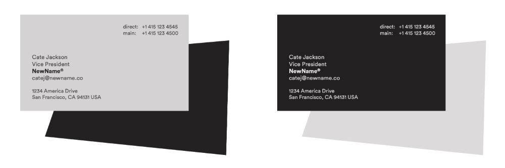
  • A visual aid – a simple mockup showing the name in a realistic context to help the audience make the necessary “mental leap” to envisage the idea as a brand name.

To avoid biasing decision-makers, make the visual aid virtually identical on each slide (although you may want to alternate between two similar designs so viewers don’t become “blind” to the mockups). If you’re naming a company, a business card can work well – a neutral, grayscale design with a handful of realistic details like the company’s address and a “®” next to the name. If you’re working on a product name, a mock package or webpage could work. Do not create a unique visual identity or mockup for each name.

Visual aid examples

As you present each slide, say the name out loud. It’s important that the audience hear the ideas, too, to confirm pronunciation, aid in recall, and imagine the name in an audio-only context (e.g. over the phone or in a radio ad). Next, make a case for the name—explain where the idea came from, why you think it’s interesting, why you like it, or anything else significant. Your goal shouldn’t be to “hard sell” the name, but to ensure your audience has a well-rounded understanding of the idea and time to process it fully before moving to the next slide.

A brief note on the order of the names: Try not to overthink it, but if you can, a) get any expected ideas out of the way first (e.g. any listed in the brief), b) put very similar names next to each other (as “variations on a theme”) and c) given the primacy and recency effects, err on the side of putting stronger candidates closer to the beginning and the end of the presentation.

5. Summary Slide

Immediately following the individual name slides, show an alphabetical list of every name from the presentation, all on one slide.

Instructions for feedback

Now comes the moment of truth. Assuming attendees have refrained from sharing their opinions during the presentation, this is your first opportunity to hear what’s resonating. The success or failure of the entire meeting may hinge on the next few words uttered. For example, imagine this worst-case scenario: The CEO blurts out, “I don’t like any of these.” If no one’s brave enough to contradict the boss, the meeting is over, and you’ll have trouble regaining the team’s confidence.

Of course, if you’ve done your homework, a swift dismissal of all the names is unlikely. More likely reactions at the end of a naming presentation include, “We definitely can’t use that one” or “I think we can all agree these three won’t work.” Faced with a tough decision, it’s natural to pursue a process-of-elimination strategy. But as soon as a negative thought is attached to a name, it creates a chilling effect – anyone who liked the idea is less likely to speak up. If you let everyone snipe at their least favorite names – even for ridiculous reasons – they’ll decimate your list before you can say “Boaty McBoatface.”

To avoid this fate, I recommend being somewhat dictatorial in your instructions. Here’s an example of what I might say as soon as the summary slide appears on the screen:

“Here are the 25 names I just presented, in alphabetical order. I want to get your feedback now, but I need you to follow one rule: Please start by sharing only your positive reactions.

With this many names, you probably saw a few you think can’t work. That’s ok – it’s part of the process. But keep any negative thoughts to yourself, for now, to avoid biasing everyone else. Even if we ultimately reject a name, we need to know what people like about it because it may spark another idea.”

These instructions create the opposite of a chilling effect (a warming effect?): Instead of a single “I don’t like it” poisoning the whole discussion, positive reactions will spread contagiously throughout the group. Those who were too shy to advocate for an idea will be more likely to do so. Your audience may even pile on, eager to share what they love about a name that’s starting to look like a crowd favorite.

As meeting attendees list the names they feel good about, keep a private tally. Once everyone has had a chance to speak, share some thoughts on which ideas the team is rallying around. These names are frontrunners for full legal searches. If the project calls for an additional round of naming, selected names may also inform future name generation.

After the Presentation

One final thought about naming presentations: While it’s standard practice to send out a slide deck after presenting, avoid sending it to anyone who didn’t attend the meeting, and remind recipients to keep it to themselves. Emailing a naming presentation (or worse yet, pasting names into an email) deprives the names of necessary context. If you’ve read this far, you already understand the importance of putting name ideas in context – priming the audience, reviewing the brief and managing the discussion. Without the presentation, you may have a list of creative ideas, but you’re missing the other ninety-nine percent.

In Summary: Dos and Don’ts

My recommendations aren’t one-size-fits-all; I encourage you to experiment and find what works best for you when presenting names. But much of my advice stems from trial and error – I’ve made plenty of mistakes and watched other branding professionals bomb like a standup comic on an off night. I hope this article will help you avoid that fate. With that in mind, here’s a list of dos and don’ts for naming presentations:

Dos and don'ts for brand naming presentations

_

About the author: Rob Meyerson is a brand consultant, professional namer and host of the How Brands Are Built podcast. He is also principal and founder of Heirloom, an independent brand strategy and identity firm in the San Francisco Bay Area.

Tuesday 28 July 2020

Survival of the Fittest: 7 Branding Strategies for Health and Wellness Businesses

This article has been contributed by Karl Kangur.

We live in an era largely driven by ideals of physical health and good looks. The culture of staying eternally young sneaked into modern society, took it over, and has no intention of going away. In 2018, the global wellness economy hit a $4.5 trillion mark, compared to $3.7 trillion in 2015. The growth of the wellness market in this period was twice as fast as the growth of the global economy.

The occurrence of a world-wide pandemic is only going to make the health and wellness industry more powerful, especially given the nature of the epidemic. Namely, people who are generally healthier are less at risk of experiencing the virus’s dramatic effects. More than ever, we’re aware that it’s not enough to react only once we’re ill. To stay truly safe and healthy, we need to take care of our bodies and devote some time to our physical well-being every day.

In other words, our approach to our health will become much more proactive and systematic, instead of being reactive and unmethodical. This means more demand in this industry, which will inevitably lead to more competition.

It’s already difficult for a health and wellness brand to stand out in any way – and it’s not going to get any easier. You’ll need to do a great job branding your business, your product and your services in order to attract consumers’ attention and survive. Here are a few strategies you can use for this purpose.

1. Be Authentic

Obviously, if you’re aiming to stand out, the first piece of advice anyone would give you is to be different and authentic. There’s a flood of copies of copies of copies of brands using the same imagery, same messages and same ideas. From unrealistically good-looking men and women, insanely photoshopped to look even less real, to video ads of people taking supplements while pretending to smile so hard it makes anyone looking at it feel deeply uncomfortable. Not to mention corny, overused slogans telling us not to give up and follow our intuition.

Now, to tell the truth, there’s a reason why this imagery and these messages are so widespread. They do work to some extent, and it’s no secret that fit human bodies will indeed attract attention. But it can’t be enough. Even if you go the more conventional way and choose to use these sorts of visuals and communication, try at least giving it your own touch that will effectively distinguish you from your competition.

The fact that there’s a dominant way of doing things doesn’t mean it’s the only way of doing things. If you want your branding efforts to have a significant long-term effect, doing the same thing everyone else does is not the best strategy.

If you’re looking for inspiration for a fresh twist to give to your own wellness brand, check out how Nuggs did it. It’s a soy-based nugget that claims to be a healthier version of chicken nuggets. Nuggs are not taking the usual road of being unnecessarily empty, clean and lifeless. On the contrary, their website is original, amusing and hip, with funny slogans like “Tesla for chicken” and “Kills you slower.” And the best part is that this laid-back approach doesn’t hurt their business but rather helps it. Their website is still informative and engaging, and it generally fulfills every other standard that a business website should fulfill.

Nuggs' authnetic branding strategy example

Image source: eatnuggs.com

2. Add a Human Touch

The value of brand humanization goes beyond the health and wellness industry. It’s a well-known approach that can positively affect brand trust and loyalty.

In order to put a human face on your brand, first, you’ll need to show that your company isn’t built or run by algorithms and mere profit calculations, but by actual humans. And to achieve this, being different and authentic is definitely the first step. But it’s still not enough. Show that your brand has a human personality. Of course, you need to retain a certain dose of professionalism, but a bit of humor and an occasional easygoing attitude will show people that your company has a human mind and soul.

Also, tell a story – about your business, about your product, about how it all started or what inspires you. That adds a human perspective and background to your brand.

Show the faces of people who work for you, show the faces of people who enjoy your products. This is especially important in the health and wellness industry nowadays, because people are increasingly skeptical about dirty pharmaceutical companies, suspicious dietary supplements, surreal promises by health and fitness gurus, and the entire healthcare system in general. It will become increasingly essential to prove that you are actually different from all these.

In this context, Nerd Fitness has taught some big companies a great lesson. They use a human tone, human language, and pursue a human cause. They’re focused on helping people with desk jobs that love nerd culture and need some exercise although they aren’t traditionally really into sports of any kind. Their narrative, their photos, and the effort they’ve obviously put into their business suggest that they’re not just talking the talk. It’s a story by real people about real people, told the way you’d tell it to real people.

Nerd Fitness human brand strategy

Image source: nerdfitness.com

3. Hire Influencers

Hiring influencers is another fantastic way to put a human face on your brand. That is, if you choose influencer(s) with a human face, not those that act like walking billboards, shouting slogans someone else wrote for them.

This is very important, as working with influencers can help you build credibility. The key advantage is that you’ll be advertising your product in a non-advertising context. In other words, influencers that are at the same time top-class content creators can make your product a natural part of their content. People like their stuff; people trust them, and they won’t mind a bit of product placement if it’s done in a way that’s not intrusive and has no negative impact on the quality of the content.

That’s why it has to be someone who’s subtle, skilled and trustworthy. If you hire a disreputable person who is known to advertise absolutely anything for a bit of cash, it can do very bad things for your reputation. Moreover, you have to pay attention to who they’re talking to and make sure your target audiences overlap. Otherwise, you’re probably just wasting money.

The people from Liquid I.V. know the value of influencer marketing. They’ve hired a lot of micro-influencers from different niches that have introduced the product to their audiences. These people can show how it works and talk about it in a way that their followers will understand, and that is something professional marketers often fail to accomplish. The company also got backing from some genuine superstars, which made it really difficult to overlook this brand.

Liquid I.V. influencer marketing

Image source: liquid-iv.com

4. Align With a Cause

Every brand should be built predominantly around a message and a mission. Without these, brands don’t really have any life or character – they’re just money-making machines.

Now, it’s vital that this message is authentic and that decision-makers in the company actually believe the cause they’re claiming to believe. And of course, that they’re actually doing something concrete to achieve the proclaimed goals.

Consumers will find it much easier to identify with a brand that shares their ideas and beliefs. Of course, they also have to like your products in order to buy them, but once you have that settled, sharing a cause with your customers can do wonders for your branding efforts. As much as 67% of millennials believe that it’s important that a brand they buy from has a charitable component.

If you’re asking yourself whether this strategy is morally objectionable, it only depends on whether you really believe what you’re saying and whether you’re doing something real about it. If you are, then you’re basically just spreading a word about a good cause you’re pursuing. If it also brings you some business benefits, it doesn’t devalue any of your actions.

Of course, some causes are better aligned with your industry or your specific product than the others. If you’re selling vegan supplements and vitamins, then it makes sense to support anti-animal cruelty causes. This is exactly what Future Kind does. Deciding to sell only supplements that are 100% vegan is already sending a message. Donating to animal sanctuaries, supporting the Coalition for Rainforest Nations, and using only recycled bottles and mailers proves that they’re serious about it.

Future Kind mission-based marketing

Image source: futurekind.com

5. Create Valuable Content

The health and wellness industry nurtures a very high number of frauds and charlatans, who use every channel available to tell ludicrous stories about their magical products. That’s why it’s of utmost importance to establish your brand as competent, knowledgeable and science-based.

There’s probably no better way to do that than to run a company blog where a team of experts in the field will cover key topics related to your niche. Use your blog to inform people and build trust. Of course, you can advertise your product or sneak in a CTA button or two, but in a subtle and organic way. Just don’t use it to give miraculous promises or promote dodgy pseudoscientific theories.

Furthermore, your blog can increase your brand’s online visibility. People often look for medical advice online and ask Google about health issues, so if you offer high-quality articles that answer these questions, people will have a good chance of coming across your website.

An excellent example of great content that’s meant to attract consumers and earn their trust is Sleep Junkie. It’s an affiliate site for mattress brands that offers quality articles on sleep science and sleep health, coupled with mattress and bedding guides that are meant to drive sales and conversions. Here, it’s crucial to maintain a delicate balance between informative and promotional content, and Sleep Junkie does it very well.

Sleep Junkies content marketing examples

Image source: sleepjunkie.org

6. Utilize Engaging Design and Colors

We’ve already established that brands are predominantly built around messages, stories and broader narratives. But what people usually remember most distinctly about brands are their colors and their visual identity. That’s why you have no right to make a mistake here.

The trouble is there’s no recipe for success. There are some traditionally accepted design solutions for health and wellness brands, but they don’t have to work for you. In general, this industry is dominated by green, the color of nature and growth, as well as blue, the color of calmness and cleanliness.

It also makes sense to use a more minimal design that will have a tranquilizing effect, but this is often not true as there are a lot of other factors included. It simply doesn’t work for all sub-branches of this industry. A gym and a yoga studio will have radically different designs, which can both potentially work for their target markets.

That’s why you should develop your visual identity based on what you do and who you’re targeting. Take Ultimate Meal Plans as a good example of a well-balanced and effective design. They help their customers get healthier and lose weight with the help of customized meal plans. Green dominates the design, which makes sense, as it’s the color associated with healthy food and lifestyle. Moreover, using large images of food is a safe and efficient way of promoting their products – the internet just never gets tired of food photos, and we don’t see that changing any time soon.

Ultimate Meal Plans green and white visual identity

Image source: ultimatemealplans.com

7. Offer a Personalized Experience

Personalization is another tactic that works well for businesses in all branches. As much as 80% of consumers are more inclined to buy from a company that offers personalized experiences. It’s a trend that will continue to grow as businesses get to know their individual customers better. And with the amount of customer info businesses have at their disposal, it’s no wonder that consumers expect their journey to be highly personalized.

This strategy is even more important for wellness businesses than for most others. Everyone’s body is different, and we all have varying ideas about feeling healthy and fit. We all need different supplements or training plans, and we don’t all react the same to various medicines.

Consequently, people won’t necessarily care how many people your product has helped if it doesn’t fit their needs or their anatomy. It’s vital that you provide personalized products, services, and experiences, whenever you can. That’s how you’ll show people that you understand they have different needs you must adapt to, and that you care about each and every one of them.

Final thoughts

Keep in mind that branding a business is a long and painstaking process. There are no easy solutions, so don’t try to cut corners. One step in the right direction is just one of a thousand steps you’ll need to take, while one step in the wrong direction can mean your reputation is damaged forever. That’s why you need to be extra careful when it comes to making sensitive decisions about your branding strategy.

Think about what your business offers and how it’s different from all the others, and use that to your advantage. Also, never forget who your customers are and who you want to attract. Some branding ideas may be ingenious in themselves, but if they don’t work for your specific target market, you should avoid them. Every business has a different story and a different character – so building a successful brand is always a unique and special adventure.

_

About the author: Karl Kangur is the founder of Result Compass, a digital marketing agency with a proven track record of helping business owners transform their marketing and effectively turbocharging their growth.

Best Vintage Fonts for Branding and Logo Design

While they say that everything old becomes new again, the appeal of vintage fonts appears to be timeless.

With their classic design and elegant look, a vintage font can be the perfect thing needed to put your clients’ business over the top. With our list of the Best Vintage Fonts for Branding and Logo Design, you can transport your clients to the past and provide them with a unique, stylish, and timeless design.

To help get the ball rolling, we wanted to showcase some of our favorite vintage fonts for you to consider. Before that though, let’s take a closer look at what a vintage font is.

What is a Vintage Font

A vintage font has the innate ability to transport you and your work to a different era and give it the nostalgic and timeless feel that it needs. No other font style can successfully emulate this. Being able to transport your audience or client back to eras such as Prohibition, or the sixties to bring a breath of fresh air to their business while still upholding their values and ideals.

Best Vintage Fonts for Branding and Logo Design

More Top Font Compilations

Best Vintage & Retro Fonts for Branding and Logo Design

Bilcase Vintage Display Font Family – $39

Bilcase Vintage Display Font FamilyBilcase Vintage Display Font Family

A layered, condensed font family, the Bilcase Vintage Display Font Family gets its inspiration from vintage logos, labels, packages, and signage. The font is layered with contextual, stylistic ligatures and alternates and also provides you with special capital letters when you activate the contextual alternate feature. The OpenType features are accessible through programs such as Adobe Illustrator, Adobe Photoshop, Adobe Indesign, Corel Draw, and more.

Learn More

Hollywood Vintage Font – $12

Hollywood Vintage FontHollywood Vintage Font

The glory days of Hollywood were full of glitz, glamour, and incredible stars. The Hollywood Vintage Font, designed by Annenkov Dmitriy is an easy to use typeface that can be used with numerous programs including Photoshop and Illustrator. PUA encoded so all alternate glyphs work automatically, the Hollywood font is perfect for any project you are doing from branding and logo design to posters and more! Included in the set are TrueType and OpenType versions of the font plus a Webfont kit to make everything look amazing!

Learn More


Knucklehead Font Family – $40

Knucklehead Font FamilyKnucklehead Font Family

Inspired by the culture found in the American West, the Knucklehead Font Family, created by HeadFonts, the font provides designers with a unique way to communicate with your client and their customers by wrapping their branding and logos with a vintage font that can draw lots of attention. Suited best for designers who are tired of using the same thing over and over again and are interested in creating a new vision and those who like to experiment as well. While the font family is a great choice for branding and logo design, it’s versatile enough for posters, wedding invitations, or just about any other project you can think of.

Learn More


Vintage Queens – $16

Vintage QueensVintage Queens

Designed by Putra Novembria and Candra Kusuma, the Vintage Queens typeface gets its inspiration from the typography and lettering used in the 70s and 80s, combined with a bold style of typography that can add a groovy feel to any of your projects. With over 500 glyphs and more than 350 alternates, you have an insane amount of lettering combinations that you can create. Best for use with logotypes, headings, logos, branding, social media, and packaging, the Vintage Queens font can add a groovy new level of fun to your projects.

Learn More


Braton Composer – $10

Braton ComposerBraton Composer

Designed by Alit Suarnegara, the Braton Composer font family comes with a vintage look that appears plump, fat, heavy, and strong but still comes across as elegant and unique. The typeface can be categorized as a bold serif font but it also comes with italic options. When combined with swashes and the character alternates, it becomes a very unique and worthy tool in your toolbox. The vintage design makes it a perfect choice for all kinds of projects from logos to branding and everything in between.

Learn More


The Aviator Font Collection – $15

The Aviator Font CollectionThe Aviator Font Collection

The vintage look that came with the early days of aviation is on full display with The Aviator Font Collection from Vintage Voyage Design Co. The collection uses four different vintage fonts and brings them together to create a unique, 100% vintage style font. With this collection, you can create your own vintage style whether you prefer clean and elegant or the look of distressed letterpress. The set also comes with more than 50 vintage illustrations that you can use as well as a vintage badge creator. All these extras make The Aviator Font Collection more than worth the price.

Learn More


Victorian Fonts Collection – $14

Victorian Fonts CollectionVictorian Fonts Collection

The Victorian era was a time of great prosperity and the first industrial revolution. The Victorian Fonts Collection hopes to recapture some of that magic from the 1800s with an easy to use collection. Designed by Burntilldead, the collection features a typeface that is ornamental, decorative, classical, and of course, victorian. The OpenType font includes 200 alternator characters that you can use to create unique logos. With the Victorian Fonts Collection, your work will be fit for a Queen.

Learn More


Bignord Typeface – $16

Bignord TypefaceBignord Typeface

Inspired by vintage packaging and typographic cover lettering, the Bignord Typeface is a new font that comes with a distinctly vintage look. Designed by AF Studio, the font is available in five different stylistic variations that allow you to create a vintage feel from the swash of each letter. Created for designing covers, the Bignord typeface is a great option for logo, branding, and any other project that could use a touch of vintage design structure.

Learn More


Melvis – Vintage Font Family – $19

Melvis – Vintage Font FamilyMelvis – Vintage Font Family

With five style fonts, the Melvis – Vintage Font Family is a great typeface that you can use on just about any project you’re designing. Created by Craft Supply Co., the set includes extra badges and illustrations that you can use to make your designs just the way you want. A great option for a logo or even branding, the Melvis font can make all of your work stand out from the crowd.

Learn More


Rumble Brave Vintage Fonts – $10

Rumble Brave Vintage FontsRumble Brave Vintage Fonts

Designed by Alit Design, the Rumble Brave Vintage Fonts collection combines vintage and victorian classic into one of the designers’ favorite creations. The collection comes with three font variations: serif, script, and dingbat. These three font combinations are the epitome of the Victorian classic design concept. The font provides your project with a level of luxury, elegance, and style. As a bonus, the set includes an ornamental collection that has 2 gradient variations with it.

Learn More


Best Vintage & Retro Fonts for Branding and Logo Design

Finding the right font for your latest branding or logo design can be difficult and when you have a client looking for something new, unique, and vintage, the difficulty level can be turned up to 11. With our list of the Best Vintage Fonts for Branding and Logo Design, we have given you our list of the best vintage fonts that can take your design work to another level.

Monday 27 July 2020

10 Easy Ways to Take Your Landing Page to the Next Level

This article has been contributed by Stephanie Jones.

It’s really disheartening to build a landing page, publish it, and then get only a couple of conversions.

You spent hours crafting your copy and designing everything. You sent it out to your email list, paid for ads, and yet you’re still not seeing results.

As with most marketing work, there is an art to creating effective landing pages. It’s not just about attractive design and clean copy; the audience insights, user experience, and value proposition have to be there as well.

Still not sure how to take your landing page to the next level? Take a look at these ten tips:

1. Research Your Audience (Again)

Every decision you make about your landing page, from its title to its footer, needs to be based on what you know about your target audience. Even if you’ve conducted research in the past, audiences change; it never hurts to collect fresh data.

First, you need to understand what your audience’s pain points are. Otherwise, how are you going to convince them that your whitepaper or email marketing is worth their time? All good products and services solve a problem, so be sure to weave this into your landing page.

Don’t just pay attention to the problem itself, though. How does your audience speak about it? Why haven’t other solutions worked for them? What psychological triggers get them to pull the trigger on a purchase?

There are several ways you can research your audience:

  • Interview existing customers, especially those that have been loyal to your business.
  • Convene a focus group to encourage a conversation among your customers.
  • Send out a survey to your email list.
  • Use lookalike audiences on social media to fill in demographic gaps.

Think, too, about how they interact with your landing page. For example, you can use heat maps to see where your visitors are clicking. If you notice a link is causing visitors to leave the page, consider removing it altogether. The more you know about who your audience is and how they interact with your page, the better.

Target audience member using website landing page

2. Make the Most of Content Above the Fold

The material at the top of your landing page is what gives visitors their first impression. In some cases, they’ll look at only the title and header image to decide whether or not the page is worth their time.

Make sure your above-the-fold content:

  • Clearly explains your offer: Why are readers there in the first place?
  • States the benefit: How is your solution better than their other options?
  • Uses white space wisely: A breathable layout provides a better user experience than a jumbled, confusing one.
  • Includes a call to action: CTAs shouldn’t only sit at the bottom of the page, where some readers will never see it.

By the same token, notice what’s not included above the fold. Elements like testimonials or specific features should be mentioned further down the page. Although these are valuable, they’re not as important to your audience as your offer and sign-up form.

3. Get Specific About Your Value

Don’t leave any doubt in your reader’s mind about why they need your product or service. Otherwise, they may not feel compelled to click or enter their email address.

You want to avoid two big mistakes here: One, never promise something you can’t deliver. People hate clickbait and being led on. Even if you land a few sales by doing so, your brand will suffer in the long run.

The second mistake is hiding your value in the details. Don’t make your visitors dig around your website for the information they need. Think about not just what you offer, but to whom and why.

Say you’re a data security consultant. You’ve done a good job of describing what you do and what cybersecurity risks you can help clients minimize — but who do you serve? A startup’s IT needs are drastically different from an established enterprise’s.

Don’t do that to your customers. Hit the who, what, when, why and how, ideally in the first 250 words on the page.

4. Use Fewer Form Fields

When it comes time to get your visitors’ information, it’s tempting to ask for everything but the kitchen sink. Why wouldn’t you want to collect things like their age, gender, race and household income? The more you can learn about your landing page visitors, the better — right?

Personal information is valuable to people. You need to build trust with them before you ask for those sorts of details.

Remember, your landing page is essentially making a trade: You give them something of value, like a whitepaper or discount, and they agree to receive your marketing messages.

The bottom line is, the more you ask for, the less likely people are to convert. That’s why one of the best ways to boost your landing page’s effectiveness is simply to reduce the number of fields your readers have to fill out.

Ask yourself what, exactly, you need to know. Although many landing pages ask about company size and title, inbound marketing agency HubSpot suggests limiting requests to name and email.

5. Write Clear and Concise Headlines

When it comes to landing pages, headlines are everything. There are a lot of wrong ways to write one, including:

  • Using jargon or lofty phrasings: “We specialize in synergistic optimization solutions.”
  • Using vague phrases that could be talking about anything: “Looking for the lowest price? We guarantee it!”
  • Being unnecessarily wordy: “Make a lot more money than you probably are right now just by driving your car.”
  • Being too brief: “Earn more by driving.”

Bad headlines distract and confuse readers. Your goal should be to summarize your landing page’s value in an attention-grabbing way. Readers don’t see a good headline, so much as they see your offer through the headline.

What makes a good landing page headline? Think about it like a blog post headline: Be accurate, conversational and brief. Speak to your audience’s needs, and tease the top benefit of your product or service.

6. Craft a Strong Call to Action

Part of the battle is bringing visitors to your landing page. Once they’re there, the challenge becomes motivating them to take the next step. That’s where a strong CTA comes into play.

Here are some best practices to implement:

Make Your CTA a Contrasting Color

You want the CTA to stick out. For example, if your background is light green, make the CTA a dark orange. If your brand’s style guide calls for particular colors, pick the boldest and the brightest for your CTA.

Put Your CTA Above and Below the Fold.

By locating your CTA atop the page, you capture readers who are eager to take that next step. But by also placing one at the bottom of your landing page, you’ll capture those who are convinced by reading its other content.

Alternatively, use an element that follows the reader along the page. Not only does motion catch the eye, but it lets readers sign up the moment that they’re convinced of your product or service’s value.

Use Enticing Language

Your CTA shouldn’t be something boring, like “Submit.” Use phrasings that create urgency, such as “Shop Now,” or those that imply a good value, such as “Download for Free.”

Above all, experiment. Every landing page looks a little difference because every audience and business is different. Naturally, it might take some trial and error before you discover the CTA that maximizes your conversion rate.

Website landing page design experimentation

7. Cut Out Distractions

Isn’t flashy design and copy better for a landing page? Not necessarily. If you go overboard, you could hurt your conversion rate. When you introduce too many elements, you take your audience’s attention away from your offer.

There’s a delicate balance to be had. Landing pages need some amount of design and copy, of course. Think about it in “goldilocks” terms: Too much or too little of either, and you’ll see conversions fall off.

If your landing page is littered with distractions, what should you cut out? Good options include:

External Links

You don’t want visitors leaving the page without signing up, so why include them at all?

Navigation Tools

Assume readers can scroll up and down the page themselves.

Images and Video

Images and video catch the eye. If you don’t need one to deepen the reader’s understanding of what you do or to promote sign-ups, then why include it at all?

8. Include Social Proof

How often do you read reviews before hitting the “Buy” button? Before people buy from you, they need to trust your brand.

You can immediately build that trust by including social proof on your landing page. If you’re not familiar with social proof, it’s the idea that a brand is good if other people like it.

Thumbs up review

Generally speaking, people follow the masses. If you can show visitors that the masses like your business, they’ll join the crowd.

Social proof takes many forms, such as:

  • Third-party reviews from websites like BBB and Yelp
  • Case studies
  • Customer testimonials
  • Endorsements from celebrities and influencers
  • Social media follower figures
  • Awards, certifications and recognitions
  • Logos of big brands that use your services

Once you’ve identified a form of social proof, consider where it should sit on your landing page. For instance, a testimonial about how easy it is to get started might be best next to your sign-up form. One that reinforces your service’s quality should probably be near its value proposition. Use social proof to underscore benefits and minimize perceived pain points.

9. Align Your Ad Copy and Landing Page

Imagine seeing an ad for bartending classes. When you click through to the landing page, however, you see that the company has pivoted to cooking classes. Chances are, it isn’t a pleasant surprise.

A surprising number of companies make this mistake. As their service offerings change, they often forget to update their marketing materials.

It’s critical to meet the expectations you set for your customers. If your landing page doesn’t match what they saw in a social media ad, they’ll leave instantly.

Leave no stone unturned here. Ensure that your ads and landing pages cover the same services and use cases. Check that their copy strikes the same tone. Use the same color scheme. Make sure the faces in each image reflect your audience.

This ensures that everyone who clicks on your ad knows precisely what they’re getting into. The result is more pre-qualified traffic to your landing page, which ultimately means higher conversions.

10. A/B Test Everything

All of these tips and tricks can help you build better landing pages. But the truth is, you won’t know what works and what doesn’t until you test it. A lot of marketing advice applies generally, but very little of it works universally.

To discover the best version of your landing page, get ready to do round after round of A/B testing. Marketing automation agency Ontraport suggests creating four versions at a time to make the process more efficient.

When you test, isolate variables by focusing on a single element at a time. Don’t vary both the photos and the text in a single test, for example.

A few places to try A/B testing include:

● Social Proof

Do value-oriented testimonials convert more leads than quality-focused ones? Should the case study go higher on the page or lower?

● Titles

Is a longer title more effective than a shorter one? Is a question better than a statement?

● Colors

Is it better to provide reassurance with calming colors like blue? Or do colors like red, which communicate passion, convert more visitors?

● Tone

Do visitors respond best to a casual style? Might a more formal one boost conversions by conferring a sense of authority?

Keep track of your findings, and don’t be afraid to run the same test twice. You never know whether the first run’s results were due to sample irregularities, or whether some other variable was influencing them.

Landing page A/B test results

Get it right, and you’ll see: Landing pages can be lead-generating, money-making machines. Unfortunately, they’re also easy to botch. Test, redesign and optimize your way to a landing page that your audience can’t resist.

_

About the author: Stephanie Jones is the Editor-in-Chief of Personal Branding Blog and writes for a variety of major media outlets.