Sunday 31 May 2020

2020 Logo Design Trends & Inspiration

Earlier in 2020, I posted an article on the latest logo design & branding trends and now 6 months on, the official 2020 logo trends report has just been released by Bill Gardner of LogoLounge.

This report has been put together by carefully analyzing over 350k logos from the past 18 years, handpicking those that contribute to emerging trends for the year. The findings & insights are found below.

Remember, as Bill says:

“This report is an observation on the logo industry and isn’t meant as a guide for best practices. Trends are trajectories that will evolve and modify over time, not a passing fad. Use the ideas here to push your design skills to the next level and keep the trajectory moving to the next iteration.”

Please share this article if you found it useful. You can find Pinterest pins at the end of the article.

Past Logo Design Trend Reports:

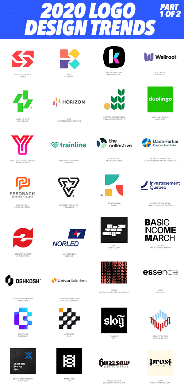
What are the Logo Trends of 2020?

  1. Counters
  2. Mazes
  3. Sisters
  4. Chex Melt
  5. Bevel Tips
  6. Petri-Dish
  7. Variable Type
  8. Black Letter
  9. iDrops
  10. HandOut
  11. Bolts
  12. Twinkle
  13. Cornered
  14. Letter Illusions
  15. Chiseled Shadows

Further explanations are provided below.

2020 Logo Trends Report

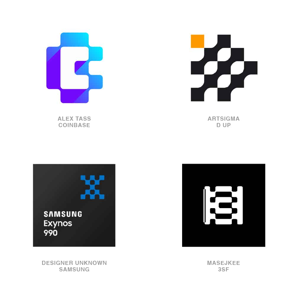
1. Counters

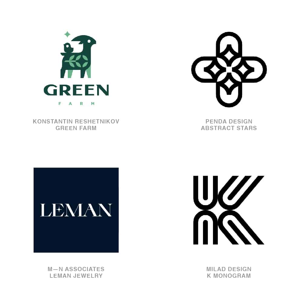
Cleverly arranged elements that create a negative counter space, often forming arrows, letters or symbols.

Logo Design Trends 2020 - Counters

2. Mazes

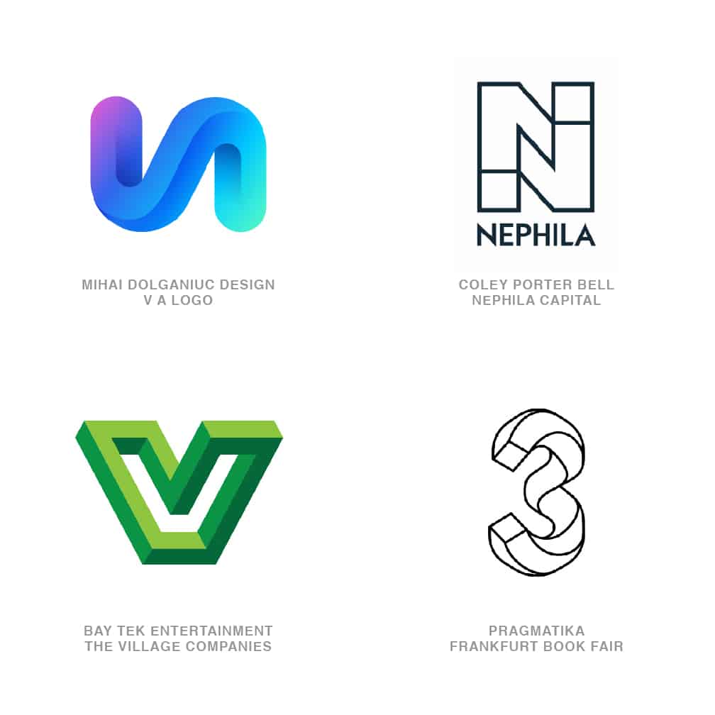
A specific pathway embedded within the logo, often with a start and end.

Logo Design Trends 2020 - Mazes

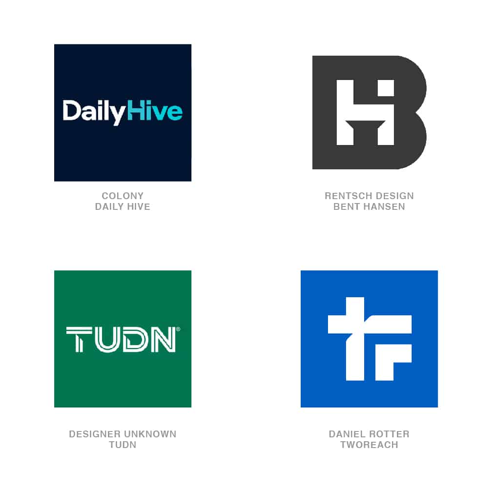
3. Sisters

Two identical elements either mirrored, or nestled together after a 180 degree rotation.

Logo Design Trends 2020 - Sisters

4. Chex Melt

A checkered square framework that links and blends forms together to create a larger shape.

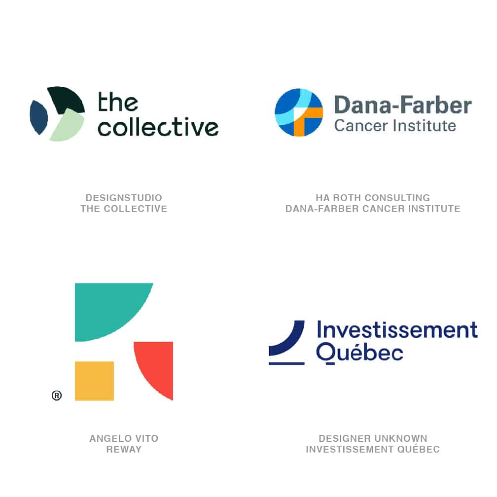
5. Bevel Tips

For each rounded bend there is a counter corner that draws to a point like the tip of a leaf.

Logo Design Trends 2020 - Bevel Tops

6. Petri-Dish

Tightly cropped shots, often framed within a geometric shape.

Logo Design Trends 2020 - Petri Dish

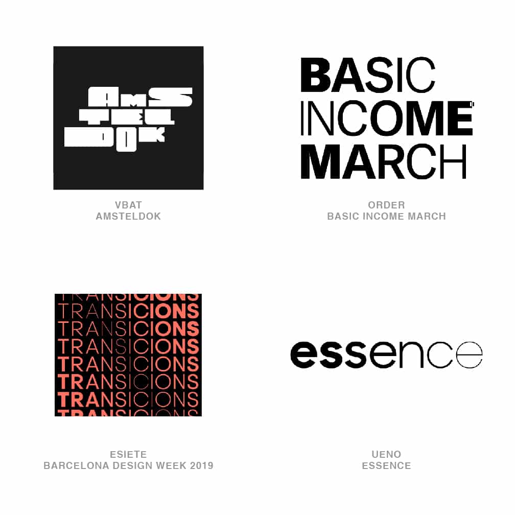
7. Variable Type

Thick to thin type transitions.

Logo Design Trends 2020 - Variable Type

8. Black LetterSlab

Angled letter forms with a sharp graphic appeal.

Logo Design Trends 2020 - Black Letter

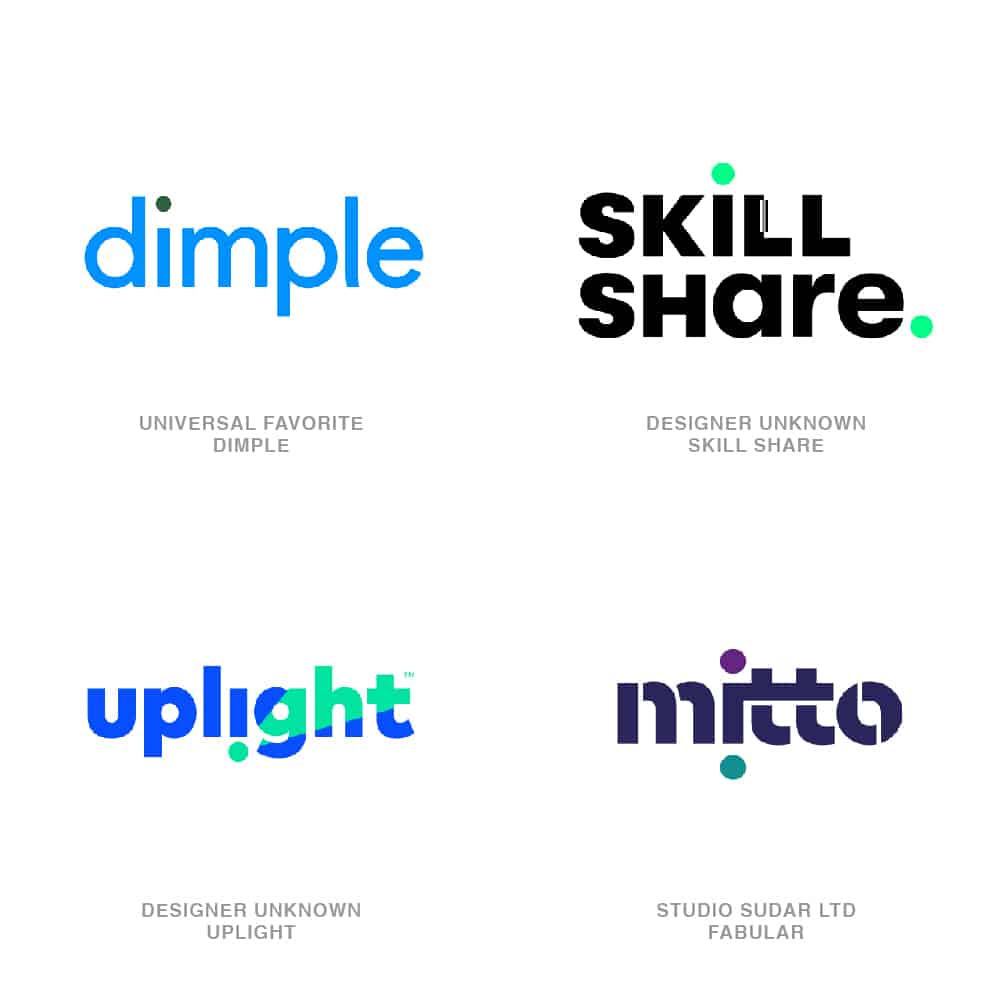
9. iDrops

Colored dots, often found on the letter I.

Logo Design Trends 2020 - iDrops

10. Hand Out

Hands outstretched often with items hovering above them.

Logo Design Trends 2020 - HandOut

11. Bolts

A “lightinng bolt” symbol within the logo.

Logo Design Trends 2020 - Bolts

12. Twinkle

A sparkle star often used to add charm, subtly or overtly.

Logo Design Trends 2020 - Twinkle

13. Cornered

An illusion of a third dimension is added by wrapping designs around an artificial reality.

Logo Design Trends 2020 - Cornered

14. Letter Illusions

Shape shifting optical illusions in the form of a letter or number.

Logo Design Trends 2020 - Letter Illusions

15. Chiseled Shadows

45 degree angled cuts that creates a 3D shadowing effect.

Logo Design Trends 2020 - Chiseled Shadows


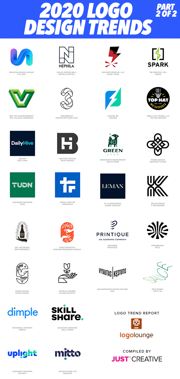
Pin 2020 Logo Trends to Pinterest

Logo Design Trends Report 2020 - 1 of 2 Logo Design Trends Report 2020 - 2 of 2


A shout out to Bill Gardner & LogoLounge!

A huge thanks to Bill Gardner from LogoLounge (read our interview here) for putting this report together. In case you did not know, LogoLounge.com is the world’s largest logo search engine and for less than $10 per month (billed annually), members get unlimited uploads and access to more than 350,000 logos from designers across the globe. They also get immediate entry into the selection process for the LogoLounge book series.

Learn Logo Design & Adobe Illustrator

Learn logo design & Adobe Illustrator with the LogoCore Masterclass which includes 65% off Adobe Creative Cloud, and an exclusive + 10% Discount.

LogoCore Masterclass

The LogoCore Masterclass is the most in-depth online logo course available, perfect for beginners and intermediate designers looking to learn logo design.

Master Adobe Illustrator, learn grid structures, how to vectorize a logo, how to present design work, create a styleguide, build a creative brief, get valuable feedback, animate logos and so much more. They also have a mentorship program.

Get an exclusive 10% discount with coupon code ‘JUST10’. Simply enter the coupon at checkout.

The best part? You get 65% off Adobe Creative Cloud.

» Enroll in LogoCore Masterclass

Do you have any further logo design trends or inspiration to add?

Friday 29 May 2020

15 Best Procreate Lettering Brushes (Free & Premium)

For many beginners, the term lettering may not mean much other than just writing letters and numbers. For amateurs and professionals however, lettering is an art form of its very own. Each letter is created with detailed attention and given a unique role in the piece of art.

For those who use Procreate, having a lettering brush can make things much easier. That’s why we wanted to take a look at the Top 15 Procreate Lettering Brushes, free and premium, to help make things easier for you as well.

Before we dive in, let’s take a quick look at our top choices out there, in no particular order.

The Best Procreate Lettering Brushes

If you’re ready, let’s get on with the countdown!

Top 15 Best Procreate Lettering Brushes

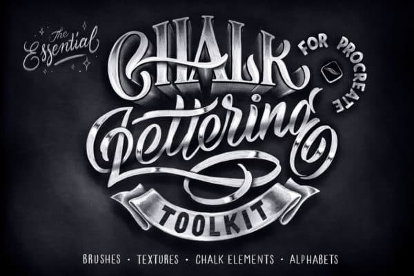
Chalk Lettering Toolkit for Procreate – $14

Chalk Lettering Toolkit for Procreate

Chalk can be an amazing medium to work in as the shading is hard to beat. So is the chalk dust. Thanks to the Chalk Lettering Toolkit for Procreate from Aurelie Maron, you can say goodbye to that dust and hello to incredible works of art. Perfecting imitating real chalk on a blackboard, the toolkit has everything you need to design stunning and realistic lettering and chalk art. The kit also includes ready-to-use chalkboard textures, hand-drawn chalk elements, and alphabets for reference.

Learn More


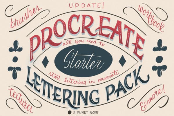
Procreate Lettering Starter Pack – $25

Procreate Lettering Starter Pack

If you’re new to Lettering, it can get confusing and frustrating quickly. Thankfully, the Procreate Lettering Starter Pack from LePunkyNoir has got your back with a kit that contains everything your need to get started lettering in Procreate. Loaded with brushes and textures, the real draw of this pack is the 10-part lettering workbook that walks you through the process of using and understanding Lettering in Procreate. While it’s not the cheapest option, the guidebook makes the Procreate Lettering Starter Pack well worth the price.

Learn More


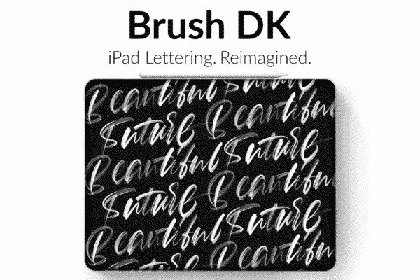
Brush DK For Procreate – $29

Brush DK For Procreate

Created by Calligraphy DK, the Brush DK For Procreate set is much more than a simple set of brushes for Procreate. According to the designer, the Brush DK is the future of lettering. With 16 unique brushes that have been optimized for lettering on the iPad which helps them surpass other options that are currently out there. With the drive to create a new standard in iPad lettering, the Brush DK may just be the first step into a great new territory for artists.

Learn More


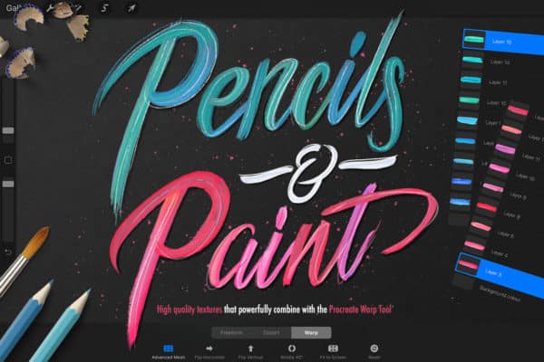
Pencils and Paint Texture Kit For Procreate – $16

Pencils and Paint Texture Kit For Procreate

With over 100 vibrant textures, you can bring energy and color to your Lettering with the Pencils and Paint Texture Kit For Procreate from iPad Calligraphy. Sourced from real art materials to bring authenticity to the textures, they will save you time so you can achieve the result you’re looking for. Designed to use the ‘warp tool’ in Procreate, you can create a paint streaked look right from your iPad.

Learn More


Hand Lettering Brushes For Procreate – $10

Hand Lettering Brushes For Procreate

Created by Seamless Team, the Hand Lettering Brushes For Procreate is an amazing set of creative brushes that are filled to the brim with details that make the brushes simple to write with. Packed with 20 brushes of different types including lettering, monoliners, and thick liners, all designed to help you create amazing Lettering artwork with varieties of textures and styles that help your work stand out every time.

Learn More


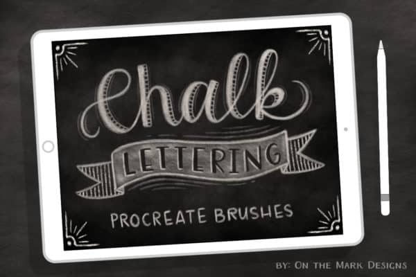
5 Chalk Lettering Procreate Brushes – $5

5 Chalk Lettering Procreate Brushes

Chalkboard lettering can have such a wide appeal to so many and with the Procreate app and iPad, anyone can try their hand at chalk lettering which is what makes the 5 Chalk Lettering Procreate Brushes from On The Mark Designs so attractive. With everything you need to create amazing chalkboard drawings in one simple kit, you can start right away. Packed with three lettering brushes and two shading brushes, you can create chalkboard designs until you’re out of virtual chalk.

Learn More


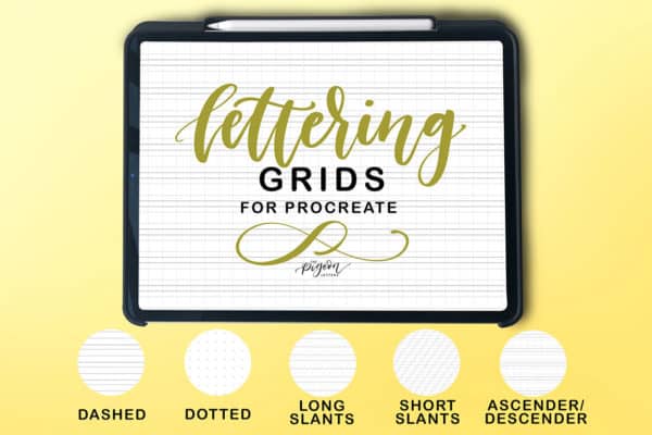
Lettering Grids for Procreate – $3

Lettering Grids for Procreate

Becoming an expert at Lettering takes time and practice but if you’ve got a pushy client, you might not have the time to work on your skills, which is where the Lettering Grids for Procreate by The Pigeon Letters becomes such an important tool. These grids will help ensure that you get your slants, ascenders, and descenders right every time. The grids are meant to provide you with an assist so you can improve and perfect your lettering skills and in no time become a pro!

Learn More


Glitter and Foil Kit for Procreate – $16

Glitter and Foil Kit for Procreate

Perfect for adding a bit of glam to your Lettering artwork, the Glitter and Foil Kit for Procreate from iPad Calligraphy provides you with incredible glitter and foil design that you can use easily on your iPad with the Procreate app. With more than 70 brushes and textures, you can bring new meaning to the term “gold leaf”. Included in the kit are 18 bonus floral brushes as well. Beautifully-detailed stamps that would in perfect unison with the other brushes and textures in this kit. Cheats sheets as well as tips and tricks are also included to help you get started!

Learn More


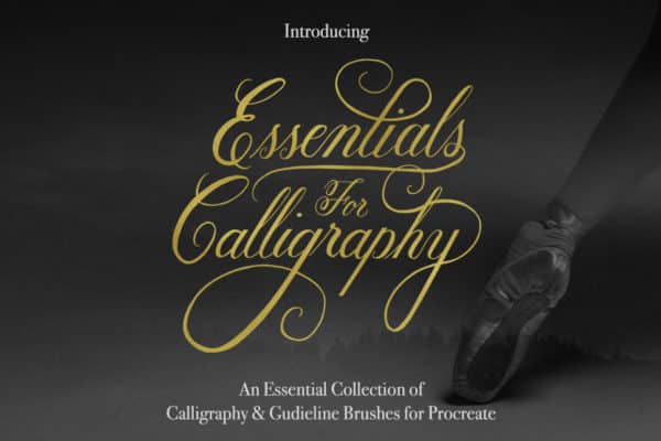
Essential Calligraphy Brush Kit for Procreate – $12

Essential Calligraphy Brush Kit for Procreate

Calligraphy is a beautiful art form that can add class and sophistication to whatever it’s being used on. With the Essential Calligraphy Brush Kit for Procreate from iPad Calligraphy, you can have the essential brushes you need in your toolbox to create amazing Lettering artwork. Specifically made to replicate the tools already being used in the most popular styles of lettering and calligraphy, the pressure sensitivity settings will make your Apple Pencil feel brand new every time.

Learn More


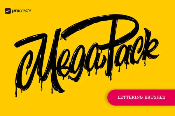
MegaPack for Lettering – $35

MegaPack for Lettering

While it may be the most expensive kit on our list, with 53 total brushes for calligraphy and lettering the MegaPack for Lettering from Loysa is certainly worth the asking price. The set includes brushes for Blackletter, Sign painting, Pentel brushes as well as 10 brand new brushes that you can use to create even more calligraphy and lettering styles. With 53 brushes included in the set, the only limit you have for creating exciting artwork is your imagination!

Learn More


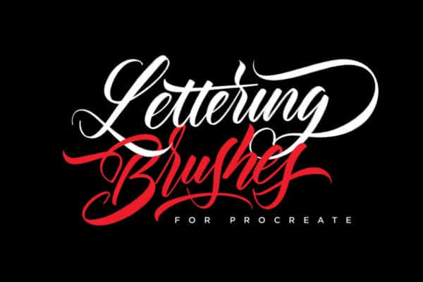
Lettering Brushes for Procreate – $20

Lettering Brushes for Procreate

Designed by Daniel Hosoya, the Lettering Brushes for Procreate set is a well-rounded set of 28 brushes that you can use to create lettering and calligraphy in Procreate. The set also lets you add texture to your lettering to give it a more realistic feel and if your skills are a bit lacking, the set also includes grids to help you and decorate your designs better. All in all, the Lettering Brushes for Procreate set is a good beginner’s set with a lot going for it.

Learn More


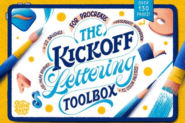
The KickOff Lettering Toolbox – $28

The KickOff Lettering Toolbox

The KickOff Lettering Toolbox by shoutbam is a great choice for beginners with over 75 lettering and ornamental brushes to help you craft the perfect lettering artwork every time. While the 12 color palettes are certainly a bonus, where this toolbox earns your money is with the Procreate Lettering Workbook that is a whopping 130 pages to help you learn the basics along with a PDF version that you can print out to use anywhere you want.

Learn More


12 iPad Brushes For Procreate – $8

12 iPad Brushes For Procreate

Created by Callie Hegstrom, the 12 iPad Brushes For Procreate is the kit you need if you are ready to take your lettering game to the next level. After tons of testing, tweaking, and testing again, 12 brushes have been handmade to perform perfectly every single time you used them. Designed to provide you with a long, lean stroke that is pressure-sensitive and forgiving if you’re just beginning and speeds up your learning process. As a bonus, the kit includes a 13th brush – Inkwell Modern to give you even more options to create amazing Letting every time.

Learn More


10 Procreate Brushes – The Essential Brush Pack – $14

10 Procreate Brushes – The Essential Brush Pack

If you’re obsessed with Lettering on your iPad Pro like we are, then the 10 Procreate Brushes – The Essential Brush Pack by Hewitt Avenue is the perfect pack for you! Packed with 10 amazing brushes that have been updated to take advantage of the newest update to Procreate so you can create incredible lettering every time you use The Essential Brush Pack in your artwork.

Learn More


Top 15 Procreate Lettering Brushes

Lettering can be an art form that not everyone understands but for those that do, creating amazing looking artwork takes time, skill, and patience. With our list of the Top 15 procreate lettering brushes, you can start creating amazing lettering work from the minute you install them into the program.

Thursday 28 May 2020

The 7 Types of Branding & How To Leverage Them for Growth

This article has been contributed by Nico Prins.

When developing a brand strategy, you must recognize that there are many different types of branding. Your brand strategy is based on an understanding of your target audience, the type of marketing campaigns you want to run, and the end goal. Each of these variables will define your approach.

In this guide, we’ll look at seven of the most common types of branding. We’ll cover each of these types of branding in turn and discuss the underlying principles you need to understand when devising your brand strategy.

Let’s quickly touch on the principles of an effective brand strategy before we get into the nitty-gritty.

The Principles of An Effective Brand Strategy

A brand is more than just your company’s logo, slogan, or even its name. A branding strategy involves defining the company’s purpose, target market, and value proposition.

Once you have defined what you stand for, you need to generate brand equity. This is simply showing customers that those brand values are not simply empty words.

It takes time and resources to build a brand and generate brand equity. The investment is worth all the name recall and repeat business that will result.

Different companies will require different approaches to branding to generate brand equity. In this guide, we take a close look at the types of branding, so you understand what they are, and importantly how they can be leveraged to help you achieve your business objectives.

The 7 Types of Branding

Below we will explore the seven types of branding:

  1. Product Branding
  2. Corporate Branding
  3. Service Branding
  4. Personal Branding
  5. Geographic Branding
  6. Cultural Branding
  7. Retail Branding

1. Product Branding

Product branding is the most common type of branding. You see product branding everywhere you go. Through words, colors, and images, product branding sets apart one item from another.

Effective product branding starts with an understanding of the end consumer, their desires and the competitive landscape that you’re entering. All of these variables help determine the brand strategy, which will in turn, impact the product roadmap.
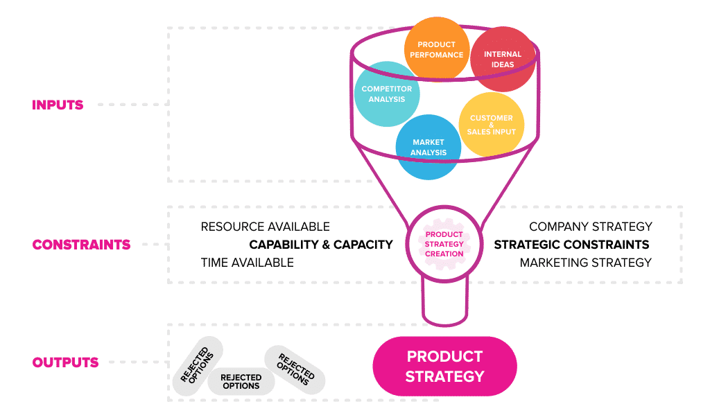
Product strategy formulated via inputs and constraints

Take the example of Oreo cookies. Until the middle of the ’90s, the principal market was the US. Kraft, the parent company, decided to try to sell the cookie in new markets. They were most interested in China and India, which, due to the size of the respective countries, offered a massive market for the product.

Oreo was launched in China in 1996, with the same product that was offered in the US. The product launch failed. Kraft turned to consumers to ask what went wrong. Through interviews, they discovered:

  • The flavors were too strong
  • The cost of a packet was too high

Oreo relaunched in China with a new reduced sugar recipe and smaller packets. The launch was a success and led Oreo to create several new variations that accommodated local tastes. For example, Oreo green tea ice cream and Oreo Double-Fruit.

Kraft replicated its China strategy to enter the Indian market to great success. They adapted the ingredients to suit Indian tastes and leveraged the brand equity of Cadbury, a recent acquisition by Kraft, to distribute the product around the country. Oreo was adapted to the local market and marketed, which was key to the success of the product.

2. Corporate Branding

Brand reputation plays a massive role in the success of a business. Everything a company does – the products it sells, target audience, how it treats suppliers and employees, and even its name – affects reputation. It can also impact your pricing strategy.

A good example of corporate branding is the automobile industry.

You might not be aware, but in the automobile industry there’s a practice called badge engineering. This is where two identical cars come off a production line and are given different names and badges. The Aston Martin Cygnet and the Toyota Scion iQ are one such example.
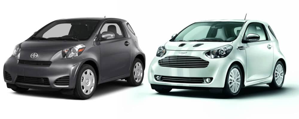
Aston Martin Cygnet and the Toyota Scion iQ are the same car with different branding

They are identical cars with different brand identities.

The Cygnet would cost £35,000+ if you bought it new from the showroom. The Scion iQ would set you back £10,000+ from the showroom.

That’s a large price differential for the same product. The reason for the different pricing models is as obvious as it is ridiculous.

  • Aston Martin is a luxury brand. Luxury brands are exclusive. To maintain the brand value, all of the products offered by the company need to be expensive
  • Toyota produces cars for the mass market. The cars they offer are affordable. To maintain the brand value, all of the products offered by the company should be affordable

Crazy, but true.

The foundations of a successful online company are based on many of the same underlying concepts we touched on in the product branding section. You need to understand your target audience and define your Unique Selling Points. Then create your brand guidelines, which covers everything from how you communicate your brand through to its visual representation.

For companies that rely on a digital presence, things like your URL become an important base for the brand. Most of the biggest companies on the net have easy to remember URLs.

“Securing the website URL has been an important part of the success of our company.  When you look at the other top calendar apps there’s a natural credibility behind calendar.com that draws people there first. We’re reaching more than 500k visitors a month with a high proportion of repeat visitors. Having an easy to remember name helps.”

John Rampton, CEO, Calendar.com

Calendar.com is not an isolated case. Tesla famously paid $11 million for its branded URL.

The final point to keep in mind with corporate branding is that you will need a periodic refresh. This is an opportunity to update the visuals of the company to make them fit with current design trends.
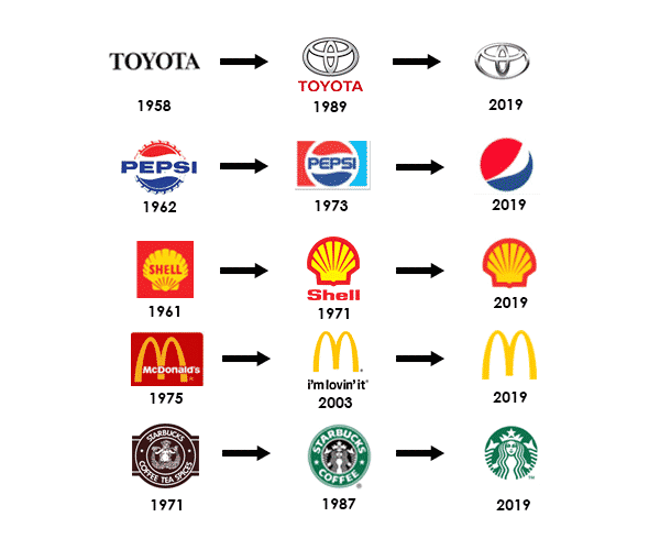
Product brand evolution examples

Image source: Branding Strategy Insider

A brand refresh offers a perfect opportunity to assess your brand values and positioning. Any brand refresh that seeks to reposition a company must go deeper than just a nice new logo.

3. Service Branding

Whatever field of business you’re in, one of your biggest challenges will be in ensuring that you deliver excellent service at all times. Service is all about the relationship between you and your customer or service user.

Your service is defined by the experience you provide your customer, whether they are calling your hotline, coming into your store, or meeting with you in person.

Some elements of service branding you will have control over and others you won’t. The graphic below is a nice illustration of the different moving parts that constitute the service branding model.

Service branding model

The rise of the internet has made service branding more complex as more communication channels open up. Maintaining the quality of your service across multiple channels is becoming the holy grail, and brand differentiator for many companies. This desire to provide a consistent service across multiple channels is known as omnichannel customer service.

Consistently great service builds a good reputation and strengthens your service branding. Ultimately, excellent service generally results in lower customer churn, which means faster company growth. It’s something that many companies are focused on at the moment, which is why omnichannel marketing is a buzzword in corporate circles.

4. Personal Branding

The concept of personal branding is often associated with public figures such as politicians, athletes, movie stars and social media influencers. This fame element is a driver of success for many successful entrepreneurs. Gaining a social profile can help business leaders land new clients and generate a fanbase.

The entrepreneur Richard Branson is a good example of a public figure who has spent a lot of effort creating a recognizable personal brand – fun, adventurous, disruptive, philanthropic – which is well known globally. His branding has rubbed off on some of his companies, which are all under the Virgin brand.

Another obvious example of someone who has a high public profile, which has both benefitted and negatively impacted his companies, is the Tesla CEO and SpaceX founder Elon Musk. Regardless of what you think of him, it is clear that he has hundreds of thousands of adoring fans who would purchase or support almost any product that he promotes. A nice example of this is when he generated $1 million selling branded Boring Company baseball caps.

You don’t need to be a billionaire to benefit from personal branding.
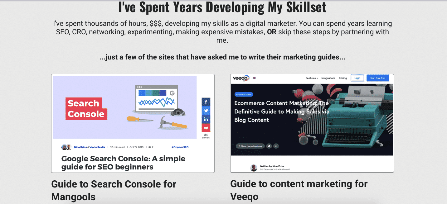
Company marketing guides produced as personal branding tools

I put a lot of effort into creating a body of relevant guides that reflects my knowledge of the marketing niche. This has helped me grow a comfortable five-figure business in less than 12 months around my SaaS consultancy services.

As a company or even an employee, you can benefit from personal branding. First, define what you want to be known for, then develop a strategy for publicly promoting yourself as an influencer in the niche. Depending on the niche you choose, it’s a lot easier than you might think.

5. Geographic Branding

Geographic branding seeks to attract people to visit or invest in a company or region because of a geographic association. Cities, regions, and entire countries practice geographic branding by capitalizing on the things that set them apart from other areas, such as tourist attractions or areas of natural beauty.
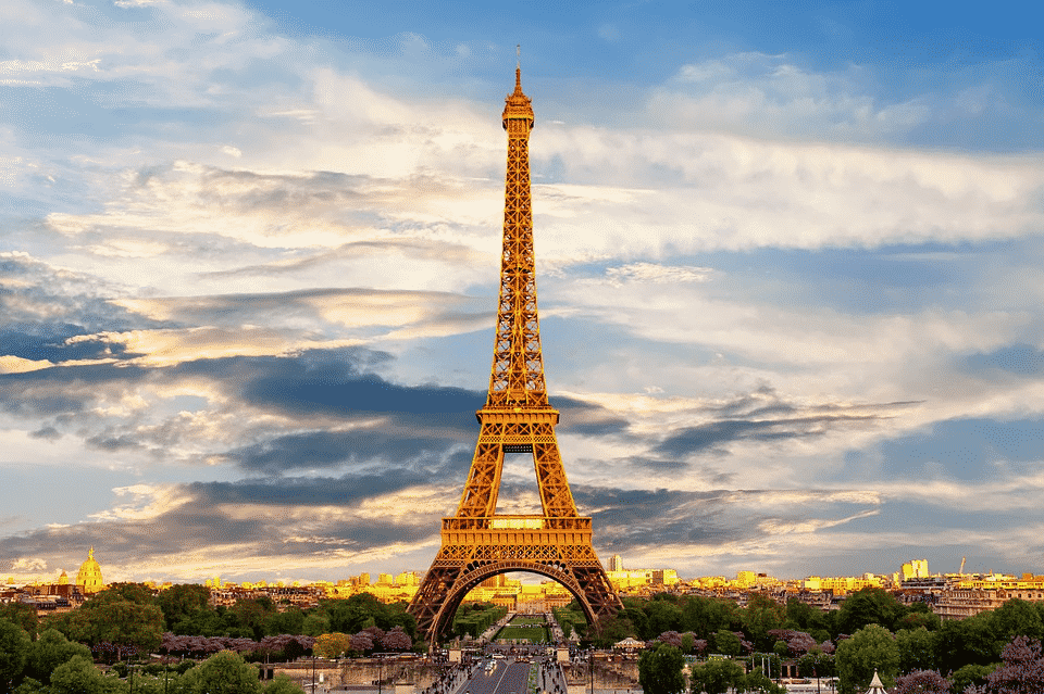
Eiffel Tower commonly used for geographic branding

Take the example of the Eiffel Tower. It’s instantly recognizable as a French national icon. Numerous businesses use the image of the Eiffel Tower to identify themselves as Parisian.

Companies can practice geographic branding to make themselves more attractive to certain demographics. A prominent example of this is vineyards in the region of Champagne that leverage geographic branding to sell their wines at a premium on the global market.

You can also apply geographic branding on a local level. For example, you’ll find many successful food producers offering a farm-to-table service that rely heavily on geographic branding.

6. Cultural Branding

Cultural branding seeks to build a positive shared identity and reputation for the people living in a particular place or of a specific nationality. It is closely linked to geographic branding. The two types of branding go hand in hand – a place’s geography influences the culture of its people, and human activities affect the place.

New York City, the “city that never sleeps,” is known as the world’s financial and commercial capital. But it is also one of the world’s cultural centers, influencing music, entertainment, fashion and art worldwide. The people who live there have a reputation for living a hectic, fast-paced lifestyle.

Again, companies can tap into cultural branding to boost sales. Take the example of Savile Row. The street is world-renowned as a place where rich British people go to get their suits. The tailors Gieves and Hawkes leveraged this cultural and geographic association to grow their business in mainland China.

7. Retail Branding

Retailers are the stores we all engage in our day to day lives. Many retailers sell products from many different manufacturers. In a supermarket, for example, you’ll find similar products from competing brands side by side on the shelf. Others sell only their own branded products.

Retailers strive to create a distinct brand for themselves. This is called retail branding. One of the most famous examples of an instantly recognizable retail brand is Apple. Their stores are often architectural works of art. The stores’ aesthetic design reflects the importance of good design for the company’s products.

Retail branding is complex because stores have layered objectives. For example, Amazon has a trendy bookstore in Seattle, which bears little resemblance to the enormous warehouses where most of its products originate.

Amazon bookstore in Seattle highlights retail branding

Image source: Amazon

As a result of changes brought about by eCommerce, the shops you enter only account for a small portion of total sales. Yet, these stores play an important role in how customers perceive a brand as they are the primary touchpoint for most people.

Whatever Your Field, Branding is Crucial

Many ingredients go into a successful branding effort. In this guide, we looked at seven of the most common types of branding. Each type of branding we covered is distinct. However, they share many of the same underlying principles.

A successful brand has acquired brand equity by living up to the standards that the brand represents. They can then subsequently build on this through brand association. Learning the different types of branding will allow you to position your product, business or service at the forefront of customers’ minds.

_

About the author: Nico Prins is an online marketer and the founder of Launch Space. He helps companies develop their digital marketing strategies and make money blogging.
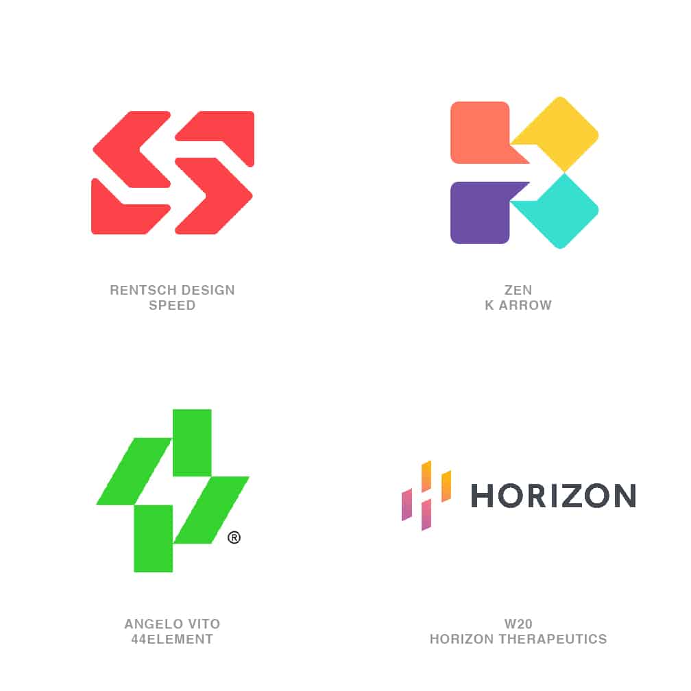
The World’s 20 Most Recognisable Logos & Their True Meanings

This article has been contributed by Andrew Simon.

It is impossible to ignore the significance of a brand’s logo.

You will see their logo everywhere, from their website and printed collateral to advertising and staff clothing. It’s the most salient part of a brand’s promotional activity both online and offline. A well-designed logo can give a company a unique identity and allows the target audience to quickly recognise a brand.

Plus, it’s no secret that companies are trying to beat their competitors in every way possible, from sales all the way to business logo design. They want to capture the attention of the largest possible audience and a successful logo will differentiate them from their competitors. That’s why they are investing a lot of money to commission logos.

Some logos are very straightforward and simple in design whereas some designers try to make them more complex. But the one thing which is common among logo designs is that every one is meaningful and tries to portray a message, without saying a word.

So, let’s look at some of the world’s most famous logos and their hidden meanings.


1. FedEx

Negative Space Logo FedEx

The logo of this American multinational delivery service company is popular for a number of reasons. One is a hidden symbol that not everyone knows about.

At first look, you probably won’t find the concealed message in this logo. But look at the white space between the letters “E” and “X” and you will find an arrow pointing right. The hidden arrow in this logo represents the speed and precision which FedEx provides to its customers by delivering parcels quickly and efficiently.

Even the different colors of the “Ex” in variations of the logo denote certain meanings. For instance, the letters appear in orange on express parcels, green on ground, red on freight, yellow for trade network and light blue for office.

2. Amazon

Amazon logo with arrow pointing from A to Z

From starting as an online bookstore to becoming the world’s largest eCommerce company, Amazon has seen remarkable success. Not only an online shopping site, Amazon now offers a range of latest technologies like an assistant and cloud services.

Like other companies, Amazon has made a number of changes to their logo design since inception. The logo now illustrates that they sell everything from A to Z via the orange arrow pointing from the “a” to the “z”. The arrow also represents the smile that customer will surely have after buying products from the store.

3. Baskin Robbins

Baskin Robbins logo has a hidden "31"

Baskin Robbins is the world’s largest ice-cream chain with shops across the globe. Burt Baskin and Irv Robbins partnered to establish the brand in 1945, which has become well known for offering a wide range of delicious flavors of ice creams.

The designers of the company’s logo, like many others, sought to communicate a specific meaning – and they succeeded. The logo uses a blue and pink color combination. However, if you look only at the pink forms, you will see the number “31”. This is the number of icecream flavors the brand offers, with the idea being that you can have a different flavor every day of any month.

4. Audi

Audi logo links symbolise the company's origins

Audi is synonymous with German auto engineering. Coming from a long history of mergers and acquisitions, the company’s logo points back to its origins. The four rings each represent the four companies that combined to form Audi’s predecessor company, Auto Union. These are Horch, the Audiwerke , DKW and Wanderer.

The latest revision of the company’s logo conveys the message of “progress through technologies”. The aluminum color of the rings reflect the brand’s innovative power. This simple yet modern design is eye-catching and imbues a sense of prestige.

5. NBC

NBC logo peacock faces right looking to the future

NBC is an American commercial radio and television network company with headquarters in New York. The brand’s logo designers cleverly crafted this logo to reflect specific meaning as well as to convey the brand essence.

When the peacock logo was first designed, color televisions had recently been introduced and NBC’s owner manufactured color television sets. So, they used an abstraction of a peacock to indicate richness in color, both to encourage people towards the network’s color programming and to buy color TVs.

In the latest update to the logo, the peacock’s head was flipped to face the right, suggesting looking to the future. The original 11 feathers were reduced to six, to represent the network’s six divisions.

7. LG

LG logo face represents the brand's connection with customers

LG is famous across the globe for its creative logo design. It is fairly easy to recognise the human face in the design. However, the “L” and the “G” may be slightly less noticeable in the features of the face. The face’s nose is the “L” and the face outline and the right eye comprise the “G”. This conveys the company’s approachability and connection with their customers.

8. Vaio

VAIO logo contains digital and analog symbols

Vaio is a great example of how you can convey a message using design. Being a well-known tech brand, they have incorporated analog and digital symbols into their logo. The first two letters, “V” and “A” denote analog signals whilst the last two letters, “I” and “O”, reflect a digital binary code. The way they have constructed the visual representation of this meaning is attractive and instantly triggers brand recognition.

9. BMW

BMW logo colours are derived from the State of Bavaria emblem

This German automobile company created aircraft engines before entering the car market. It’s for this reason that many people believe that the white and blue colors used in BMW’s logo represents a plane’s white propeller and a blue sky. Whilst this is not entirely correct, the use of the logo incorporated into propellers in the company’s advertising and BMW’s lack of an alternative explanation have turned this theory into a popular belief.

The logo displays the colors of the State of Bavaria, but inverse. At the time, it was forbidden to use symbols of sovereignty on commercial logos in a certain order, according to heraldic rules, thus BMW displayed them in reverse.

10. Cisco

Cisco logo incorporates the Golden Gate Bridge

Cisco, like many multinational tech conglomerates, was founded in San Francisco. The firm integrated this into their logo, which features the silhouette of the Golden Gate Bridge. The Bridge, which connects San Francisco to Marin County, is itself a symbol of connectivity. The same blue lines that feature the bridge shape reflect the company’s digital core.

11. Adidas

Adidas logo mountain shape represents overcoming challenges

Adidas is the second largest sportswear manufacturer in the world behind Nike, and is the first choice for many athletes. Like most companies, there have been a number of revisions to the logo over the years. However, unlike other brands, Adidas continues to use more than one logo.

Common across all logos, and an instantly recognisable visual identity asset, is the brand’s famous three parallel stripes. Also consistent across the logos is that the brand name starts with a lowercase “a”, symbolising widely accessible casual wear.

The “mountain” version show above is used for the sports line and is said to represent challenges to be overcome by focussing on the end goal, no matter what. The “trefoil” logo, sometimes thought of as the flower logo, is used for the brand’s original line, still manufactured today. Finally, the “globe” version of the logo is used for Adidas’s everyday style line.

12. Domino’s

Domino's logo features 3 dots representing the chain's first 3 stores

We all know that Domino’s is the world’s largest pizza restaurant with outlets across the globe. The logo shape is no mystery; a domino piece. However, what isn’t so obvious is why the piece has three dots on it. At the time the logo was designed, there were three Domino’s store locations. It’s lucky they didn’t attempt the update the logo to reflect new franchises, as the chain now has over 15,000 stores worldwide.

13. Mitsubishi

Mitsubishi logo denotes three diamonds in Japanese

The logo of the Japanese car manufacturer, Mitsubishi, directly represents the brand’s name itself. “Mitsu” means three in Japanese and “hishi” (or “bishi” as it is pronounced in this context) means water chestnut, which denotes a diamond shape.

The shape (and therefore brand name) is said to be related to the family crests of Mitsubishi’s founder and his first employer.

14. IBM

IBM logo redesign represents speed and dynamism

IBM’s seemingly simple logo uses only a single color and the brand’s name, and manages to successfully attract attention and trigger brand recognition. The logo, known as “Big Blue”, is one of the most iconic logos in the world.

Created by Paul Rand in 1972, the logo is one of very few to have remained unchanged in over 40 years. Blue was the chosen color to convey corporate sophistication. Prior to the redesign, the logo featured 13 horizontal strips, representing vibrancy and speed. The Rand redesign saw the number of strips reduced to eight, indicating speed and dynamism.

15. Pinterest

Pinterest logo features a white pin

This social media site has connected millions of people across the world. From the concept of pinning items to a bulletin board that are of interest, comes the name “Pinterest”. Therefore, it’s no surprise that the logo designers used a pin as inspiration. The white letter “P” in the centre of the red logo is an abstract image of a pin, so integral to the brand’s identity.

16. Unilever

Unilever logo contains 25 hidden symbols

If you look carefully, you’ll see the Unilever logo on a multitude of household products, from hair care and cleaning products to ice creams and soup sachets.

The blue “U” clearly stands for the brand name. What is less obvious is the 25 symbols buried within, each representing an aspect of Unilever’s business. For instance, a lock of hair represents the brand’s shampoos and a tea leaf their tea ranges.

17. Apple

Apple logo features a bite mark to differentiate it from other fruits

The first ever Apple logo, an image of Isaac Newton sitting under an apple tree representing the discovery of the gravitational force, only lasted one year. It was quickly replaced by the more strikingly simple but colorful graphic of an apple with a bite out of it. The hues highlighted the world’s first ever computer with a color display, the Apple II.

Why an apple? Some theories allude to original sin and others to Alan Turing, a brilliant mathematician, who died after eating an apple laced with cyanide. Steve Jobs simply claimed it was his favorite fruit. And the bite? This differentiates the apple from other round fruits and vegetables.

18. Nike

Nike Swoosh represents motion

The Nike “Swoosh” is perhaps one of the most recognisable logos in the world. The logo was designed in 1971 by Carolyn Davidson, a college student at the time. She was paid $2 an hour to subsidise oil painting classes, for a total fee of just $35. She was later paid with an undisclosed amount of Nike stock. Most commonly displayed in plain black, the shape represents motion.

20. Toyota

Toyota logo eclipses represent the company's customers, ideals and potential

The logo of Toyota is a great example of how you can craft a logo with hidden meanings. This multilayer logo surprised everyone with an eye-catching design of three ellipses.

The integration of the letter “T” is perhaps obvious. What’s not so easy to identify is that the inner horizontal ellipse symbolises customers’ expectations whilst the inner vertical ellipse represents Toyota’s ideal. The outer ellipse that encircles them signifies the brand’s global expanse and huge potential.

_

About the author: Andrew Simon is a content and branding specialist working with a renowned logo design company that assures an accurate and consistent brand message that is delivered to the audience. He loves to explore the latest technologies and trends.