This post has been contributed by Nick Kanter.
The history of the old cliche “a picture is worth a thousand words” is a murky and, honestly, boring one. However, this does not make it any less true.
Journalists know it. Politicians know it. Comic book artists know it. Marketers definitely know it.
When we are talking about landing pages, most of us still believe that copy almost exclusively drives conversions. In reality, however, visuals play a massive role. Some people would even say a more important one.
In this article, we will investigate the all-too-human reasons why emotional images and videos can be so effective in boosting conversions, how to do it right, as well as provide some examples of brands doing it right.
Research into Imagery in Marketing
To best illustrate why images and videos boost landing page conversions, we should take a look at years of research that paint a pretty clear picture.
Even if you used nothing but common sense, it is logical that people react more directly and emotionally to visual content than text. If you think about it, the existence of language (especially written language) is but a blip in the evolution of our species.
In other words, we will react to images on a more basic level, involving our emotions more directly than with language.
In his 2002 article, Investigating the power of imagery in marketing communication: evidence-based techniques, Dr. Alan Branthwaite drew from a trove of research on the matter to conclude the following in regards to the use of imagery in marketing:
- Images have a more direct connection to feelings and unconscious ideas
- Images have an immediate impact
- Images are perceived holistically (as opposed to in a linear-sequential fashion)
- Visual imagery is perceived and partially processed pre-consciously
As a result of the last point above, images affect our impressions of people and places without awareness, and their affective qualities (mood, feelings) are processed much faster than cognitive meanings.
The implications of all this on marketing are wide-reaching, making the use of images in marketing serve a multitude of purposes:
- Bypassing rational defences and evaluations (crucial in the world of increasingly cynical consumers)
- Fostering a richer, more direct emotional experience
- Clarifying goals and ideals
- Enhancing feelings of control and self-actualization
- Stimulating self-persuasion and self-fulfilling fantasies
From the standpoint of a marketer (or someone in charge of designing landing pages, for that matter), these simply cannot be ignored.
There is a sentence in Dr. Branthwaite’s article that perfectly sums up all of this, “In advertising, the expert use of images provides an effective route to building and sustaining customer relationships, providing it is done successfully.”
Of course, Dr. Branthwaite’s article (and a lot of his other work) is by no means the only research done into the role of images and video in advertising and marketing in general.
For example, a 1991 article from the Journal of Marketing Research by H. Rao Unnava and Robert E. Burnkrant called An Imagery-Processing View of the Role of Pictures in Print Advertisements provides a great overview of the topic and cites a number of studies and research.
You can also find an abundance of research conducted over the years by LightSpeed, now a part of the Kantar Group, one of the global leaders in market research. Their research also consistently shows the effectiveness of images in making an emotional impact that can boost sales (or, in our case, landing page conversions).
How To Choose The Right Image For Your Landing Pages
Of course, in order to benefit from emotional images and videos, it is important to play your cards right. This will ensure the most positive effects on your landing page conversions and avoid situations in which you actually get the opposite effect of the one you were aiming for.
Not All Landing Pages Are The Same
Before you start tugging on those emotional heartstrings of your landing page visitors, you need to do a bit of research and strategizing so that you can elicit the emotion that will most likely have a positive effect on your conversion rates.
There are a number of ways to approach this, but perhaps the most effective one is to turn to target visitors for a specific landing page and establish where they are in the sales funnel.
In his book Breakthrough Advertising, a legend of copywriting, Eugene Schwartz, puts the prospects (in our case, landing page visitors) into five different groups:
- Unaware – those who don’t even know they have a problem
- Pain-aware – those who know they have a problem, but don’t expect a specific solution to even be available
- Solution-aware – those who know solutions exist, who have started shopping around, but who may not be aware of what you have for them
- Product-aware – those for whom your solution has made the cut and who are considering it among a few options
- Most aware – those who have chosen your solution, but are still looking for more information on it before making the actual purchase
As you can see, most of these correspond very nicely with whatever type or form of a marketing-sales funnel you are using. Depending on which part of this funnel your particular landing page addresses, you will want to elicit specific emotions using images.
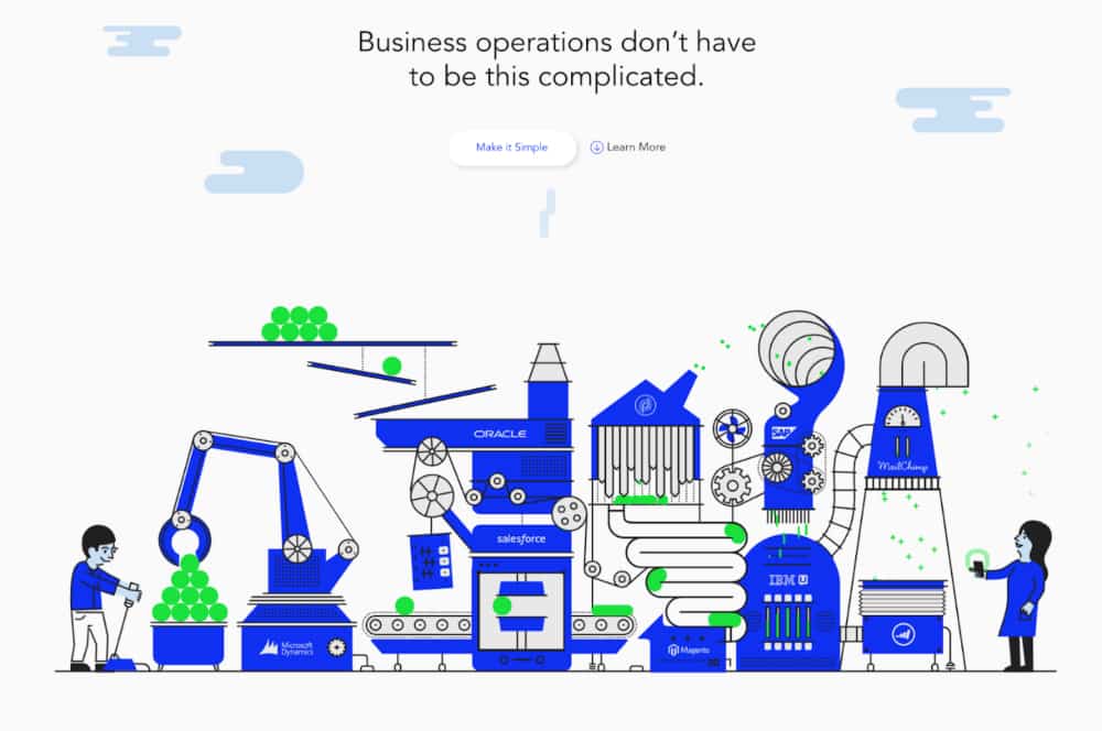
For instance, if your landing page addresses the first types of prospects, you might want to show you empathize with them. Heystack does this perfectly, showing immediately they understand how complex and difficult business operations can be.

Image source: heystack.is
By the way, this image is even animated on their homepage, making for an even more striking visual experience.
On the other hand, if your target page is meant for the fifth category (people who have already chosen your product), you might want to elicit emotions that will reinforce their decision, such as trust and confidence they’ve made the right choice.
Semplice does this well with their pricing page, which shows their different plans as physical products, sleek and modern, as simple as the offer itself.

Image source: semplice.com
Demographics Play a Major Role
It goes without saying that the demographics of your target audience will also influence your choice of imagery for boosting your landing page conversion rates.
To put it in the simplest terms possible, you will not target a segment of 45-65-year-olds with college education looking for travel insurance with the same emotions as a segment of teenagers who have only just heard of such a thing as travel insurance.
Smash.vc, for example, understands its demographics perfectly and shows this in the choice of image on their About us page.

Source: screenshot from smash.vc
They show that they understand the startup/VC culture with an amusing superimposition of a unicorn head on a man in a tuxedo. These are the people that speak the same language as startup founders. Moreover, the tuxedo and the cigar elicit the feeling of success and even envy, prompting startup owners to work with them (the copy is also 100% on-point here).
Capella University also does this very well. The combination image of a student exercising and studying from home while eating transports you to the experience of studying with them. You almost feel invigorated and ready to take a course this instant. It speaks to prospective students and, to a certain extent, their parents.

Image source: capella.edu
A Few General Tips For Landing Page Visuals
While you will want to think long and hard about your industry and your particular landing pages to get the most out of your visuals, there are also tips that are more general in nature, that will help just about any landing page.
Don’t Use Stock Photos If You Don’t Have To
A recent study has shown that visitors take notice of how much time and money was spent designing a website. In fact, it has shown that this has a greater effect on trust than some established trust signals.
One of the most noticeable signals of a haphazardly designed website is the use of stock photos that you see on every other blog and website.
In case you simply cannot invest in custom images, shop around and try to find stock photos that don’t look like something out of a 2006 website.
Show People
This tip has to do with our biology, which makes us respond positively to people and especially human faces. A study has shown that showing human faces on a website resulted in that website being more appealing and having warmth or social presence.
A great example of a website that does this well is Articulate, an e-learning platform. Their site is packed with happy people that make you feel you really become a part of a community if you do business with them. Even when they mention their customer support, they let you see the folks who actually do it.

Image source: articulate.com
Of course, this is not saying that you cannot elicit emotions without humans. For example, Amerisleep, a mattress and sleep company, does this by using simplified representations and a concise breakdown of the benefits and advantages of their products.

Image source: amerisleep.com
This is actually supported by the LightSpeed research that we’ve talked about, which showed that people recognize simplified representations faster than actual images of objects.
![]()
Image source: lightspeedresearch.com
Be Careful With Colors
There’s actually an entire science behind the use of color to affect people’s emotions, opinions, and decisions – color psychology.

Image source: red-website-design.co.uk
It should be pointed out that there’s no perfect choice when it comes to choosing colors for your landing pages. Different cultures will have different associations with colors, and people’s unique experiences will always add noise to the results. Still, some best practices can’t hurt.
Closing word

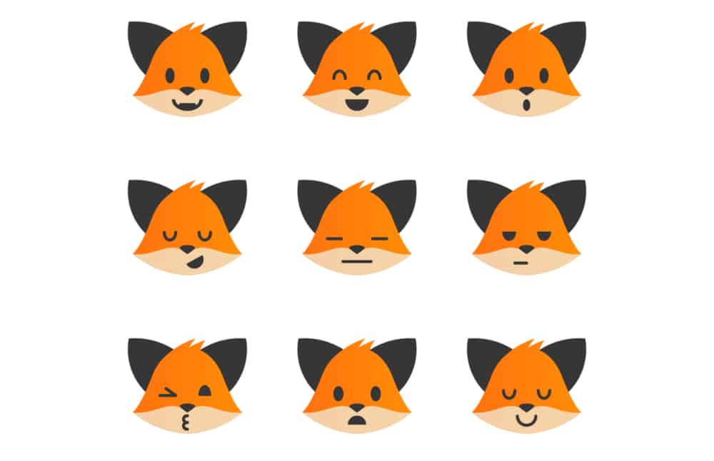
Image source: dribbble.com
There’s an abundance of research that shows incorporating images to landing pages will help boost conversions through eliciting certain emotions. It requires quite a bit of research and testing to be done the right way – but it can be done, to great results. So, dig into it, figure out what message you want to convey to your audience, and put in the work.
_
About the author: Nick Kanter from nickkanter.com is relentlessly focused on SEO and analyzing the search results. He is an operations connoisseur and has never seen a mountain he didn’t want to hike.
No comments:
Post a Comment