As designers, it’s always difficult to design for one’s self.
“You can’t read the label from inside the bottle”.
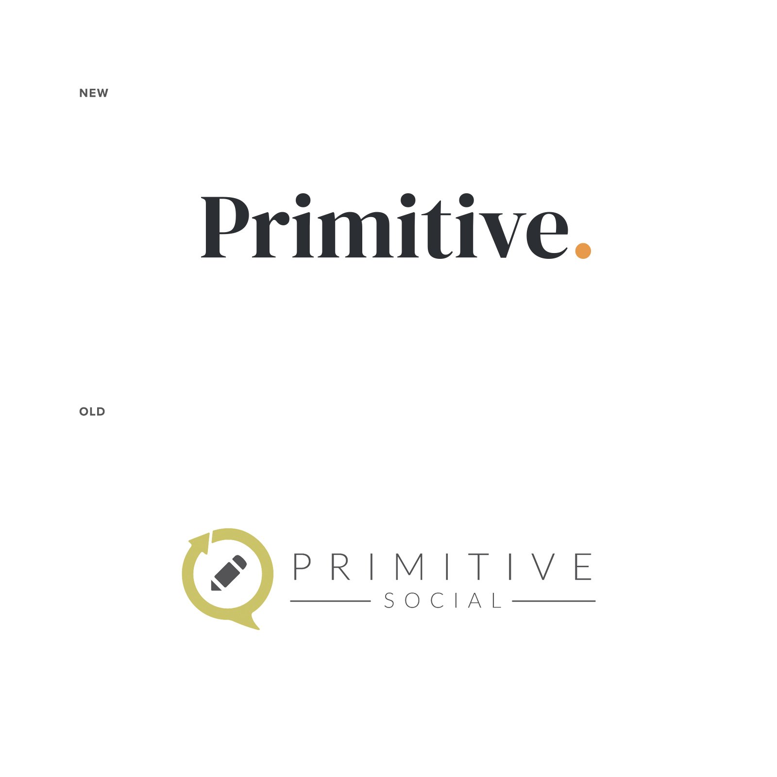
For this reason, Primitive (formally Primitive Social), a large digital solutions agency based in Texas, commissioned me for the rebranding of their agency.
The brief in short, was to create an identity that conveyed “old school character, dependability, durability, grit and endurance but with a modern mid-west vibe”.
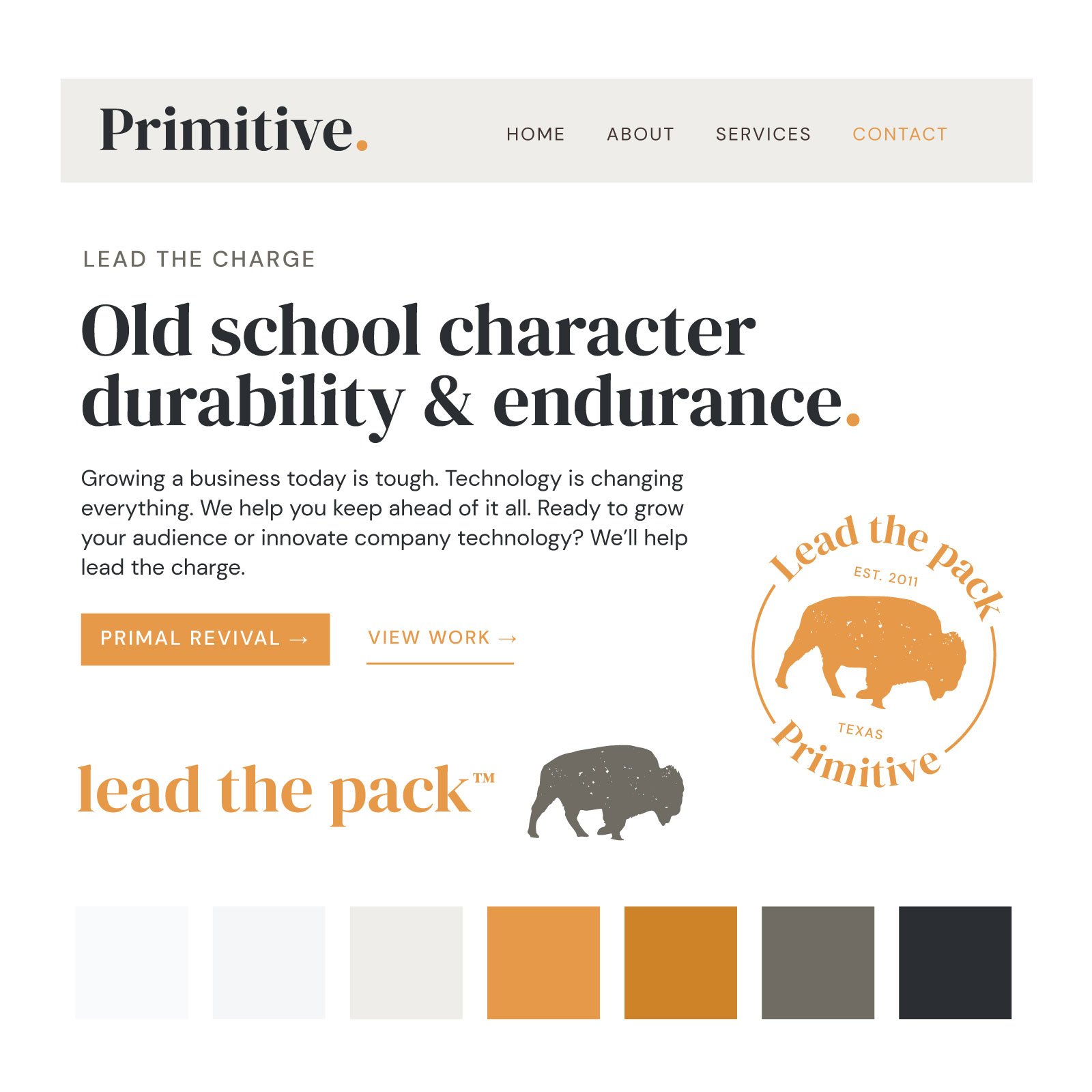
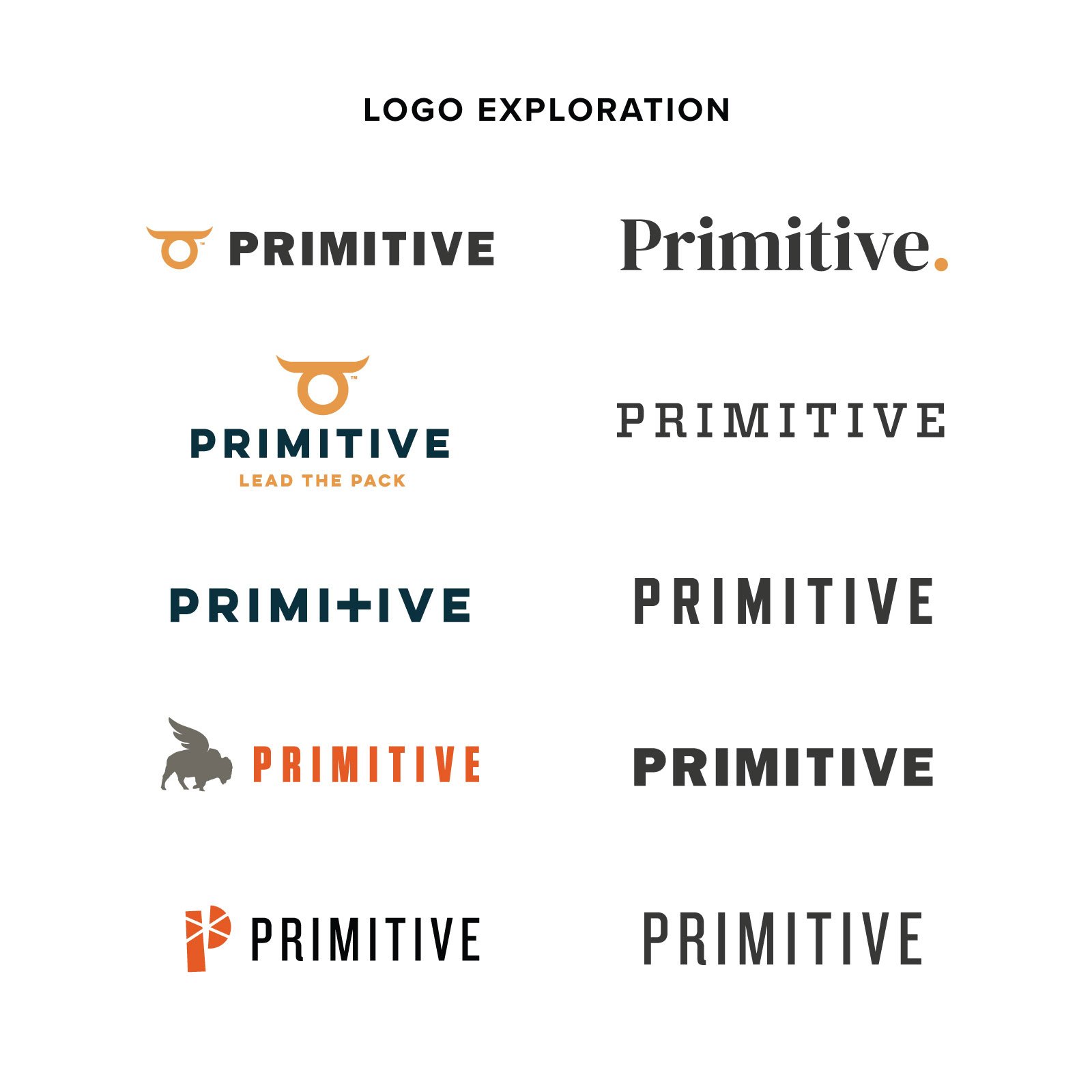
The solution was to cut the name down to just Primitive to be more reflective of their offerings. We then focused on typography to blend the old and the new, and a fresh color palette of warm neutral greys, browns and an earthy-orange was used to tie the whole identity together.
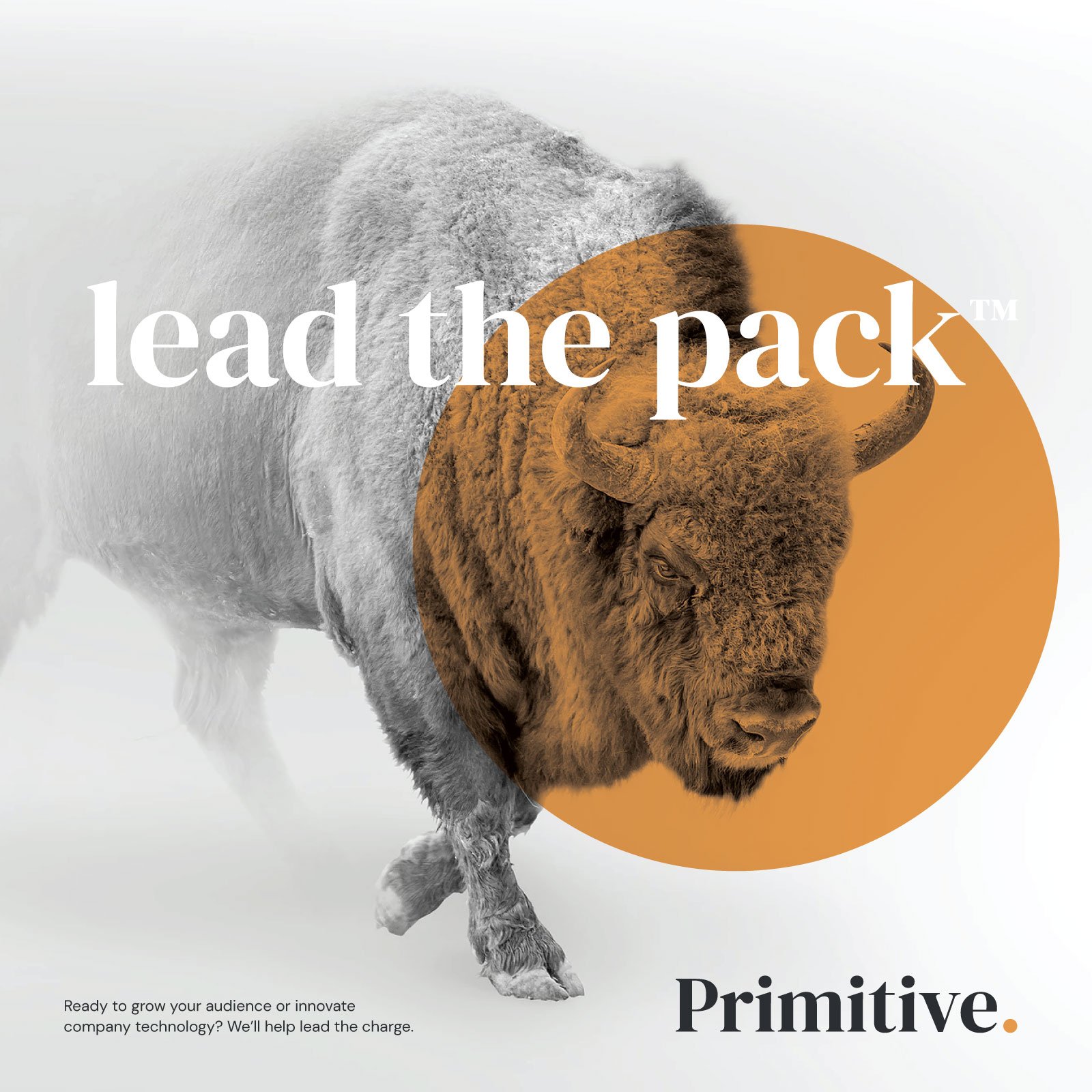
The bison was chosen as the core image of the brand as it’s one of the most primitive animals in the history of the American plains. The bison stands to represent: strength, stability, abundance, prosperity, and consistency.
The power of the bison is unmistakable. And so is the power behind the Primitive team. They lead the pack.
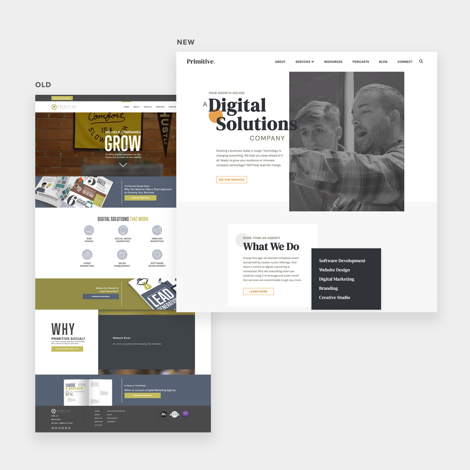
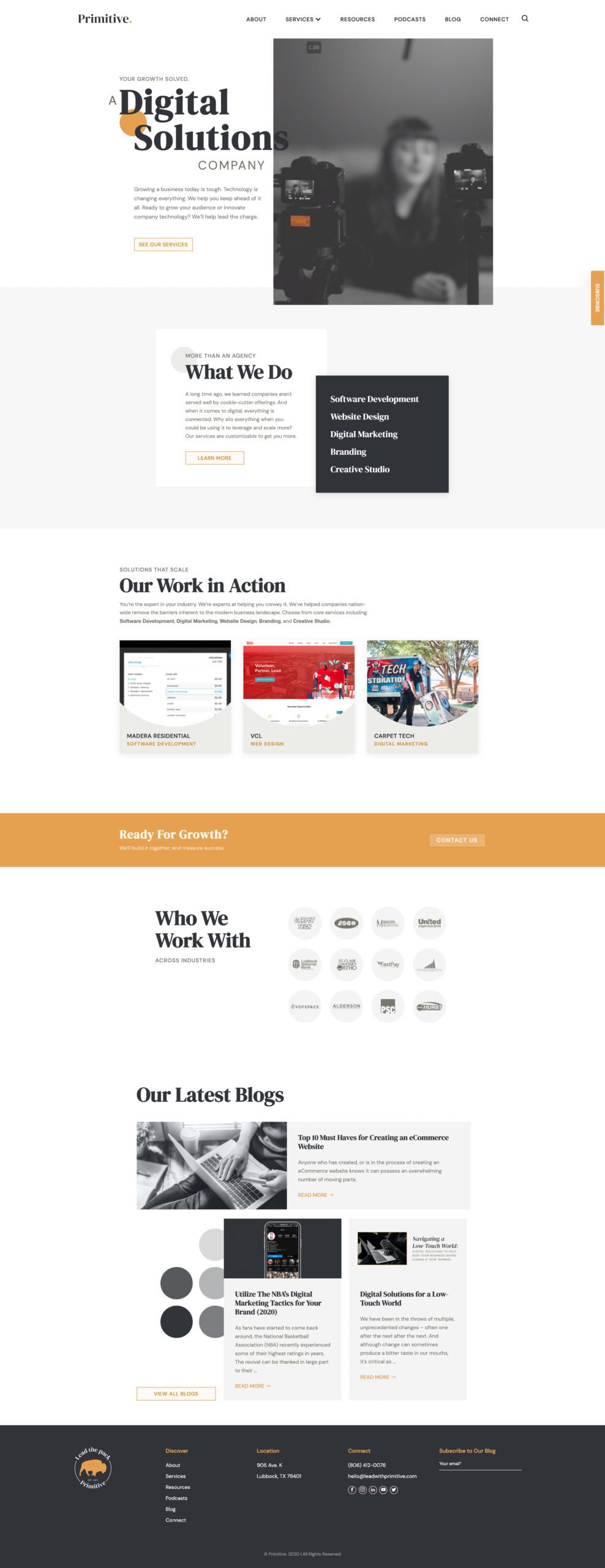
Check out Primitive’s new site, done in house.
Need a new logo, branding or strategy? Contact us.


No comments:
Post a Comment