This article has been contributed by Gabe Nelson.
If you’re like most graphic designers, you hate hearing the phrase, “Just work your magic.”
Without some specific guidance or any idea of what a client is looking for – or looking to specifically avoid – you could wind up wasting hours of design time without ever creating anything usable. And simply throwing designs at the wall and hoping some “stick” is probably something you’re not eager to try, or waste your valuable time doing.
Every web design firm will have different opinions on what they want their logo to look and feel like so there simply is no one-size-fits-all option when it comes to brand identity design. When you need a solution for a solid design right out of the gate, you need to have some idea of what is going to be a winner and what just won’t work.
Asking exploratory questions can be helpful but, when you want some truly inspirational visuals to ensure you’re on the same page as your client, the way to go is to work with them to create a mood board – sometimes known as a Stylescape.
Stop assuming what your client might want and get to work together to define the parameters of what they are looking for with a mood board – sometimes called a vision board. It’s a crucial step.
Don’t believe how important a mood board is? Here are the ways that a mood board can be a total game-changer and exactly how to go about creating and using one.
1. The Benefits of Using a Mood Board
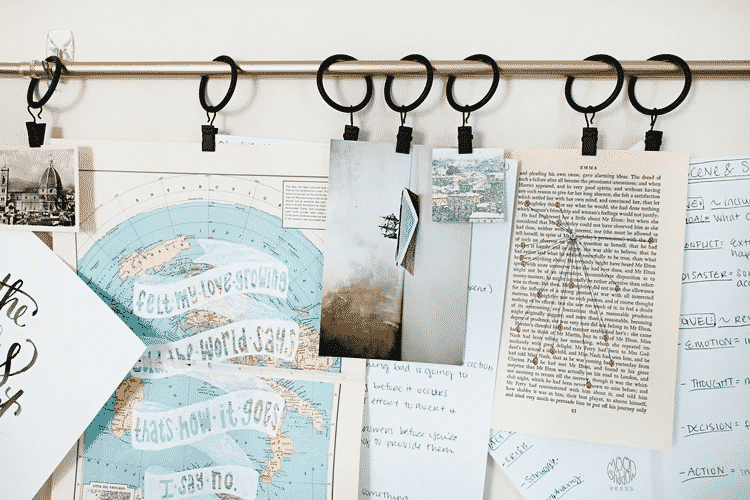
Nothing is worse than spending hours of your time working on a logo or brand identity, only to give the client some of your options and hear “Sorry, that’s not really what we were thinking.”
Many clients, even if they don’t realize it, have a solid opinion of what they do and don’t like in design. Using a mood board together gives them an avenue to communicate that to you, and gives you a sound jumping-off point to help your creative discussion.
Using a mood board for inspiration gets the team on the same page quickly. Once you both have the same idea of the right concept, you’ll be able to get work done with confidence you are on the right path toward designing exactly what your client is looking for. Think of the mood board as a way of brainstorming visually.
2. Agree on the Approach to Creating the Mood Board
Before you even think about putting together a mood board or creating a logo design, it’s essential to agree with your client on an approach to developing one. Discuss with them the benefits of having a mood board. Make sure they gain a solid understanding of how important it will be in terms of creating the best possible brand identity for their brand – efficiently and amicably.
If they don’t already have a mood board – which they likely won’t – discuss who will take the lead on developing one.
Some clients strongly prefer gathering their ideas and inspiration themselves and keeping that private until they’re ready to reveal the mood board to you. Others may wholly appreciate getting some help and creative input from you.
If they want to take the lead but they’re not sure where to start, you can guide a client’s mood board creation with suggestions of things that can help you be a more accurate designer. Ask them to include paint chips or colors, quotes or ideas that inspire them or their place of business. If they are a retail business, suggest that they put some of their products or photos of retail spaces on the board as well. The more information you can get, the better.

If, on the other hand, you are to take the lead on the mood board creation, start with some preliminary research. Without question, research can help create a solid foundation for a high-quality mood board – and guide your design choices before you ever sit down at your computer.
Think about what the client may be looking for. Who is their biggest competition? What is the primary audience? Getting peeks at their interior design and including samples from those choices on the mood board, can help point you towards a design-friendly mood board.
When you have these insights on a brand it becomes easier to bring solid ideas to mood board creation and guide the design process. Armed with your ideas, meet with your client for their feedback and discuss their ideas.
3. How to Create the Mood Board
But how do you begin creating a mood board? Mood boards can be created virtually, like on digital sites like Pinterest, or they can be created “old school,” by physically collecting items such as photographs, colors, and fabric samples then mounting them on foam core or tagboard. The idea is to visually display everything as a collection for a birds-eye view of the client’s preferences and big-picture vision.
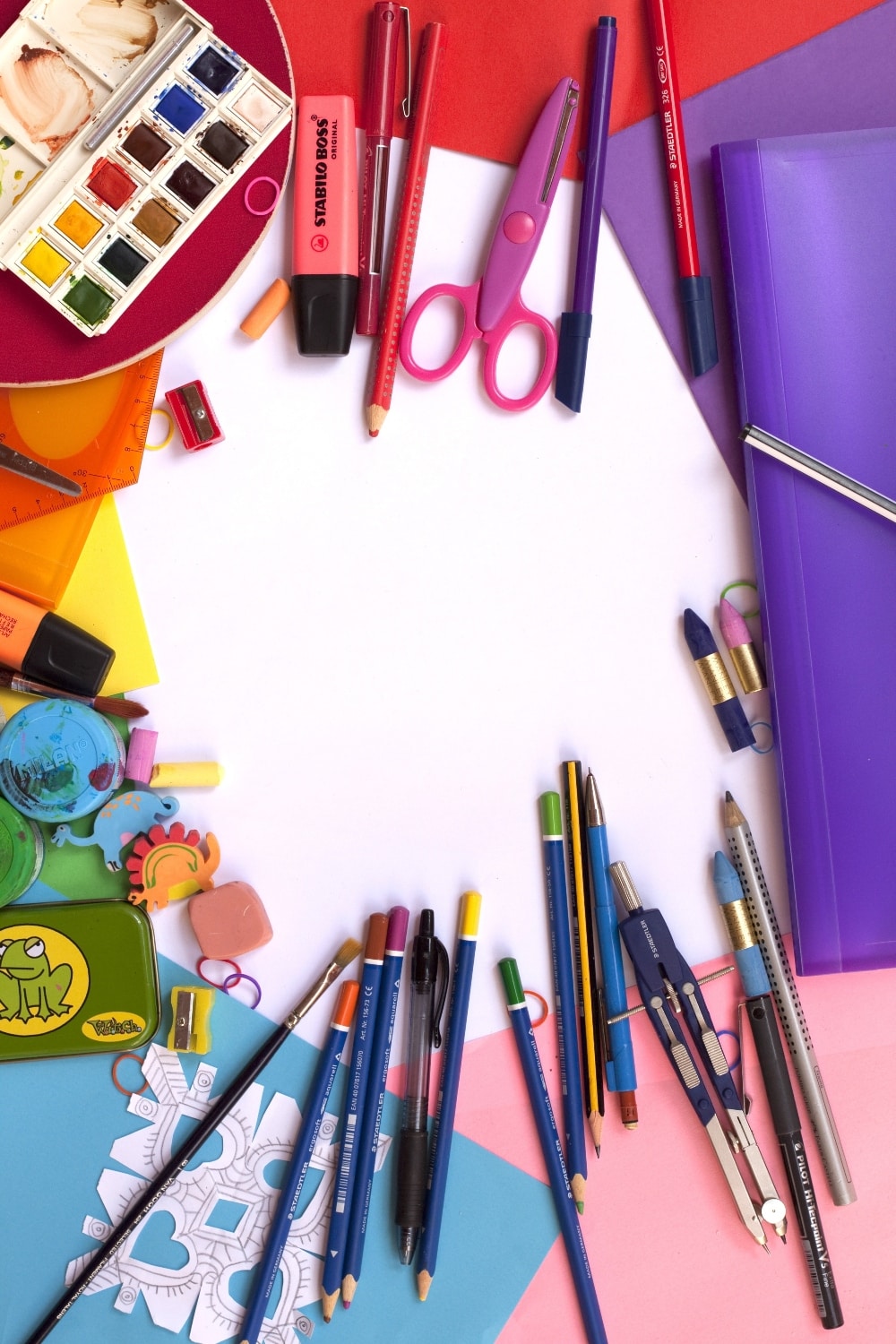
There are also apps that can help your client coordinate mood boards that make sharing easy. It may help to bookmark a few examples of digital mood boards for your client to look at as a model, in case they aren’t quite sure what a mood board is or what to include. Having mockup mood boards at the ready, and even the resulting completed design, can be strongly persuasive ways for clients to swiftly “get” the value of mood boards in delivering the vital information you need as a design professional.
It’s easy for mood boards to become a messy collage that is more confusing than helpful. But being able to sort through the examples of what your client is envisioning and hoping for can allow you both the benefit of getting on the same page and sharing a creative vision. After all, a mood board is as close as you can get to crawling into someone else’s mind.
4. Putting a Mood Board into Action
Once you have a mood board created, it can be difficult to know how to use it effectively during the brand identity design process. Luckily for you, a mood board already contains visual cues that can help you develop a brand’s important design elements. The leg up you can get from the mood board will help you design accordingly.
Also take advantage of the mood board to stay on track as you go. Of course, you should talk to your client about their brand identity wants and needs, but when you’re in the thick of designing and you aren’t sure about something, checking the mood board is a great guide and can even answer a lot of questions you may have.
Color
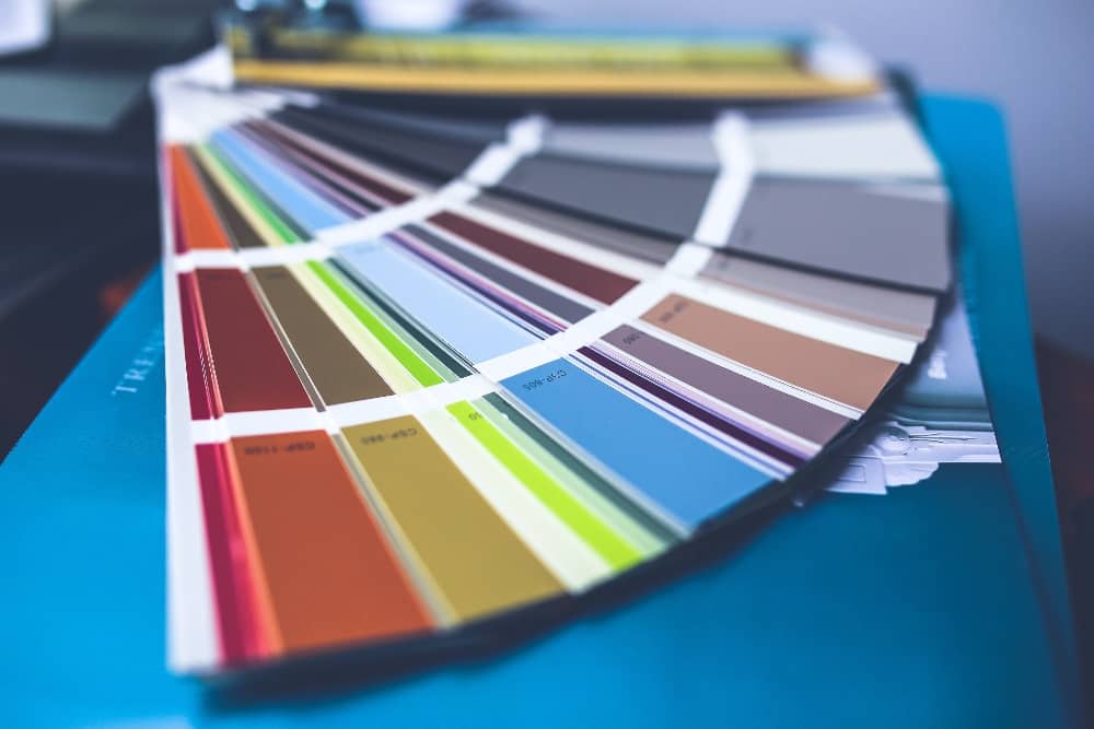
Mood boards are visual mediums that tend to take a very set direction when it comes to color. After all, color sets the mood. Whether a customer wants their business to be wild and passionate with reds, trendy like corals, or calm and serene with blues, a mood board will tell you exactly what a client is thinking. Color can be very important guideline when it comes to the basics of creating on-target design.
When you can focus your work on the color palette that shows up on a mood board, you can curate the brand identity or logo design to tap into the best emotions, and curate an excellent color scheme for the business. You don’t have to Pantone color match every part of the mood board, but using it as your starting point will definitely get your creations heading in the right direction with an eye-catching brand identity.
Shape
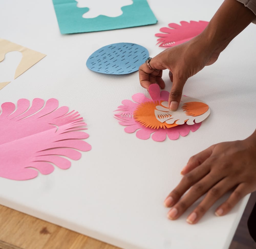
Most people who aren’t graphic designers don’t think much about the shape of things. In fact, if you asked your client what shape they wanted their logo to be, for example, they may not have any idea. But the mood board will also hold the key to the door of what shape style a client is likely looking for.
For instance, if the mood board is full of loose, natural elements, an organic shape may be the right choice. Organic-shaped logos may be more irregular or curved with unexpected design. This is in direct contrast with a more mechanical style. If their mood board is all sharp angles, metal, and industrial pictures, you will probably design a more geometric-shaped logo.
While shape and color are just two of the basic graphic design elements, they are certainly helpful factors to know in creating a winning brand identity. Matching the foundation of the design to the aesthetics of the mood board is just smart design. If you find a client’s mood board to be inconsistent, asking a few clarifying questions should help guide you in making the correct choices.
Typography
At the heart of any brand identity or logo design is the typography. While some major brands can pull off being recognized by a simple icon (think Nike swoosh) or specific imagery like Target’s iconic red target, most logos are going to need some sort of typography within them. The key to good typography is to execute the text artistically and within the confines of what a mood board suggests.
If your client’s mood board is full of quotes in handwritten script, you might want to choose a typeface that follows suit. Then you can have fun with it! Let your own creativity shine as you focus on kerning and text hierarchy in ways that blend the mood board’s tone with excellent graphic design.
Rather than shoot in the dark for the design elements you will want to include in your logo design, for example, the mood board will gather the inspiration you need for an easy leap into the perfect concept. Providing early draft options that you know land squarely in the realm of your client’s hopes and dreams (thanks to the mood board direction!) can eventually get you to the finished product faster.
5. Feel the Vibe
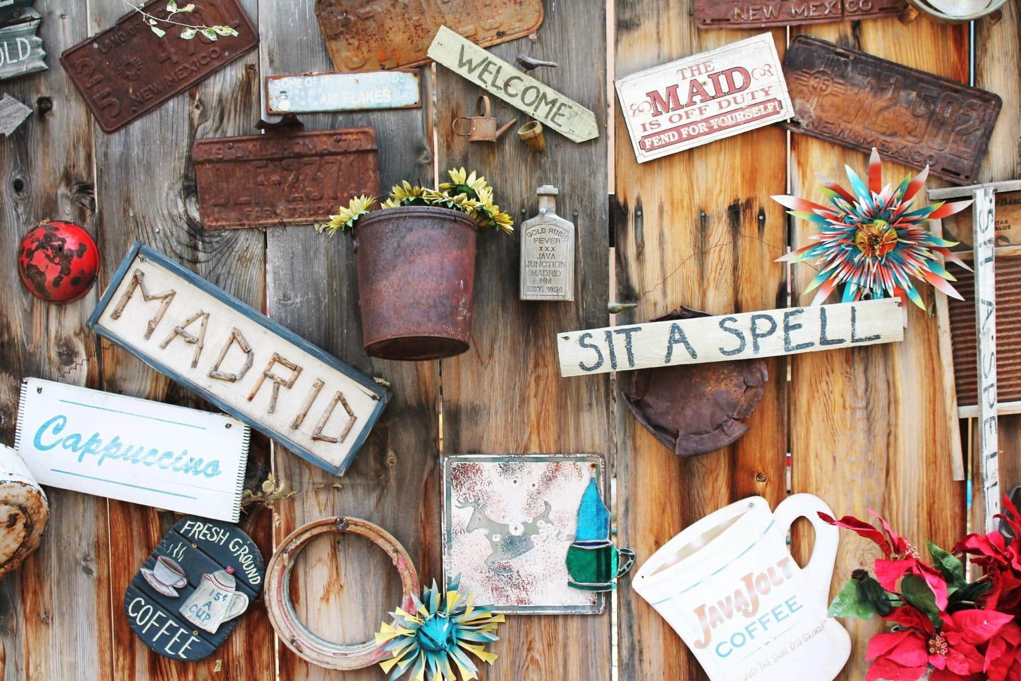
Is your client quirky? Are they playful? You’ll figure out your client’s fundamental nature right away when you have their mood board to use as your creative springboard. A lot of times clients don’t really know how to describe their business or articulate their visions. Often, clients simply request a logo design simply because they are about to open their business and want to check it off their to-do list. The more information you have, the better you can tailor a brand identity that best reflects their preferences.
Ultimately, the vibe of the business isn’t going to come from their words alone. In fact, you and your clients may have wildly different takes on the word “country” or “classy,” since there is no one way to design based on one word. Since a mood board is a visual medium, it is going to give you additional, contextual clues where words alone fail so that your graphic design concepts fit in seamlessly with your client’s business.
6. Take Educated Risks
Every single time you release a design into the world, it’s like putting yourself out there. Sometimes it makes sense to play it safe with design because you know everyone is going to leave pleased. You don’t have to hear any criticism and your client will like their new brand identity. But is a logo they like enough for you?
With a mood board to fall back on, you can take more risks with the individual graphic design elements to push yourself and your client to find the best possible logo for their business. Because you can get a feel not only for their likes and dislikes, a mood board also allows you a deeper glimpse into a client’s personality to drive your creativity and their expectations.
Offering several different designs for a customer to choose from – from several options that you love – can keep your portfolio reflecting your talent standards. Remember, your work history and samples are why your client chose to work with you in the first place, so there’s no reason you should have to play it safe when you can create the best possible brand identity for them.
7. Relationship Building
Not only is working from a mood board good for the design process, but it is excellent for building a relationship with the client. A mood board is a small piece of them, just like your design will eventually be of you. When both sides are open and honest with each other, your professional relationship will flourish.
Mood boards are the perfect way to allow a client to be engaged in the design process without having to look over your shoulder at all times. It’s not a pleasant experience to design for an audience so have your clients focus on their mood board, so you can focus on giving them what they want and creating the perfect designs.
Your customers will certainly be satisfied with the final results when they feel as though they have had some control and personal contribution to the final logo design. Having a mood board is the easiest way to get the feedback you need early and also give you specific guideposts you can use as justification for your finished product.
A customer who feels heard and is rewarded with a brand identity they love is going to tell their friends, which can help you grow your business and have some great references going forward. If your client ever decides to change their logo or they need other design work done – promotional mailers or branded products, for instance – they are going to come to you because they trust you already.
Conclusion
If you’ve never designed a graphic identity using a client mood board to kick-off your inspiration before, why not give it a try? You’ll be amazed at how much vision a mood board collection can bring to the design process. Being able to answer your own questions with a visual example of what a client likes and is looking for can speed up your overall design time and let you get quality feedback sooner.
A mood board can be an excellent way to refine your graphic design based on your client’s wishes. A mood board is a significantly lower investment than multiple designers trying to coordinate, or relying on your client to put their vision into words. Not only with their brand identity benefit but a mood board can also be used by their interior designer, commercial painter, and other professionals who might ultimately contribute to the final success of the business.
When you’re looking for a way to keep your brand identity concepts fresh and exciting, getting a client’s mood board can be the perfect solution. Mood boards can provide the groundwork for your creative concepts and help you build their brand in a better way. It’s really the strongest foundation for getting from inspired design concept to brand identity completion efficiently.
_
About the author: Gabe Nelson works with MAC Art.
No comments:
Post a Comment