This article has been contributed by Aslam Multani.
First impressions matter.
The first interaction a potential customer has with your brand is usually on your website. The way you design and develop your website can make or break your conversion rates.
If you see an increase in your website traffic but not in sales, then it is time for you to evaluate your website design. It really doesn’t matter what kind of company you have or what kind of industry you’re in, it really pays off to concentrate on the design of your website.
In fact, in a recent survey, 57% of respondents said that they would not recommend a business to their peers if it has a poorly designed website. Moreover, 88% of respondents in another survey stated that they are less likely to return to a website after a bad experience.
Hence, maintaining a website with good design and development is crucial for businesses – especially for small business owners. For small companies or newly launched enterprises, you may not get a second chance to encourage users back to your site if they don’t enjoy it the first time.
In this article, we will discuss the most important elements that you need to consider when developing your website to ensure that it converts.
1. Use Consistent Branding Throughout The Site
Never underestimate the power of branding. Your website is the best tool to build a brand and gain customer recognition.
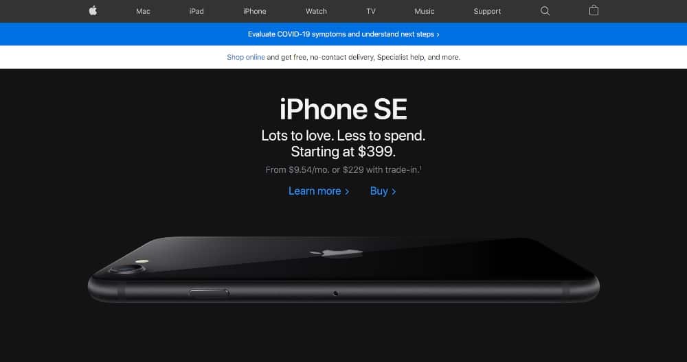
Apple has perfected the exquisite branding craft. It’s not only about the brand’s distinctive logo; every aspect of the Apple website expresses its value proposition: sleek style and advanced features.

On Apple’s homepage, you can see some of the main branding strengths of this tech giant:
- A unique logo, clear but not distracting and positioned in a traditional location
- A quick title and subheading conveying the brand’s current main message
- Stylish photo of the product
Before you start on a web design project, open your brand style guidelines and keep them close!
To inform the site’s narrative and tone of voice, remember that your website is your main medium for telling your brand’s story. Use it to your every advantage to connect with your target audience and inspire an emotional reaction from them.
2. Keep It Simple
User-friendly websites have better conversion rates.
It’s as simple as that. The minute you add unnecessary options and complexity too early in the user journey is the moment your conversions will drop.
Several websites attempt to squeeze as much material on their homepage as possible. They want to show off all their assets, programs, awards, associations, contact details and everything else that you can think of
If this sounds like your site, the first thing on your agenda should be to simplify your layout.
Having loads of details on your website is great, both for the customer decision-making journey and for SEO. However, don’t put it all on your homepage.
Take a look at Mint’s homepage below.

See how effective it is?
At the top of the screen, the menu bar has only four items. There isn’t much text, so browsing through the website and focusing on the important sections is really easy for consumers.
The header image has a strong focal spot on the call-to-action icon, which urges visitors to register. What’s more, they’ve highlighted that registration is free, which is always a good thing.
Even if you’ve never heard of this business, this homepage makes it clear what services they offer, without going into unnecessary detail.
3. Leave Plenty Of White Space Between Elements
White space — sometimes called negative space — enhances important elements, while preventing the site from becoming overly crowded. If multiple elements are placed too close together, a visitor is likely to get confused and leave the page immediately.
Hence, you should use margins and padding to expand the distance between photos, copy and other elements when creating a website.
4. Reduce The Number Of Choices You Offer Your Visitors
Hick’s Law says that the time required to make a decision increases if you expand the number of choices that you give a person. This concept is known as “analysis paralysis.”
UX specialist Paul Boag says, “The most successful way to motivate users to make a decision when confronted with daunting options is always to recommend a course of action.”
Hence, if you want to increase the conversion rate of your website, effective CTAs play a crucial role. Moreover, instead of offering multiple CTAs to visitors, just recommend one that is most relevant to that particular page.
For example, adding a ‘Buy Now’ button on a product page is sufficient. To urge visitors to subscribe to your newsletter, using a relevant CTA on the homepage or blog pages is more suitable option.
5. Focus On Speed

In today’s era, most people lead a fast-paced lifestyle, and are used to accessing the internet at 4G and now even 5G speed. If a website fails to load instantly, visitors are definitely not going to be happy.
Hence, speed impacts conversion rates tremendously. If your website loads too slowly it will ruin your conversion rate. A recent survey stated that 47% of its respondents expected the average load time of a website to be a maximum of 2 seconds.
If you have loads of photos, long text lines, complicated menus, lots of colours, animated elements and other needless items, your website will not load quickly.
Moreover, you can also make use of plugins to optimize the speed of your website. In this case, WordPress is an excellent CMS as it offers a wide range of plugins that ensure your website loads at an optimal speed.
6. Use High Quality Pictures
A visually appealing website is known to garner more conversions for a business.
Websites without photos tend to be bland, dull and a little unprofessional. But that doesn’t mean you need to go all out and add as many pictures on your site as possible.
As stated above, using too many photos will affect the loading time on your website, especially if they’re not optimised. Moreover, Google found that pages with a limited amount of photos have better engagement rates.
Hence, you should choose the best images of the lot and put those pictures on the website. Basically, consider quality over quantity.
7. Conduct A/B Testing
Let’s say you made a few improvements to your homepage and you saw a rise in your conversions. Excellent, job done!
Or is it? Are you sure this is the best result you can accomplish?
One of the easiest methods of finding out whether you could be getting even more conversions is to conduct A/B testing.
A/B testing, also known as split checking, means running different variants of the same website to determine which one has a better conversion rate. 50% of the traffic sees one version, and the other 50% sees another.
When performing these experiments, it is crucial that you don’t adjust too many elements between the two versions. Otherwise, you won’t know which change had an effect on the outcome.
You’re best off modifying just one thing on the entire page, be it the copy, image, colour, or location or phrasing of the CTA icon.
Once you’ve A/B tested one element and found the optimal solution, then go ahead and check other elements, one at a time.
8. Apply The Rule Of Thirds
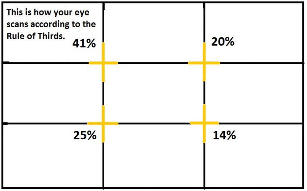
The ‘Rule of Thirds’ has been a vital component of the fine arts field for a long time. However, this concept is now largely used in web design as well.

The principle uses an overlay of two horizontal lines and two vertical lines which are equally spaced on the web page. The yellow intersection points in the image above indicate the areas that the human mind tends to look at first when looking at an image, whether it’s a picture of a landscape or a web page.
Knowing this, you can place your CTAs and other important elements in certain positions on the page, ensuring the visitor’s eye is drawn to the most important aspects first.
9. Use A Straightforward Call To Action
You can’t expect strong conversion rates if your CTAs aren’t glaringly obvious. This may seem like a given, but it’s surprising how many websites neglect the importance of CTAs.
In fact, very few websites have CTAs that are easily noticeable within the first 3 seconds of landing on the website.
People who visit your site are not going to waste time searching for the button that puts money in your wallet. If it isn’t clear, they are going to move on.
That is why simplicity is so critical, as discussed earlier. If your website has little to no distractions, the visitor’s eye is free to head right to your CTA.
Some examples of effective CTA text are:
- Sign up now
- Sign up today
- Join for Free
- Tap to read more
- Shop now to get 20 percent off
All of these are fantastic homepage CTAs. However, if they are all used simultaneously, they will most likely do more damage than good.
Visitors won’t know which one to click on, and conversions will be lost. Hence, rely on the text that is most successful for your site by carrying out A/B testing.
10. Optimize Your Mobile Page
It’s great that your platform runs perfectly on a laptop, but it’s not enough if you want the best conversion rates. You need to customize your website for smartphones and tablets.
Mobile optimisation is relevant for websites in every sector. But for eCommerce stores, it is even more critical. As much as 66% of eCommerce sales are made on mobile devices.
If you have a non-mobile focused eCommerce shop, you’re losing out on a large portion of potential business – maybe as much as two thirds!
Hence, right from web design through to development, every component of your website has to be crafted keeping mobile optimization in mind.
Google’s Mobile-Friendly Test is a good place to start to find out if your site could be doing better.
11. Compress Pictures To The Utmost
As we now know, the optimal load time for a website is only 2 seconds, but most websites load much slower than that.
Picture compression is one of the simpler, yet effective, approaches commonly used to decrease load time. You should not only upload photos that are no bigger than required, but you should also compress their size before uploading them to your site. There are plenty of apps and browser extensions that you can use for this.
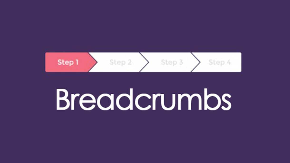
12. Add Breadcrumbs
Think about your website as a global listing of different destinations. A guest is free to choose any location, but they still want to know where they are and how they got there.

Breadcrumbs are like the signs that say “You Are Here” at the shopping mall. They inform you where the user’s current page is in relation to the rest of the website.
If a website visitor wants to move back two or three pages in a single click, they can do so using breadcrumbs.
On large eCommerce sites, breadcrumbs are particularly important. When you’ve got hundreds or even thousands of categories, you don’t want your visitors to get confused. If they cannot locate what they are looking for, they will leave your website.
Conclusion
If you’re happy with the level of traffic to your website but not generating enough conversions, it’s crucial to evaluate the design of your website.
Use our tips to streamline your site structure, optimise images and load time – particularly for mobile, and conduct A/B testing on important elements of your site. You should start seeing better results in no time!
_
About the author: Aslam Multani is the Co-Founder and COO at Multidots Inc, an Enterprise WordPress digital agency helping content publishers around the world.
The post How To Create A Website Design That Converts - Guide for Small Businesses first appeared on JUST™ Creative.
No comments:
Post a Comment