Sunday, 19 August 2018

11 Ways to Improve Your Website’s User Experience Design

This article was contributed by Les Kollegian.

In today’s digital market, customers have more options than ever when it comes to buying online. Nearly every product or service imaginable is available at their fingertips, which means that every online business must find a way to convince consumers to choose them over the other guys.

One of the best ways to do this is by offering an intuitive and positive user experience (UX). In fact, 71% of successful businesses believe that their superior UX is their top competitive differentiator that attracts customers.

What is even more incredible to note is the fact that customers are incredibly influenced by even the smallest of details, just one of the many UX challenges that web designers face.

With these facts in mind, you’ve probably understood why you need a kickass UX design for your website. Here are a few tips to keep in mind.

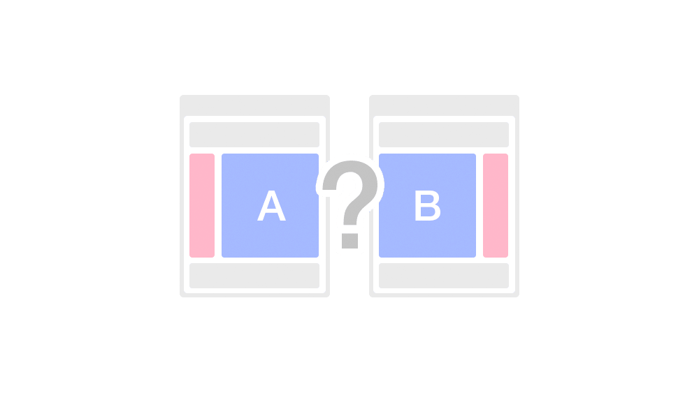
1) Perform A/B Testing Frequently

AB Testing

The key to creating a better UX is constant improvement, and that kind of innovation can only be supported by thorough testing and experimentation. A/B testing tactics are the best way to determine which adjustments are best for your website specifically. Even the smallest of changes can have a heavy impact on conversion rates, so be sure that your design team is constantly experimenting and comparing new concepts and ideas.

2) Reduce the Number of Website Pages

No. of Website Pages

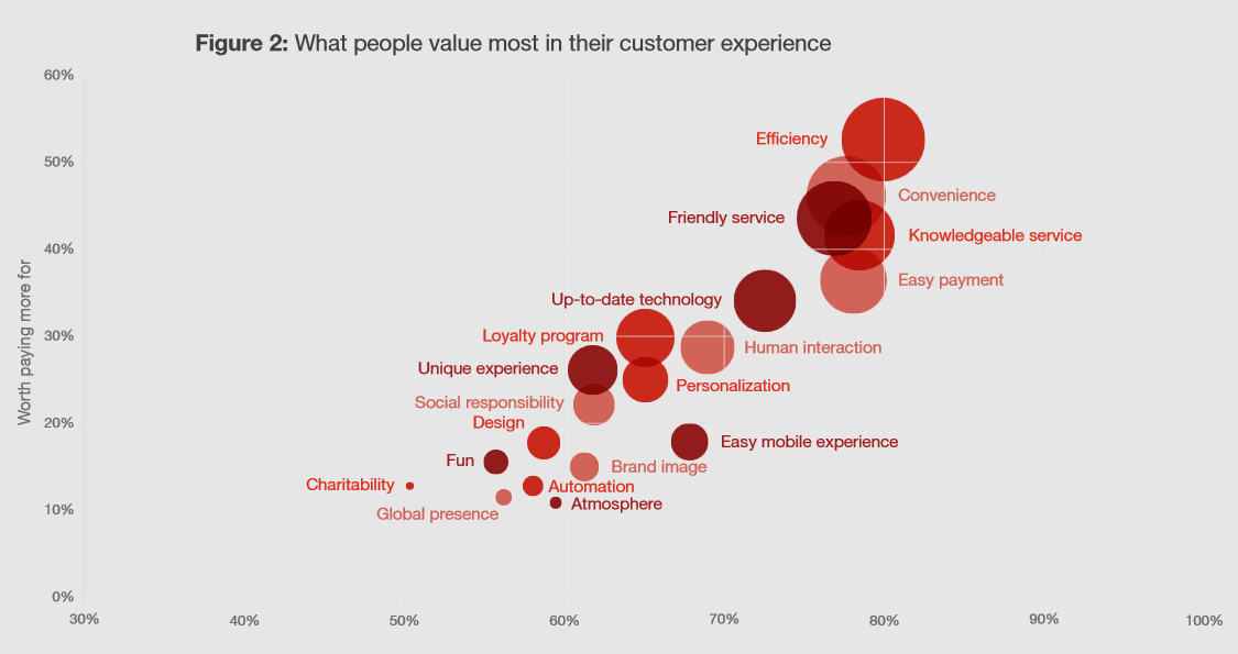
Efficiency and convenience are the two factors that customers value the most in a website’s UX – beating out service, technology, and even personalization. A website with dozens of pages for each and every bit of content is certainly not efficient, especially when someone is in the initial stages of the customer journey and is simply researching your organization. Simplify things by eliminating unnecessary tabs and always be sure that they never lead your customers to a dead end with no CTA.

3) Include Attractive CTAs

CTA buttons are fussy creatures. A few little tweaks here and there can boost or impact the click-through rate significantly. One case study found that when a website made their CTA button a contrasting color from the rest of the webpage, it had 122% higher click rates.

The placement is also very important to keep in mind. In general, the closer to the top of the page, the better the button will perform. Of course, your team should do some experimentation here to see what design changes perform best with your visitors, but keep in mind that even a little change (i.e. font, color, moving graphics, etc.) can have a big impact.

4) Pay Attention to Website Security

Website Security

One of the main reasons that a customer will abandon their cart or leave a webpage is because something scared them off. And for good reason; the number of data breaches continues to rise every year, so consumers are especially skeptical and concerned with the safety of their personal information.

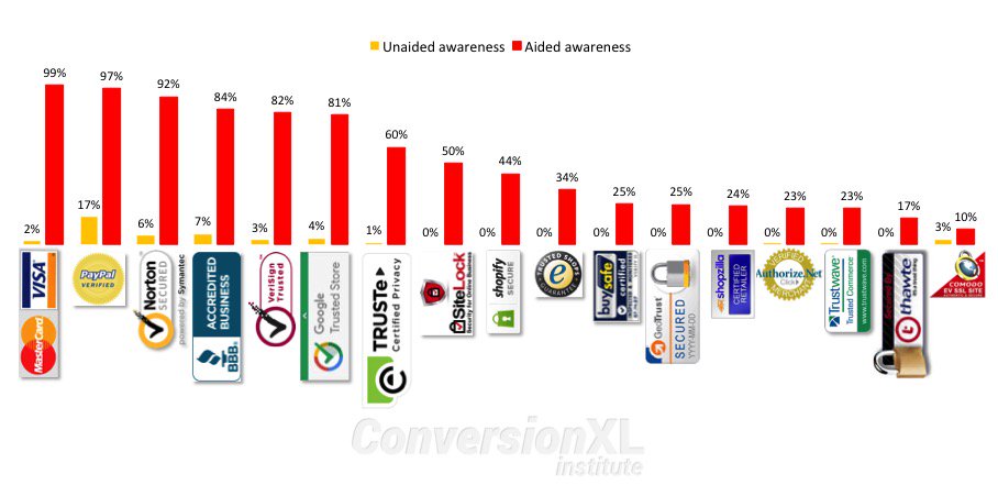
Obviously, the safety and security of your website should be a top concern to your business as well. If you don’t have a security system in place yet, get one. Then be sure to clearly display your security features with trust badges throughout your website – especially on the checkout page. When customers see a security badge on an ecommerce site, they are more likely to buy.

5) Beware of 404 Errors

404 Errors

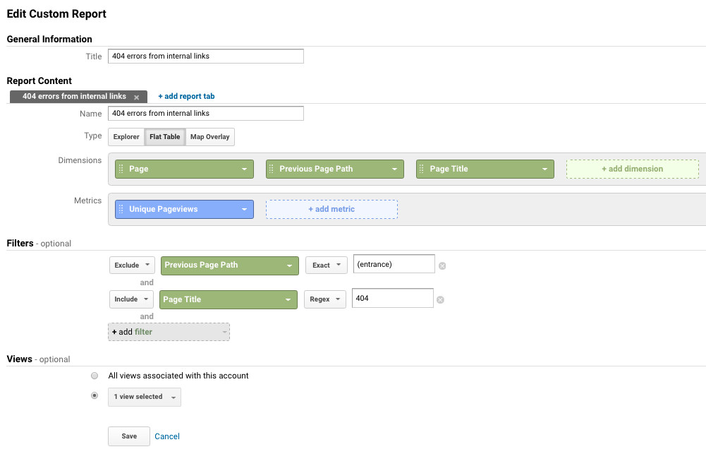
Want to know the best way to get rid of your customers? Lead them to an error page. 74% of customers who run into a 404 error will immediately leave your website without a second thought. There are plenty of monitoring tools out there, but just a simple check with Google Analytics data can show which internal and external links are broken.

6) Use Adequate Images and Videos, but Provide Ample Whitespace

There is no debate when it comes to visuals on your webpage. Including a video on a landing page can increase conversions by 80%. Product images have been statistically proven to increase engagement and conversion rates, but balance is definitely key when it comes to a smooth UX.

Heatmap

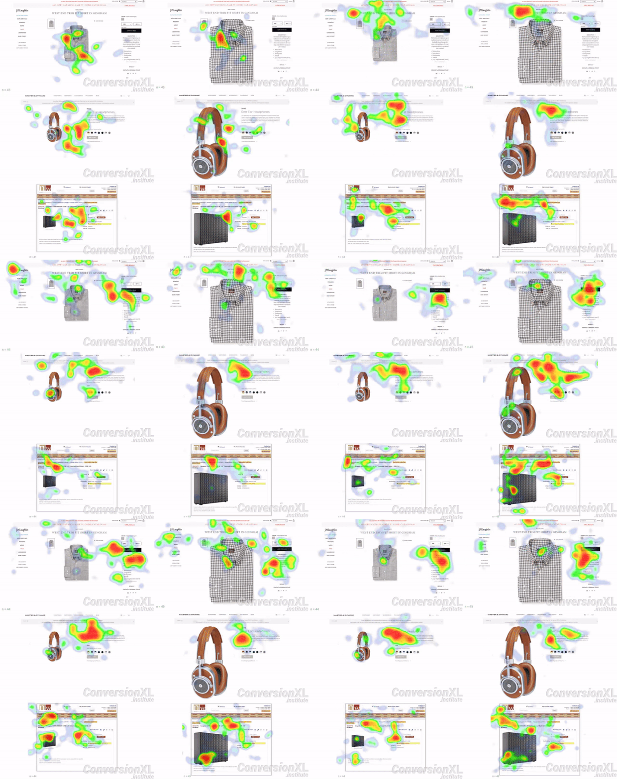
A little bit of whitespace goes a long way, and remember it doesn’t necessarily have to be white. Business and text-heavy landing pages can be overwhelming to a visitor’s eye and they don’t know where to focus their attention. Instead, cleverly-used whitespace can be very powerful in guiding eyes along the page right to the CTA button for better conversions, as you can see from this heatmap study. The page on the left has far more whitespace usage, and as a result, customers are naturally drawn to the contrasting black CTA button.

7) Focus on the Flow

Your website is there to take your customers through the buyer’s journey, hopefully ending in a conversion. Therefore, every piece of it must have a flow that makes sense. Interestingly, one study found that 46% of customers found it incredibly annoying when a website “lacked a message” – and this was the most common reason that they exited the platform altogether.

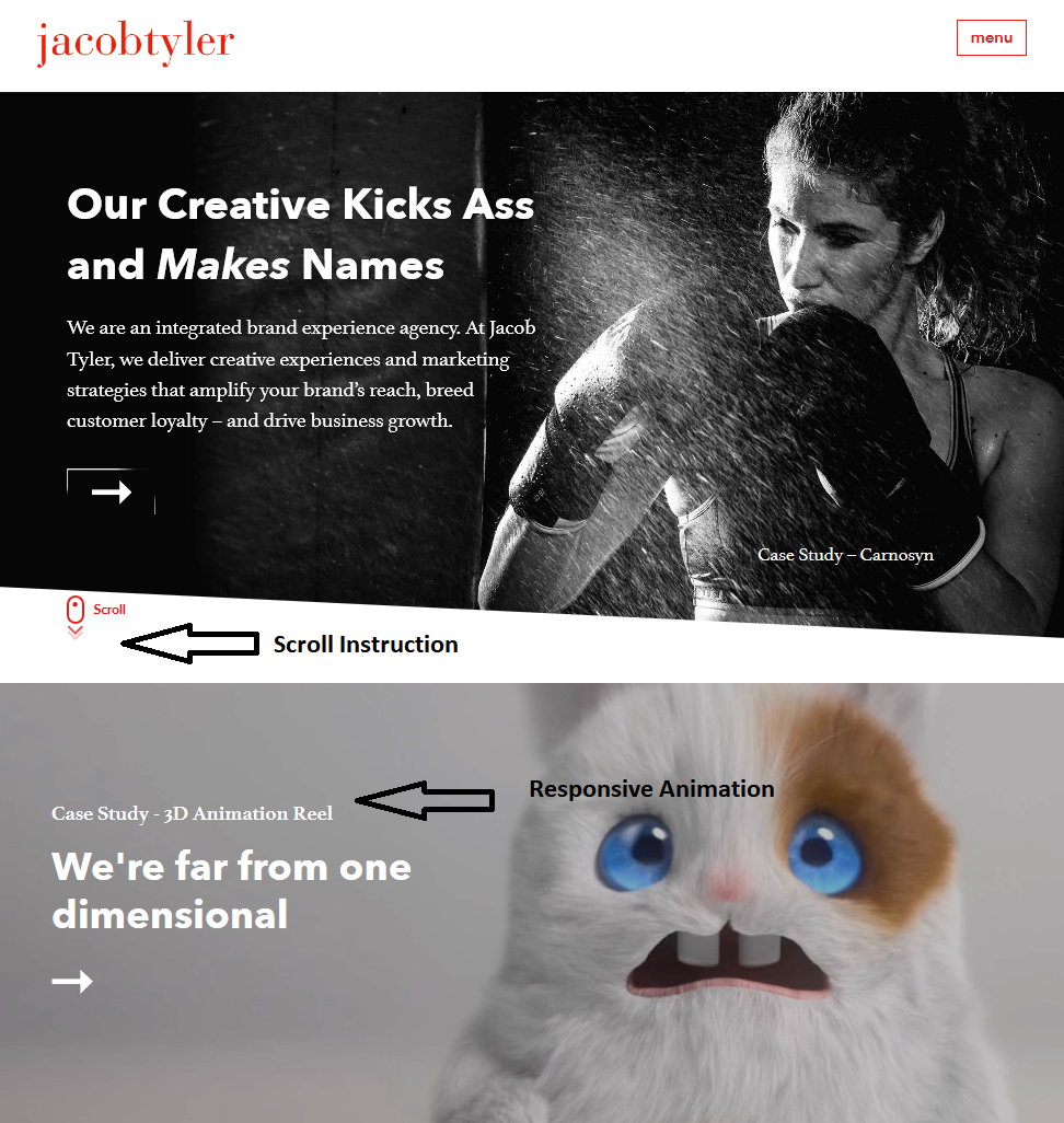
Again, proper usage and placement of CTA buttons is incredibly important here. Take the homepage for this San Diego website design company as a perfect example. It literally spells out how to interact with the website, and each tab offers responsive animation when the mouse hovers over the CTA.

JacobTyler Site

Your customers shouldn’t land on a page and wonder what to do next; create clear steps towards their next move and include content that supports each stage of the customer journey for a smoother UX.

8) Colors Matter

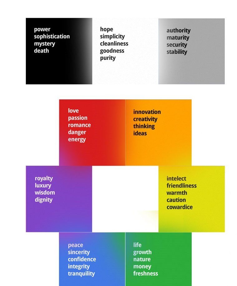
Colour Guide

Colors carry a whole lot of meaning when it comes to branding. A recognizable color scheme can increase brand recognition by up to 80%. According to psychological studies, customers associate various meanings to colors when they are used by a brand. For example, lots of blue evokes confidence and honesty while orange is viewed as innovative and creative. Be sure to use the colors that support the type of branding message you want to communicate to your audience.

9) Make It Responsive and Easy to Navigate

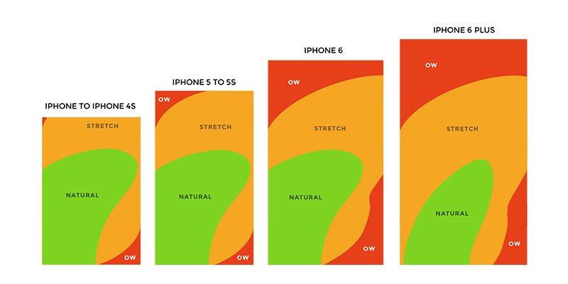
Responsive form

Over half of your website traffic is most likely from a mobile device these days, so smartphone compatibility is critical. An unresponsive website design will turn away as much as 80% of organic searches if it doesn’t adjust to their screen size or support mobile-friendly navigation. The key here is to simplify and enlarge.

While your website may have a lot of navigational options clearly displayed at the top of the page, this design is not so great on a small phone screen. Instead, opt for larger CTAs, fold down navigation, and be aware of the natural use patterns for phone screens for optimized placement.

10) Faster Loading Times Are a Must

According to findings by the Nielsen Norman Group, website visitors typically leave it within 10 to 20 seconds.

What’s more?

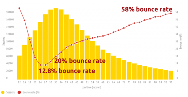
Bounce rate

If Statisticbrain.com is to be believed, the average person’s attention span is just 8 seconds and only 28 percent of words are read on an average web page. Therefore, quick loading speeds are a necessity. Every single second that it takes to load your site matters, and anything over 3 seconds could be enough to send them searching elsewhere. Stay on top of your website’s loading speeds and optimize the graphics and pages that could be slowing it down.

11) Conduct Site and Usability Audits

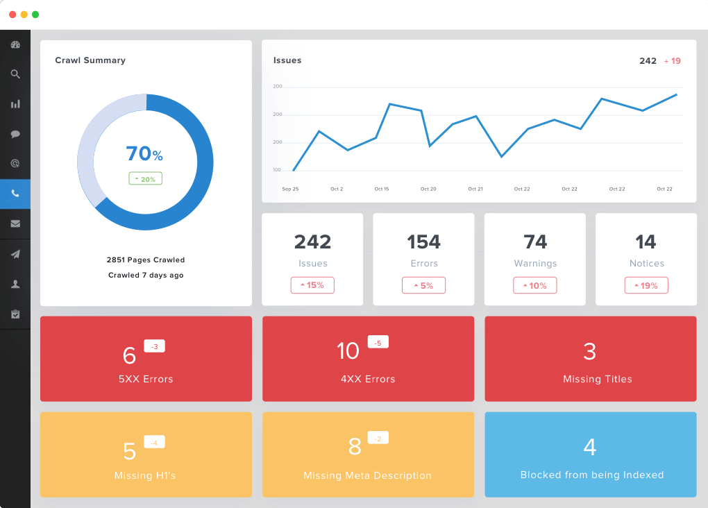
Site-auditor

Your business’s website will never truly be “finished.” There will always be room for improvement, especially as new trends emerge. There are several ways that your team can conduct UX audits regularly to ensure that your customers are constantly satisfied with their experience. Be sure to stay on top of your customer reviews and look for patterns regarding the UX of your website, or send out surveys to customers asking them to rate the usability. For a more technical approach, you can try a UX auditing tool that will gather analytical data to identify the areas that need improvement.

Conclusion

According to PwC’s research, nearly one-third of customers will abandon a brand after a single bad experience. Furthermore, 54% of consumers are unsatisfied with the UX from the majority of online brands.

Your customer’s happiness should be a top priority, especially once you realize how much rides on their online experience. Keep these tips in mind and see what areas of your website could use a little improvement.

(Image credit: 1, 2, 3, 4, 5, 6, 7, 8, 9 & 10)

Les Kollegian is CEO of Jacob Tyler, San Diego’s Top Web Design & Branding Agency specialized in Web design, user experience, brand development, marketing strategy, and digital marketing.

Top 10 Best Monitors for Graphic Design in 2018

In order to provide your clients, the best possible work that you can produce, making sure that the technology you are using meets those standards as well is important. Especially the monitor you’re using in your design work.

Professional graphic designers should look for monitors that can give them the best combination of extreme performance, the highest resolution available, and has the latest options available when it comes to connectivity with the other equipment you use.

Related: See here for the best printers for designers and the best laptops for designers.

With such a specialized set of needs, many of the best monitors on the market for graphic designers are not available at your local electronics store sitting on a shelf. Products such as these are typically referred to as professional quality and the combination of features and price point sets them apart from standard monitors you can buy anywhere else.

While improvements in technology have made monitors better than ever, the change in resolution to 4k has risen to the forefront, making them the most often choice of monitors for creative use. The improved resolution helps provide graphic designers wirh a better idea of the work process, while larger screens are much easier to use.

While there may be a litany of choices out there, today we’re going to look at the top monitors for graphic design. If you’re ready, let’s get started with what you should be on the lookout for so you can make sure you choose the monitor that’s best for you.

How to choose the right monitor for graphic design

Before purchasing a monitor for your graphic design needs, you must consider resolution, screen size, color accuracy, connections, ergonomics and price.

How to choose a monitor

Resolution

It seems as though every few years, a new resolution for computer monitors comes onto the market, further blurring the line between what’s on your screen and reality. With pixel resolution, more is obviously better. This is especially true if the kind of work you are doing has a lot of high details you need to pay attention to. The best resolution available at the moment is Ultra-High-Definition (UHD), also known as 4K. These monitors offer the highest available resolution at 3,840 by 2,160 pixels which is twice the pixels found in a 1080P monitor. From there, the highest resolution available is Wide-Quad HD (WQHD) which has a pixel ratio of 2,560 by 1,440 pixels, otherwise known as 1440p. A point to keep in mind is that as the resolution of the monitor gets better, the cost of the monitor will relatively increase as well. A 4K monitor will cost a significant amount more than a typical Full HD (1,920 by 1,080 pixels), 1080p monitor.

Screen size

Yes, size matters. Especially when you are working with images that are highly detailed and have an ultra-high resolution. Unfortunately, we’re all limited by the size of our workspace when it comes to the size of the monitor that we ultimately buy. The goal is to maximize the real estate that you have for your monitor as much as possible so you can view multiple projects on a single screen. If you choose to go with a monitor that is either UHD or WQHD, you will want to try and find a monitor in the 27 to 32 inches range but if you work in an office where you may use two or more monitors, you may want to consider buying a 29-inch, ultra-wide WQHD monitor that can provide you with a screen with an aspect ratio of 21:9.

Gray-Scale and Color Accuracy

Before a graphic designer sends their project to the printer, they want to be sure that what comes out will look the same on the screen first. This means that they need the colors to be displayed extremely accurate on the monitor they’re using. Monitors with high-end technology including an Advanced High-Performance In-Plane Switching (AH-IPS) panel. The monitor that you choose should have a look-up table (LUT) of either 10-, 13-, or 14-bit which will allow you to make frequent calibrations and should also cover at least 99 percent of the Adobe RGB color space.

On the market today, there are many professional-grade monitors allow you to maintain the color consistency by using the monitor’s hardware and software tools or through the use of a third-party calibration which you can buy separately. Any PS panel that is worth the money shouldn’t have any trouble displaying shades of dark gray and light, which help to determine the level of shadow and highlight detail that you’ll be able to see on the screen. PS technology also helps to provide you with wide viewing angles on your monitor. PS panels can deliver solid color fidelity as well as luminosity when you are viewing them from the top, bottom, or sides unlike twisted nematic or vertical alignment panels.

I/O Connections

For those who may not know, I/O connections are the ports on the monitor that allow you to hook it up to your computer tower. To give yourself the best options for connectivity, the monitor you choose should come with HDMI, dual-link DVI ports, and DisplayPort 1.2. However, if the work you do will benefit from having multiple monitors and linking them together to give yourself one continuous display, you’ll want to consider a model that comes with either Thunderbolt-in and -out ports or a DisplayPort 1.2 in order to make it much easier.

If you have to have the very best monitor out there, which would come with UHD (4K) resolution, in order to achieve the best resolution that the monitor can display, be sure that the graphics card supports Multi-Stream Transfer along with a DisplayPort 1.2 input and/or two HDMI ports. This way you will give your shiny brand new monitor the best chance to achieve the maximum resolution and 60Hz refresh rate you are looking for.

Ergonomics

People come in all different shapes and sizes and having a monitor on a stand that doesn’t give you the option of adjusting either the height of the monitor or being able to swivel the monitor to move it into the most comfortable viewing position can become a major problem, especially if you’re spending hours and hours in front of it daily. For some designers, the mobility of a monitor that allows you to pivot the screen 90 degrees into a portrait mode can be very handy and can make working on long documents or even websites much easier.

A monitor with multiple USB ports can be great for plugging in your phone or inserting thumb drives. These are typically located on the side of the monitor to keep them out of the way and easy to reach. For graphic designers who may use photos they’ve taken, a card reader slot may be a good option to look for. It’s not a necessity by any means, but it can make it much easier to upload and download pictures, especially if the computer tower is under your desk.

Price

The part that everyone waits for and at the same time dreads. While the cost of whatever monitor you choose has to be a consideration, the truth is those high-end monitors aren’t the cheapest option out there for a reason. For a UHD (4k) monitor around 32 inches, you can end up spending around $3,000. A 27-inch WQHD monitor may hot your wallet for anywhere between $800 and $1,200 while a 24-inch monitor may cost you $500 or more. Obviously, if you do some research and shopping around, you may be able to find some good deals so that these figures don’t give you sticker shock. There is an old saying that the quality of the work is based on the tools of the craftsman. If your graphic design projects require you to use accurate color and gray-scale performance, settling for a monitor just to save some money won’t help you further your career.

The Top 10 Best Monitors for Graphic Design in 2018

Although everyone will have different requirements, these are the top monitors for designers in 2018 and most likely, 2019.

  1. Eizo ColorEdge CG318-4K
  2. Dell UltraSharp UP3216Q
  3. Philips Brilliance BDM4065UC
  4. Acer S277HK
  5. Asus ProArt PA329Q
  6. BenQ PD3200U
  7. Samsung U28E590D
  8. Iiyama B2888UHSU
  9. Acer B276HK
  10. LG 27UD68-W
  11. Worth Mentioning: Apple iMac Pro (Technically a computer and monitor)
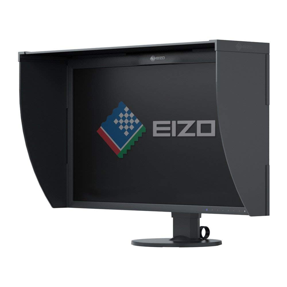
1. Eizo ColorEdge CG318-4K

As one of the most preferred monitors by graphic designers, the Eizo ColorEdge CG318-4K, the recently released, monitor projects your work using a resolution of 4096 x 2160, more than four times the resolution of a monitor with a Full HD display while its enhanced pixel density improves clarity with 149 PPI.

A self-calibration sensor lets you automate the calibration of the colors displayed by the monitor and also works well the ColorNavigator 5 and ColorNavigator software within the monitor.

With a contrast ratio of 1,500:1, nine millisecond response time and a brightness rating of 350 cd/m2, it’s easy to see why it’s a favorite of professionals.

The monitor from Eizo is equipped with HDMI and DisplayPort inputs allowing you to easily plug into different computer configurations while the Rec. 709, EBU, and SMPTE-C standards are met 100% and covers 99% of Adobe RGB color space.

Being at such a high price point, the Eizo ColorEdge CG318–4K monitor is an excellent machine for those professionals whose work requires the very best technology.

Learn More

($4663)
2. Dell UltraSharp UP3216Q

dell best graphic design monitor

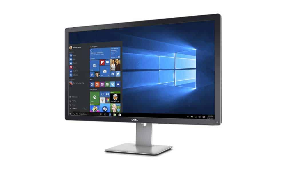
While many people may remember the Dell commercials from the 90s, the company has continued to put out high-quality products for consumers and professionals alike. For the latter, the Dell Ultrasharp UP3216Q is one of the best 4k display monitors on the market.

With one HDMI, one DisplayPort, and one Mini DisplayPort offers you a monitor with 31.5 inches of In-Plane Switching that can provide you with comfortable viewing no matter where you decide to put it. When you do, Dell ensures a quality display image with 99% Adobe RGB coverage plus 100% RGB, REC, and 87% of the DCI-PS color spaces will make any image stand out.

The monitor comes with the standard inputs on its back including HDMI, DisplayPort, mini DisplayPort, audio jack, and USB 3.0 ports. A hidden treasure is the 6-in- card reader positioned on the left side of the monitor. On the right side, another USB port is located for charging your phone or other use you may have for it.

With prices starting around $850, the Dell UltraSharp UP3216Q is more affordably priced than a lot of other options out there. If you’re looking for a powerful monitor but you’re on a budget, this may be right for you.

Learn More

($1350)
3. Philips Brilliance BDM4065UC

phillips best monitor for designer

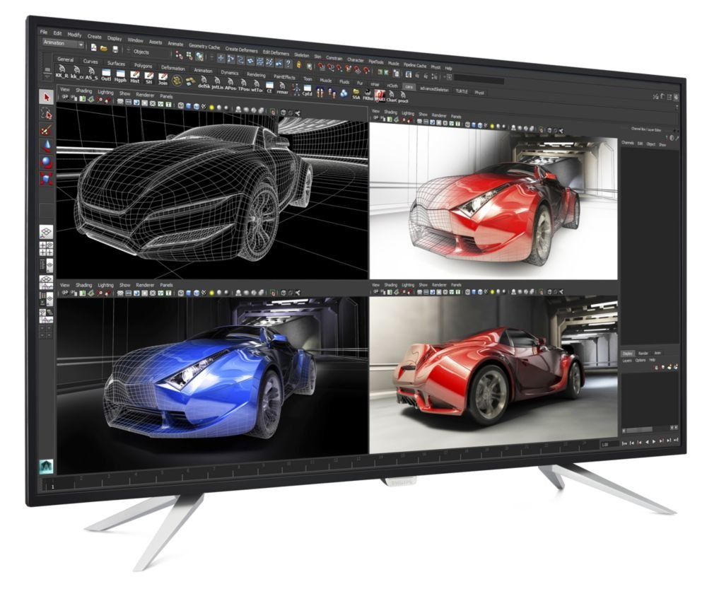
A close rival of the monitor from Dell, the Philips Brilliance BDM4065UC has sRGB color coverage up to 99% and comes with a 40 inch LED panel displaying 4K UHD (3840×2160) resolution which will make every pixel of your project stand out.

Phillips’ own VA LED screen technology makes for more vibrant images by using advanced vertical alignment technology to not only improve the contrast quality of your images but also the richness and can improve the viewing angle, making it visible from wider angles.

All of the usual suspects are there in regards to the types of connections you’ll find on the monitor. From HDMI, DisplayPort, and D-Sub are the ones most will find on a high-end monitor. Philips gives its customer a bonus with the addition of a mini DisplayPort input and an MHL HDMI port, which allows you to connect a tablet or smartphone and mirror the screen without lag. The only downside is that with MHL active, the monitor only supports a 1080 resolution and 60Hz refresh rate.

A rival, not only in performance but in price to the monitor from Dell, the Philips Brilliance BDM4065UC is an affordable monitor that performs like one that costs three times as much.

Learn More

($561)
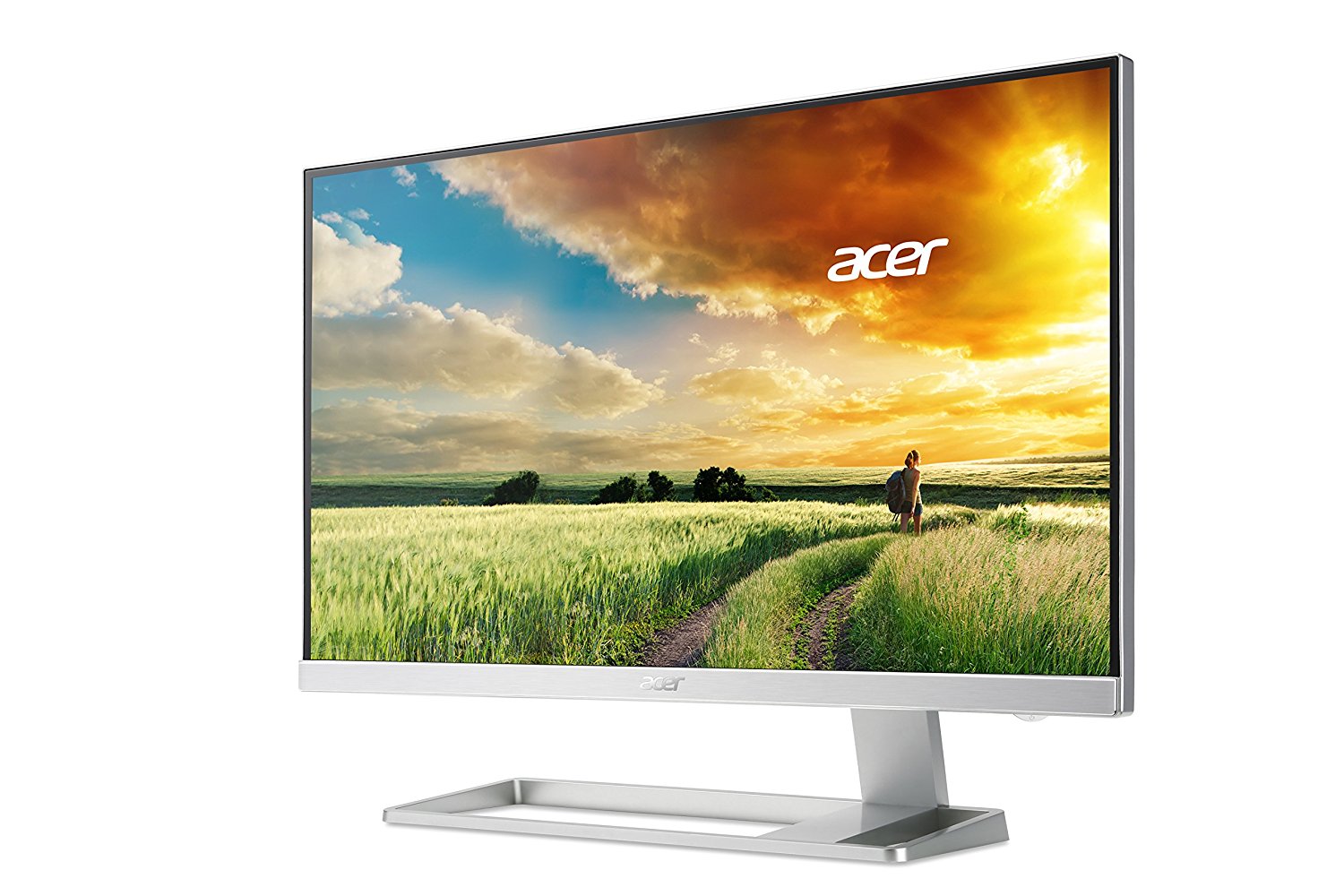
4. Acer S277HK

Acer best graphic design monitor

For some graphic designers, the aesthetics of how the monitor looks is just as important as the performance that it delivers. For those looking for the former, the Acer S277HK might fit the bill. With a resolution up to 4K UHD, the monitor has a brightness level of up to 300 cd/m2 as well as a dynamic contrast ratio of 100 million:1

The 27-inch monitor uses IPS panel technology to deliver excellent gray-scale and accurate color performance as well as providing you with a sharp, highly detailed image. Positioning is an issue as you can tilt the monitor forward and backward, but you can’t adjust the height of the monitor or pivot or swivel the monitor either, which could be a turn off for some.

Like many monitors, the I/o ports appear on the back of the monitor with the usual suspects all being here. The Acer S277HK is built with conservative energy consumption in mind, the monitor uses only 49.87W while in use, and 470W while in standby mode.

Not everyone has a lot of space for a big monitor, with the 27-inch Acer S277HK, you can get the performance and the aesthetic appeal that you may be looking for.

Learn More

($1,097)
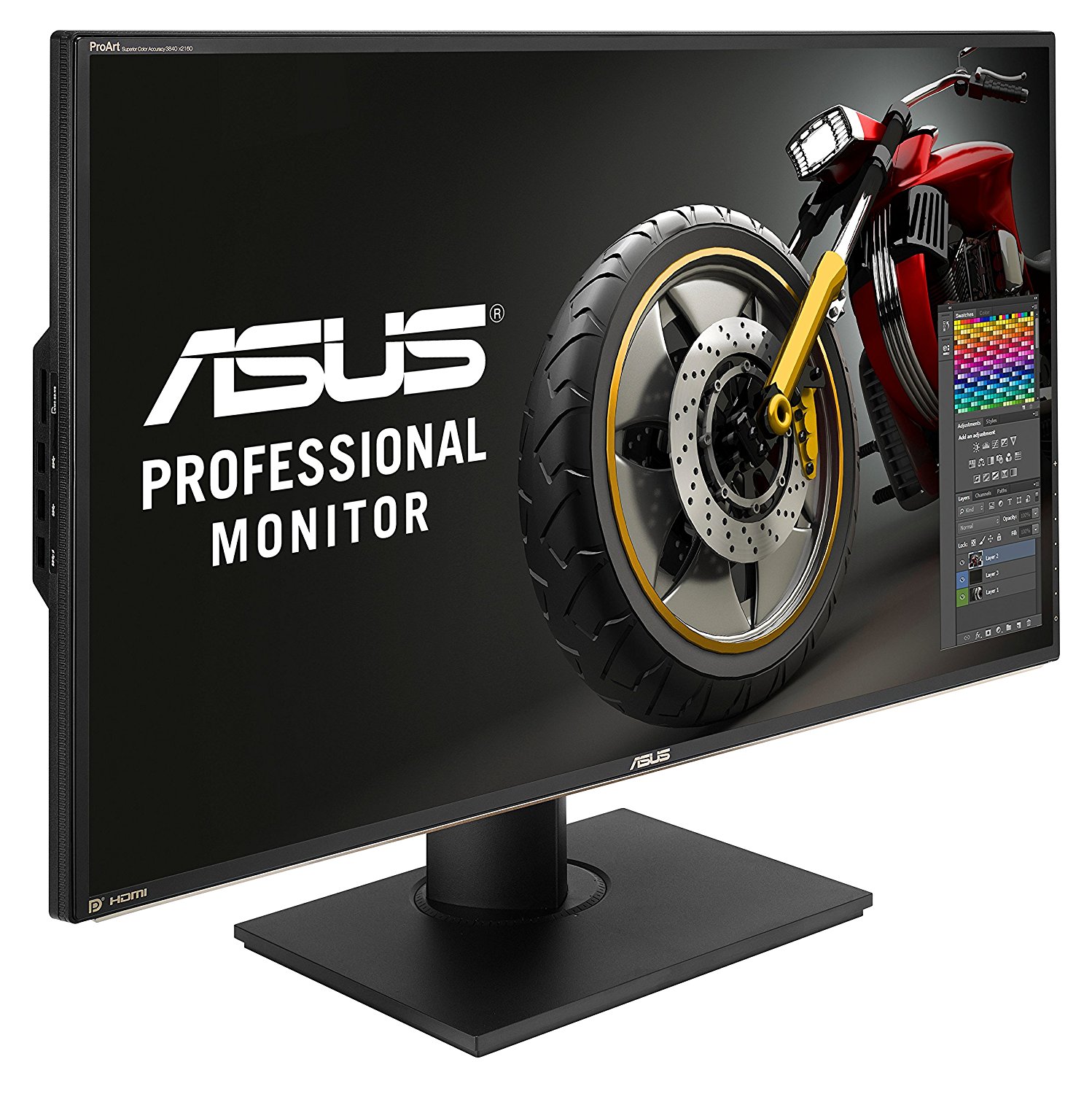
5. Asus ProArt PA329Q

Asus best graphic design monitor

Putting their hat into the 4K ring, the Asus ProArt PA329Q is a quality 32-inch monitor that features coverage up to 95% of the color space for Adobe RGB as well as 100% Rec.709 color space coverage providing you with more vibrant colors on the monitor.

Designed to meet the specific needs of photographers, designers, and especially graphic designers, the Asus ProArt is equipped with a 10-bit IPS panel, which also supports 16-bit color look-up table.

Putting the monitor into a position for optimal viewing is easy with the available tilt, swivel, and pivot that you can do to the monitor to get it just right. Once you do, four HDMI, a DisplayPort, Mini DisplayPort, five USB slots, as well as a USB upstream port and Memory Card reader gives you just about all of the I/O connections that you could need at work.

While the price can be viewed as a bit steep depending on your needs, Asus does market the ProArt as their top of the line monitor. If you do a lot of photography along with your graphic design work, this could be the monitor you’re looking for.

Learn More

($1,097)
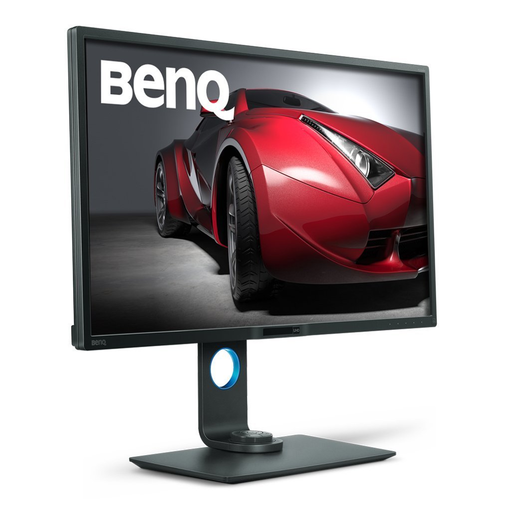
6. BenQ PD3200U

benq top graphic design monitor

Featuring a widescreen display, the PD3200U from BenQ makes working with images in 4K and in 3D much easier than it would be on other monitors. The 32-inch display has a PS screen equipped with a contrast ratio of 1,000:1 and has full, 100% support for sRGB color space.

See Jacob’s review of the PD3200U here.

With a resolution of 3840×2160, the PD3200U is a 4K monitor which features 100% support for Rec 709, which also includes a darkroom, dedicated animation, and CAD/CAM modes. Sporting a KVM (Keyboard Video Mouse( switch, the PD3200U allows you to plug in a second PC to the monitor and switch between the two while using one screen, keyboard, and mouse. This can be a great option and space saver, especially if you use separate computers and have a smaller workspace.

Fully adjustable, giving you the option to tilt and swivel the monitor into your preferred position, the monitor also rotates 90 degrees into portrait mode, giving you more flexibility for your projects. On the right-hand side, BenQ provides you with two HDMI ports, a DisplayPort 1.2, as well as a mini DisplayPort, SD card slot, and two USB 3.0 ports so you can connect any peripheral to the monitor that you need to.

With features that can make it a perfect option to be the only monitor you need, the cost of the PD3200U from BenQ is modestly priced when compared to other monitors on the market today.

Learn More

($699)
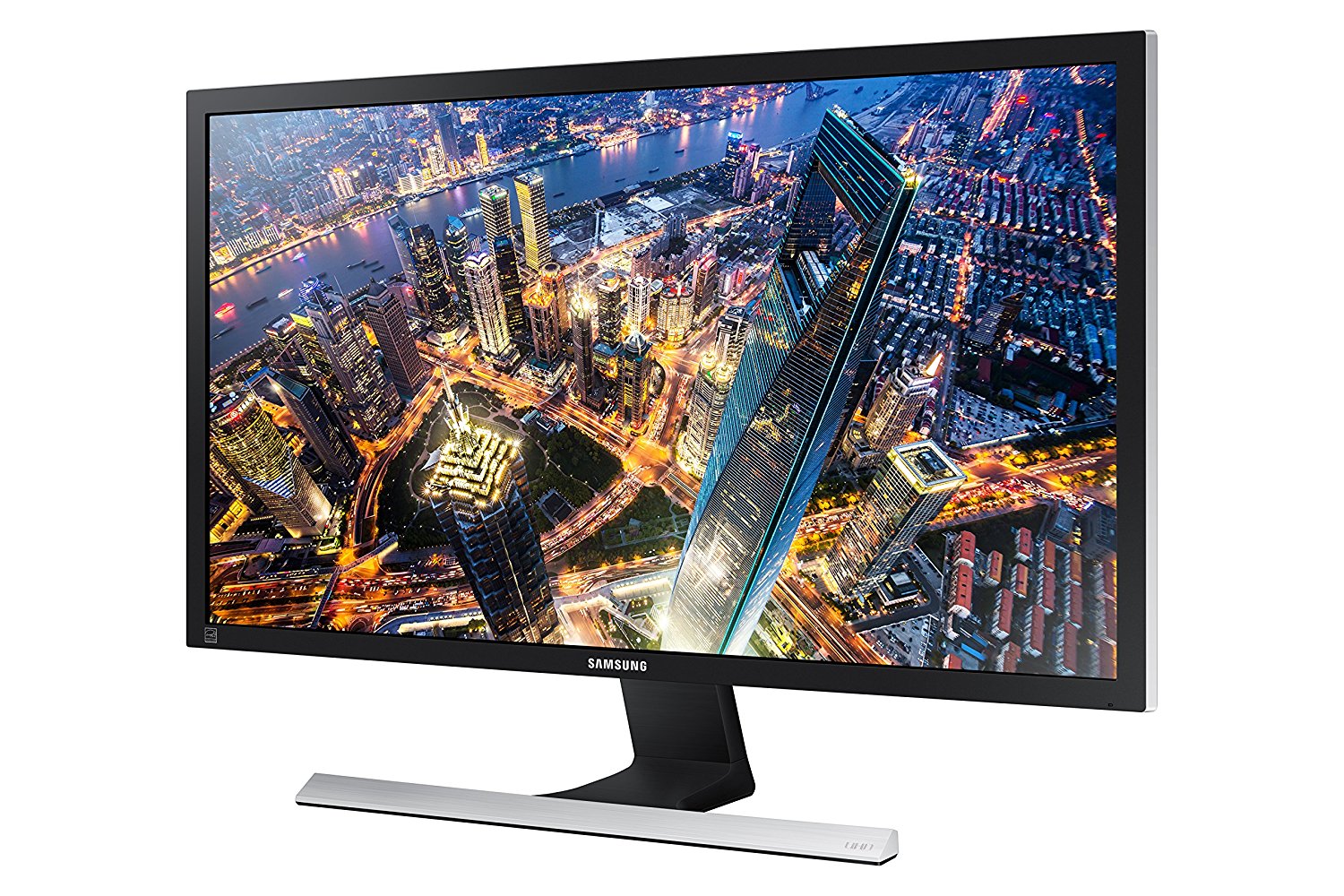
7. Samsung U28E590D

Samsung best monitor for designer

As one of the biggest electronics manufacturers in the world, products from Samsung, including their U28E590D monitor provides you with a high-quality product that with its sleek design, cannot only appeal to graphic designers but photographers as well.

With one of the lowest response times on the market of 1 millisecond, providing you with better picture quality and virtually no ghosting on the screen. With support for 8.3 billion pixels, the monitor, with 4K resolution come with a static contrast ratio of 1,000:1

While tilting the panel should be done with two hands to keep the monitor from tipping, changing the height, swivel or pivot are not available with Samsung monitor. While it does house two HDMI ports, and a DisplayPort 1.2, there are no USB 3.0 or DVI ports on the monitor. While for some, this may not be a deal breaker, for others, it could be a deciding factor.

For a reasonable price, the Samsung U28E590D 28-inch monitor can provide you with an impressive Ultra High-Definition (UHD) picture and good performance overall. The lack of inputs and position adjustment are the only things keeping this from being one of the best ones on our list.

Learn More

($249)
8. Iiyama B2888UHSU

iiyama best monitor for designer

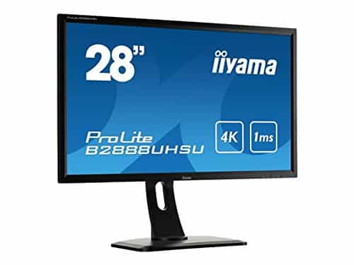
While considered by most to be a budget option for those looking for a 4K monitor, the Iiyama B2888UHSU the response rate of 1-millisecond matches that of the high-quality Samsung U28E590D, but at a lower price may be enticing to someone on a budget.

However, a cause for concern to some buyers should be the viewing angles that the monitor provides. IPS panels typically provide a consistently accurate color displayed no matter the viewing angle, the monitor from liyama does not provide this and does not the same power that some of the other monitors we’ve discussed have. That’s not to say it doesn’t have its own perks though.

With its 4K resolution, the monitor comes with all of the standard ports you would expect so you can hook up to the monitor but also features a picture-in-picture mode which is easy to use on this monitor and is quite reliable.

While it is an option for those with a budget, the Iiyama B2888UHSU can give you a good monitor with many of the same features found in some more expensive models without breaking the bank.

Learn More

($497)
9. Acer B276HK

Acer UHD best graphic design monitor

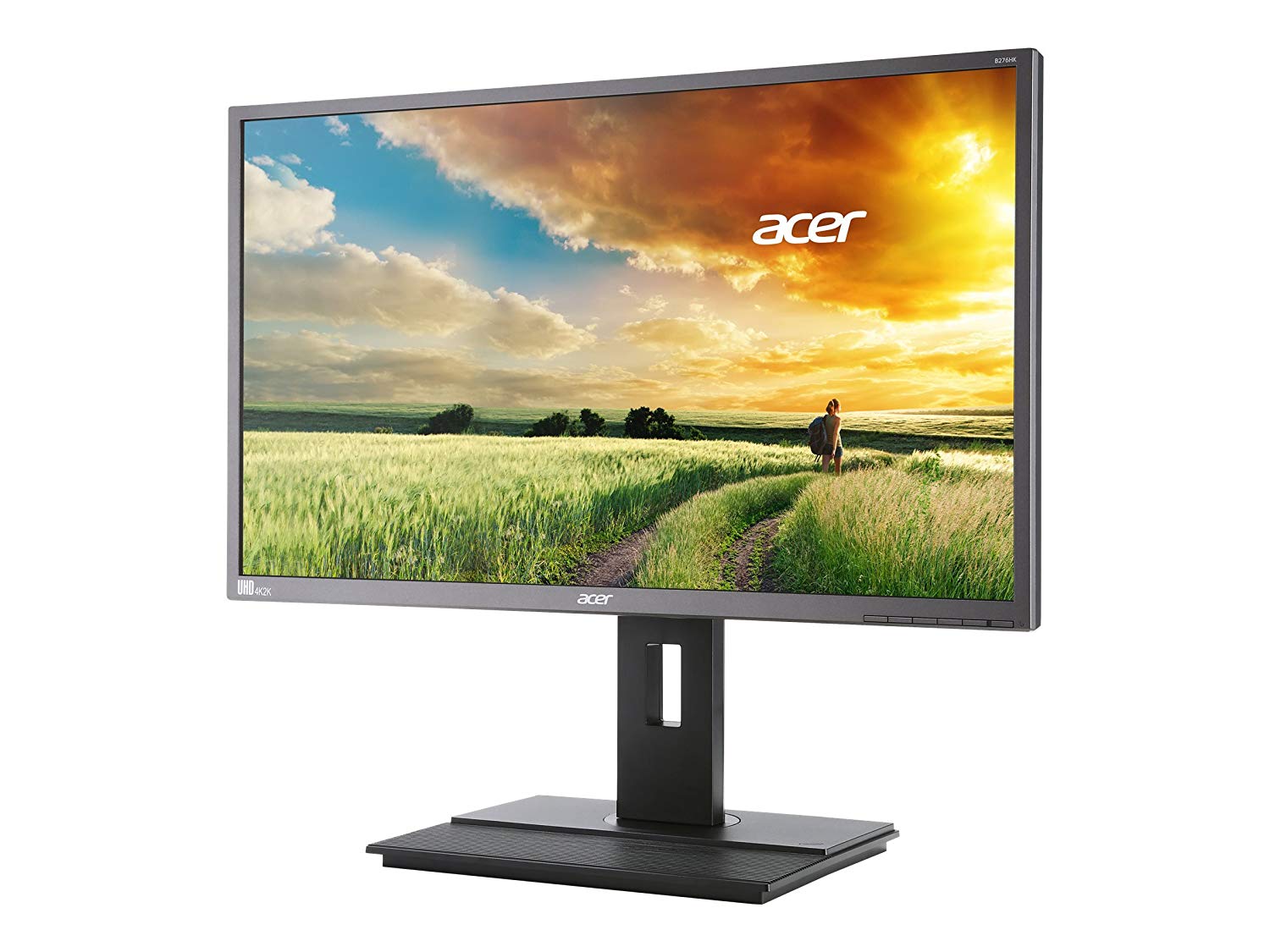
Profession color support, the Acer B276HK is a great example of how 4K monitors can be beneficial to anyone who works in graphic design, video or photo editing. The 27-inch monitor displays your work in Ultra HD with a resolution of 3840×2160.

The IPS display can provide you with vibrant colors while still providing you with a good range if a viewing angle which retains both its contrast and clarity when viewing the screen a bit off center. This can help the 1.07 billion colors 10-bit display, which for the price of this monitor is better than average compared to what you would normally get.

While the connectivity options are pretty standard, a four-port USB hub stands out because this feature isn’t very common in many 4K displays as well as an MHL port. MHL stands for Mobile High-definition Link and can offer support for a single cable and allows you to connect your smartphone or tablet to the monitor.

While the Acer B276HK has its limitations, the combination of the price and the features it does have make this a monitor worth considering for your business.

Learn More

($398)
10. LG 27UD68-W

LG best monitor for designer

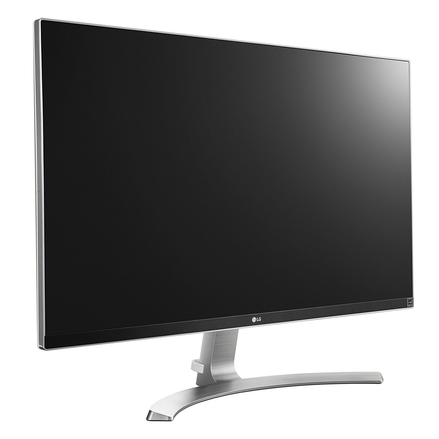
The competition for the best monitor for graphic designers can get pretty crowded, but we would be remiss if we didn’t mention the LG 27UD68-W, a 4K monitor can deliver a highly detailed picture for whatever work you’re doing.

Using an IPS panel, along with AMD’s FreeSync anti-tearing technology, the Ultra-High Definition monitor has a wealth of features contained behind its 27-inch screen. One of these is a USB-C cable which can be utilized to deliver audio, 4K video, and data over a single cable. The image on the screen comes with a 16:9 aspect ratio along with a 60Hz refresh rate and 5-millisecond pixel response.

While it can be marketed to the gaming crowd, the LG 27UD68-W can provide a quality monitor that should be able to help you with any project you bring up on its screen.

Learn More

($419)

11. BONUS: Apple iMac  (Computer+Monitor)apple best graphic design monitor
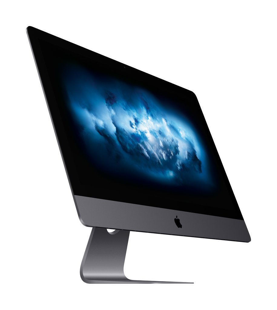
Apple is a company that needs no introduction. Throughout their history, they have continuously been at the forefront of technological change and innovation and the same can easily be said for the monitor that comes with the iMac Pro. The most powerful desktop computer offered by the company, you need a powerful monitor to match and it does not disappoint.

With a sleek, gorgeous 27-inch 5k retina display, the iMac Pro display uses Radeon Pro Vega graphics to help provide you with an almost life-like presentation of the project you’re working on. With all the muscle behind this machine, it may leave many curious how many ports they can use to connect to the gorgeous display. A total of four Thunderbolt 3 ports allow you to connect two displays at once, which can give you a maximum of 44 million pixels ready to display your work.

While all that hardware is certainly impressive, so is the price. Starting at $4,699, this machine may not be suitable for everyone’s needs, but hey, we can dream right?

Learn More

($4,699)

Best Monitors for Graphic Designers Summary

Choosing the right monitor can make any project that much easier to handle with access to the brightest colors and the sharpest images. While the size and features may be different from monitor to monitor, if you are looking for a monitor for your graphic design business, make sure you know what’s important to you before you start shopping.
Sunday, 12 August 2018

How to Use Content Marketing to Increase Leads, Sales, and ROI

This article was contributed by Nathan Elly.

Content marketing can often seem like it exists in its own world.

While intrinsically linked to advertising and the rest of the digital marketing spectrum, the lack of a clear monetisation structure often makes for a lot of conjecture about its worthwhileness. However, in my time as a content marketing specialist, one thing has been proven to me time and time again:

It works, but not in the way many people assume.

Once again, the fact that content marketing often exists outside the realms of basic advertorials can cause a considerable amount of confusion; both for marketing specialists and their clients. So, the question inevitably becomes “how does content marketing increase leads, sales and ROI?” which is what we’re going to get into today.

Leads

Before we get directly into leads, let me ask you a question:

What makes people trust your business over its competitors?

Let’s face it; for the most part, every business will be competing against a variety of other ventures offering similar services. So, you can’t necessarily base your entire business plan around how good your service is. Customers need a reason to believe that your business is both an authority in its field and a place that they feel comfortable supporting.

That’s where content marketing comes in. Building your content portfolio not only gives your potential customers more ways to find and interact with your business, it (if done well) creates a consistent voice for your customers to gravitate toward.

When Has This Been Effective?

Let’s take Dove as an example. As one of the leading personal care brands in the world, with a history spanning over half a century, Dove had already cemented itself as a household name. However, with 2004’s “Real Beauty” campaign, they brought their brand nearer and dearer to the hearts of a generation through their body positive messages.

Utilising a mix of traditional advertising and digital marketing, this well-established brand managed to completely reinvigorate the perceived image of their company in a way that has managed to last over a decade. By creating a tone of support and empowerment, the shadow of this image now spans far further than their products themselves; forcing other large brands to follow suit as to avoid being left in the dust.

Why is This Important?

With this sweeping image taking the advertising world by storm, it’s easy to forget that, taken away from their marketing, Dove are simply a large personal care brand under the Unilever umbrella. The fact that Dove is owned by Unilever is especially important, especially when you look at the other brands that share said parent company.

Source: Huffington Post

Many are surprised to find that Dove, with its powerful female empowerment message, is a sister company to Axe/Lynx; a male-oriented fragrance brand that has been criticised for being misogynistic throughout its history. The fact that Dove has managed to use their content marketing campaigns to minimise association with this negative press is a fantastic example of how shaping your tone can be used to widespread success.

So, we’ve talked about how content marketing can increase interest in your brand. Now, how can it help you turn those leads into sales?

Sales

In recent years, publishing content has become a vital part of many companies’ marketing strategies, and for good reason. With that said, this doesn’t mean that every company is doing it right. Content marketing is an ever changing beast; with strategies that were effective even 5-10 years ago quickly falling out of favour.

What I’m trying to say is that content marketing can be used as an effective way to drive sales, but only when used smartly.

How Can Content Marketing Be Used to Drive Sales?

Adidas Logo Trifoil

Whether you’re referring to internal or external content (content that exists on your website or on other platforms), content marketing offers a variety of benefits for your sales strategy. These include:

  1. Attracting Website Traffic Through SEO

When it comes to online traffic, search engines are the gatekeepers of success. Gone are the days of people finding websites by typing in a URL, with 1.2 trillion worldwide Google searches per year making up a bulk of online searches. Therefore, as a business looking to drive sales in the online landscape, your goal becomes finding ways to get noticed and ranked highly by these search engines.

So, how do you do this?

While there are a variety of tactics that fall under the SEO (Search Engine Optimisation) umbrella, one of the most effective tools for search engine success is link building. In short, link building is the process of ensuring that your business is being linked to by reputable websites. What factors go into a website being deemed “reputable” can differ wildly, but things like traffic, relevance to your service and domain authority all play a part in how effective a site will be.

This is one area where the distinction between old and new content marketing tactics comes into play. Back in the 2000s, link building campaigns ran rampant with keyword stuffing, spammy links and useless content that only existed to try and get websites noticed by search engines. However, with several updates to Google’s ranking algorithm, businesses who were utilising these shady tactics were quickly weeded out and penalised.

In 2018, the link building landscape is a completely different place. With relevance, keyword placement and the health of your link portfolio all playing a pivotal role in your campaign’s success, the era of high quality link marketing has arrived.

What Does This Mean For You?

It means that the success of your campaign hinges on the quality of your content, and your ability to perform meticulous keyword research. A well-written blog on a highly-regarded site that links to your service from a relevant keyword that gets traffic on search engines is likely to provide you with exceptional results. With that in mind, having an experienced copywriter as part of your marketing team is exceedingly valuable.

  1. It Helps Customers Understand Your Service

When we use the phrase “help customers understand your service”, we’re not necessarily referring to simple product descriptions and pragmatic details about the service itself. Each service exists to fulfill a want or need, and both onsite and offsite blogging allow you to flesh out the reasons that someone may want to interact with your business.

So, How Do You Do This?

For several years, I worked as a content marketing specialist for a web scraping company. While for the sake of anonymity I will avoid naming the business in question, but I feel it’s an excellent example of how to explain the need of a service, as opposed to the service itself.

I’m sure you won’t be surprised to learn how few people know why web scraping is a worthwhile service. Whilst explaining the intricacies of how data extraction and website crawling works would potentially draw the interest of some consumers, it still doesn’t explain why you should use it in a relatable way. So, we took another tact.

As opposed to writing blogs about the service itself, we focussed more on finding examples of scenarios where this would be effective. From blogs about how marketing intelligence can benefit your marketing campaigns, to articles on why competitor analysis is a vital part of any ecommerce store, we successfully developed a portfolio of written content that worked in two ways:

  1. It sought to justify the existence of this service with real world examples of its use.
  2. It gave the impression of authority for those that read these pieces.

That second point is more important than you may initially think when looking to drive sales.

  1. Authority, Trust, and Reputation

Adidas Shoes and Logo

To stand out and find success as a business, especially one in the digital landscape, there are three elements that you need to develop:

Trust – With the internet being flooded with less-than-stellar products and fraudulent services, you need to be able to ensure that potential customers believe your business to be trustworthy. Otherwise, they are almost certain to look elsewhere for your service.

Authority – When working with a business, especially one that will be providing you with an important or highly-technical service, you need to know that they understand every facet of their field. People are unlikely to gravitate toward a business that has no proof of their expertise.

Reputation – This can often come down to reviews and word of mouth. While this may seem like a simple area (good service = good reviews), this isn’t always the case, and there’s a lot that can be done or neglected to shift that balance in either direction.

These are the three pillars of any good business. While they are things that can come naturally once your business is large enough, that doesn’t mean that any successful business today is resting on their laurels. Brands like Nike spend a considerable amount of time, energy and resources ensuring that the boons of their products never stray too far from the hearts and minds of their audience. So, whether you’re a fledgling startup or a multinational conglomerate, keeping your business alluring to your target audience is vital.

How Can Content Achieve This?

Both online and offline, content is your human connection to your audience.

Through the use of the written word, videos, images and overall aesthetic of your website, customers will inevitably draw a personality from your business. This is often a comparable drawcard to the service itself, as people prefer to support businesses that they can identify with.

More than just attempting to advertise a product, your goal should always be to create a voice and tone that is consistently appealing to the demographics that your business is trying to convert into customers. With that said, don’t assume that you understand exactly what your target audience is looking for. Like all things, a little research can go a long way when attempting to identify topics that your audience will be interested in.

In this instance, keyword research is your friend. Services such as Hubspot and Google Analytics will allow you insights into what people who are searching for your services are interested in. This gives you a perfect starting point for creating a content plan that you can flesh out based on how your audience interacts with the content provided.

Many website hosting platforms, such as WordPress, offer a wealth of analytical data, including bounce rate and average view time for specific pages. This is a great overview of whether or not your content has peaked the interest of readers. A long view time and low bounce rate means that people are sticking around to find out what you have to say. Alternatively, if your readers are disappearing after ten seconds, it’s probably time for a change.

How All of This Affects Your ROI

Word of Mouth

While I can give you all of my views on the subject, the question that everyone asks is the same:

“How do I earn more money from this?”

In the end, most businesses exist solely to make revenue, so understanding how to monetise your content marketing efforts is an excellent way to wrap things up. Unlike services like PPC and traditional advertising, both of which have a very clear line between the action and whether someone will convert into a customer, content marketing is less direct. This makes it difficult to explain as a money-making effort, but it’s also its greatest benefit.

Content isn’t about frantically trying to convince people that your product is the best, it’s about giving your audience something to gravitate toward; something human.

It’s a vital part of defining your image and differentiating your business from those that are trying to take its place. Often, in regard to building the image and personality of your brand, it can be the deciding factor that makes people want to trust and support your business.

Content isn’t just a worthwhile (and relatively small) investment, in many cases it’s integral to your success in the online world. Your business is trying to connect with people, so give them a reason to connect with you.

This article was contributed by Nathan Elly, who runs the Digital Marketing Agency, Digital Next.

Tuesday, 7 August 2018

Claim Your FREE .Design Domain

Everyone is familiar with .com and .net, but did you know you get your own free .design domain?

As a designer, I think it’s pretty awesome that we can get a domain name that reflects what we do, .design.

And because it’s a fairly new domain, there are still plenty of short .design names available. So the good news is, you can shorten or improve your existing branding by switching to the .design domain.

ie. johnsmithdesign.com >> johnsmith.design

You can also get your own unique email address such as hola@yourname.design or you can even use it as a clever redirect to another site, like a Behance profile.

Get your FREE .Design Domain

I have teamed up with Porkbun to offer all JUST Creative subscribers a FREE .design domain name. The first year is free, and yearly renewals will be just $35 instead of the $70 offered at some registrars.

You also get:

  • Free email hosting – you can add an email address (or multiple!) that matches your domain name. For example, anne@goldsmith.design or info@goldsmith.design, or any other name you want.
  • SSL Security – An SSL certificate will encrypt your visitors’ sensitive data, and also display your site with “HTTPS” in your address bar, which will let visitors know that you’ve made their security your top priority. You’ll also avoid the “NOT SECURE” label from Google.
  • Free WHOIS Privacy – Your contact information will be private, and protected forever. Other registrars charge you for this. PorkBun won’t.
  • Free website builder – If you want to build your .design website with no code, you can build it for free using their site builder, powered by Weebly. And with this option you don’t have to pay for website hosting.
  • Free domain connection – Whether you built your website (or plan to build it) with other services like WIX, SquareSpace, or Weebly, you can easily connect your .design domain to your website platform. Your website content will stay exactly the same, but you’ll have a modern .design domain name for your website to show off!

Here’s your chance to get a free website domain name that reflects what you do and helps you showcase your work.

YES! I want my FREE .design Domain Name!


To claim your free domain:

  1. Click to claim & search for your domain name
  2. Click the pink + icon on the desired domain
  3. Click the checkout button & complete the checkout process.

This offer does not apply to premium names.

16 Essential Fonts for Designers – All 99% OFF

Font bundles are my favourite, and this one is no exception.

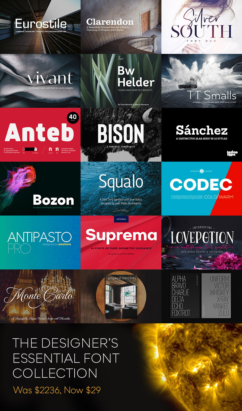
This brand new bundle from DesignCuts brings you a wide range of quality fonts, from sans-serif to serif, brush, calligraphy, display and many more. And you will notice some big names in there such as Eurostile, Clarendon and even the brand new BISON which is already a best seller. And a handful of workhorse fonts!

This is a unique chance to own these best-selling font families for a massive 99% discount. You can get 16 versatile and professional font families (304 individual fonts) for just $29, instead of $2236, perfect for adding exceptional typography to your design work.

Each font has been meticulously crafted by top font designers, to guarantee incredible quality. And Web fonts are also included for each font family!

» View Designer’s Essential Font Collection (99% Off)

Don’t miss out on this amazing deal as it expires August 21st.

Essential Font Collection Overview:

Designers Essential Font Collection

Eurostile

Eurostile Font

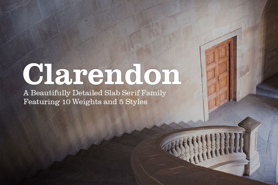
Clarendon

Clarendon Font

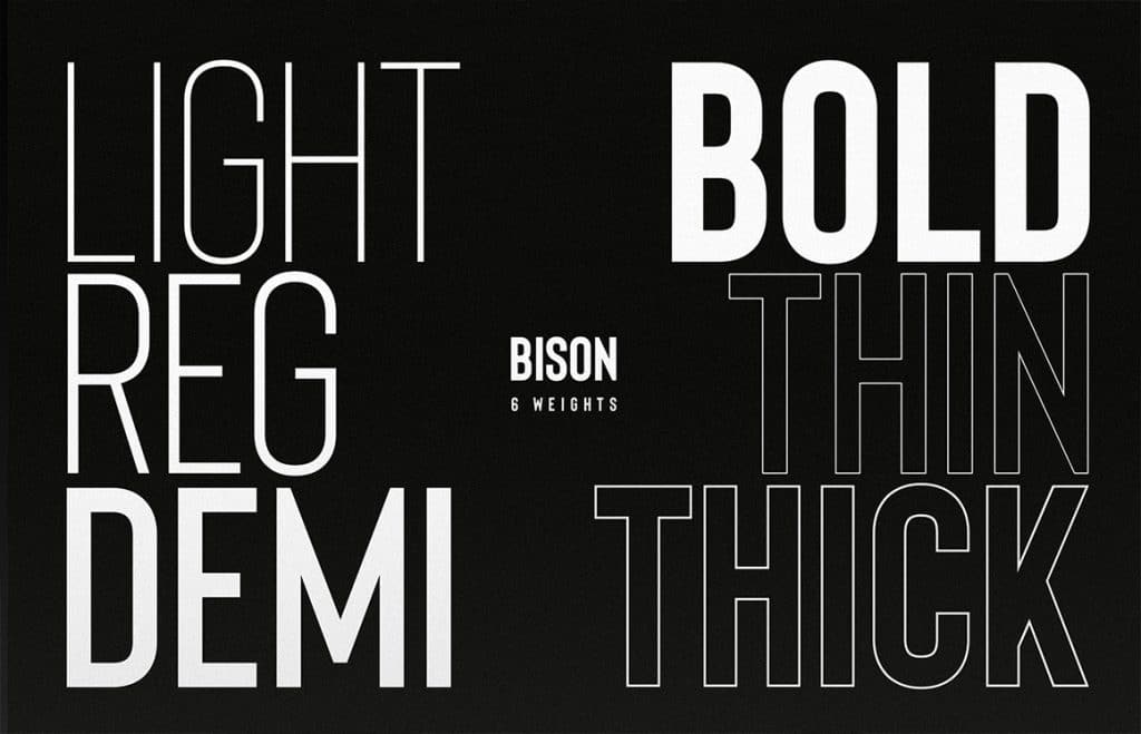
Bison

Bison Font

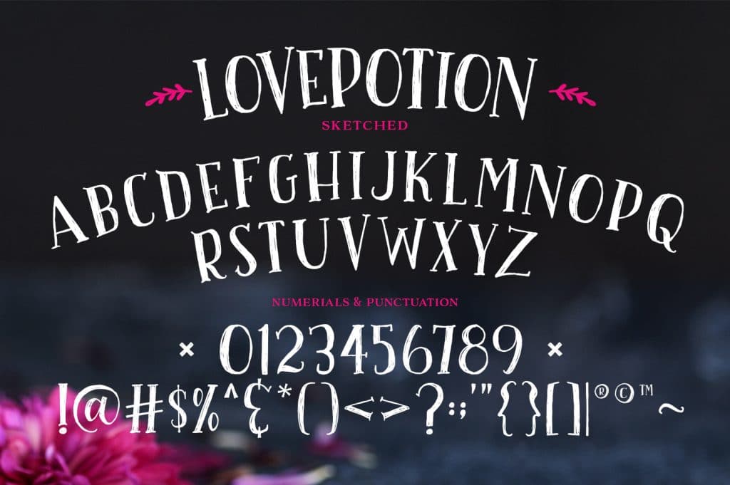
Love Potion Font Family

Love Potion Font

Love Potion Font Script

Silver South Font Duo

Silver South Font

This bundle includes:

  • 16 World Class Fonts 
    This bundle is a true gem for any font lover – featuring best-selling fonts from world renowned type foundries
  • Full extended license
    Use these resources in commercial work available for sale.
  • Unlimited free support
    If you need any help working with your new resources, our team are here to help.

» View Designer’s Essential Font Collection (99% Off)

Deal expires August 21st.