This article has been contributed by Alisa Taylor.
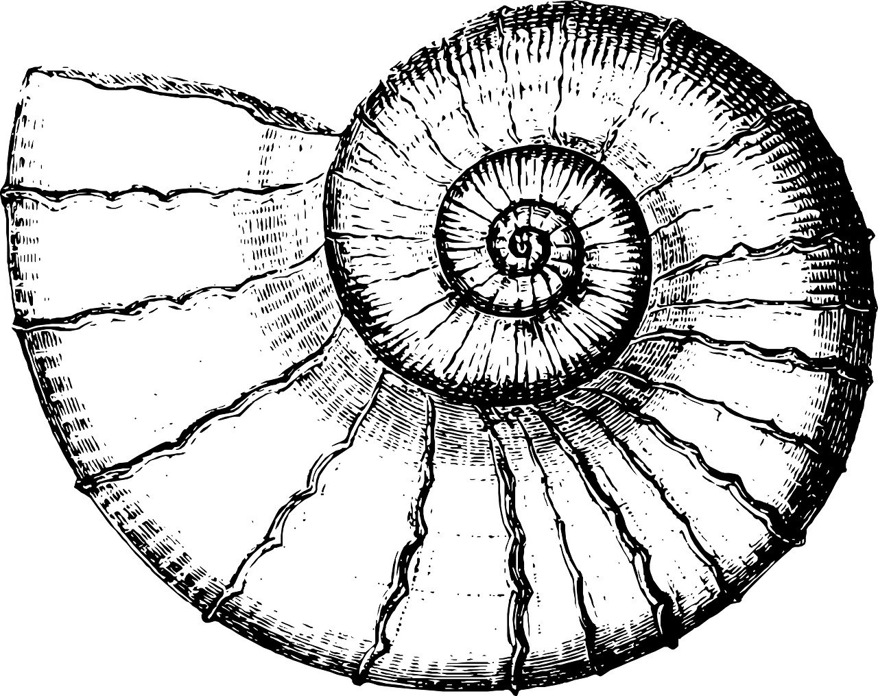
You don’t need to look far for people who agree that a simple nautilus shell, the Parthenon in Athens, and the Mona Lisa all have a certain special something about them.
To the uninitiated, some designs just ‘look right’, while those in the know will tell you it comes down to the Golden Ratio. They’ll also tell you that, far from being a relic of the past, the ratio is all around you — and you can use it to create impactful, well-proportioned logos, and other designs.
We’ve put together the ultimate guide to the Golden Ratio. Get ready to dive in!
What is the Golden Ratio?
The Golden Ratio, also know as the Divine Proportion, is the term given to a specific ratio between two quantities. Specifically, it means their ratio is equal to the ratio of their sum to the larger of those quantities.
If we call those quantities A and B, with A being the larger of the two, we can express the ratio like this:
A + B is to A as A is to B.
It’s also shown as 1:1.618033987, and it’s represented algebraically as the Greek letter Phi (Φ). Basically, if length X is 100mm, length Y must be 161.8mm.
You’ve probably seen the Golden Ratio represented graphically as interlocking squares and rectangles within a larger rectangle. Most representations show the Golden Spiral emanating from one of the small squares, and spiraling through the other square and rectangles, getting wider as it does so.

The ‘growth’ of the spiral is logarithmic, and it can be expressed as the Fibonacci Sequence (1,1,2,3,5,8,13,21,34,55). In the sequence, each number is the sum of the two preceding numbers (0+1 = 1, 1+1 = 2, 1+2 = 3, 2+3 = 5, 3+5 = 8).
Let’s glance at a few of the ratio’s design applications and then take a closer look at how it has been used to create some of the most iconic company logos.
How Designers Can Use the Ratio
You can apply the Golden Ratio to your designs in ways that are simple, or complex.
Take a simple approach and use it to tweak your design here and there, making small but impactful improvements. Alternatively, if you have artistic skills and expertise, you can use it as the foundation for your designs.
Either way, the ratio and its representations as the Golden Rectangle and Golden Spiral do not necessarily need to be templates for your designs. You can instead use them to feature your design’s best parts.
It’s important to add that the ratio is not the be-all and end-all of good design. Rather, it’s one of many tools at your disposal.
Here are a few ways that you can use it in your next graphic design project.
Layout
You can use the Golden Spiral as an overlay that will help you center the design’s focus on the spiral.
When that’s in place, you can use Golden Rectangles to place the other elements of the design. Use them to work out the best proportions or measurements for those elements.
The ratio can be used in the layout of websites that have a sidebar. In that application, the body will be 1.618 times bigger than the sidebar.

Typography
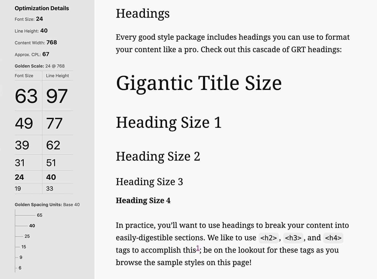
You can use the Golden Ratio to work out the sizes of the fonts used in your design. For example, if the body text is a 10pt font, multiply it by 1.618 to find the best size for the header font.
In this case, it will be 10 x 1.618 = 16.18, or a 16pt font. If you’re using a 20pt font for your headlines, divide it by 1.618 to find the size of the body text. In this example, it’s 20 ÷ 1.618 = 12.36, or a 12pt (or 13pt) font.

Image source: thedesignest.net
The Golden Ratio in Logo Design
When it comes to logo design, you can use the Golden Ratio in different ways. You can base the layout of your design on the Golden Rectangle or Spiral, or you can use the ratio to determine the proportions of various elements of the logo.
Regardless of whether your design is for a website, large format printing or small business publishing on an inkjet printer, it will still benefit from applying this principle.
Below are several examples of how the ratio has been used to create some of the most recognizable and on-trend logos in the world.
National Geographic

Image source: wikimedia.org
National Geographic’s yellow rectangle is recognized by people on every continent on earth. There’s no denying that it’s simple and effective. Yet not many people realize that it’s the Golden Ratio that makes it a perfect rectangle.
Whether you measure the shape’s outer or inner edges, you’ll find that the ratio of the width to the length is 1:1.618. The name of the ratio may have even inspired the choice of color, too.
Toyota

Image source: wikimedia.org
Toyota’s three ovals is another prime example of the Golden Ratio in logo design.
The distance from the outer bottom to the top edge of the largest of the three ovals is 1.618 times the distance from the bottom outer edge of the large oval to the bottom inner edge of the smaller horizontal oval distance.
This is what makes the logo look so well-proportioned.
British Petroleum (BP)

Image source: pinimg.com
British Petroleum’s (BP) company logo has gone through a few iterations over the years, but there’s no denying that its current design is highly effective.
The green and yellow stylized sunflower is formed by several concentric circles; their dimensions determined by the Fibonacci Sequence. This makes it visually striking and incredibly appealing to look at.
Pepsi

Image source: wikimedia.org
Where competitor Coca-Cola uses Spencerian script and formerly the dynamic white ribbon device for its iconic look, Pepsi’s logo uses simplicity and the Golden Ratio.
It’s not immediately apparent to many people, but the logo is formed by several intersecting circles in proportion to one another. That ratio is 1:1.618.
Apple

Image source: wikimedia.org
The stylized apple that is the Apple Inc. logo is one of the few logos that doesn’t include a company name — at least, not in text. Other than being instantly recognizable, the logo is pleasing to the eye. The curves of the fruit, leaf, and bite mark are all in perfect balance. Each of those elements is formed by a section or sections of one or more intersecting circles, the diameters of which are proportionate to the Fibonacci Sequence.
Apple’s iCloud service logo, a stylized cloud, also uses the Golden Ratio. In this logo, every curve in the cloud is formed by a section of the edge of a circle. The Golden Ratio determines the diameters of those circles. Also, the ratio of the logo’s height to its length is 1:1.618.
Other Applications of the Golden Ratio
Who would have thought that a simple ratio informs some of the most impactful company logos? There’s much more to the Golden Ratio than its applications in graphic design, of course. As we touched on earlier, the number is also found in the natural world, as well as in art and architecture.
The Divine Proportion in Nature

We don’t know who the first person to notice the Golden Ratio’s many manifestations in the natural world was. What we do know is that it’s all around us.
Just a few examples of the Golden Ratio and Spiral in nature include:
- The logarithmic Golden Spiral can be seen in nautilus and other spiral shells.
- The spiral is found in plants such as spiral aloe, Romanesco broccoli, curled fern fronds, sunflower seed heads, and the underside of pinecones.
- The spiral can be found in the shape of barrel waves, hurricanes, and spiral galaxies.
- The Golden Spiral is seen in the curling tail of a chameleon.
- The Fibonacci Sequence can be found in flower petals — some lilies have 3 petals, buttercups have 5, some cosmos have 8, asters can have 13 petals, and chrysanthemums have 21 petals.
The Golden Ratio In Art
The Golden Ratio can be found in some of the greatest works of Western art, which is one reason their proportions are so pleasing to the eye. Among them are works by Da Vinci, Michelangelo, Raphael, and Sandro Botticelli.
If you were to overlay the Golden Spiral on Da Vinci’s Mona Lisa, you would see that the spiral frames her. You could trace it from the tip of her nose, past her dimple, across her chin, across her forehead, and down to her left wrist. The artist and inventor also used the Golden Ratio in the proportions of the top and bottom of his painting, the Annunciation of our Lady.
Michelangelo used the ratio in his Sistine Chapel painting, the Creation of Adam. The ratio is found between the area that contains Adam, and the area that contains God. The divide between those two areas is found where their fingers touch.

The Golden Ratio in the form of the Golden Rectangle can be found throughout Raphael’s painting titled the School of Athens. He even offered a clue as a gold-colored rectangle just below the image.
Sandro Botticelli’s Birth of Venus is another great artwork where you can find the Golden Ratio. For starters, the canvas itself is almost a perfect Golden Rectangle. It’s 172.5 cm wide and 278.5 cm high, which makes for a ratio of 1:1.6168. The variance between that and the 1.618 is 0.08%. Next, Venus’ naval forms the Golden Ratio point of the distance between the top of her hair and the bottom of her left foot, and from the distance between her hairline and the bottom of her right foot. It’s an almost perfect example of the proportions.
The Golden Ratio in Architecture
Long before artists used the Golden or Divine Ratio to find beautiful and graceful proportions for their paintings, architects used it to design buildings that, in some cases thousands of years later, never fail to make an impression on the people who see them.
The geometry of the Great Pyramid of Giza in Egypt is less than 0.025% away from being a perfect Golden Triangle. Also known as a Kepler triangle, the shape has a hypotenuse of Phi, a height of the square root of Phi, and a base of length 1.
You can find the Golden Ratio in several elements of the Parthenon in Athens, Greece. One of those elements is the columns, the height of which is in a Golden Ratio proportion to the structural beam on top of them. Also, each column’s width is in a Golden Ratio proportion to the distance from its centre line to the outside of the column.
Completed in 1976, the CN Tower in Toronto, Canada, is the 9th tallest tower in the world. It’s also one of the most famous modern structures with a design that incorporates the ratio. You’ll find it in the proportion of the 342-metre height of the observation deck to the 553.33-metre height of the tower. That ratio is 0.618, which is the reciprocal of Phi.
Found in some of the most attractive designs in nature and created by human beings, the Golden Ratio is a truly valuable tool for graphic designers and artists. By drawing inspiration from these examples, you can use it to improve the balance in your designs. Ready to get started?
_
About the author: Editor at large and content monster, Alisa Taylor, shares awesome vibes and magic words wherever she drops her ink. She often focuses on business, graphic design, and education topics but is always looking to broaden her knowledge and expertise.
The post How To Use The Golden Ratio in Design (With Examples) first appeared on JUST™ Creative.
No comments:
Post a Comment