This article has been contributed by Kevin George.
Many aspects of professional and personal lives have changed over the past year. Similarly, marketing practices have also evolved to adapt to changing customer behaviors and preferences.
Just like social media marketing and email marketing, email design has undergone a tremendous transformation over the years, and it is set to reinvent new possibilities in 2021.
Email design trends in 2021 will be a lot about mixing and matching design principles. They’ll be about bringing freshness to the subscriber’s inbox with innovative email designs.
Take a look at this report by Email Monday and Zettasphere.
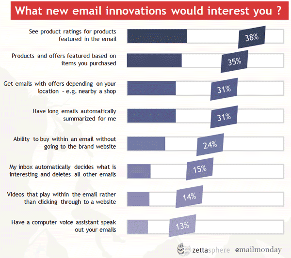
Email designers and developers will have to create email designs that integrate and effectively communicate the information that readers want. Emails containing product ratings, offers based on previous purchases and location, and TLDR summaries will set brands apart
So, let’s take a sneak peek into what the new year holds in store for email geeks and their subscribers.
1. Bold Typography
Visuals used to be the “hero” in email designs since their very inception. Brands have now started experimenting with bold typography to convey their message to recipients.
Bold typography dates back to the 19th century. In those times, varying weights did not exist. Everyone simply used a generic bold like Clarendon slab-serif.
Now, they’re back on-trend, and for good reason. Below is an example to prove my point. See, how they have used the “huge” font to draw the recipient’s attention. It’s a breeze to skim through and get the gist of such emails.

2. Animated Illustrations
Designers are constantly trying to innovate with the kind of visuals they use in emails. Thank goodness, things have evolved since the era of sole use of stock images in emails. Designers started experimenting with different types of vectors, fluid designs, and illustrations. Soon, rich media like GIFs and cinemographs were introduced, and seasoned developers even created emails with embedded videos to drive more conversions.
In 2021, it is expected that marketers will combine the power of illustrations and GIF animations to add visual oomph to emails.
Harry’s email below is a perfect example of using animated illustrations to effectively convey the meaning and mood of the email’s content.

Image source: milled.com
3. 3D Images
3D images were used for the first time in computers in the 1970s. Over time, their use emerged as a winning design tactic for websites and then emails.
Take a look at this email by Designmodo. They have made wonderful use of 3D images in their email design.

While it may be somewhat difficult to incorporate 3D design into emails, it is worth the effort. It will change the entire look and feel of the email and make it stand out from all the other emails your subscribers receive.
4. Textured Illustrations For 2D Images
Add some uniqueness to your 2D images by using textured illustrations. Not only will they differentiate your emails, but they can add subtlety to your images and mellow the tone of your content.
You can try out different color contrasts, gradients, tints, patterns, and shading in email designs. They will make your emails more impactful and increase engagement.
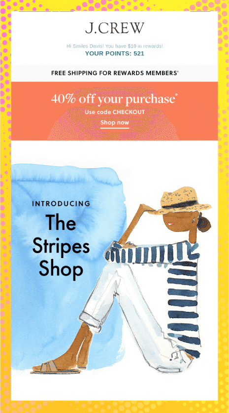
J.Crew has done a great job with textured illustrations in emails.
5. Gradients in Emails
The origin of gradients goes back to the psychedelic culture of the 1960s. With their entry into the world of emails, designers could convey feelings of nostalgia through the vintage effect that gradients offer.
Designing with gradients allows you to add unique backgrounds to your emails. They pique the subscriber’s interest and can get them to take action. By adding a gradually fading effect, you can make the email more engaging for readers.
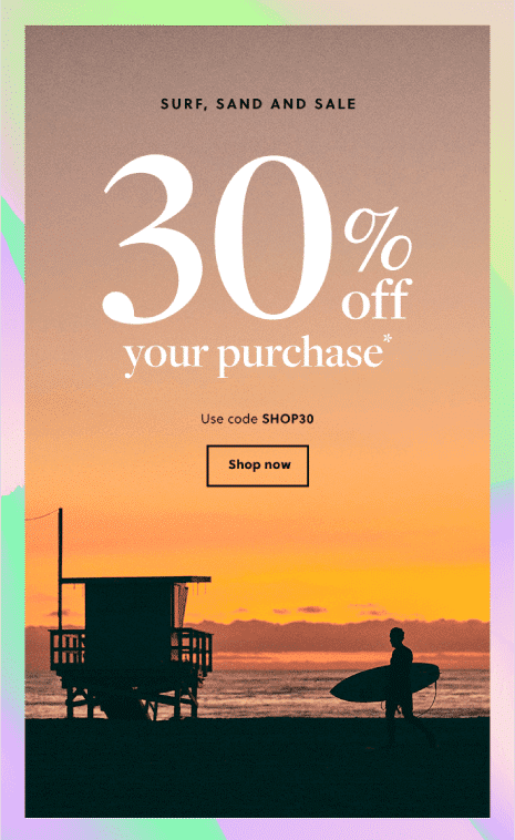
J. Crew has used a gradient background to display the view of a beach and support their headline: “SURF, SAND AND SALE”.
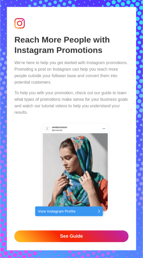
Besides the background, you can add gradients to your call-to-action (CTA) button. This makes the CTA pop in the email while making your emails even more attractive.
See how Instagram has nailed this trick in their email below.
If you want to go a step further, you can design emails with animated gradients. Wouldn’t it look impressive if you have a live gradient backdrop in the email?
6. Emotional Design
Of course, your emails must be valuable for the reader, but they must also trigger the right emotion in the subscriber’s mind.
The nine triggers that can drive maximum conversions in email marketing are:
- Love
- Greed
- Guilt
- Belonging
- Trust
- Curiosity
- Vanity
- Optimism or hope
- Fear
So, how do you convey these emotions in an email?
First of all, your copy must be drafted in such a way that it matches the purpose of the email. Pick the colors and imagery that evoke the right emotion.
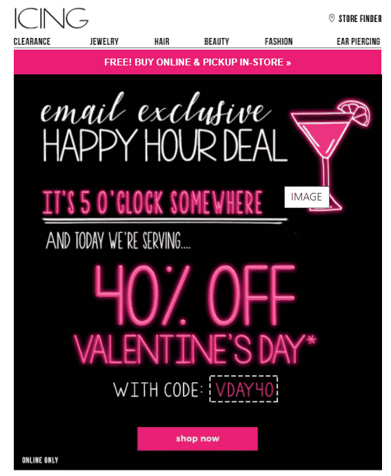
For example, marketers who are planning to send a promotional email highlighting a discount offer can use bright colors with images reflecting excitement.
Icing has made beautiful use of shades of pink to promote their Valentine’s Day offer.
On the contrary, if you are a marketer in a non-profit organization, you would probably use colors like white and blue that reflect sincerity.
Check out this email by Charity: Water. They have used a blue color in their headline and CTA that exudes soothing vibes. The image gives a sense of hope and optimism to the reader.

7. AMP in Emails
Accelerated Mobile Pages (AMP) were launched on 26 March 2019 and since then, they have been trending in the world of email design. AMP is an open-source technology introduced by Google which has paved new avenues to send out dynamic emails to subscribers. HTML, CSS, and JavaScript are used to create AMP emails.
Through AMP emails, you allow email recipients to interact with the email from the inbox itself. They can fill a form or survey response, or RSVP to an event from the email.With the help of AMP, Booking.com has sent out emails that allows users to see the deals right in the email and even manage their subscription preferences.

AMP emails emulate the look and feel of an app and make browsing easier for the subscriber. They eliminate the additional step of navigating to a landing page, thereby increasing conversion rates.
Although it can be a bit complicated to design AMP emails, brands will not shy away from using them in 2021. AMP in email is anticipated to be an evergreen trend that will continue to be an email geek’s favorite for years to come.
8. Interactivity
Interactivity is another timeless trend that brands have been using for their routine promotions as well as occasion-based marketing. According to a report by Martech Advisor, adding videos and visual elements to business emails can improve click-through rates by 300%.
Interactive features enhance email engagement by encouraging people to connect with brands. The Martech Advisor report suggested that menus, sliders, and website-like navigation increase the likelihood of hitting conversion targets.
Lego has created a beautiful email with an embedded video to promote their reproduction of the iconic Volkswagen Beetle.

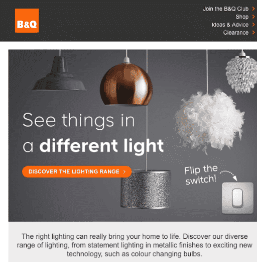
B&Q sent out an interactive email that allows the user to “Flip the switch!” and see their lighting range. The recipient only has to click on the switch button in the email to check out the changing colors of the bulbs.
Email Uplers sent out a beautiful Christmas email with an embedded video. Once the recipient clicks on “Click to join the call”, Santa Claus will convey a heartfelt wish for the Holiday Season.

9. Muted Colors
Muted colors are anticipated to replace bright and bold colors in email designs. They gained huge momentum in 2020 and the rage is expected to continue in the coming years. These pastel colors are created by desaturation and addition of white, black, or other complementary colors.

Image source: venngage.com
Muted color schemes are quite effective for health and wellness brands as they reflect safety and security.
Here’s an example by NUEBAR. They have used a muted color composition and plenty of white space to bring a sense of tranquillity in the user’s inbox. The email has a soothing effect on the subscriber’s mind.

10. Monochrome Layout
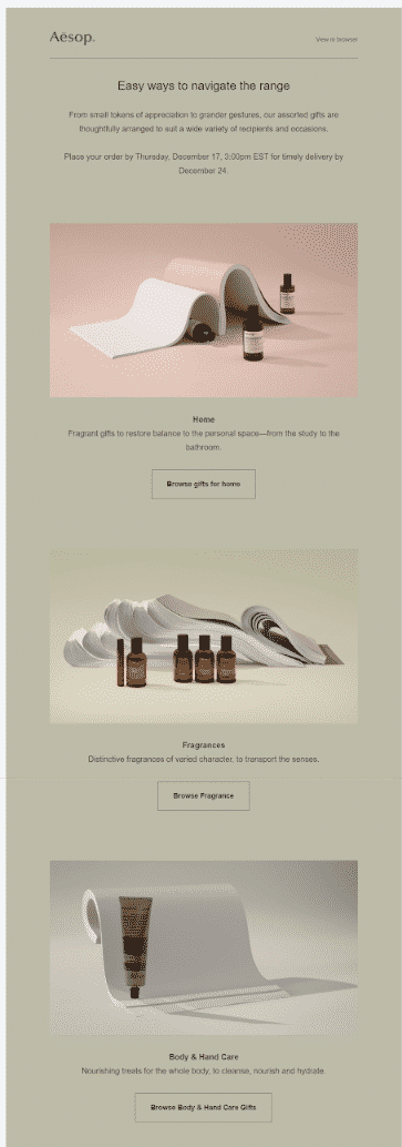
Monochrome shades are getting more popular because they help to create a sense of harmony in emails. They make emails easy to read and more comfortable to engage with it.
Aesop has used green hues in their email to create a close-to-nature feel, which is in sync with the message they are trying to put across.
In 2021, brands will try to get more innovative and incorporate GIFs in their monochrome emails like Mokee has done.

Such minimalistic emails will reinforce the importance of saying more with “less”.
11. Dark Mode
Dark mode has become the hot favorite among marketers and subscribers ever since Google introduced it on 24 September 2019. Android Authority has revealed that 91.8% of people prefer to use some form of dark mode on their devices.
Do you use dark mode on your phone?
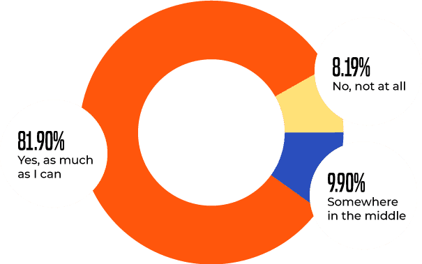
Image source: androidauthority.com
Dark mode refers to a reversed color scheme in which dark background rests behind light-colored typography, iconography, and UI. The reasons it has become so popular with the masses are:
- It’s less exhausting for the eyes as it reduces the impact of blue light.
- It imparts a better reading experience when the ambient lighting is low.
- Having dark mode settings on helps save battery life.
Here’s an example comparing a Duolingo email displayed in regular and dark mode.
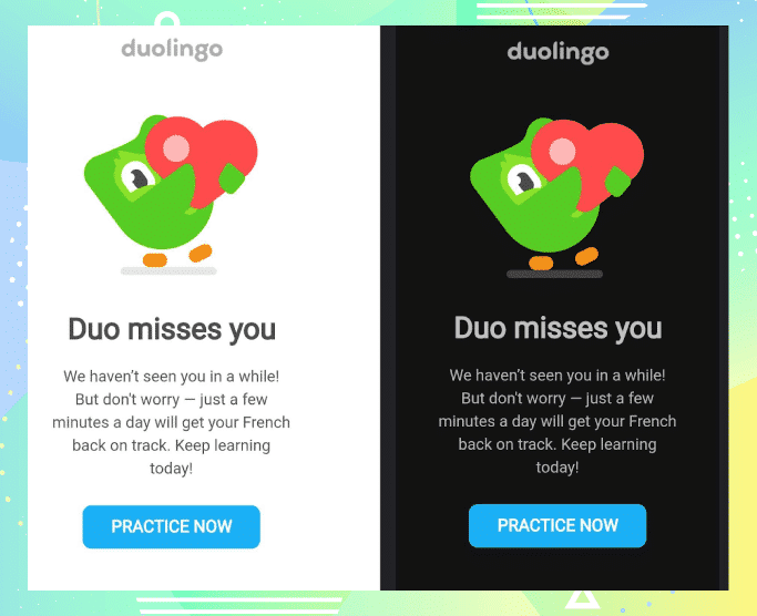
Make sure you design dark mode compatible emails in 2021, otherwise, it may hamper your deliverability rates.
11. Neumorphism
Take a look at this image.

Image source: medium.com
Wouldn’t it be great to include such visually rich elements in emails?
These design elements form a part of neumorphism. The effect of playing with two shadows adds a freshness to visual elements, and can be produced with tools such as Adobe XD, Figma, Sketch, and Adobe Photoshop.
12. Phantasmagoric Collage
If you are looking for something beyond mediocre innovations, phantasmagoric collage is the answer for you. It consists of tidbits of different images in a single image. More and more brands will turn to this trend in 2021.
Have a look at this email by FILMSUPPLY.
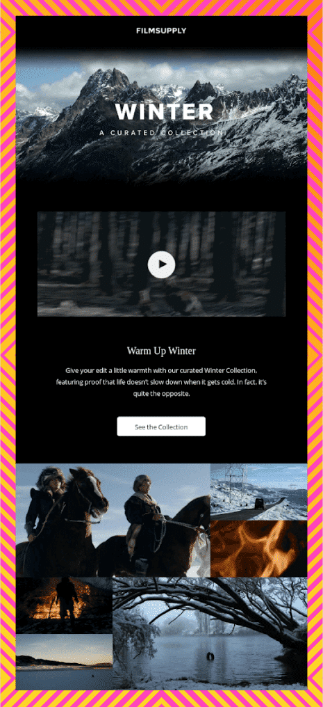
Having the right images in a collage helps email marketers convey a message more effectively while enhancing the brand image.
13. Geometric Shapes
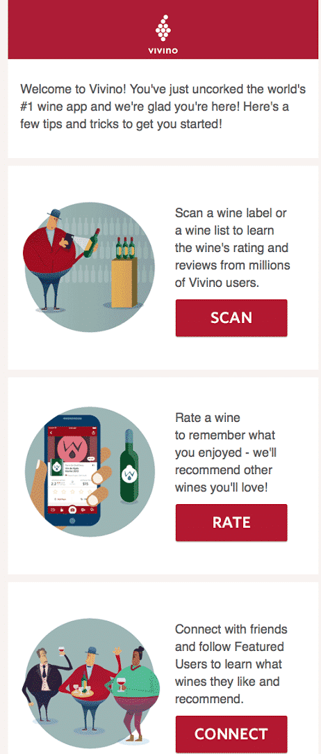
If you want to subtly deliver the context of your email, you can use relevant geometric shapes according to the purpose of your communication.
Take a look at this email by Vivino. See how they have used circles, rectangles, and squares to convey their message more powerfully. Also, notice the placement of illustrative images in the circles, rectangular CTAs, and logo placed in a square. The best part is that the usage of these shapes does not overpower the balance between text, visuals, and white space.
Wrapping Up
2021 will be all about striking the right balance between subtlety and vibrancy. People will not shy away from experimenting with new ideas. They will look forward to imparting a flawless customer experience and making it better with time.
If you want to learn more about these design trends, check out the infographic below created by our friends at Email Uplers: 11 Email Design Trends That Will Reign Supreme in 2021.

_
About the author: Kevin George is Head of Marketing at Email Uplers, one of the fastest growing custom email design and coding companies. He enjoys sharing his insights and thoughts on email marketing best practices on his blog.
The post Email Design Trends 2021: Are You Ready To Up Your Email Strategy? first appeared on JUST™ Creative.
No comments:
Post a Comment