This article was contributed by Ashley Wilson.
Does your office space relay the same message as your branding? It should! The most successful brands bring their branding message, values and goals to life right in their offices, and here’s why you should do it too.
Branding is one of the most important aspects of any successful business. Whether you’re a large multinational, or just starting out, your brand is the first thing potential clients see.
But, your brand is more than just a logo and color-scheme, it’s your company’s personality. Your brand tells people your values, and what to expect from your services. Through a combination of design and language, your unique brand makes sure that you are instantly recognizable and offers a sense of who you are.

Photo by Marc Mueller from Pexels
The Importance of Branding
Are you sleek and stylish, or fun and offbeat? Do you cater to top-end clients, or are you accessible to the average Joe?
Done right, business branding tells potential clients that you’re trustworthy, efficient and that you match their needs.
Whilst most businesses understand the need for a properly branded website and marketing materials, many people underestimate the importance of branding in the office.
Now, if you are conducting client meetings on-site, the need for a well-branded office is clear. After all, you want to make a good impression on your customers and an on-brand office goes a long way towards appearing professional and capable.
But, even if your clients never step into your workspace, branding is important. That’s because it fosters a sense of community amongst your staff.
It reminds people who you are, what your company philosophy is, and what they are working towards every day. It is a visual reminder of why they joined your company in the first place and it has the potential to promote a sense of teamwork across your team.
So, how do you make your office space an integral part of your brand? Let’s take a look:
1. Check That You Are Happy With Your Existing Branding
Before you make changes to your office, it’s a good idea to check that you are happy with your existing branding.
Do your logo and color-scheme fit your business? What about your mission statement and values? How about employees? Are they aware of your mission, your vision, and values, or do you need to work on that first?
If you have any concerns, address them now. It is far easier to make changes before you spend time and money on changing your office space than after.
2. Tell Your Story
So you’re happy with your brand? Fantastic, now it’s time to incorporate your story into your office.
Storytelling is becoming increasingly important within business. Clients don’t just care about prices, they want to know who they’re dealing with, and what makes them tick. Business has always been about relationships, but now things are getting personal.
Storytelling grabs people’s attention, in fact, it has been proven to stimulate brain activity.
But that’s not all; in today’s world, people, particularly those from younger demographics, want to like you before they do business with you. They want to believe in your mission statement, and to trust that you are a positive influence on the world.
So, How Do You Tell Your Story Using Office Space?
One way of displaying your story is to use carefully chosen quotes around your office. There are many ways in which you could choose to do this.
For example, you could frame your values or paint them directly onto the wall. Adding text at eye-level will help draw visitors’ attention, and it’s hard to miss your company philosophy when it’s literally written on the wall.
Alternatively, you could write key statistics in strategic places around the office.
- Are you committed to being environmentally conscious? Try writing something like: ‘Plastic-free since 2016’.
- Have you grown significantly in recent years? Display your success with a quote like: ‘From 1 garage in 2010 to 17 offices in 2019’.
Whatever you choose, make sure your philosophy shines through.
Add Powerful Imagery
Of course, the written word is not the only way to tell a story; images can be just as powerful. To display your story through images, try decorating your office with artistic pictures of your products or services, ideally at different stages of development.
How this is done will depend on your individual business model, but here are a couple of examples:
- A coffee supplier may display photos of coffee beans being picked, packaged, and brewed.
- For an innovative new gadget, sketches of prototypes progressing in detail could tell the story of business from initial idea to an idea to fruition.
Or, if you prefer to concentrate on the here and now, pictures of happy customers can help build trust amongst potential clients, and provide a sense of accomplishment for staff. This is especially effective if the images are teamed with written feedback.
OK, what’s next?
3. Think About Color
Your website and marketing material probably already follow a set color-scheme; bringing this pallet into your office is an easy way to display a seamless continuation of your brand.
If your budget allows, the easiest way to incorporate your brand’s color-scheme into your office is to redecorate.

Photo by Visual Tag Mx from Pexels
However, if your budget will not stretch to painting, adding accents in your brand color(s) can really help create a sense of place.
4. Choose Furniture Wisely
It goes without saying that offices are made up of more than just walls that can be painted, they are filled with furniture too.
And from desks to filing cabinets, the style of your office furniture says a lot about your brand.
Think about how different styles of furniture make you feel.
- Dark wood paired with leather suggests a sense of tradition and prestige.
- The use of glass hints at a more modern and forward-thinking organization.
- Industrial style furniture suggests a company that is cutting edge and fashion-conscious.
- Scandinavian inspired furniture can promote a trendy yet sophisticated image.
The possibilities are endless and texture, as well as style, is important here. From natural materials to synthetic, and from soft fabric to cold metal, the choices you make all impact on the atmosphere of your office space.
So, to choose the right kind of furniture for your brand, think about your values and the service you provide; does it conjure a certain aesthetic in your mind? If you’re not sure, it may help to summarise your business in a few words.
- Are you reliable, sensible, and good value?
- Or, are you more innovative, fun, and high-energy?
Use your chosen words to search the web for inspiration then get creative.
5. Inject Your Personality with Accessories
If your budget is limited, or you don’t wish to change your furniture just now, you might want to look at the smaller details in your office space.
Accessories like plants, wall clocks, and even light-fittings can quickly change the feel of a room, all without breaking the bank.
Think about what reflects your business best when choosing accessories.
- If you are fun and quirky, let your playful side shine through with novelty items.
- If you have a more serious persona, stick with simple, quality items.
For a budget-friendly way to stand out, look for unique bargains in flea markets and community selling sites. If you really want to add a unique element to your decor, try customizing items to match your color scheme.
6. Utilize Your Office Layout
Once you’ve thought about furniture and accessories, it’s time to think about how your office layout can be used as an integral part of your brand.
Before you make changes to your office, it pays to do your research. Try looking at the latest office design trends to get some ideas and guidance on the best office layout that fits your management style.
You see, how you set up your space says a lot about your organization.
Lots of closed doors and private working spaces may match a brand that places emphasis on a discreet service, but it sends the wrong message for a brand that claims to take a collaborative approach to business.
So, think about your image in addition to your business needs. Maybe you need some private working spaces, but if your brand places emphasis on teamwork, make sure your layout includes an element of open-plan working.
7. Examples Of Offices That Get Office Branding Right:
You can seek your inspiration with some of the world’s most famous brands too. Websites like office snapshots allow you to easily look for inspiration from successfully branded offices.
What all of them have in common is that they know the value of office branding, and they are really nailing that part. Here’s how they do it:

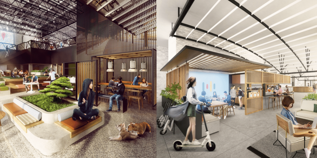
It’s impossible to talk about office branding without mentioning Google. You know why? Because they get it so right.
When you look at any one of the tech giant’s offices, you see a sense of fun and an emphasis on creativity. From their proudly displayed staff perks, like games rooms and chill-out spaces, you see that they care about attracting, and keeping, the best professionals in their field.
And from their playful design and use of color, you are left in no doubt that they are leaders of innovation.
Of course, their name is displayed prominently in their office buildings, but it almost doesn’t need to be. They have encapsulated their brand so perfectly, that their offices are famous around the world.
OK, so you’re probably familiar with Google, but not every excellently branded office is so well known. So, let’s look at some other businesses that are getting office branding right.
Nulo Pet Food

Nulo is a health-conscious pet food business that’s philosophy is ‘healthier together’. They believe that good, nutritious, natural food is important for our dogs, and that dogs are integral in keeping us healthy.
Their office in Austin incorporates comfortable chill-out areas with natural shots of dogs displayed on the walls. Their logo is placed prominently, and the entire space is accented with the brand color-scheme or red and black.
To bring a sense of nature to the office, wooden tables and large windows help bring the outside in, whilst fun additions like dog-house shaped seating areas add a sense of identity and fun.
For anyone visiting Nulo, it is immediately apparent that this is a dog-related business, but the branding goes further than this.
Through its design, Nulo’s office encompasses a feeling of tranquility, wellness, and companionship. Perfect for a pet food brand with an emphasis on keeping dogs and owners healthy.
Costa Coffee

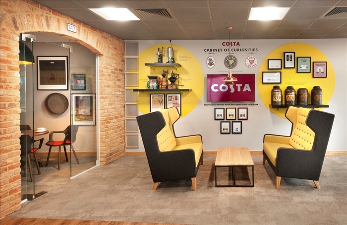
Stepping into Costa’s Essex office, you would be forgiven for thinking you were inside one of their many coffee shops. Their brand logo and famous red brickwork cover the walls, and coffee-related paraphernalia is everywhere.
If there’s one thing Costa’s Essex office does right, it’s storytelling. Bold red writing breaks the companies development down into years, and curiosities like the first-ever bean scoop used by the founder take pride of place.
As a chain of coffee shops, it’s unsurprising that Costa’s office features comfortable booth seating and its own stylish roastery. For staff and visitors alike, the companies love of coffee is unmistakable.
HubSpot

Inside the marketing agency Hubspot’s Dublin office, bright playful design brings a sense of youth and innovation.
Bright colors perfectly match the companies website, and quirky decor brings creativity to the forefront of visitors’ minds.
Plus, a mixture of spacious workspaces and comfortable chill-out areas promotes an image of teamwork and collaboration.
Smart & Biggar LLP

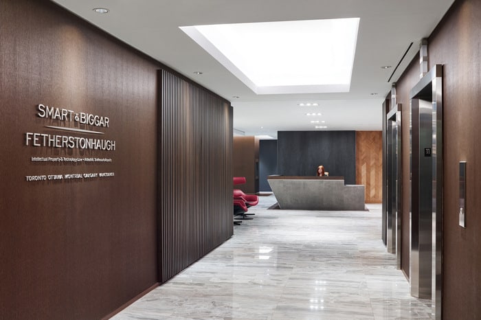
In law firm Smart & Biggar Toronto office, dark wood and leather are intercepted by red and blue accents. This perfectly blends the brand colors with a sense of prestige and reliability.
Lux light fittings, marble flooring, and simple, clean fonts signal that Smart & Biggar is a high-end firm, and offers a sense of reassurance to clients.
All of that dark wood could feel old fashioned and dull, however, because of the law firm’s clever layout and use of white space, they succeed in appearing crisp, modern, and efficient rather than stuffy.
Final Thoughts
Whilst each of these offices is different, one thing stays the same. They all represent their companies brand. Inside each of these offices, the company’s story, aesthetic, and philosophy come together to create a unique space that is all their own.
To follow in their example, pay close attention to your own branding and values.
What textures, colors, and images give a sense of your business? How can you tell your story and highlight your philosophy?
Whether you’re planning a large scale redesign or looking for smaller touches, thinking carefully about these factors can make all the difference to your business.
—
Author bio: Ashley Wilson is working remotely as a content creator, writing about business and tech. She has been known to reference movies in casual conversation and enjoys baking homemade treats for her husband and their two felines, Lady and Gaga. You can get in touch with Ashley via Twitter.
No comments:
Post a Comment