This article was contributed by Chris Donald.
Emails are the lifeline for most brands to survive in this competitive digital marketing world.
Out of the several different marketing channels, email is the one service that can cover multiple levels of engagement with a customer in one shot. It can engage a new prospect, educate and groom them, tempt them with a lucrative incentive, thank them for a purchase, learn from their preferences to serve better & relevant content and delight them. Yet every email campaign does not achieve the level of perfection that an email marketer strives to achieve. Despite its widespread application, there is still scope for improvement.
Here are 20 powerful tips to improve your email marketing campaigns.
1. Improving Email Deliverability
a) Ask your subscribers to whitelist
An undelivered email is a lost opportunity. When your subscribers whitelist your email address, their ISP flags your emails as credible and this indirectly improves your sender reputation. This way, your email has more chances of reaching the inbox of your subscribers than the SPAM folder.
b) Scrub and clean your email list periodically
Another deliverability boosting method is having a clean list. Email list hygiene deteriorates naturally by 22.5% every year and unless you eliminate or re-engage your inactive subscribers, you are wasting time and your efforts by sending them emails. By weeding out hard bounces, dormant subscribers and competition from your mailing list, you reduce the number of SPAM complaints as well as save money (as many ESPs charge you for the number of leads/subscriber in your database).
2. Improving Customer Engagement
a) Behavioral List Segmentation
Most brands use demographics to segment their customer list and get exemplary results in terms of open rates. Marketers who are looking to improve customer engagement also need to segment the list with behavioral triggers of their customers. Identify the behaviors that you need to target such as new leads, cart abandoners or inactive subscribers. Secondly, understand how you want them to move forward in the customer journey.
- Someone who has visited your website but not made any purchase can be sent emails educating them about different products and services you offer.
- A prospect who bounced back from your order or services page can be sent emails featuring testimonials to build trust.
- Someone who ordered in their first visit can be sent the feature introduction emails directly.
b) Experimental Send Timing
Find the optimum send times for your email campaign through trial and error. While different brands have different send times, you must keep experimenting even when you manage to pinpoint your favored sending times. Take a note of the hours that have the maximum traffic on your website and send an email at that time. Does it make a difference?
c) Detailed Preference Center
Although this is applicable to brands that have a lot to offer or when the customers have a multitude of content choices, it is always important to provide the link to your preference center. This will keep your customers engaged with the content that interests them without being overwhelmed by a huge influx of marketing emails when they no longer have the requirement.
d) Personalized Onboarding
A new prospect, on subscribing, has limited information about your brand and wishes to learn about how you can provide a solution to their pain points. Instead of onboarding them with a single welcome email, innovate. Try sending an email series that further simplifies their onboarding process. Survey your email subscribers about their pain points and their responses can help you curate and serve appropriate content to them.
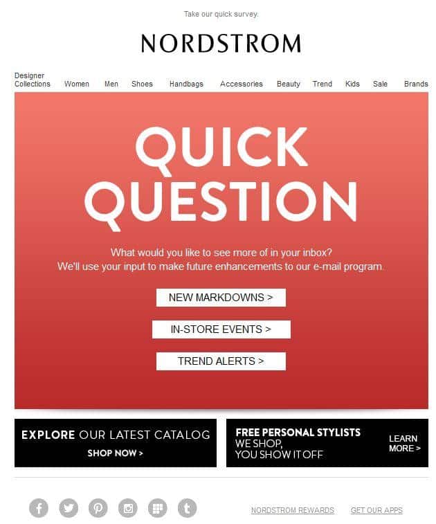
Additionally, providing them with good user experience from the beginning itself helps create lasting relations for the future.
e) Focus On Email To Landing Page Transition
While most email marketers worry about open rates and click rates of their emails, they tend to miss out on the click-through rate and conversion rate of the accompanying landing page. Always create campaign specific landing pages and periodically optimize it to improve conversions. Also, look for drop-outs who clicked on your email but didn’t reach the landing page and re-target them with an appropriate email.
f) Find hidden gems in your email metrics
Besides standard metrics like open rates, click rates, and unsubscribes, look for Easter eggs in your campaign metrics to identify niche points to improve. As we stated earlier, comparing website visits at the time of email sending is one such metric. Certain enterprise level ESPs such as Adestra and PinPointe provide the heatmaps of your email campaigns to identify sections of interest for your customers. You can also gauge the interest by using the accordion layout in your email (explained later).
3. Improving Email Copy
a) Craft Hooking Subject Lines
When it comes to emails, a subject line is the first point of interaction for the customers. Miss the chance to catch their attention with your subject line, all your efforts go down the drain. Email marketers always try using a cryptic subject line to prompt subscribers to open their emails, but it rarely works as there will be many such emails. A good subject line will explain what the subscriber can expect from the email. Create a sense of urgency, but don’t be pushy.
Many suggest summing up your subject lines within 50 characters, but sometimes it may not suffice and you will need to rely on supporting pre-header text.
b) Add in Pre-header Text
Pre-header is a small snippet of text from the email copy, displayed in conjunction with your subject line in most email clients like Apple Mail, iOS Mail and webmails such as Gmail, AOL and Yahoo!. When you cannot convey your message with the subject line alone, continue the conversation with the pre-header text.
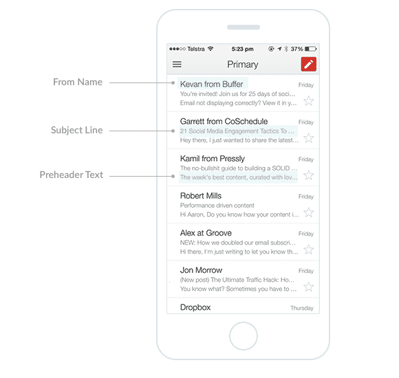
In fact, an experiment conducted by MarketingSherpa revealed that adding a pre-header increased the open rates by 30%.
c) Personalized Email Copy
The meat of an email i.e. the email copy needs to be conversion-oriented yet human-sounding. While everyone personalizes their email copy by addressing the subscribers by their first name and creating specialized content for demographics, it is important to move the level of personalization forward. Create an email copy that you expect to receive yourself. Converse using words such as “I”, “You” and “Me” to make your subscribers feel a part of your brand family.
d) CTA copy that doesn’t say click here
The task of a CTA button is to redirect your subscriber to a dedicated landing page. The story you build using the email copy is only effective if your CTA copy is actionable. Move ahead from standard terms such as “Click here”, “Start free trial” and draft a CTA copy that is relevant to the story.

In the above email by Levi’s, the CTA copy gives a clear understanding regarding what the subscriber can expect by clicking the link.
e) Ask for customer feedback
Ask instead of guessing and assuming. As we suggested earlier, ask your customer about what they like and how they didn’t to cater them better. But the probability of them helping depends on two factors:
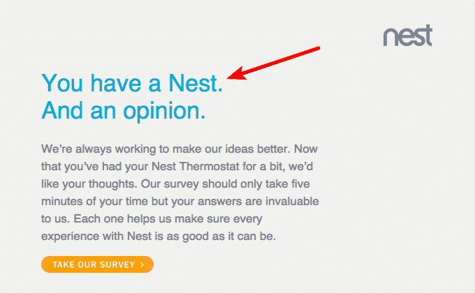
The incentive they get: Encourage customers to provide you feedback and explain how you will use the data to enhance their experience in the future. By showing that you care about their opinions, customers will be encouraged to share feedback as done by home automation brand Nest in the example below.
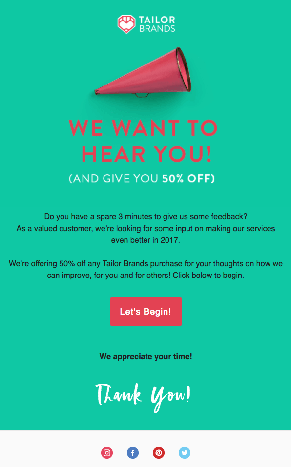
Or provide a lucrative incentive in exchange for the feedback, which will increase your sales as done by Tailors Brands in the example below.
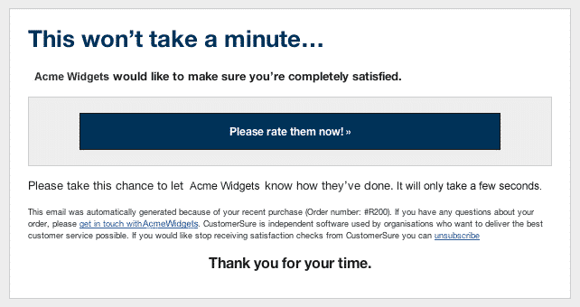
Inconvenience in answering: Psychologically, asking anyone for help while also suggesting how much time they need to contribute increases the chances of them complying. Convey in your subject line or in the email copy about how they can give valuable feedback by sparing a few minutes as shown by CustomerCheck’s email below:
4. Email Design & Coding Tips
a) Dynamic Content
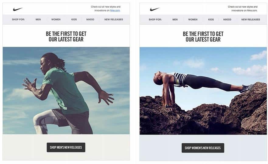
Personalization in emails is not only restricted to using merge tags, but it can also be achieved using dynamic content blocks that change the content of a specific email section when it is opened. This way, your email design can remain the same and you just need to specify the content that needs to change as per segmentation. In the below email by Nike, the hero image and the CTA copy (links also) change depending on the gender specified by the subscriber.
b) Pixel Art
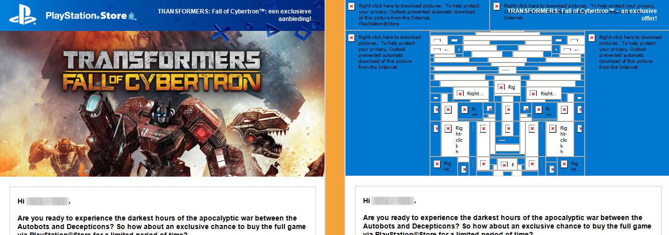
Modern email clients tend to disable images from unknown sender. While others may suggest adding appropriate alt-text to the images to maintain relevance (an important tip to follow nonetheless), go a step further by slicing your images in a specific way to look like a pixel-art with images disabled. In the below email by Sony, as you can observe, the hero image has been split and styled in a way that it resembles the Autobots logo from Transformers.
c) Separate Mobile Layout
Emails should be responsive, but some email marketers tend to scale down their emails so that it can be accommodated in the small screen of a mobile or handheld device. Irrespective of the intention behind doing so, it provides a bad user experience for the end-user. Always create a separate mobile layout while designing an email as this helps you understand how much content can be placed in your emails. Moreover, you can also show/hide certain sections of your emails for mobile users to generate exclusivity.
d) Plain text version along with your email template
This is an important email marketing practice that is often not followed by email marketers. While HTML emails are a delight to view, email client renderability support sometimes manages to ruin the user experience. For a subscriber with slow Internet connection, your HTML email may take eons to download. So, always send an alternative plain-text version of your emails along with your HTML emails for engaging a small yet important section of your mailing list.
e) A/B test a different layout
Never stick to a single email layout, especially for email newsletter. Your subscribers may get accustomed to scanning over the email copy and missing out on some important information. You can understand what works for your brand by A/B testing different email template layouts.
f) Introduce some type of user interactivity
One of the best ways to engage a customer is to make them a part of your story. By involving your customers in revealing the email message, you enhance user experience as well as engagement. This translates to improved customer relations and long-term relations. Two of the most common ways to include user interactivity in your emails are:
1. Selectively show content using accordion effect: Inspired from the movement of the musical instrument, Accordion Effect in email tends to expand and collapse certain sections of your email based on where the subscriber clicks on your email. This way, the content in your email doesn’t affect the overall length of the email and you can also trace which sections were more observed by your customers. Talk about hidden email metrics ;).

2. Live Twitter and Instagram Feeds in Email: Social media is a great tool to increase visibility for your brand and emails are a good way to reach out to your subscribers. Combine the benefits of both by integrating live Twitter or Instagram feed in your emails. This will help you garner more organic followers, which in turn will bring in more traffic to your website.

Wrapping Up
At the end of the day, email marketing is all about trying new things and pushing the limits of your campaign performance, while treating your email subscribers as part of your family. If you manage to raise the metrics by even a fraction by following and adopting the above-mentioned tips, consider the efforts worthwhile. Have any other email marketing campaigns tips that we missed? Share your views in the comments below.
—
Chris Donald is the Director of Inbox Group, A professional email marketing agency that specializes in providing advanced email marketing solutions from production to deployment. He enjoys sharing his distinctive thoughts and insights into email marketing blog.
No comments:
Post a Comment