This article was contributed by Patrick Foster.
There’s little more infuriating when browsing online than landing on a website that is cluttered, complicated and difficult to navigate. If you’re in the process of creating a website, or you are upgrading your existing one, you should do your utmost to make it as intuitive as possible.
If visitors to your website find it frustrating to use, you can be sure they will never return. Just as in life it is better to be friendly, if you’re designing a website, you must ensure it is user-friendly.
At the end of the day, if it doesn’t please your visitors, then you’ve failed to achieve the objective of running a website in the first place.
Here are 7 principles of user behavior that you can use to improve your website design – along with your bounce rate and ROI.
Users shop with brands they trust
In the early years of online shopping, there was a lot of concern about the safety of handing over payment details online. To some extent that is still true, but far less so for trusted websites and online stores. So how to create a website that users trust? It comes from a combination of factors, including: how your website looks and feels, security assurance, brand recognition, positive customer reviews and clearly displayed contact details.
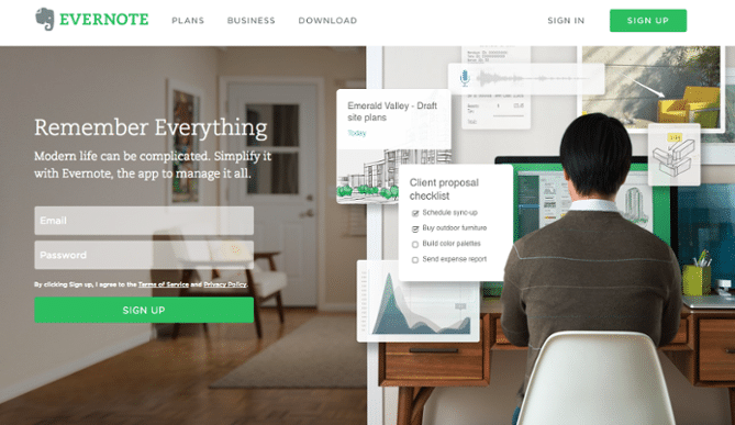
Always remember that you have a limited amount of time to convince visitors to stay once they land on your site. High quality landing pages are crucial, as they are the first thing users see. And don’t ask for too much information upfront – form-fills, etc. How would you feel if a stranger started interrogating you right off the bat?
They want the best solution – quickly
All the best web designers understand that successful websites must be customer-oriented. That is, their sole purpose should be to help your visitors solve their problem (or find what they’re looking for) as quickly and easily as possible. It should be a pleasant experience – not a problematic one. The more pleasant it is, the more customers will reward you with their business.
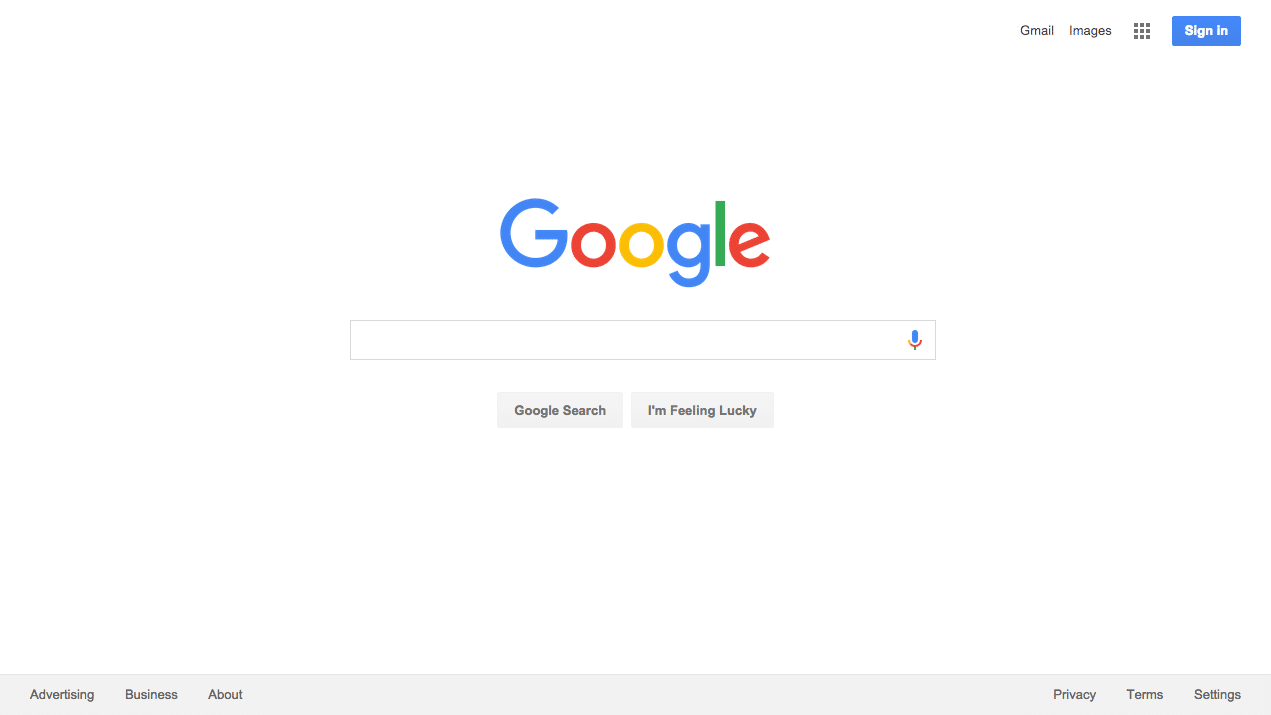
The trap that some designers fall into is added functionality at the expense of the end user experience, ‘because it looks nice’. Always remember that when in doubt, simple is best, especially when it’s a question of ease of use. Look at Google. It wasn’t the first search engine, but it’s undoubtedly the best – and it’s super simple to use. That’s why it makes $100 million a day.
Distractions and pushy sales tactics are a big turnoff
“Please oh please sign up for our newsletter!” Just hold your horses there. This person has barely had time to land on your site and take it all in. Give it a moment. Let them breathe.
Pop-ups are – let’s face it – really annoying. Especially when they try to grasp your attention in the first few seconds, before you’ve even had a chance to see what you’re looking at. They’re an old-school sales technique and, like many other old-school forms of advertising, they need to die out.
If you absolutely have to include a pop-up on your website, heed the following. Make sure it is mobile-friendly. If the sizing is off and the user can’t cancel the pop-up, they may not be able to access your website at all. Make it as unobtrusive as possible, after they’ve viewed your site. Make the purpose clear and do not pander. And don’t do it more than once.
Users start top-left
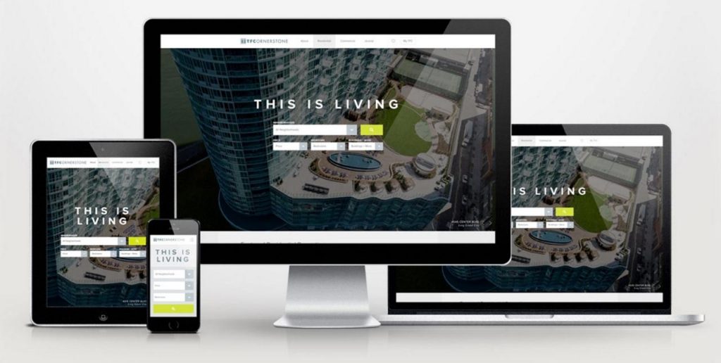
We are trained (through reading) to look first to the top-left of every webpage we come across. Therefore, this makes top-left the perfect place to put your logo. Let the visitor know exactly where they are and what your brand is as soon as they arrive. They will then come to associate your content with this brand.
Your logo should appear at the top-left of every page, not just the homepage. Make sure the logo links back to the homepage, no matter how deep into the site your visitor has found themselves. There should always be a quick and easy way back to the start.
See how it’s done in Jacob’s portfolio piece for TF Cornerstone.
If they get lost, they will leave
This is very important: make sure that at all times your website visitors know where they are, and where you want them to go next. This comes down to good navigation, both from menus and internal links within the pages. Internal links also make it easier for Google to crawl and index your site, so it’s worth doing. Make it easy to browse, but provide a clear pathway to purchase (or whatever your objective) once the user has made that decision.
CTA (Call to action) links on every page are very important, and should be displayed in such a way that they stand out from the rest of the content. Don’t be overly pushy, but use them to guide your readers to the logical next step, for example ‘Contact Us’ or ‘Download Now’.
TLDR (Too long didn’t read)
‘Too long didn’t read’. Be aware when working with your website design that the average internet user only skims through content. It’s not like reading a book – they are simply scanning for the areas that apply to them. That means you need to structure your content in a different way.
As one of the most crucial factors in convincing your web visitors to stick around, make sure you pay attention to your copy. It should be fresh, concise and easy to read. This is not the place to show off how many long words you know. Make content scannable by breaking up long sentences and paragraphs, and using bullet points or numbered lists. Use a readable font and don’t be afraid of white space – white space is your friend. Include plenty of headings and display your CTAs in a different color.
Here’s a good example of a user-friendly landing page from Shopify:
Large headings and subheadings. Short paragraphs of no more than a couple of sentences each. The CTA ‘Get started’ in blue. Active verbs such as ‘Try Shopify free for 14 days’. Shopify has done a great job of making this landing page clean, attractive and encouraging to its users.
Your mistakes are off putting
Spelling mistakes, server errors, 404 pages, broken links – don’t let your wider audience base be the ones to discover your sloppy mistakes. Before you go live with your new redesign, be sure to do plenty of user testing with a small subsection of willing customers. User testing is crucial to creating a solid, user-friendly website. There are plenty of tools and resources out there to help you. Allow plenty of time for this, and as an incentive, consider giving away some products for free (or heavily discounted) in return for your customers’ honest feedback.
By keeping these principles in mind, you can hope to produce a great web design that is both functional and user-friendly, without necessarily sacrificing the bells and whistles. For more advice, be sure to check out Web Design Tips & Advice from A to Z. Remember that your website, once up and running, is a powerful tool that is always working for or against your business – and saying a lot about you. To achieve great results, always keep your users’ needs and desires at the forefront.
—
About Patrick Foster: Branding Consultant & Freelance Writer – As a business owner and digital marketer, I understand the power and importance of bold and powerful design. I write about branding and UX for a range of online publications worldwide, and also for my website: EcommerceTips.org.


No comments:
Post a Comment