Wednesday, 31 January 2018

New Logotype Masterclass with Jessica Hische

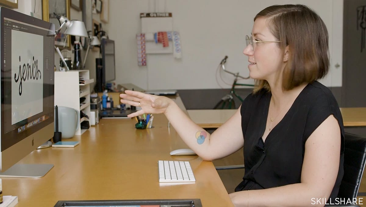
I want to introduce you to this excellent new Logotype Masterclass that will teach you how to take your logos from good to great, with the award-winning designer and letterer, Jessica Hische.

Jessica’s last lettering course was a huge hit with you guys (as well as Aaron Draplin’s Logo Design class) but this one is focused purely on logotypes.

You will get an insider look at her start-to-finish process for refreshing type-based logos, to help improve your individual letterforms and overall designs. There’s tons of inspiration inside, along with recommended resources, and her iconic lettering style.

Jessica Hische Skillshare Logotype Masterclass

The lessons include:

  • A checklist for “big picture” design qualities, like hierarchy and scale
  • How to hone your eye for detail and consistency
  • Polishing vector logos in Adobe Illustrator
  • Tips for making the most of freelance & client work

After taking this class, you’ll see logos and lettering through Jessica’s eyes and be able to spot issues and improve your work with the checklist Jessica uses in her own work every day.

Take this class FREE + get 2 FREE months of Skillshare Premium

Get access to this course and 15,000 more classes with Skillshare Premium. Totally free for 2 months!

Take Jessica’s course & get 2 FREE months of Skillshare Premium

Enjoy!

Monday, 29 January 2018

7 User Behavior Principles You Can Use to Improve Your Website Design

This article was contributed by Patrick Foster.

There’s little more infuriating when browsing online than landing on a website that is cluttered, complicated and difficult to navigate. If you’re in the process of creating a website, or you are upgrading your existing one, you should do your utmost to make it as intuitive as possible.

If visitors to your website find it frustrating to use, you can be sure they will never return. Just as in life it is better to be friendly, if you’re designing a website, you must ensure it is user-friendly.

At the end of the day, if it doesn’t please your visitors, then you’ve failed to achieve the objective of running a website in the first place.

Here are 7 principles of user behavior that you can use to improve your website design – along with your bounce rate and ROI.

Users shop with brands they trust

In the early years of online shopping, there was a lot of concern about the safety of handing over payment details online. To some extent that is still true, but far less so for trusted websites and online stores. So how to create a website that users trust? It comes from a combination of factors, including: how your website looks and feels, security assurance, brand recognition, positive customer reviews and clearly displayed contact details.

Always remember that you have a limited amount of time to convince visitors to stay once they land on your site. High quality landing pages are crucial, as they are the first thing users see. And don’t ask for too much information upfront – form-fills, etc. How would you feel if a stranger started interrogating you right off the bat?

They want the best solution – quickly

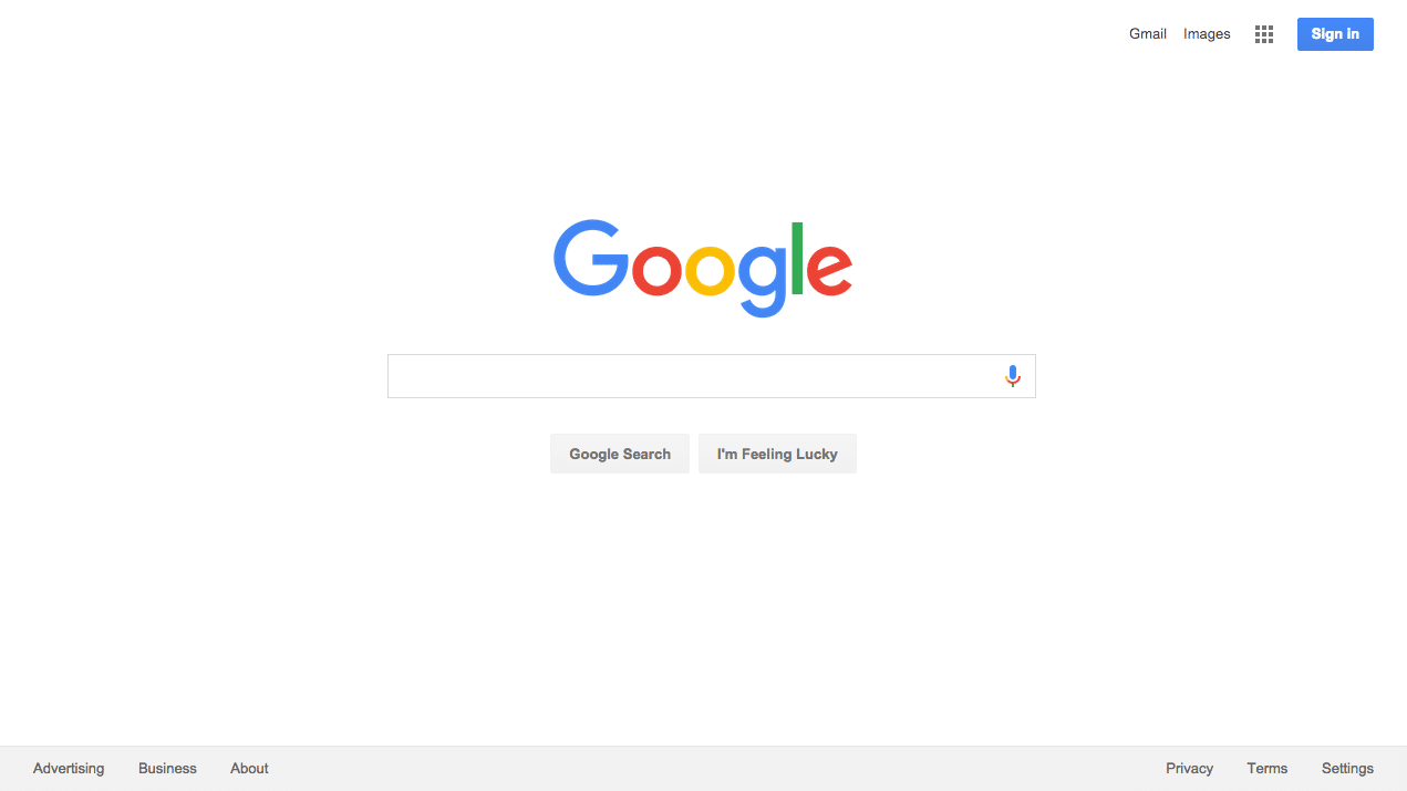
Google Website

All the best web designers understand that successful websites must be customer-oriented. That is, their sole purpose should be to help your visitors solve their problem (or find what they’re looking for) as quickly and easily as possible. It should be a pleasant experience – not a problematic one. The more pleasant it is, the more customers will reward you with their business.

The trap that some designers fall into is added functionality at the expense of the end user experience, ‘because it looks nice’. Always remember that when in doubt, simple is best, especially when it’s a question of ease of use. Look at Google. It wasn’t the first search engine, but it’s undoubtedly the best – and it’s super simple to use. That’s why it makes $100 million a day.

Distractions and pushy sales tactics are a big turnoff

Bad Popup

“Please oh please sign up for our newsletter!” Just hold your horses there. This person has barely had time to land on your site and take it all in. Give it a moment. Let them breathe.

Pop-ups are – let’s face it – really annoying. Especially when they try to grasp your attention in the first few seconds, before you’ve even had a chance to see what you’re looking at. They’re an old-school sales technique and, like many other old-school forms of advertising, they need to die out.

If you absolutely have to include a pop-up on your website, heed the following. Make sure it is mobile-friendly. If the sizing is off and the user can’t cancel the pop-up, they may not be able to access your website at all. Make it as unobtrusive as possible, after they’ve viewed your site. Make the purpose clear and do not pander. And don’t do it more than once.

Users start top-left

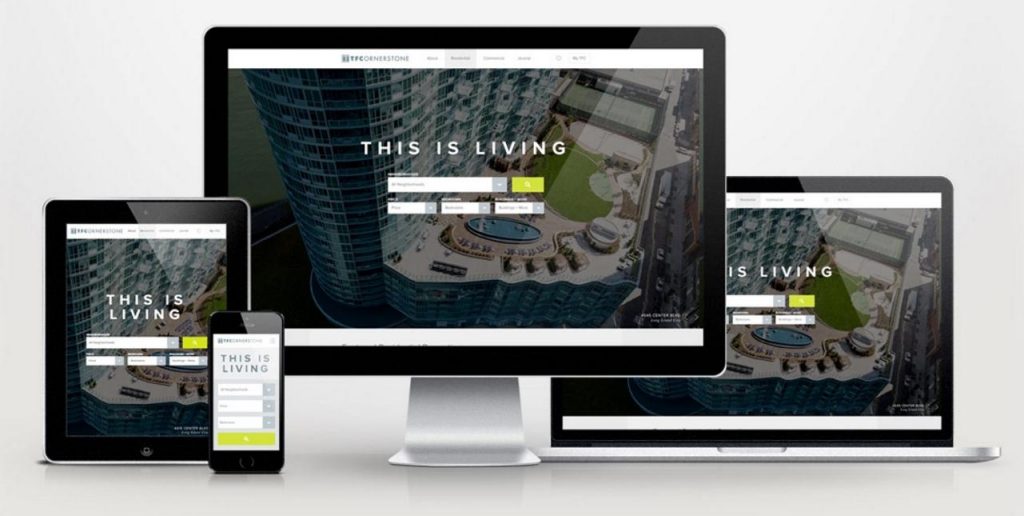
We are trained (through reading) to look first to the top-left of every webpage we come across. Therefore, this makes top-left the perfect place to put your logo. Let the visitor know exactly where they are and what your brand is as soon as they arrive. They will then come to associate your content with this brand.

Your logo should appear at the top-left of every page, not just the homepage. Make sure the logo links back to the homepage, no matter how deep into the site your visitor has found themselves. There should always be a quick and easy way back to the start.

TFC

See how it’s done in Jacob’s portfolio piece for TF Cornerstone.

If they get lost, they will leave

This is very important: make sure that at all times your website visitors know where they are, and where you want them to go next. This comes down to good navigation, both from menus and internal links within the pages. Internal links also make it easier for Google to crawl and index your site, so it’s worth doing. Make it easy to browse, but provide a clear pathway to purchase (or whatever your objective) once the user has made that decision.

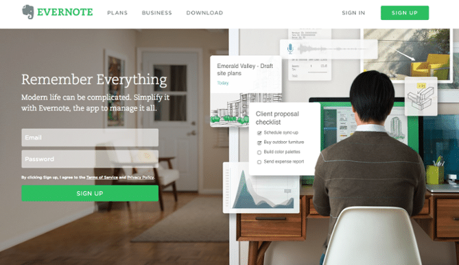
Evernote CTA

CTA (Call to action) links on every page are very important, and should be displayed in such a way that they stand out from the rest of the content. Don’t be overly pushy, but use them to guide your readers to the logical next step, for example ‘Contact Us’ or ‘Download Now’.

TLDR (Too long didn’t read)

‘Too long didn’t read’. Be aware when working with your website design that the average internet user only skims through content. It’s not like reading a book – they are simply scanning for the areas that apply to them. That means you need to structure your content in a different way.

As one of the most crucial factors in convincing your web visitors to stick around, make sure you pay attention to your copy. It should be fresh, concise and easy to read. This is not the place to show off how many long words you know. Make content scannable by breaking up long sentences and paragraphs, and using bullet points or numbered lists. Use a readable font and don’t be afraid of white space – white space is your friend. Include plenty of headings and display your CTAs in a different color.

Here’s a good example of a user-friendly landing page from Shopify:

Shopify Website

Large headings and subheadings. Short paragraphs of no more than a couple of sentences each. The CTA ‘Get started’ in blue. Active verbs such as ‘Try Shopify free for 14 days’. Shopify has done a great job of making this landing page clean, attractive and encouraging to its users.

Your mistakes are off putting

Spelling mistakes, server errors, 404 pages, broken links – don’t let your wider audience base be the ones to discover your sloppy mistakes. Before you go live with your new redesign, be sure to do plenty of user testing with a small subsection of willing customers. User testing is crucial to creating a solid, user-friendly website. There are plenty of tools and resources out there to help you. Allow plenty of time for this, and as an incentive, consider giving away some products for free (or heavily discounted) in return for your customers’ honest feedback.

Crazy Egg

By keeping these principles in mind, you can hope to produce a great web design that is both functional and user-friendly, without necessarily sacrificing the bells and whistles. For more advice, be sure to check out Web Design Tips & Advice from A to Z. Remember that your website, once up and running, is a powerful tool that is always working for or against your business – and saying a lot about you. To achieve great results, always keep your users’ needs and desires at the forefront.

About Patrick Foster: Branding Consultant & Freelance Writer – As a business owner and digital marketer, I understand the power and importance of bold and powerful design. I write about branding and UX for a range of online publications worldwide, and also for my website: EcommerceTips.org.

Monday, 22 January 2018

My Top 7 Favorite Branding & Logo Books

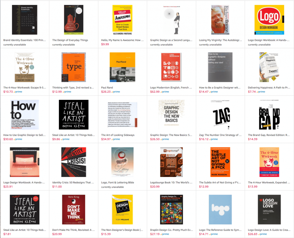
I was recently asked to join the Amazon Influencer Program, which basically is a way for ‘influencers’ to get their own customizable Amazon page, to recommend products to their followers.

I took this opportunity to recommend some books and other items in my Amazon shop, so go check it out.

» Browse my Amazon shop

Or read on below for my top picks. These would be the books I would choose if I had to start my library fresh.

My Top 7 Favorite Branding & Logo Books

Designing Brand Identity

If I had to choose one book, it would be this one because it’s the best ‘all-rounder’ on the topic of design & branding. In their words, it’s the “best-selling toolkit for creating, building, and maintaining a strong brand”.

Designing Brand Identity

Learn More

Logo: The Reference Guide to Symbols and Logotypes

For a purely ‘logo inspiration’ book, then this would be my top pick. There are 1200 logos inside this tomb, sorted by 75 categories. An essential for any logo lover.

Logo Book

Learn More

The Ultimate Guide to Logo Design

Kyle Courtright’s ebook is the “definitive guide to logo design”, with 90 pages detailing every facet of logo & brand identity design, but in delivered in a concise manner that you can actually understand, perfect for both beginners & professionals.

JUST Creative readers can get $10 (35% off) the book, making it just $19. Use coupon code ‘JUST10OFF’ at checkout

Ultimate Logo eBook

Learn More

Hello, My Name Is Awesome: How to Create Brand Names That Stick

The best brand naming guide available. Period. A quick, good read.

Hello my name is awesome

Learn More

Logolounge Book 10: The World’s Premier Logo Showcase

The logolounge series is the longest running logo inspiration series and the best in my opinion. The logos featured inside are the creme of the crop and book 10 is no exception, with 2500 logos inside, selected by an international jury.

LogoLounge 10

Learn more

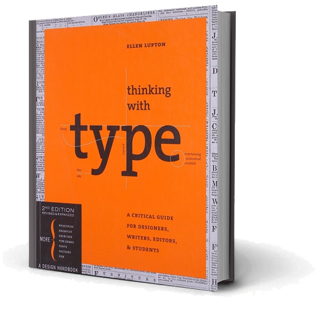
Thinking with Type: A Critical Guide for Designers, Writers, Editors, & Students

Knowledge of type is essential for effective visual communication in branding and logo design and this book teaches you the basics and then some.

Thinking with Type

Learn More

Browse my Amazon shop

For more of my recommendations, check out my Amazon Shop.

» Browse my Amazon shop

Amazon Book Recommendations

Tuesday, 9 January 2018

The Definitive Type Lover’s Collection – JUST $29

Fonts are fundamental to every design and creative project, and finding well-made fonts can not only be really tricky, but really expensive!

DesignCuts have put together this definitive new collection featuring some of the most popular fonts across every discipline. These fonts sell for thousands of dollars and regularly top every best-sellers list. This is the first time you can find this incredible collection for just $29, for a limited time only.

Kick Start Your New Year Projects With This Diverse Array Of Best-Selling Fonts!

  • Top fonts from some of the best foundries in the world
    They have included the best-selling fonts from foundries such as URW, Latinotype, Zetafonts, ROHH and many more. Whether you’re working on a clean graphic design brief, an elegant invite, a bold website or vintage artwork, this collection is packed full of stunning fonts to cover you for any project.
  • 17 versatile and professional font families (featuring a total of 377 individual fonts), perfect for adding exceptional typography to your design work.
  • Many fonts include extra weights, styles and stylistic alternates.
  • Many fonts also include bonus/extras packs, containing additional creative resources.

These fonts retail for $3316 but you can get them all for just $29 (99% off)

» View Type Lover’s Bundle (99% Off)

Don’t miss out, this deal expires on Tuesday Jan 30th 2018.

Type Lover Collection

» View Type Lover’s Bundle (99% Off)

Monday, 8 January 2018

Creative Chats with Jacob Cass

I recently had a “Creative Chat” with HUNTERHunter, an online publication that keeps people in Newcastle, Australia up-to-date with the latest news & things to do in the area. As I studied at Newcastle University, traveled extensively and won the University’s ‘Young Alumni Award‘, they wanted to provide further insight & inspiration for others wanting to get the most out of their career. Enjoy the transcript of our in-person conversation.

Creative Chats with Jacob Cass

Jacob Cass has pretty much scaled the highest of mountains when it comes to his working life. We caught up with Jacob to chat about New York agency life and how he works/travels the globe.

Graduating from the UON in 2007 with a Bachelor of Visual Communication (Graphic Design Major) Jacob was invited by New York agency Carrot Creative to move to the Big Apple and kick-start his career in the most awesome of ways. Seven years later Jacob has notched up a spectacular resume and created the ultimate work/life balance.

We caught up with Jacob on one extremely hot December day at the end of 2017 to find out just how one gets asked to live and work in New York and about some of his career highlights.

How did your career in design start?

In high school, I opened my business as JackCass Productions (see his brand evolution here), which I soon found out was a terrible name, so I changed it to Just Creative. This is where it all started. I was learning design in High School and then I moved to University to study further. I’ve always loved design.

The UON provided me with the principles to build upon but I’ve also learnt a lot myself and on the job, digital moves so quickly that it’s difficult to keep up. Now I specialise in branding, logo design and interactive design.

How did a Creative Agency in New York find you, all the way back in 2007?

I grew up in Sydney and moved to Newcastle to study at the UON, I was two and half years through a three-year course when I was offered the job in New York. At the time I didn’t have a job, I had no experience and I told them I had to finish my studies before I moved which they accepted and then as soon as I graduated I moved over.

They found me through my blog, Just Creative, which I am still writing now, and I was also active on social media and gaining traction at that time, which was early days for social media back then. The agency was focusing on social media and digital at the time and I guess I came up on their radar.

When you say Social Media what platforms are we talking given this was in 2007?

Facebook, Twitter and blogging, they were the mains ones, Twitter was just starting up. It was mainly the blogging aspect. The digital landscape is quite different now, there’s a lot more competition, back then they were smaller communities, a lot of people knew each other so you networked much closer which made things a little easier.

Jacob Cass Talking

How did you come to be so switched on to Social Media so early on?

For me it started as a way of recording my design studies at the UON, on my blog, it was just a personal project at the time. When I learnt more about blogging I also learnt more about social media and how you could use it as a tool to promote yourself, as well as collaborate and discuss with other people.

How long were you in New York for?

I was in New York for 5 years, my wife and I left in April 2015 and have been travelling ever since. We’ve only just returned to Australia but do plan to travel more.

What did your first job involve?

When I moved to New York my first job was at a digital design agency where I was worked as an interactive designer. This gave me access to big clients, so one of my first jobs was working for Disney which was really awesome, then we did some work for Nike, and this was straight out of uni, I couldn’t believe it. I then moved onto another company.

There I worked for clients like Powerade, Nintendo and Jerry Seinfeld (Comedians In Cars Getting Coffee) which just catapulted my career as did my TEDx talk. I stayed at that agency for four years and it was a really interesting environment to work in as I had the opportunity to work for some big brands which then involved working with teams of people such as; creative directors, art directors, interactive managers, developers, interns even and you’re all collaborating together. Very different to what I do now which is working with small to medium businesses and start-ups all around the world.

Just Creative

Jacob’s project for Jerry Seinfeld being advertised in Times Square

What were your highlights of working in New York?

Working with Jerry Seinfeld was definitely a highlight, I actually worked with him directly as he liked being very hands on. That was a big highlight and seeing my work at the Super Bowl was really cool, on the jumbo screen, during the ad breaks and now on Netflix. Another highlight was working with Nintendo. They had so many different games and styles so I had the opportunity to be more artistic and creative with my work.

Where do you call home at the moment?

So we have a few places we call home, at the moment we’re living at in Sydney, as well as wherever we choose to travel to. We are looking for a place to live in Sydney, but we’re not ready to commit right now. We still want to travel and as my work allows us this flexibility, we want to utilise it for as long as we can, before kids.

So you can literally work from anywhere? 

Absolutely that’s what I’ve been doing for the last two years, my wife and I have travelled to over eighty countries, and apart from a couple of countries that have slow internet I’ve been able to work from anywhere. Even Africa, which in some areas has faster internet than in Australia.

You’ve worked all over the world, where do you consider the most creative cities to be?

New York is definitely number one, I might be a bit biased though as I lived there for so long, I also consider Barcelona and Berlin to be very creative. London a little bit but I haven’t spent as much time there as I would have liked to have. Those are the ones that really stood out to me.

What is it about those cities that make them creative?

I think it’s their open-mindedness, the scene in general and their acceptance. They’re all quite different cities so I am not sure if there is a pattern but generally speaking they all have creative hubs and I would say it’s definitely ingrained in the culture.

Jacob Cass on Laptop in Maldives

Jacob Cass working remotely in the Maldives. 

What do you think of Newcastle’s creative scene?

I think Newcastle is definitely creative in terms of the art scene, I haven’t lived here for ten years so I am not completely across it, but I think the Master in Creative Industries degree is a great step to take in encouraging that scene even further.

The course itself is broad in scope so you can get a touch of everything and then hone in on what it is you love. You don’t always know what you want to do. When I first went to the UON I didn’t know I wanted be working in Interactive or Web Design, that wasn’t even a part of the course at the time. I learnt early on that I disliked illustration, instead, digital design and typography were what I was drawn to, so I went in that direction and I am still doing that today.

How do you stay across all the changes that are happening in the digital world?

I am always reading online, there are so many articles and resources, there’s actually too much, there’s so much noise these days. The thing is you need to specialise in something, otherwise if you do everything you’ll never excel at it. I see it every day, people trying to do too many things and they get overworked. I personally focus on branding and logos. That’s my niche.

Jacob Cass Laughing

How important would you say branding is?

There are two sides to the sword here, businesses can be successful without “good branding” especially if they have a good product. However, I would say that branding is quite crucial because even if you don’t have a brand per se or set out to create one, your customers are going to make one for you. They’ll have their own image in their mind and will form an opinion based on your service and products. So why not make one for them and have a strategy behind it?

Even for small business?

I think at the start it’s crucial, your identity is everything and you want to be perceived with a certain goal in mind. If you don’t establish yourself from the beginning and have a consistent brand identity such as a logo, colours, fonts and a general style then your brand is going to be all over the place.

What are you currently working on?

I am actually working with a yarn shop, knitting that is, in the US which I’ve had a lot of fun with, lots of puns. I am also working with a brand called Walabot. They have this cool device that allows you to see through walls, basically you attach this device to your Smartphone and scan your wall. It can pick up wires, rodents and more, so you don’t drill into the wrong spot. Not quite x-ray vision [laughs].

Just Creative

Jacob going head to head with The Masai lead jumper “After the longest minute of my life, he gave in and I won a new wife (the prize of the competition).”

And most importantly where are you travelling to next?

We’re actually going to be spending some time in Australia, we’re going up to Bryon Bay then off to Adelaide, then Melbourne, Tassie, Perth and then back home. We are also planning our winter holiday which might be Africa or Central America, not sure yet still deciding. Tough decisions! Follow along at their travel blog Just Globetrotting.

Do you have any further questions? Let me know!