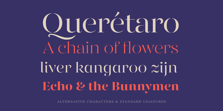
For many designers, when it comes to designing a clean and elegant logo for a company, using a Serif font in their designs helps to add a little bit of flair & sophistication to the brand.
A serif font is easily identified by the “little feet” that appear at the ends of the letters being used. Doing a search for Serif fonts can lead you down the proverbial rabbit hole with all of the options there are to choose from.
To offer a bit of help, we wanted to focus on ten of our favorite Serif fonts you can use when branding or designing a logo with a clean and elegant look.
Now, you may have your own favorite Serif font and it may or may not appear on our list, but we recommend taking a closer look at the options presented here, some of which are revivals of the classics, ensuring your logo has a unique character to it.
Who knows, you may find a new font that you end up using for years to come.
See here for the best SANS-serif fonts for clean & minimal logo design.
10 Best Serif Fonts for Clean & Elegant Logo Design
- Hermann
- Recoleta
- Blacker
- ITC Lubalin Graph
- Linotype Didot
- Begum
- ITC Caslon No. 224
- Sabon
- Bookmania
- Gabriela Stencil
Each font listed below has a brief description & font preview.
If you’re ready, let’s get started, here are the best 10 serif fonts for logo design.


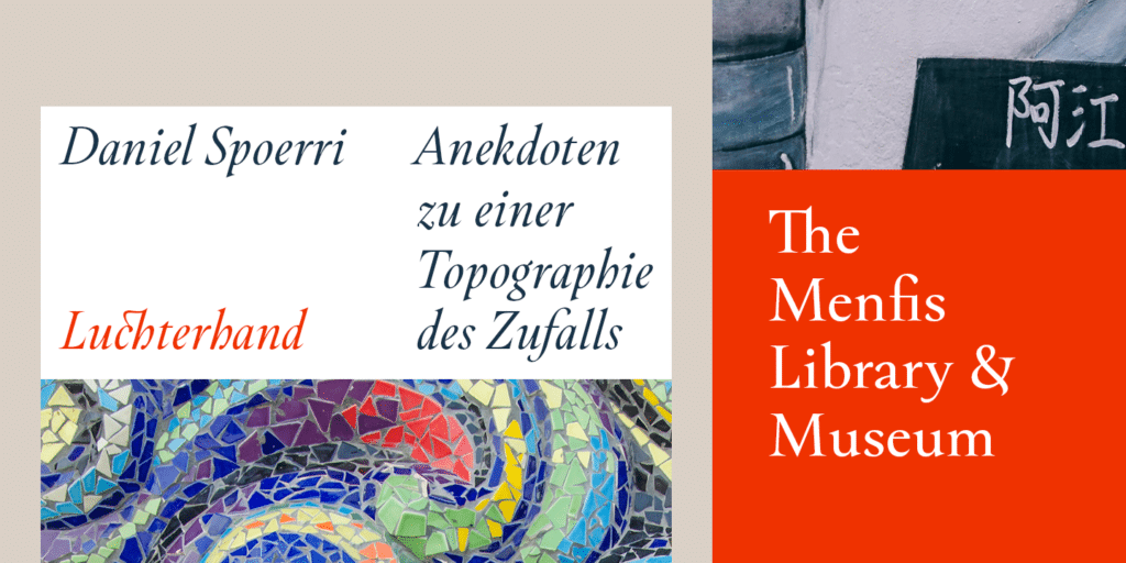
Designed in 2018 by Diego Aravena and Salvador Rodriguez, the Hermann font family is one of the design teams most readable fonts available so far. Looking at the works of Herman Hesse and Aldous Huxley for inspiration, the team found the concepts of duality, surrealism, and wildness frequently appeared, fueling the design process.
Designed to not only be an accurate font when it comes to legibility but can also present a feeling of being wild and bold. Available in ten different variations including italic and bold, the Hermann font is inspired by the novels of the 20th century and their worlds, taking its name from one of the most prolific authors of that era.
» Download Hermann Font
2. Recoleta


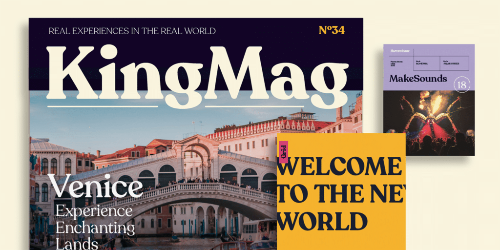
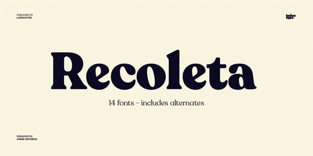
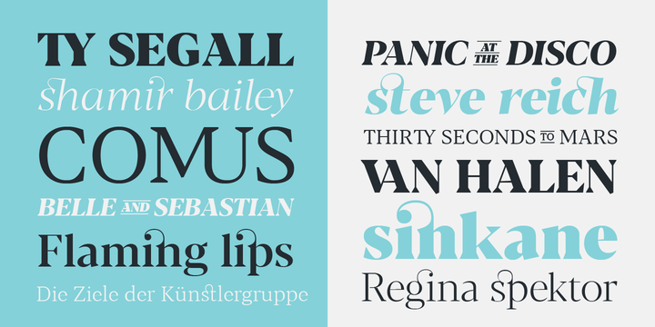
Like a melting pot, Recoleta combines many different aspects from fonts of the past to create something new, fresh, and with a modern flavor. By taking the soft and gentle shapes found in the Cooper font and the fluid angled strokes in Windsor, designer Jorge Cisterna has blended together a beautiful and familiar font that looks amazing in a logo or on a business card, giving them a look that’s unique
Available in a variety of weights, this font gives you the options you need to choose the best typographic color for whatever project you’re working on. While body text works well with a lighter weight, if you’re writing headlines, heavier weights are ideal.
The Recoleta font can make any design stand out like in the Waves to Wilderness logo.
» Download Recoleta Font


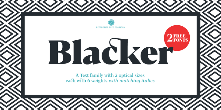
A wedge serif type font, Blacker was designed to be a take on the “evil serif” typeface genre. The high contrast, sharp wedge serif design was created by Cosimo Lorenzo Pancini and Andrea Tartarelli who were looking to evoke the proportions of fonts used in the 1970s.
Using the Latin alphabet, Blacker features an extended character set which covers more than seventy languages, including Russian Cyrillic. Small caps, fraction, alternate forms, four sets of figures, as well as superior and inferior figures and discretionary ligatures are all features of the Blacker font family.
» Download Blacker Font

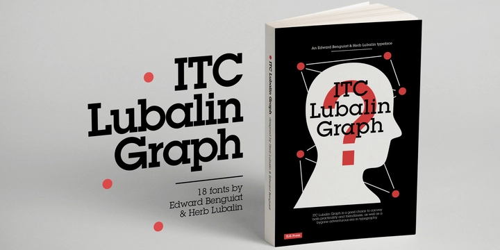
While it is technically a slab-serif font, the ITC Lubalin Graph font helps convey a no-nonsense look, that while strong, can be perfect for a modern design, especially with the lighter weights.
ITC Lubalin Graph is a 1974 design which is based on an earlier sans serif font that was designed by Herb Lubalin, ITC Avant Garde. The character shapes may be identical between the two designs although Lubalin Graph adds a slab serif feature.
Designed to look good in applications from headlines to packaging, this is an extremely versatile font family.
» Download ITC Lubalin Font


Designed by Adrian Frutiger, the Linotype Didot font pays respect and tribute to one of the most important print shop and font foundries in France during the 18th and 19th centuries. The Didot family were active designers as well as printers, typeface designers, inventors, intellectuals as well as publishers during this era.
Frutiger’s Linotype Didot design is a sensitive interpretation of the French Modern Face Didot font and gives any text you use it for, a classic and elegant feel and at the same time paying respect to the original Didot family.
» Download Didot Font


A Latin display serif typeface with contrast, the Begum font family has an ultra-contemporary appearance and shares DNA with other Anglo-Dutch font types such as Caslon, Fleischmann or Times, with a slightly exotic feel.
Designed by Manushi Parikh, the Begum font truly shines when used with texts of a shorter length, article introductions that are multiple lines and even on packaging.
» Download Begum

Designed in 1983 for the International Typeface Corporation by Ed Benguiat, ITC Caslon 224 was designed to be a modern-day interpretation of the Caslon typeface.
With eight font weights ranging from Standard to Standard Black Italic, ITC Caslon 224 has a large x-height, a very high contrast between think and thick strokes and also provides transitions between the different weights smoothly.
» Download ITC Caslon Font


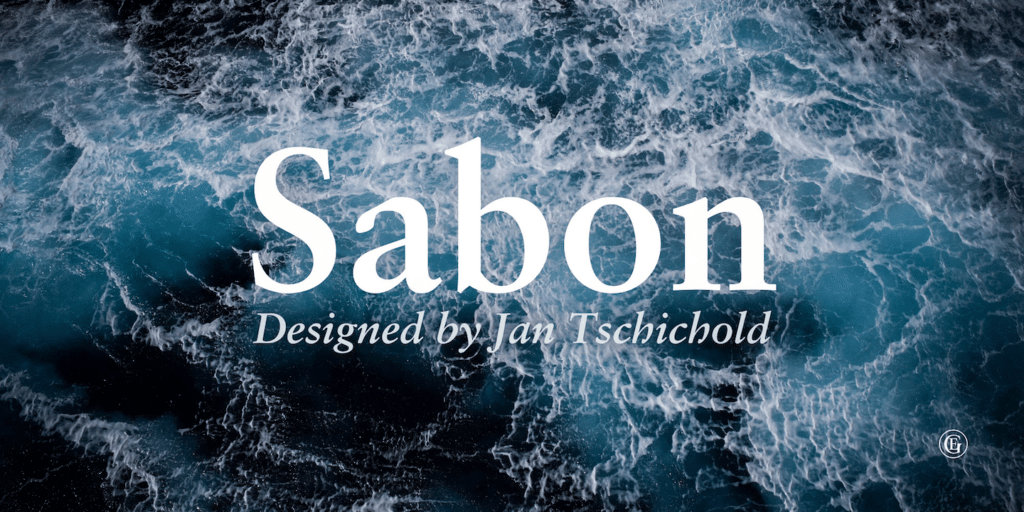
In the 1960s, a new typeface was requested by the German Master Printers’ Association to be designed and produced identically on both Linotype and Monotype machines in order for both the text and technical composition would match. Jan Tschichold was commissioned to use Claude Garamond’s classical and serene Roman font and design a new version.
Sabon succeeds although its bold and italic styles are limited by Linotype casting machine requirements. This forces the character widths to match between different styles and also gives the italic typeface its characteristic narrow f.
» Download Sabon Font

With 10 styles, 658 swashes and a multitude of expert features, Bookmania is a font that any logo design can benefit from.
Designed by Mark Simonson in 2011, the Bookmania font type has all of the features that you may expect to appear when using a modern digital font family. As a revival of Bookman Oldstyle, designed in 1901 and the Bookmans font family from the 1960s, the Bookmania font family has the features that you need to make your logo design excel.
» Download Bookmania Font
10. Gabriela Stencil


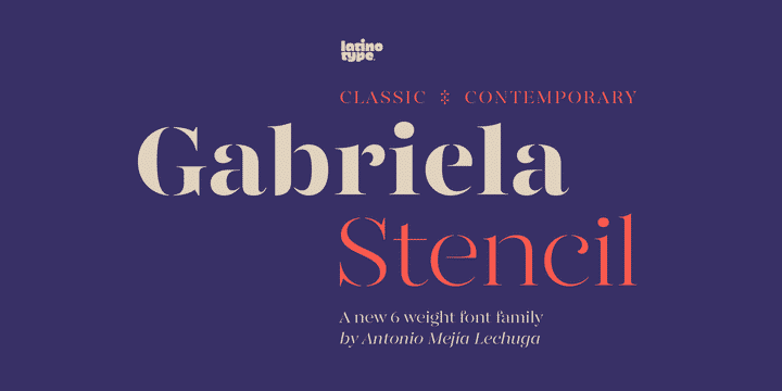
Designed by Antonio Mejia in 2016, Gabriela Stencil has a unique character while being part of a classic font family. Well-suited for headlines & fancy logos, the font emphasizes the modern and elegant personality that the font features and has been inspired by the style found with the Didone typefaces from the 19th-century.
Also ideal for branding, short text and publishing projects, Gabriela Stencil is a highly readable font with the x-height sized at 50% of the cap height, along with short ascenders and descenders. Available in six styles, the font family contains a 433-character set which supports over 200 different languages.
» Download Gabriela Stencil Font
Best Serif Fonts for Clean & Minimalist Logo Design
Using a clean and elegant Serif font in your logo design not only makes it sophisticated, but it can also add a bit of exciting flair to your design.
There are so many different, well-designed Serif fonts that are available for any graphic designer to use. We hope that our list of the ‘best professional serif fonts for logo design’ can provide you with some options you might not have considered before and inspires you.
More Top Fonts
Do you have a favorite clean and elegant font that you use in your logo designs?
Let us know in the comments below.
Infographic: What your Logo’s Font Says About Your Brand
Thanks to Brand Marketing Blog for the below infographic.


