Below is my entire design process of updating the logo, tag and brand identity for outdoor fashion brand, Waves to Wilderness.
Old Logo vs New Logo

Old Logo VS New Logo
Old Website
This is their old website and logo which hasn’t been updated to the new look, just yet.
Old Website
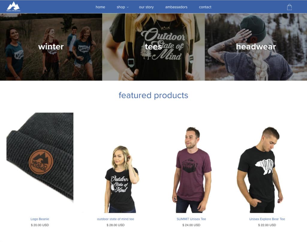
New Website
This shows the new logo and visual identity in context of their website, showing how the fonts, colors, photography, textures and overall style work together.

New Waves to Wilderness Website
[Video] Logo Design & Branding Process: Behind The Scenes
A behind-the-scenes look at my art board, showing how I experiment with concepts, type and color to form the brand’s identity.
Type Wall
As mentioned in the video, I often start with a “Type Wall” because this allows me to get a feel for each typeface at a glance.
I open my Type Wall template and use “Find and Replace” to change the words to the brand I’m working with. I would share the template, but it would be quite useless you had all the fonts that I have installed.
Sometimes you find the right typeface, but not always. Either way, it’s a quick starting point and a good reference to come back to.
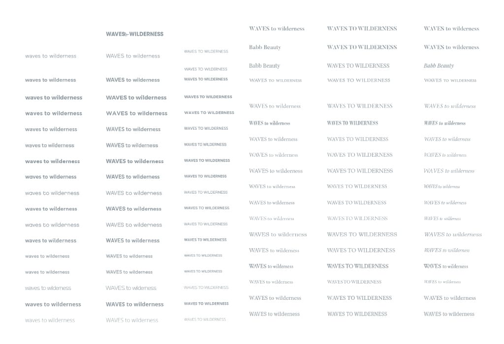
Type Wall used to find a suitable font
I also browse my favourite font site, MyFonts and paste font previews on to my art board.
Logo & Branding Art Board
This is my entire art board, which I worked on in an anti-clockwise direction, starting at the Type Wall and ending at the circled logo.
My Logo Design Art Board
Sketching
Throughout the project I often sketch out ideas, but this project was mostly done on the computer due to the geometric style.
Logo Sketches
Type & Concept Exploration
At this stage, I experimented with certain concepts seeing how they gel with other typefaces.
Type & Concept Exploration
Finalising Concepts
After experimenting with the logo concepts, I came down to a shortlist and continued working on them. At this stage, I reference other designs, getting inspiration for layout and color.
Shortlisting Logo Concepts
Final Logo Concepts Presented
I presented these logos to the client over Skype, showing one logo per page and then in context of clothing, a website etc. You can see the actual PDF presentation in the video. I don’t often show so many concepts, but I felt these had merit because the brief was so open-ended.
Ultimately, we decided the nod to heritage and the modern-retro-classic vibe was the best direction for the brand.
Final Logo Concepts Presented
Logo Approved & Variations Created
Great news! The client approved concept one in the first round. Rare, but I’ll take it!
After selecting the logo, we explored alternatives & tested how the logo worked in reverse. We kept the original (circled below) and then refined it.
Exploring Logo Variations
Logo Refinement using a Grid, Golden Ratio & Optical Alignment
After the logo was chosen, I refined the logo lockup using a grid, the golden ratio, geometric shapes and optical alignment.
The pink shows the construction of the logo using core geometric shapes; two triangles and circles which are in proportion to the Golden Ratio.
The Fibonnaci Swirl, shown in white, shows exactly where the mountains & wave meet (the crosshair part) which is 1.618 of the length of the logomark. The logomark length being measured by the total width of the two triangles (A+B).
You will also notice that these are ‘optically aligned’ – eg. the tip of the wave goes over the exact point where the crosshair meets, to give better balance to the logo. No geeky grid can can do that. It’s done by the naked eye.
Logo Construction using a Grid, Golden Ratio, Geometric Shapes & Optical Alignment
The Final Logo
The final logo
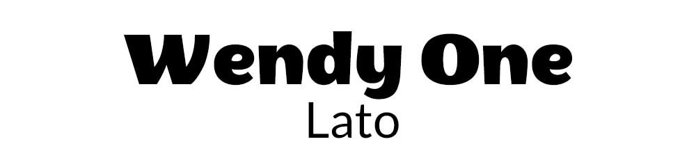
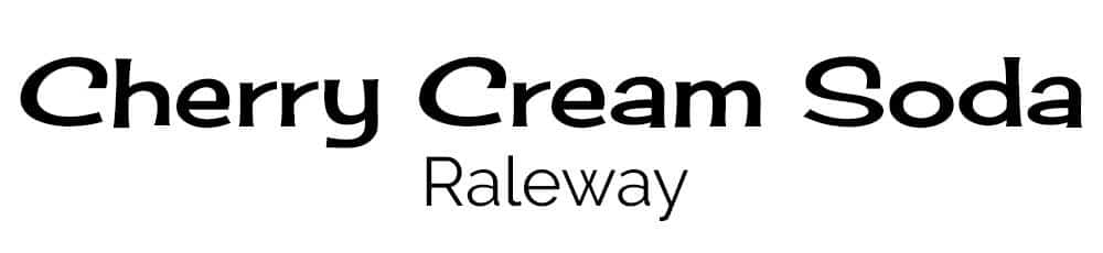
Fonts & Colors
The logo is just the tip of the iceberg. I then finalize the fonts, color and overall style, ensuring it is cohesive and consistent with the brand as a whole.
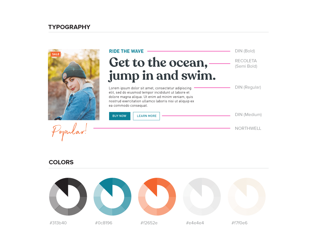
Type & Color Styleguide
Logo & Tag Line Lockups
Different lockups of the logo were made for different use case scenarios such as the horizontal version for the website, and the stacked version for badges, as well as a styled version of the tagline ‘Find Your Path’, which I also created. ![]()
Logo Lockups for Different Use Case Scenarios
Badge Variations
A brand should have flexibility with constraint, and this can be seen in the badge variations created for different pieces of clothing.
Final Logo Badge Variations
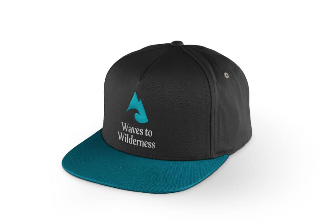
Logo in Context
A logo is rarely shown on a plain white background so it’s important to show how the logo will be used in reality, such as on clothing.
Waves to Wilderness Hat
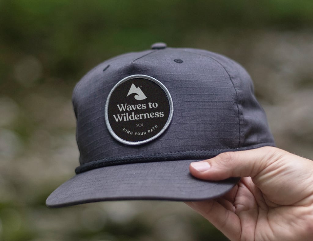
Logo badge in context of a hat (Thanks to Cory McClaren for the hat)
Final Brand Identity
And there we have it, a fresh logo & brand identity for outdoor fashion brand, Waves to Wilderness.
Final Waves to Wilderness Logo & Brand Identity
Have any questions, comments or feedback? Let me know.