This article was contributed by Manish Dudharejia.
The user experience is clearly one of the most important aspects of a website, and it can be the deciding factor when it comes to making a purchase. Studies have found that when the customer experience is improved, 42% of businesses experience retention increases, 33% report more satisfied customers, and 32% see a boost in revenue.
However, cracking the UX code has been a puzzle that web designers are working endlessly to solve. While new technology provides designers with more and more tools and systems to improve their efforts, there are still many obstacles and challenges that stand in the way of a better UX for the customer.
Thankfully, many of these problems are not without a solution. Let’s discuss the top ten challenges with customer UX and how to beat them.
1. Gathering Marketing Data Without Interruption
Marketing and sales teams these days require all kinds of customer data to support their strategies and campaigns. However, their methods of gathering this information are often intrusive or questionable to the consumer (i.e. Facebook’s latest data collection fiasco). Consumer data collection is certainly not going away, as it is necessary for providing personalization and relevant content to customers. However, it must be done in a way that does not disturb the experience or put valuable information at risk.
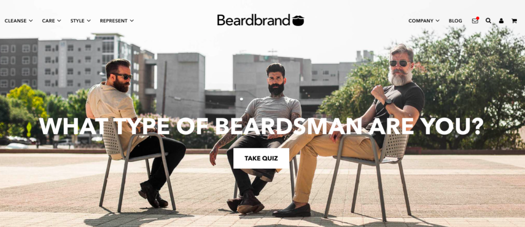
Instead of asking for consumer data through opt-in forms or using cookies and monitoring systems, designers should test out more engaging and subtle collection methods. Using interactive content, such as quizzes, polls, or surveys is one easy way to gather valuable data.
Interactive web pages are known to have 500% higher engagement rates than static pages, which means designers can improve both data collection and the customer’s experience through unobtrusive approaches.
2. Complicated and Confused Chatbots
Of course, the use of chatbots has increased greatly over the past couple years – since they are extremely helpful for customer service issues and boosting conversions. And while these virtual assistants have helped many companies provide instant support, they are not always the most user-friendly. In fact, 73% of customers who have had a bad experience with a faulty chatbot will not use them in the future, and 61% found them to be more frustrating to deal with and would prefer a human representative instead.
If chatbots are not sophisticated or smart enough to solve customer issues, they can inevitably lead to frustration, conflicting messages, or incorrect answers; all of which hurts the UX. The chatbot must be focused on conversational UX, rather than just trying to solve an issue quickly or offering a witty response. This can be done by incorporating smarter AI systems that use machine learning to pick up on interaction cues and emotional intelligence. This technology helps chatbots to virtually “learn” which responses are appropriate and helpful for various situations so it can improve with every interaction.
3. Implementing Personalization that Converts
There’s no doubt that offering personalized experiences can boost sales and customer satisfaction. In fact, 91% of consumers report that they are more likely to buy from businesses that offer these benefits.
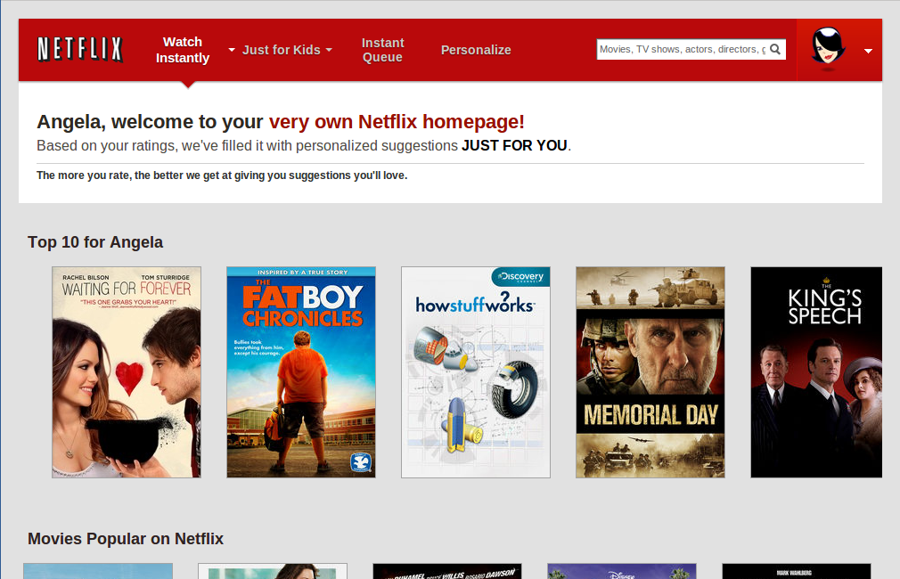
Many websites are taking personalization a step further by optimizing landing pages for each specific customer in order to display content they believe is most relevant for that individual. But again, in order to do this, designers must be able to access tons of consumer data to determine a layout that will actually lead to conversions.
Smart personalization means that marketing teams and web designers have a deep understanding of who their customers are, what they want, and how to provide it through unique experiences. For example, brands can collect data from POS system transactions to see which products a customer has bought in the past and use this information to send personalized offers or coupons for related items. Teams can also create buyer personas and formulate page layouts around their needs and desires for targeted webpages that can boost conversions.
4. Understanding the Implications of UX
Every little detail of the major design elements adds to the UX in some way, including the layout, graphics, aesthetic, user interface, and even the colors of the landing pages. Unfortunately, there is often a disconnect between what a brand wants their webpages to look like and what will actually contribute to a positive UX. This is why it is so important to understand the impact of each little tweak and the effect it has on the UX of the webpage.
For example, let’s say you are building an e-commerce site for a client. The client and your designer disagree about the placement of the “add to cart” button on the product page. Perhaps the client wants the box at the bottom of the page while the designer argues that it would perform better if it is placed above the fold. Once the site goes live, an A/B test of these two variations can show how the placement of a CTA button can have an effect on its conversion rates.
5. Product Showcasing
When it comes to selling products online, the biggest drawback is you never really know what you are getting until it shows up. With so many sales options available online, brands must always work to create confidence and communicate why their product is the one that customers should go with. Just relying on product pictures and ratings from past purchases may not be enough, especially since every retailer uses these tactics nowadays.
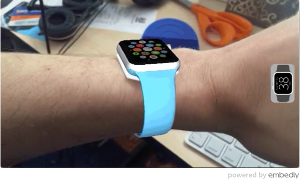
This is where a little creativity and technology can go a long way. Online retailers have started using virtual and augmented reality tools to create 3D models of their products for a virtual “hands on” shopping experience that was never before possible. With this kind of technology, customers can see exactly how a piece of furniture would look in their living room or how a smartwatch would look on their wrist by simply using their smartphone.
This kind of product display brings the best element of the brick and mortar store to an online one. Customers seem to be delighted with this feature, too. According to recent reports, 40% would be willing to spend more on a product if they could test it with VR first, and 71% of shoppers would buy more from a business that offers this feature.
6. Time Consuming Tweaks
Designing a website is a long process, and even the smallest edit or change can take several hours to program and implement on a page. Plus, the pickier the client, the more tweaks will probably be needed during the process, eating up precious hours of a designer’s day.
Many designers are turning to AI automation systems to save time on the mundane tasks of editing, changing, and adjusting design elements. Adobe is currently working on a software system with a machine learning program to support design automation. Essentially, the program makes much of the design decisions on its own (all backed by analytical data of course) and automatically adjusts graphics, colors, and pictures to fit best on a webpage without any human assistance, saving web designers’ hours on projects by eliminating small, yet time consuming tasks.
7. A/B Testing Inaccuracies
While A/B testing is often a designer’s go-to strategy for comparing ideas and designs, it is quite limited and woefully inaccurate. In fact, reports have found that 8 out of 10 A/B tests deliver inaccurate results. Since many systems can only compare two variants at a time, there may not always be a clear winner between the subjects. Plus, there is always a chance that neither of these options is really the best, and it could take months before enough A/B testing combinations are run to find the one that should be implemented.
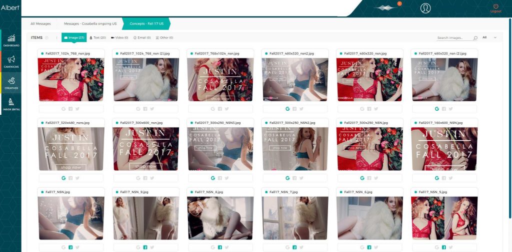
Once again, machine learning and AI can make this process much easier and more precise. Traditional A/B testing can only compare two elements at a time. But since AI systems can analyze great amounts of data instantly, these tools can compare thousands of variants simultaneously and report results much faster. For example, the online clothing store Cosabella used AI to run design tests for a website revamp. They were able to test several hundred changes over the course of just three weeks, and their redesign resulted in a 38% increase in conversion rates.
8. Fix The Consumer Behaviour Code
Knowing what motivates customers to make a purchase, complete an action, and so on has always been a challenge for web designers. Furthermore, they must know how to use this motivation to improve conversion rates. Of course, everyone’s preferences are different, and it is impossible to please everyone. However, thanks to recent case studies on consumer psychology, web designers can make better and more confident UX design choices that are proven to get results.
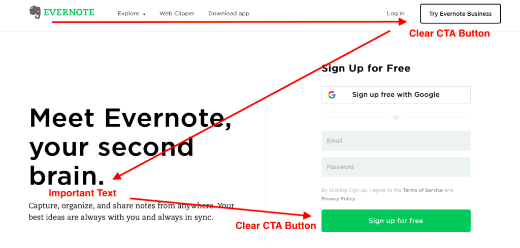
There are some key psychology principles that web designers should take into account when they are trying to improve the UX. For example, when people browse a webpage, they do not typically read it left to right like they would a book. Instead, consumers tend to follow a Z or F-shaped reading pattern when consuming online content. Designers can use this to their advantage by placing CTA buttons or important content along the path that a customer’s eyes will naturally fall to.
Following this natural flow of visual hierarchy makes it easier for customers to consume content quickly, get an idea of what the website is about, and make a fast decision.
9. Cultivating Customer Confidence
With 47% of online shoppers worried about the security of their data, it’s imperative that the UX of the website builds customer confidence. Many customers feel that brands are not protecting their data, leaving them vulnerable to attacks and breaches. Their fears are not unwarranted; the number of data breaches from 2016 to 2017 has more than doubled.
The UX and perception of a website has a massive impact on company trust. In fact, nearly half of consumers base the credibility and trustworthiness of a website solely on its design.
In order for brands to instill this kind of confidence in regards to privacy and behavior tracking, websites must be designed in a way that promises security. This can be done through transparent data collection processes, which alerts customers when their information is being stored and what the purpose is. 70% of shoppers agree that they would be more comfortable with this sort of tracking if the brand lets them know how their data will be used. Moreover, brands should always provide an option to opt out.
Displaying security badges on webpages also communicates to customers that their information will be protected, and this sense of security can translate to higher conversions.
10. Navigating the Hottest Trends
Just because something is “trending,” doesn’t mean it is right for your design. For example, the concept of data storytelling is very popular at the moment, but it does not necessarily fit into every business. This tactic requires lots of consumer data, planning, and design tricks in order for it to be done well. Plus, just including this tactic as part of a website because it is “popular” does not mean that it will necessarily add to the UX and provide the customer any real benefits.
However, this does not mean that designers should exclude every trend they don’t understand or see the relevancy. Going back to data storytelling, there are lots of ways this concept can be used to illustrate an idea, support a claim, and even stir up an emotional response through data visualization.
The important thing for web designers to keep in mind here is relevancy. Does the latest trend actually improve your website? Or does it distract from the main message?
Conclusion
With every year comes new sets of challenges and ideas that web designers must consider to improve the UX. But, designers should remember that there is a workaround for every obstacle. By carefully considering the customer’s needs, wants, and preferences, designers can make the necessary decisions to build a successful website that provides a better UX for every visitor.
—
Manish Dudharejia is the President and Co-Founder of E2M Solutions Inc, a San Diego Based Digital Agency that specializes in Website Design & Development and eCommerce SEO.



 Series #1 – Create Experimental Gradients and Posters