This article has been contributed by Andrew Simon.
It is impossible to ignore the significance of a brand’s logo.
You will see their logo everywhere, from their website and printed collateral to advertising and staff clothing. It’s the most salient part of a brand’s promotional activity both online and offline. A well-designed logo can give a company a unique identity and allows the target audience to quickly recognise a brand.
Plus, it’s no secret that companies are trying to beat their competitors in every way possible, from sales all the way to business logo design. They want to capture the attention of the largest possible audience and a successful logo will differentiate them from their competitors. That’s why they are investing a lot of money to commission logos.
Some logos are very straightforward and simple in design whereas some designers try to make them more complex. But the one thing which is common among logo designs is that every one is meaningful and tries to portray a message, without saying a word.
So, let’s look at some of the world’s most famous logos and their hidden meanings.
1. FedEx
![]()
The logo of this American multinational delivery service company is popular for a number of reasons. One is a hidden symbol that not everyone knows about.
At first look, you probably won’t find the concealed message in this logo. But look at the white space between the letters “E” and “X” and you will find an arrow pointing right. The hidden arrow in this logo represents the speed and precision which FedEx provides to its customers by delivering parcels quickly and efficiently.
Even the different colors of the “Ex” in variations of the logo denote certain meanings. For instance, the letters appear in orange on express parcels, green on ground, red on freight, yellow for trade network and light blue for office.
2. Amazon
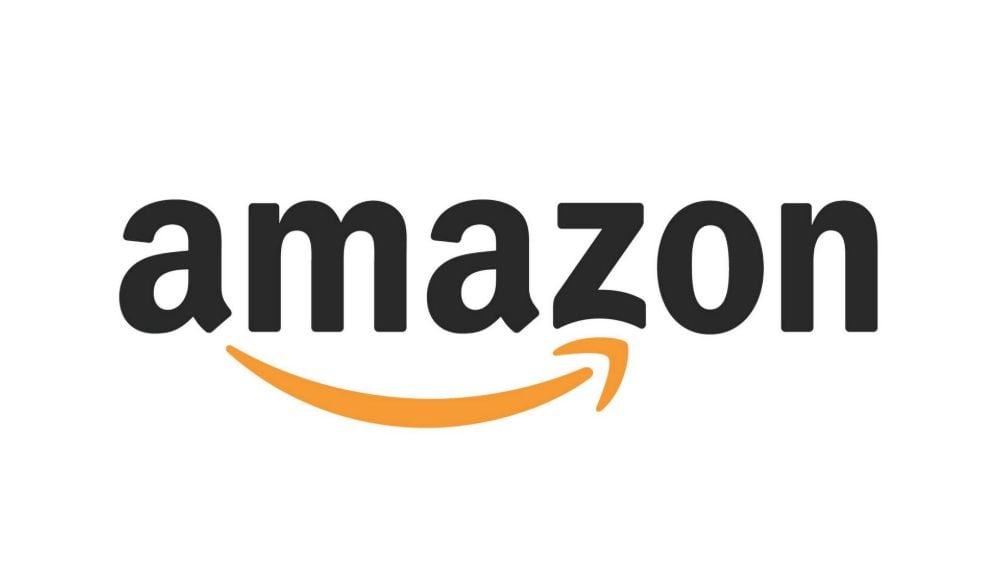
From starting as an online bookstore to becoming the world’s largest eCommerce company, Amazon has seen remarkable success. Not only an online shopping site, Amazon now offers a range of latest technologies like an assistant and cloud services.
Like other companies, Amazon has made a number of changes to their logo design since inception. The logo now illustrates that they sell everything from A to Z via the orange arrow pointing from the “a” to the “z”. The arrow also represents the smile that customer will surely have after buying products from the store.
3. Baskin Robbins
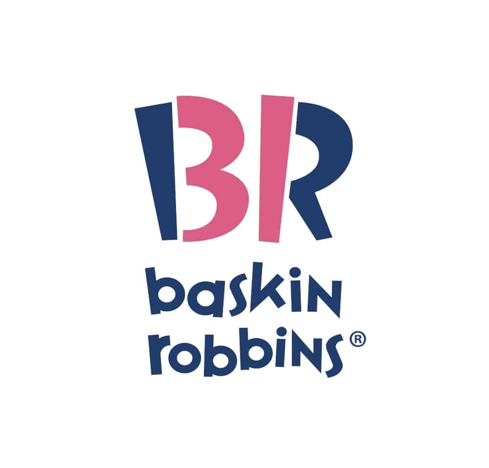
Baskin Robbins is the world’s largest ice-cream chain with shops across the globe. Burt Baskin and Irv Robbins partnered to establish the brand in 1945, which has become well known for offering a wide range of delicious flavors of ice creams.
The designers of the company’s logo, like many others, sought to communicate a specific meaning – and they succeeded. The logo uses a blue and pink color combination. However, if you look only at the pink forms, you will see the number “31”. This is the number of icecream flavors the brand offers, with the idea being that you can have a different flavor every day of any month.
4. Audi

Audi is synonymous with German auto engineering. Coming from a long history of mergers and acquisitions, the company’s logo points back to its origins. The four rings each represent the four companies that combined to form Audi’s predecessor company, Auto Union. These are Horch, the Audiwerke , DKW and Wanderer.
The latest revision of the company’s logo conveys the message of “progress through technologies”. The aluminum color of the rings reflect the brand’s innovative power. This simple yet modern design is eye-catching and imbues a sense of prestige.
5. NBC

NBC is an American commercial radio and television network company with headquarters in New York. The brand’s logo designers cleverly crafted this logo to reflect specific meaning as well as to convey the brand essence.
When the peacock logo was first designed, color televisions had recently been introduced and NBC’s owner manufactured color television sets. So, they used an abstraction of a peacock to indicate richness in color, both to encourage people towards the network’s color programming and to buy color TVs.
In the latest update to the logo, the peacock’s head was flipped to face the right, suggesting looking to the future. The original 11 feathers were reduced to six, to represent the network’s six divisions.
7. LG
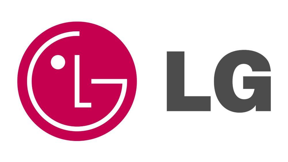
LG is famous across the globe for its creative logo design. It is fairly easy to recognise the human face in the design. However, the “L” and the “G” may be slightly less noticeable in the features of the face. The face’s nose is the “L” and the face outline and the right eye comprise the “G”. This conveys the company’s approachability and connection with their customers.
8. Vaio

Vaio is a great example of how you can convey a message using design. Being a well-known tech brand, they have incorporated analog and digital symbols into their logo. The first two letters, “V” and “A” denote analog signals whilst the last two letters, “I” and “O”, reflect a digital binary code. The way they have constructed the visual representation of this meaning is attractive and instantly triggers brand recognition.
9. BMW

This German automobile company created aircraft engines before entering the car market. It’s for this reason that many people believe that the white and blue colors used in BMW’s logo represents a plane’s white propeller and a blue sky. Whilst this is not entirely correct, the use of the logo incorporated into propellers in the company’s advertising and BMW’s lack of an alternative explanation have turned this theory into a popular belief.
The logo displays the colors of the State of Bavaria, but inverse. At the time, it was forbidden to use symbols of sovereignty on commercial logos in a certain order, according to heraldic rules, thus BMW displayed them in reverse.
10. Cisco
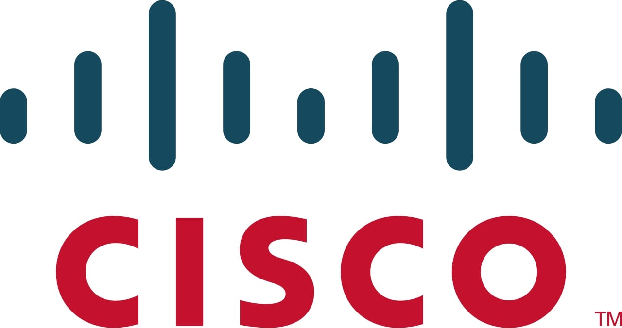
Cisco, like many multinational tech conglomerates, was founded in San Francisco. The firm integrated this into their logo, which features the silhouette of the Golden Gate Bridge. The Bridge, which connects San Francisco to Marin County, is itself a symbol of connectivity. The same blue lines that feature the bridge shape reflect the company’s digital core.
11. Adidas
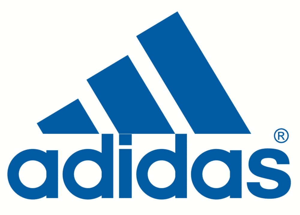
Adidas is the second largest sportswear manufacturer in the world behind Nike, and is the first choice for many athletes. Like most companies, there have been a number of revisions to the logo over the years. However, unlike other brands, Adidas continues to use more than one logo.
Common across all logos, and an instantly recognisable visual identity asset, is the brand’s famous three parallel stripes. Also consistent across the logos is that the brand name starts with a lowercase “a”, symbolising widely accessible casual wear.
The “mountain” version show above is used for the sports line and is said to represent challenges to be overcome by focussing on the end goal, no matter what. The “trefoil” logo, sometimes thought of as the flower logo, is used for the brand’s original line, still manufactured today. Finally, the “globe” version of the logo is used for Adidas’s everyday style line.
12. Domino’s
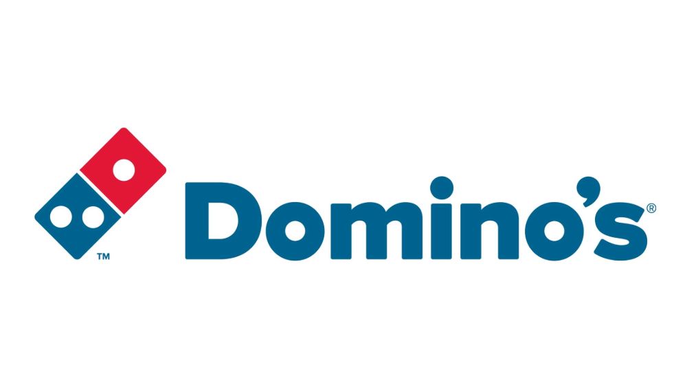
We all know that Domino’s is the world’s largest pizza restaurant with outlets across the globe. The logo shape is no mystery; a domino piece. However, what isn’t so obvious is why the piece has three dots on it. At the time the logo was designed, there were three Domino’s store locations. It’s lucky they didn’t attempt the update the logo to reflect new franchises, as the chain now has over 15,000 stores worldwide.
13. Mitsubishi
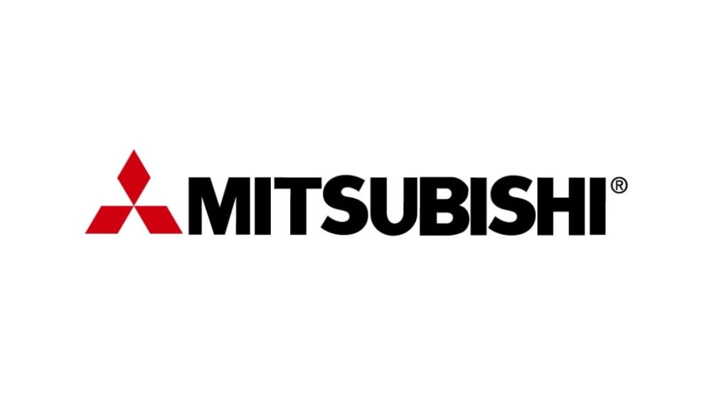
The logo of the Japanese car manufacturer, Mitsubishi, directly represents the brand’s name itself. “Mitsu” means three in Japanese and “hishi” (or “bishi” as it is pronounced in this context) means water chestnut, which denotes a diamond shape.
The shape (and therefore brand name) is said to be related to the family crests of Mitsubishi’s founder and his first employer.
14. IBM

IBM’s seemingly simple logo uses only a single color and the brand’s name, and manages to successfully attract attention and trigger brand recognition. The logo, known as “Big Blue”, is one of the most iconic logos in the world.
Created by Paul Rand in 1972, the logo is one of very few to have remained unchanged in over 40 years. Blue was the chosen color to convey corporate sophistication. Prior to the redesign, the logo featured 13 horizontal strips, representing vibrancy and speed. The Rand redesign saw the number of strips reduced to eight, indicating speed and dynamism.
15. Pinterest
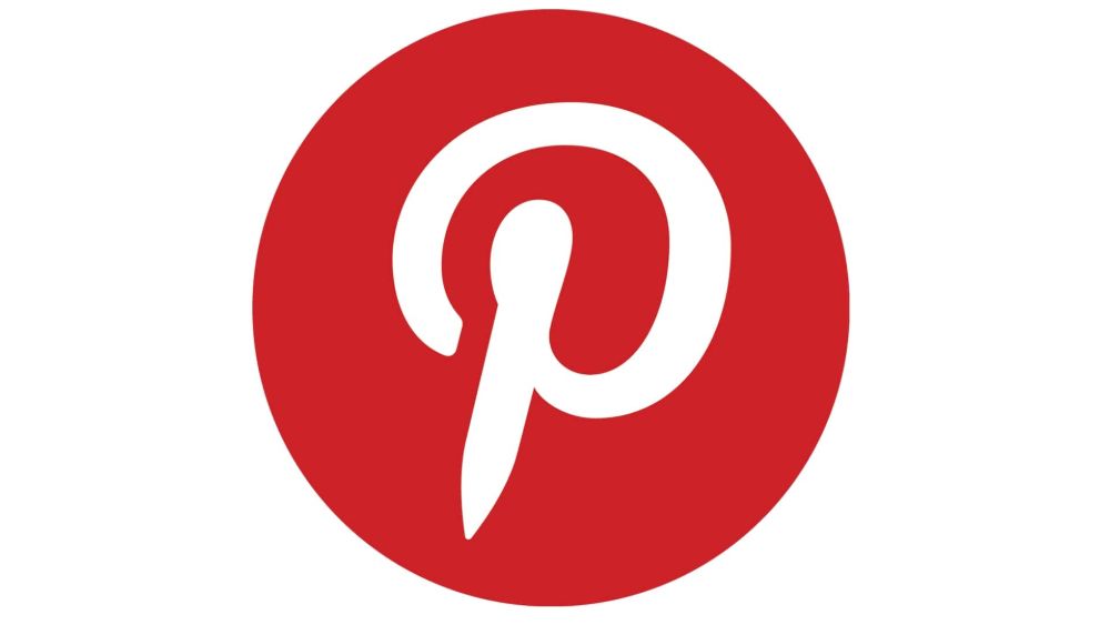
This social media site has connected millions of people across the world. From the concept of pinning items to a bulletin board that are of interest, comes the name “Pinterest”. Therefore, it’s no surprise that the logo designers used a pin as inspiration. The white letter “P” in the centre of the red logo is an abstract image of a pin, so integral to the brand’s identity.
16. Unilever
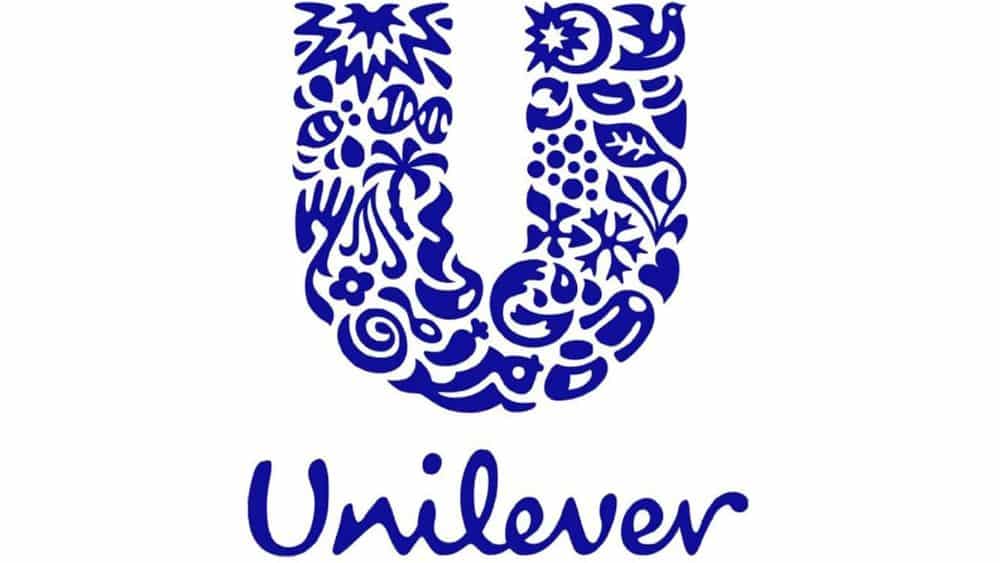
If you look carefully, you’ll see the Unilever logo on a multitude of household products, from hair care and cleaning products to ice creams and soup sachets.
The blue “U” clearly stands for the brand name. What is less obvious is the 25 symbols buried within, each representing an aspect of Unilever’s business. For instance, a lock of hair represents the brand’s shampoos and a tea leaf their tea ranges.
17. Apple
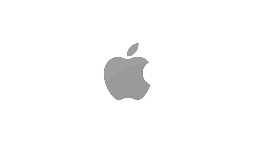
The first ever Apple logo, an image of Isaac Newton sitting under an apple tree representing the discovery of the gravitational force, only lasted one year. It was quickly replaced by the more strikingly simple but colorful graphic of an apple with a bite out of it. The hues highlighted the world’s first ever computer with a color display, the Apple II.
Why an apple? Some theories allude to original sin and others to Alan Turing, a brilliant mathematician, who died after eating an apple laced with cyanide. Steve Jobs simply claimed it was his favorite fruit. And the bite? This differentiates the apple from other round fruits and vegetables.
18. Nike

The Nike “Swoosh” is perhaps one of the most recognisable logos in the world. The logo was designed in 1971 by Carolyn Davidson, a college student at the time. She was paid $2 an hour to subsidise oil painting classes, for a total fee of just $35. She was later paid with an undisclosed amount of Nike stock. Most commonly displayed in plain black, the shape represents motion.
20. Toyota
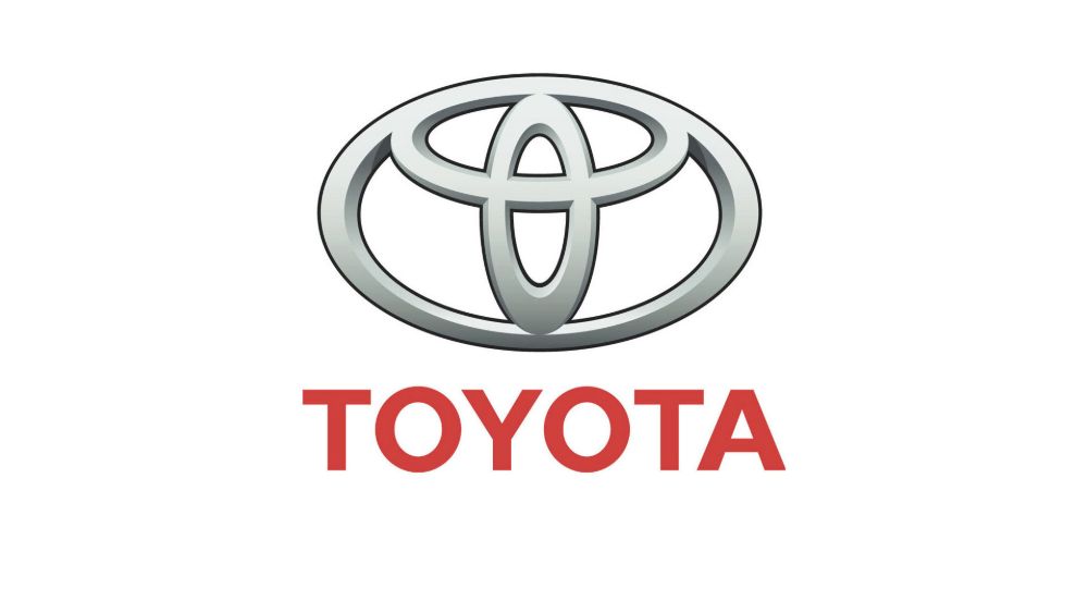
The logo of Toyota is a great example of how you can craft a logo with hidden meanings. This multilayer logo surprised everyone with an eye-catching design of three ellipses.
The integration of the letter “T” is perhaps obvious. What’s not so easy to identify is that the inner horizontal ellipse symbolises customers’ expectations whilst the inner vertical ellipse represents Toyota’s ideal. The outer ellipse that encircles them signifies the brand’s global expanse and huge potential.
_
About the author: Andrew Simon is a content and branding specialist working with a renowned logo design company that assures an accurate and consistent brand message that is delivered to the audience. He loves to explore the latest technologies and trends.
This is a fascinating showcase of some of the world’s most recognizable logos — it’s amazing how these simple symbols can become so closely tied to brands and cultures across the globe. A strong logo not only makes a company instantly identifiable, it also helps communicate values, personality, and trust at a glance. Many of these iconic designs are the result of thoughtful design choices and extensive creative thinking about colors, shapes, and typography. Because logos have such a powerful impact on branding, some companies invest millions in creating or updating their visual identities to ensure they stand out and remain memorable. If you’re curious to see examples of high‑profile and costly logo projects, check out the Fifteen most expensive logos in the world article. It highlights major logo designs that command attention and reflects why strong branding is worth investing in.
ReplyDelete